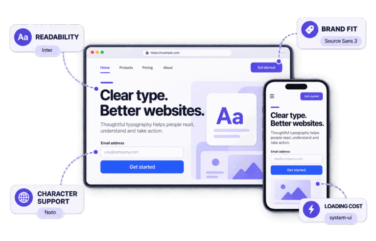
I
I
In This Guide
To choose the right font for your brand, start with the role the typography must perform, not the prettiest option in a dropdown. It is a decision about how your business should sound before anyone hears a word.
A typeface can make the same message feel established, friendly, technical, luxurious or wonderfully chaotic.
The challenge is finding one whose personality matches your brand, works wherever you need it, and remains readable when the polished mockup becomes a real website.
This guide explains how to choose the right font using a practical five-step process, test it in context and turn the final choice into a typography system your team can use consistently.
If the wider vocabulary still feels fuzzy, start with Typography Explained for the essential principles, then return here with sharper eyes and fewer mysterious font-menu decisions.
Font Inspector: Shortlisted a font already? Upload it to the Fontish Font Inspector and test real headings, paragraphs, glyphs and practical use cases before you commit.
Why Your Brand’s Font Choice Matters
To choose the right font, you must consider the audience, message, context, and job the typeface will perform.
Typography influences the tone of every message your brand publishes. It appears in the logo, website, packaging, emails, presentations, social graphics, and tiny interface labels nobody notices until they are difficult to read.
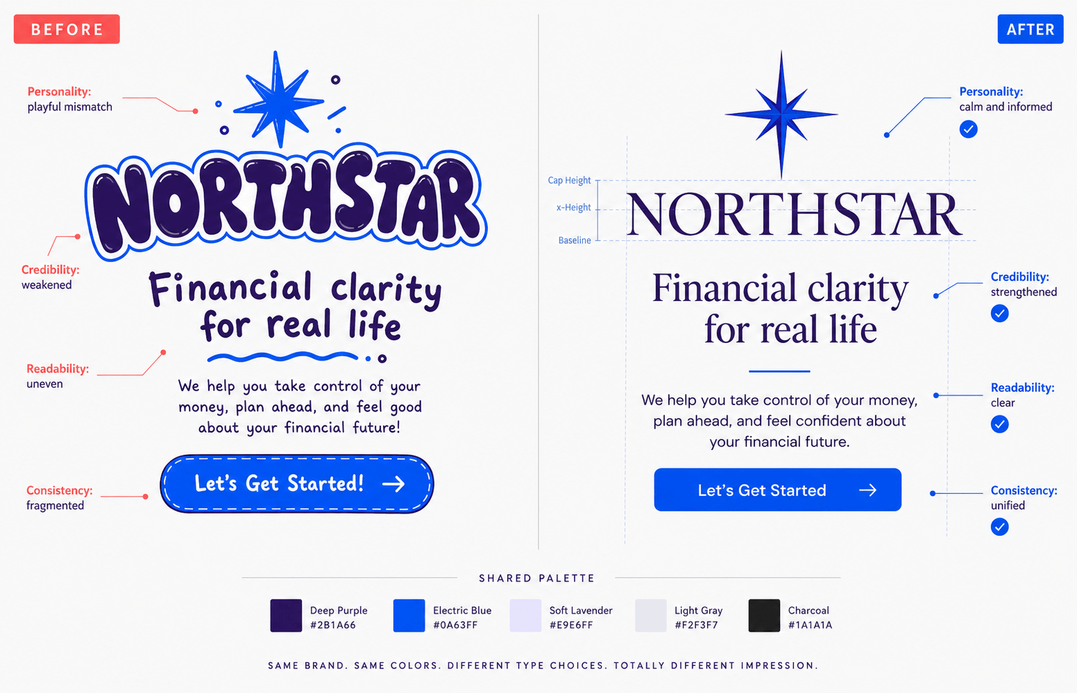
Consider a financial consultancy set in a bubbly novelty font. The words may promise discipline and long-term planning, but the type suggests birthday invitations.
Now imagine a children’s activity brand using a narrow, severe corporate sans serif. It may be perfectly legible and still feel emotionally wrong.
That mismatch is the real risk. A “good font” is not automatically a good brand font. Suitability depends on the audience, message, context, and job the typeface must perform.
The right font choice helps you create:
- Recognition: Repeated letter shapes, proportions and spacing become part of the brand’s visual memory.
- Credibility: Typography that fits the category and content makes the communication feel considered.
- Hierarchy: Clear differences between headings, body text, captions and calls to action help readers understand what matters first.
- Consistency: A documented type system reduces improvisation across teams and channels.
- Usability: Legible text, useful weights and dependable glyph coverage make the design work beyond the brand board.
Typography cannot rescue a weak product or manufacture trust on command. It can, however, support the qualities your business consistently demonstrates. That is more useful than expecting one fashionable serif to perform brand therapy.
What to Decide Before Browsing Fonts
Opening a font library too early creates an oddly specific form of paralysis. You compare hundreds of attractive specimens without knowing what problem you are solving.
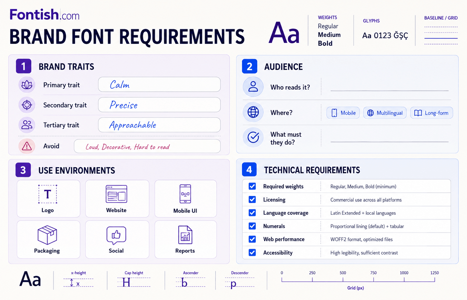
Before browsing, turn the brand strategy into a short set of selection criteria.
Define three brand personality traits
Choose three traits you want the typography to reinforce. “Professional” is usually too broad; nearly every serious business wants that. More useful combinations are:
- established, precise and calm;
- warm, thoughtful and editorial;
- energetic, optimistic and direct;
- premium, restrained and contemporary;
- playful, curious and accessible.
Define the opposite of each trait too. If “confident” is the goal, should the brand avoid looking aggressive? If “friendly” matters, should it avoid looking childish? These exclusions make the later creative brief more precise.
Understand the audience
Before you choose the right font, ask who must read the brand’s content, where they will encounter it, and what they need to feel or do next.
A type system for a clinical service has different responsibilities from one for an independent coffee shop, even if both describe themselves as modern.
Older readers, multilingual audiences, data-heavy interfaces and long-form editorial content may require more open letterforms, stronger character differentiation and a wider range of weights. Style matters, but the reader gets a vote.
Study industry expectations without copying competitors
Category conventions are useful signals.
Serif typefaces remain common in editorial, heritage and luxury contexts; neutral sans serifs are familiar in technology and professional services; expressive display faces appear frequently in entertainment, fashion and cultural branding.
Study relevant competitors and note what repeats: classification, width, contrast, case, weight and spacing.
Decide which conventions help people recognize the category and where your brand can be distinct without becoming confusing.
Identify every practical use
List the environments the font must survive, including logos, websites, social graphics, navigation, buttons, prices, charts, legal text, invoices, packaging, presentations and email.
Note the non-negotiable constraints: required weights, body-text readability, screen or print use, licensing, language coverage, numerals, web performance and compatibility with your team’s tools.
You will convert these into pass-or-fail requirements during Step 2.
These criteria make it much easier to choose the right font without becoming distracted by hundreds of attractive but unsuitable options.
How Font Categories Shape Brand Perception
Font categories provide a sensible starting point, not a personality test with scientific certainty.
Two serifs can feel entirely different because of contrast, proportions, terminals, width and spacing. Still, classifications help narrow the field.
| Category | Typical impression | Useful for | Main risk |
|---|---|---|---|
| Serif | Established, editorial, refined | Publishing, hospitality, luxury, professional services | Can feel dated or formal in the wrong context |
| Sans serif | Modern, direct, efficient | Technology, interfaces, corporate and service brands | Can feel generic without distinctive details |
| Slab serif | Sturdy, confident, practical | Food, outdoor, editorial and characterful identities | Heavy styles can become blunt or tiring |
| Script | Personal, elegant, handcrafted | Wordmarks, packaging and selective accents | Readability drops quickly in long or small text |
| Display | Expressive, bold, memorable | Headlines, campaigns and short brand moments | Too much personality can overpower the message |
| Monospace | Technical, systematic, utilitarian | Developer tools, data, labels and specialist accents | Can feel cold or inefficient for general reading |
Serifs such as Playfair Display can bring editorial contrast and elegance, while a geometric sans such as Poppins feels cleaner and more contemporary.
Neither is universally better. The question is whether the details support the brand’s character and the text’s job.
Look beyond the category label. High contrast between thick and thin strokes often feels more dramatic; low contrast tends to feel sturdier.
Rounded terminals may feel approachable, condensed widths can feel forceful and generous apertures usually help small-screen legibility.
Google Fonts’ guide to emotive considerations when choosing typefaces is useful here because it treats emotional response as contextual rather than pretending every serif automatically means “trust.”
MYTH: Every luxury brand needs a high-contrast serif.
REALITY: Premium positioning can also come from restrained sans-serif typography, spacing, materials and art direction. Category fit matters more than following a luxury-font formula.
Understanding these differences helps you choose the right font category before comparing individual families.
How to Choose the Right Font: A Five-Step Framework
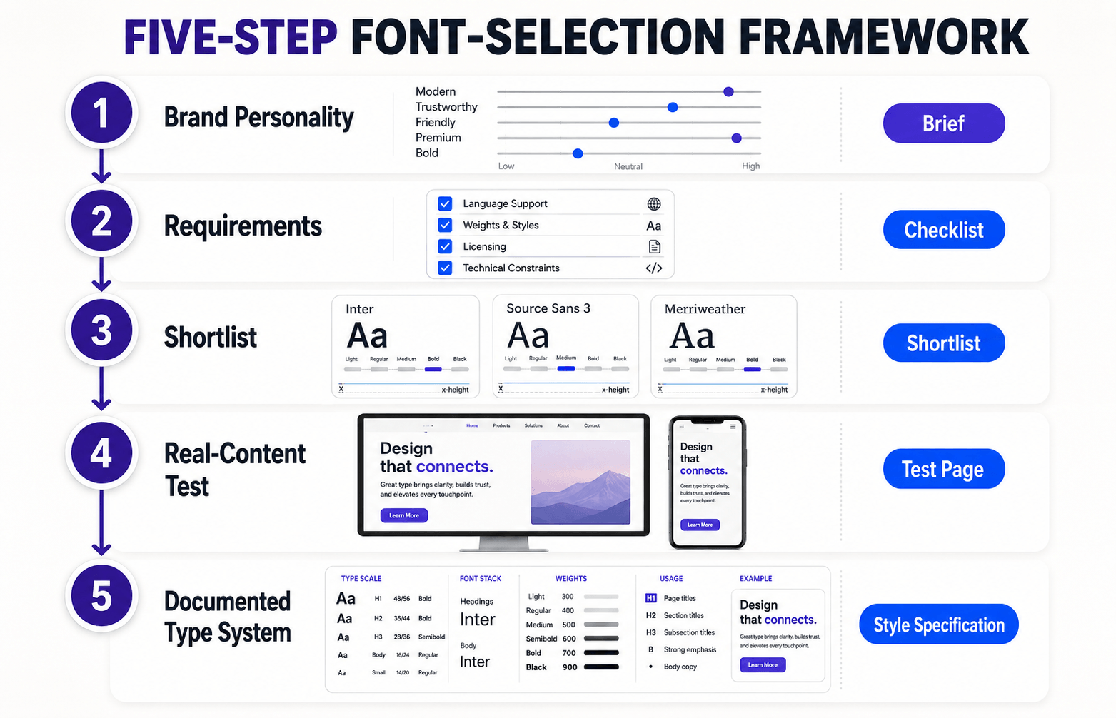
The following process moves from strategy to evidence. Do the steps in order. Choosing a beautiful font first and inventing the rationale later is not a selection framework.
Step 1: Turn the brand personality into a creative brief
Use the traits, audience and exclusions identified earlier to produce one clear sentence:
We need a type system that feels warm, informed and contemporary, without becoming rustic, academic or trendy.
Translate each trait into characteristics you can test.
“Warm” might suggest humanist shapes, open counters or moderate stroke contrast. “Contemporary” might point toward clean spacing and a family that works well in digital interfaces.
These are hypotheses, not rigid formulas.
Collect five to ten references from brands outside your immediate competitor set. Study the type category, proportions, weight, spacing and hierarchy rather than simply copying the font name.
Step 2: Convert practical constraints into pass-or-fail requirements
Separate essential requirements from preferences. If the website needs Turkish, French and English, language coverage is essential. If you would enjoy a swash capital for campaign graphics, that is a preference.
A useful requirements list might read:
- readable body text from 16 px upward;
- regular, medium, semibold and bold weights;
- true italics;
- Latin Extended character set, including Turkish glyphs;
- tabular numerals for pricing and reports;
- webfont format and clear commercial licence;
- acceptable loading performance;
- distinctive headings without sacrificing interface clarity.
Use this list to eliminate unsuitable font choices before judging style. There is little value in falling in love with a typeface that lacks the characters in your founder’s name.
Step 3: Shortlist suitable categories and families
Choose a font or two likely categories, then shortlist three to five families. To choose the right font from your shortlist, compare every family using identical content, sizes, spacing and layouts.
Font specimens are designed to flatter the font; your refund policy is not.
Evaluate the family rather than a single weight. Check the regular, italic, semibold and bold. Look at lowercase text, all caps, punctuation, numbers, and awkward combinations such as Il1, rn/m, O/0 and B/8.
Do not reject a family merely because its default spacing looks imperfect in one design tool.
Tracking and line spacing can be adjusted. Weak basic letterforms, missing glyphs and an unsuitable tone are harder to repair.
Step 4: Test the fonts in real content
Build a simple test page with the actual words your audience will see:
- full logo or wordmark;
- homepage H1 and H2;
- two body paragraphs;
- navigation and buttons;
- product names and prices;
- forms, error messages and captions;
- dates, percentages and currency;
- mobile and desktop layouts;
- a long word, a short word and an all-caps label.
Test at realistic sizes and widths. A typeface that looks magnificent at 72 px may become cramped at 16 px.
A family that feels neutral in English may become unsuitable when accented characters or another script appear.
Check the spacing system too.
Read the Leading in Typography guide if paragraphs feel dense or disconnected; the font may be fine while the line height needs adjustment.
Step 5: Build and document the typography system
Once a family passes the tests, assign roles. A simple system might use:
- display or bold serif for H1 and campaign headlines;
- neutral sans serif for body text and interface copy;
- semibold sans serif for navigation, labels and buttons;
- one restrained accent style for quotes or editorial details.
You may not need two font families. A versatile superfamily or variable font can create contrast through size, weight, width and optical size while keeping the system coherent.
The Google Fonts CSS2 API supports variable-font axes when the selected family provides them.
Document the family names, weights, sizes, line heights, letter spacing, fallback fonts and approved uses. This turns a font choice into a repeatable brand system rather than a mood board everyone interprets differently.
This framework helps you choose the right font through strategy, practical requirements and real-world evidence.
Match Fonts to Common Brand Personalities
Personality labels are more useful when paired with practical constraints. Use this matrix as a shortlist prompt, not a vending machine that dispenses the “correct” font.
| Brand direction | Look for | Consider | Avoid |
|---|---|---|---|
| Premium and restrained | Refined proportions, controlled contrast, generous spacing | Editorial serif plus neutral sans serif | Decorative excess and ultra-thin body text |
| Modern and technical | Open forms, strong screen legibility, useful weights | Humanist or neo-grotesk sans serif | Generic geometry with weak character distinction |
| Friendly and accessible | Open counters, soft curves, clear lowercase shapes | Rounded or humanist sans serif | Childlike novelty unless the audience genuinely calls for it |
| Established and authoritative | Stable rhythm, moderate contrast, mature details | Old-style or transitional serif | Stiff formality that conflicts with a conversational voice |
| Bold and creative | Distinctive display voice supported by a quiet workhorse | Display face for short headings plus readable sans serif | Using the expressive font for every role |
| Natural and handcrafted | Human details, irregularity used with restraint | Warm serif or selective script accent | Faux-handmade clichés and difficult long-form text |
A premium skincare brand might pair a controlled high-contrast serif with a clean sans serif for ingredients and instructions.
A technology product or children’s learning platform may take a different direction, but both still need clear character distinction and dependable reading text.
The industry does not choose the right font for you. It supplies expectations you can respect, bend, or deliberately reject.
Build a Simple Font-Pairing System

If one family cannot provide enough contrast or brand character, add a second with a clearly different job. The easiest system is usually:
- Primary/display font: personality, headlines and short brand moments.
- Secondary/workhorse font: body copy, navigation, captions and interfaces.
Contrast should be visible but controlled. Pairing two nearly identical geometric sans serifs often creates redundancy, while pairing two highly expressive display faces creates competition.
Look for complementary differences in classification, proportion, contrast or texture.
The roles matter more than the number of fonts. Two families with five unplanned weights can feel messier than three carefully assigned styles. Limit the available choices so contributors know which style belongs to each role.
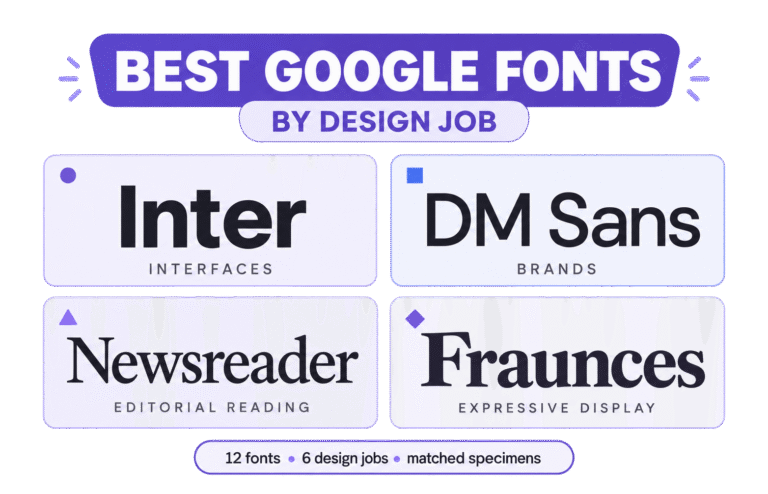
Good starting examples include Playfair Display and Inter, Libre Baskerville and Inter, and Lora and Poppins. Each pairing balances a more expressive voice with a practical reading face.
For the complete method contrast, hierarchy, testing, and implementation, use the dedicated How to Pair Fonts guide.
Test a Font Before Committing to It
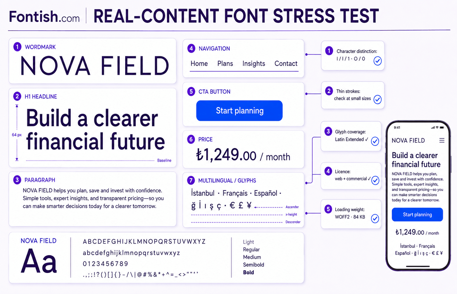
If you want to choose the right font with confidence, test it under the imperfect conditions of real brand communication.
It reveals problems that disappear inside curated specimens: a strange ampersand, weak numerals, narrow bold text, missing diacritics, or a lowercase a that suddenly dominates every paragraph.
Run a readability and accessibility test
Check body copy on a phone, laptop, and at least one older or lower-resolution display.
Test normal text at the sizes you will actually publish, not only in an enlarged design canvas.
Pay particular attention to:
- distinction between
I,land1, and betweenOand0; - open counters and apertures in small text;
- thin strokes that fade against the background;
- dense bold weights and cramped letter spacing;
- uppercase labels and long paragraphs;
- zoomed layouts and reflow at narrow widths.
Accessibility involves the complete presentation, not just the font family.
Follow the Web Content Accessibility Guidelines, confirm sufficient text contrast, ensure text can be resized to 200 percent, and test whether layouts remain usable when readers adjust text spacing.
Check language and glyph coverage
Type every language, name, currency and symbol the brand is likely to use. Do not rely on a language label alone; inspect the glyphs.
For an international brand, the checklist may include:
- accented Latin characters and Turkish characters such as
ğ,İ,ı,şandç; - Cyrillic, Greek, Arabic or other required scripts;
- currency symbols, fractions and mathematical marks;
- curly quotation marks, apostrophes, dashes and ellipses;
- lining, old-style or tabular numerals where relevant.
Google Fonts’ guidance on choosing reliable typefaces highlights language support, legible details, styles and alternate characters as practical measures of a dependable family.
Verify licensing and ownership
Before you choose the right font, read the licence from the foundry or distributor before using a font commercially.
Confirm whether it covers desktop installation, websites, apps, ebooks, logos, social templates and client handoff. “Free download” is not a legal category.
Google Fonts states that its library uses open-source licences and permits commercial and non-commercial use, but you should still retain the licence information for the selected family.
For commercial libraries, check the exact terms and audience limits rather than assuming every subscription covers every product.
Measure web performance
Load only the weights, styles and character subsets you need.
Modern WOFF2 files, subsetting and variable fonts can reduce requests or file weight, but a variable font is not automatically smaller than a carefully limited static set.
Use a sensible fallback stack and decide how text behaves while the webfont loads.
MDN’s documentation for @font-face and font-display explains the implementation options. Test the result on a throttled connection rather than assuming every reader has ideal network conditions.
Score the shortlist
Rate each finalist from 1 to 5, then compare totals. Weight the essential criteria more heavily if needed.
| Criterion | Font A | Font B | Font C |
|---|---|---|---|
| Brand personality match | /5 | /5 | /5 |
| Body-text readability | /5 | /5 | /5 |
| Mobile and interface performance | /5 | /5 | /5 |
| Weight and style coverage | /5 | /5 | /5 |
| Language and glyph coverage | /5 | /5 | /5 |
| Licensing suitability | /5 | /5 | /5 |
| Distinctiveness | /5 | /5 | /5 |
| Pairing flexibility | /5 | /5 | /5 |
| Web performance | /5 | /5 | /5 |
| Total | /45 | /45 | /45 |
The score does not make the decision for you. It exposes where enthusiasm is hiding a practical weakness.
Common Font-Selection Mistakes
Most font-selection mistakes come from rushing the process without a clear brief or proper testing.
To choose the right font, evaluate how each candidate performs across real content, practical contexts and technical constraints—not aesthetics alone.

Choosing from the font name or specimen alone
A polished specimen shows the typeface at its best. Replace it with your longest headline, dullest legal sentence, product price and mobile navigation.
Real content is less flattering and much more honest.
Following trends without checking fit
A fashionable font can make a new brand feel current, but it can also make five unrelated competitors look like siblings.
Choose font trends only when they support the brand strategy and the family has enough range to survive after the visual fashion changes.
Prioritizing personality over readability
Distinctiveness belongs where attention is welcome: wordmarks, headlines and campaigns.
Body text, labels and instructions need quieter competence. If readers must decode the font, the design has assigned them unpaid work.
Using too many families and weights
More options do not automatically create richer hierarchy.
Begin with one or two families and a limited weight set. Add another style only when it solves a role the current system cannot handle.
Ignoring licensing, glyphs or future markets
A font can pass the visual test and still fail the business test.
Missing characters, restricted app use or a restrictive page-view licence can become expensive after templates, packaging and code depend on it.
Treating the logo font as the entire type system
A custom wordmark or display face may be ideal for the logo and unsuitable for paragraphs.
The website does not need to use the logo typeface everywhere to feel consistent; it needs complementary proportions, tone and rules.
Case Study: Fixing a Brand Through Typography
Imagine a small financial-planning platform whose website uses a geometric sans serif in six weights, a decorative serif for quotes and a condensed display font for calls to action.
None of the fonts is terrible. Together, they make every section compete.
The audit reveals three problems: body text is too light, heading styles change from page to page, and the condensed buttons become difficult to scan on mobile.
The brand wants to feel calm, informed and approachable—not severe or flashy.
The revised system uses one humanist sans serif for body copy, navigation and interface text, plus a restrained editorial serif for selected H1s and reports.
Body text moves to a sturdier regular weight, buttons use semibold rather than condensed caps, and the team documents a four-level hierarchy.
| Role | Before | After |
|---|---|---|
| H1 | Decorative serif, inconsistent sizes | Editorial serif, one responsive scale |
| H2 | Geometric sans in several weights | Humanist sans, bold |
| Body | Light sans, tight leading | Regular sans, comfortable line height |
| Buttons | Condensed all caps | Semibold sentence case |
| Supporting styles | Multiple accent fonts | One italic and one muted label style |
The outcome is not “more premium” because a serif was added. It is clearer because each style has a purpose. This is an illustrative case study, not a claim about measured conversion results.
Advanced Font Considerations for Growing Brands
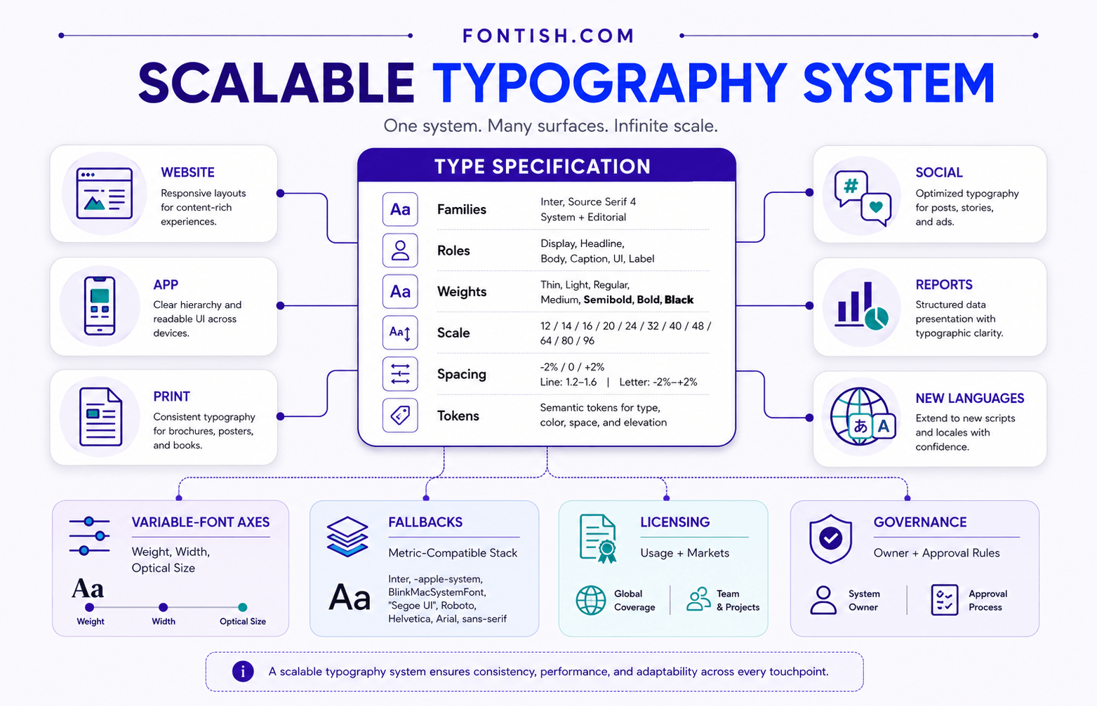
Growing brands must choose the right font for both their current needs and the products, platforms, languages and markets they may add later.
Ask what happens when the brand adds products, markets, languages, apps, data dashboards or long-form publishing.
Variable fonts can provide continuous ranges for weight, width, slant, or optical size within one file, depending on the family. They can make responsive systems more flexible, but only if the design team documents when and why each axis changes.
Optical sizes are particularly useful when available because letterforms can be tuned for text or display use.
Define fallback fonts too.
If the primary webfont fails, the fallback should maintain reasonable proportions and hierarchy. Developers can reduce layout shifts by matching metrics where practical and using the CSS font controls supported by the target browsers.
Finally, decide who owns the typography system. Someone must approve new weights, maintain licences, update design tokens and test changes. Clear ownership keeps the system consistent as the brand grows.
Tools and Resources to Choose the Right Font for Your Brand

Use tools according to the decision you need to make to choose the best font:
- Inspect a font file: Use the Fontish tools collection to examine previews, glyphs, and practical recommendations.
- Learn type fundamentals: Read Typography Explained for hierarchy, spacing, readability, and web typography.
- Build a pairing: Follow How to Pair Fonts and review proven Fontish pairing examples.
- Browse open-source families: Explore Google Fonts and its educational Fonts Knowledge library.
- Check web implementation: Use MDN’s webfont guide and
@font-facereference. - Check accessibility: Review the Web Content Accessibility Guidelines and test the finished layout, not only the font file.
- Understand font creation: To see why spacing, character sets, and metrics matter, read Font Design for Beginners.
No tool can choose the brand voice for you. The useful ones make comparison easier, expose technical problems and help you test with evidence.
The Bottom Line
To choose the right font for your brand, begin with the brand, not the font library.
Define the personality, audience and use cases; create practical requirements; shortlist a few suitable families; test them with real content; then document clear roles.
The final typeface should feel appropriate, remain readable, cover the characters you need, fit the licence and perform across the environments where the brand lives.
If it only looks impressive in a 96 px mockup, you have selected a poster, not a system.
Frequently Asked Questions
How many fonts should a brand use?
Most brands can build a complete system with one versatile family or two complementary families. Use one for personality and the other for practical reading roles, then limit the approved weights and styles. Add a third family only when it has a specific, documented job.
Are free fonts suitable for professional branding?
Yes, if the family has the required quality, styles, glyph coverage and licence. Verify that the licence permits commercial use, logos and every intended distribution format. Download the files from a trusted source and test the font as carefully as a paid family.
Should a logo use the same font as the website?
Not necessarily. A logo may use custom lettering or a display face that would be unsuitable for body copy. The website can use a complementary family with related proportions or tone while keeping the overall identity consistent.
Can a display font be used for body text?
Usually, no. Display fonts are designed for short, large text and often contain details that become tiring or unclear in paragraphs. Reserve them for headlines, campaigns or brand accents and use a more legible family for sustained reading.
How can I choose the right font for my brand?
Define your brand’s personality, shortlist a few suitable fonts, and test them across real content and devices. Choose the font that best balances brand fit, readability, language support, licensing, and performance.