I
I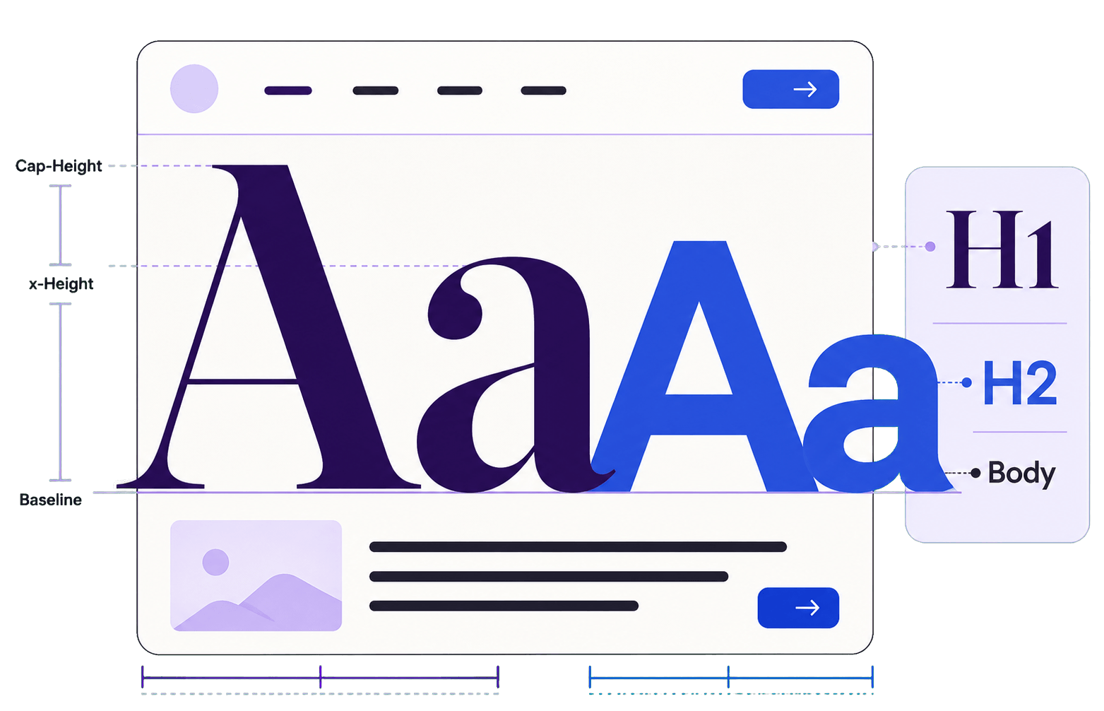
In This Guide
If you have ever created a font combination that looked almost right but never quite professional, you are not alone.
Learning how to pair fonts seems simple until you are staring at hundreds of typefaces and wondering why none of them work together.
Experienced designers rarely choose fonts at random. They rely on contrast, hierarchy, balance and consistency to build a complete typography system. Once you understand those principles, font pairing becomes less intimidating—and considerably more enjoyable.
At Fontish, we believe something simple but powerful:
Typography is not decoration. It’s strategy.
Instead of asking, “Which fonts look good together?” start asking, “Which fonts help this design communicate more clearly?” That shift turns fonts from isolated styling choices into parts of a deliberate communication system.
Here is the entire process in five steps:
- Choose one expressive font to lead.
- Choose one readable font to support it.
- Create enough contrast to separate their roles.
- Assign each font a consistent job.
- Test the complete system with real content.
If you are still choosing fonts solely because they “look nice together,” this guide will give you a more reliable way to decide.
Why Font Pairing Matters More Than You Think
People rarely land on a website and consciously admire its typography. What they do notice is how the experience makes them feel.
Strong font pairing quietly communicates confidence, professionalism and trust. Weak pairing creates friction, even when visitors cannot explain what feels wrong.
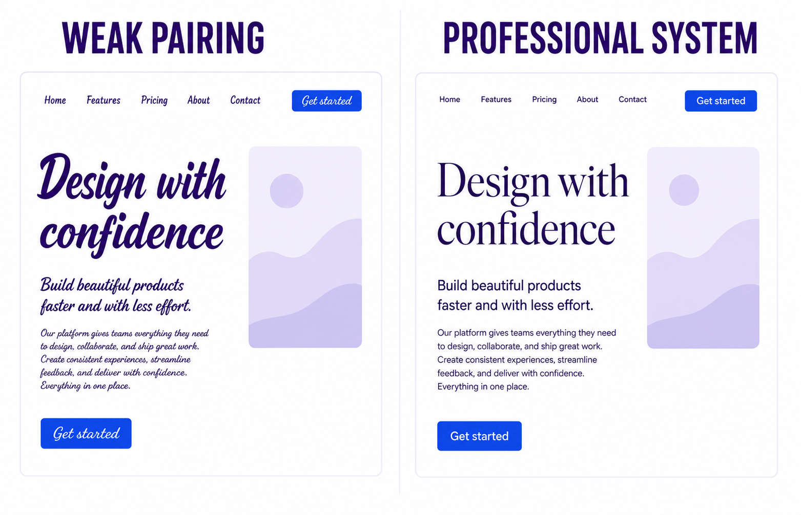
Imagine two websites selling the same product. One feels polished, premium and effortless to read. The other feels cluttered and strangely difficult to scan. The difference may not be the logo, colours or photography.
It may simply be the typography.
A refined serif paired with a clean sans-serif can make a young company feel established. A confused pairing can make an experienced company look surprisingly amateur. Fonts influence how people perceive a brand before they finish reading the first sentence.
One misconception appears repeatedly:
Myth: If two fonts look great individually, they will automatically work together.
Unfortunately, typography does not work that way.
Fonts are a little like personalities. Two remarkable people do not always make a great partnership. They may be too similar, compete for attention or speak completely different visual languages.
The strongest pairings are not created by finding two beautiful fonts. They are created by giving each font a distinct role. When those roles are clear, hierarchy becomes easier to understand, and the reading experience feels natural.
What Makes a Good Font Pairing?
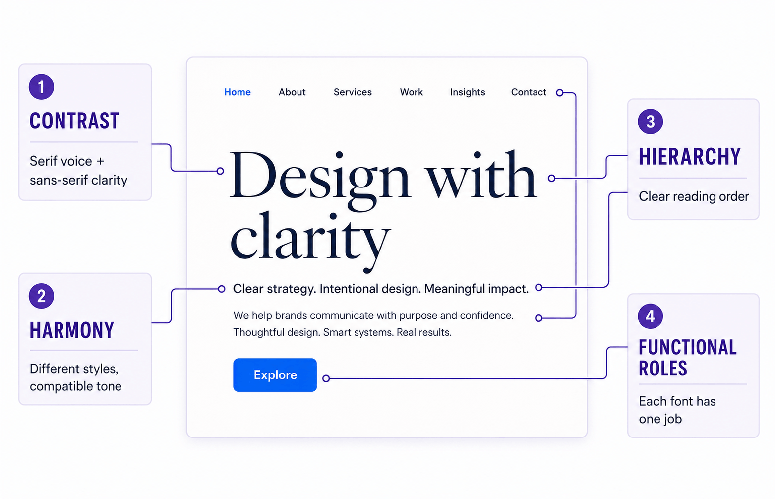
Before looking at specific combinations, it helps to define what separates professional typography from accidental typography.
A successful font pairing balances four qualities: contrast, harmony, hierarchy and functional roles.
1. Contrast
Contrast creates personality and establishes separation.
When two fonts look nearly identical, headlines lose impact and sections begin to blend together. Readers have to work harder to understand which information matters most.
Contrast can come from several directions:
- Serif vs. sans-serif
- Heavy vs. light weights
- Wide vs. narrow letterforms
- Traditional vs. contemporary styles
- Formal vs. casual personalities
The fonts do not need to look dramatically different. They only need enough distinction to perform separate jobs without competing.
2. Harmony
Contrast attracts attention, but harmony keeps the system together.
The strongest pairings feel different enough to create interest while still appearing to belong to the same visual world. A formal editorial serif and a playful novelty font may both be attractive, but together they can send a confusing message.
The goal is not maximum contrast.
It is meaningful contrast.
3. Clear Hierarchy
Every font should have a purpose.
Headlines attract attention, body text delivers information, navigation provides direction, and buttons encourage action. If every element tries to become the loudest voice, the design loses its structure.
Hierarchy also depends on more than font choice. Size, weight, spacing, rhythm and placement work together to show readers where to look next.
4. Functional Roles
One of the easiest ways to weaken a typography system is to use every font for every purpose.
Headlines create emotion.
Body copy delivers information.
Buttons prioritize interaction.
Captions provide supporting context.
Navigation improves usability.
Once each font has a defined responsibility, consistency becomes much easier to maintain. Instead of asking, “Which font should I use here?” ask, “Which role am I designing?”
That question leads to cleaner and more intentional decisions.
The 6 Core Principles of Professional Font Pairing
Professional designers do not memorize hundreds of combinations. They apply a small collection of dependable principles to different brands, layouts and reading environments.
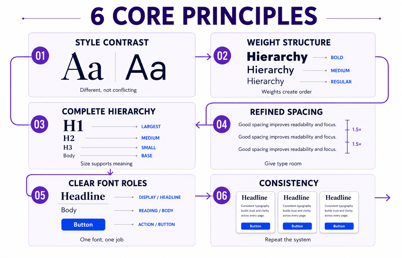
These six principles turn the qualities above into a practical working system.
1. Create Contrast in Style
The classic formula remains reliable:
Serif headlines + sans-serif body text.
The serif provides character and authority, while the sans-serif handles longer passages without demanding attention. Each font performs a different job, so the hierarchy is immediately recognizable.
Serif and sans-serif are not your only options. You can also combine:
- Geometric sans with humanist sans
- Bold display fonts with neutral sans-serifs
- Traditional serifs with contemporary serifs
- Rounded typefaces with sharper geometric styles
The important question is whether readers can immediately recognize the role of each typeface.
2. Use Weight to Build Structure
Many font design beginners spend hours choosing fonts while overlooking one of typography’s most useful tools: weight.
Even an excellent pairing can feel lifeless when every heading, paragraph and button uses Regular 400. Everything becomes one grey block with very little visual guidance.
Instead, assign weights deliberately:
- Headlines: Bold or SemiBold
- Section headings: Medium or SemiBold
- Body copy: Regular
- Captions: Regular or Medium
Many excellent websites use only one or two font families. Their hierarchy comes from consistent weight choices rather than a growing collection of typefaces.
3. Think Beyond Font Size
Hierarchy is not simply a matter of making headlines larger. It is created by combining:
- Size
- Weight
- Spacing
- Line height
- Rhythm
- Placement
A headline that is only slightly larger than the paragraph beneath it may not establish enough authority. Readers should understand the order of information before they begin reading.
As a practical desktop starting point:
- H1: 56–72px
- H2: 32–40px
- H3: 24–28px
- Body: 16–18px
These values are benchmarks, not rigid rules. Headings should scale down appropriately on tablets and phones rather than retaining desktop dimensions on every screen.
A responsive CSS rule such as clamp() can create gradual scaling between sensible minimum and maximum values. Whatever method you use, test actual heading wraps instead of assuming that a smaller viewport automatically produces a balanced result.
The principle is more important than any exact number: meaningful differences produce clearer hierarchy.
4. Refine Spacing Before Changing Fonts
Sometimes the fonts are not the problem.
The spacing is.
A small adjustment to line height, tracking or paragraph spacing can transform an average layout without replacing a single typeface. Before downloading another font, check whether the existing typography simply needs more room to breathe.
As a general rule:
- Headlines often benefit from tighter line-height.
- Body text usually reads best between 150% and 170% line-height.
- Serif headlines may benefit from slightly tighter tracking.
- Sans-serif headlines usually need little or no tracking adjustment.
Beginners often blame the font first. Experienced designers inspect the spacing first.
5. Give Every Font One Clear Job
Typography systems often fall apart when designers discover a beautiful display font and begin using it everywhere.
A display font may work beautifully in a hero headline but become tiring in navigation, buttons and body copy. When every element is expressive, nothing receives meaningful emphasis.
Think in layers:
- Voice — Headlines
- Structure — Subheadings
- Engine — Body text
- Function — Navigation and interface elements
Great typography is not about making every font stand out. It is about making every font contribute.
6. Stay Consistent
Professional typography can feel almost boring.
That is exactly why it works.
Once you have chosen a pairing, establish the rules and reuse them. Lock the headline styles, body font, spacing system and heading scale across the website.
Those repeated decisions create familiarity, and familiarity builds trust. Visitors should not notice the typography changing from one page to another. They should simply experience a system that feels dependable.
Serif + Sans: The Classic Formula (And Why It Still Works)
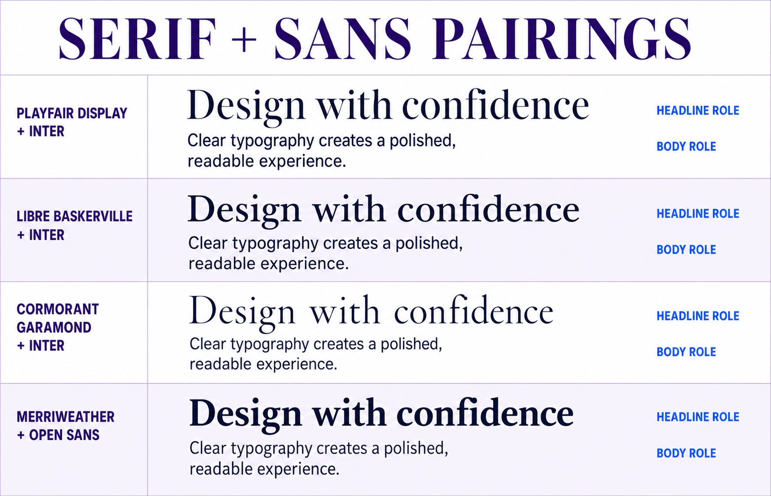
If you are learning how to pair fonts, serif plus sans-serif is one of the safest places to begin.
A serif headline introduces personality and visual interest. A sans-serif body supports comfortable long-form reading. Because each font solves a different problem, the resulting hierarchy feels familiar and effortless.
This approach appears across editorial publications, luxury brands, marketing websites and digital products. Its strength does not come from being fashionable. It comes from clear role assignment.
Some dependable examples include:
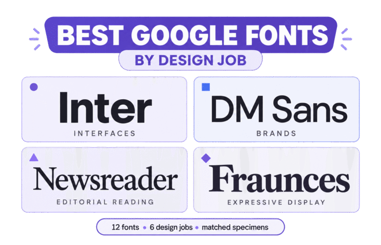
- Playfair Display + Inter — Playfair Display supplies editorial drama while Inter keeps paragraphs and interface elements neutral and highly readable.
- Libre Baskerville + Inter — Libre Baskerville introduces traditional authority while Inter adds modern clarity and dependable screen performance.
- Cormorant Garamond + Inter — Cormorant Garamond creates an elegant, expressive voice while Inter prevents the overall system from becoming overly decorative.
- Merriweather + Open Sans — Both typefaces were designed with screen readability in mind, but their serif-and-sans structures create enough contrast to establish separate roles.
In each pairing, the serif acts as the visual voice while the sans-serif carries the reading experience.
When evaluating this kind of pairing, spend more time reading the body copy than admiring the headline. Beautiful headlines attract attention, but comfortable body text keeps people reading.
If the paragraph font becomes tiring after a few minutes, an impressive headline will not rescue the system.
Sans + Sans Pairings (Modern & Clean)
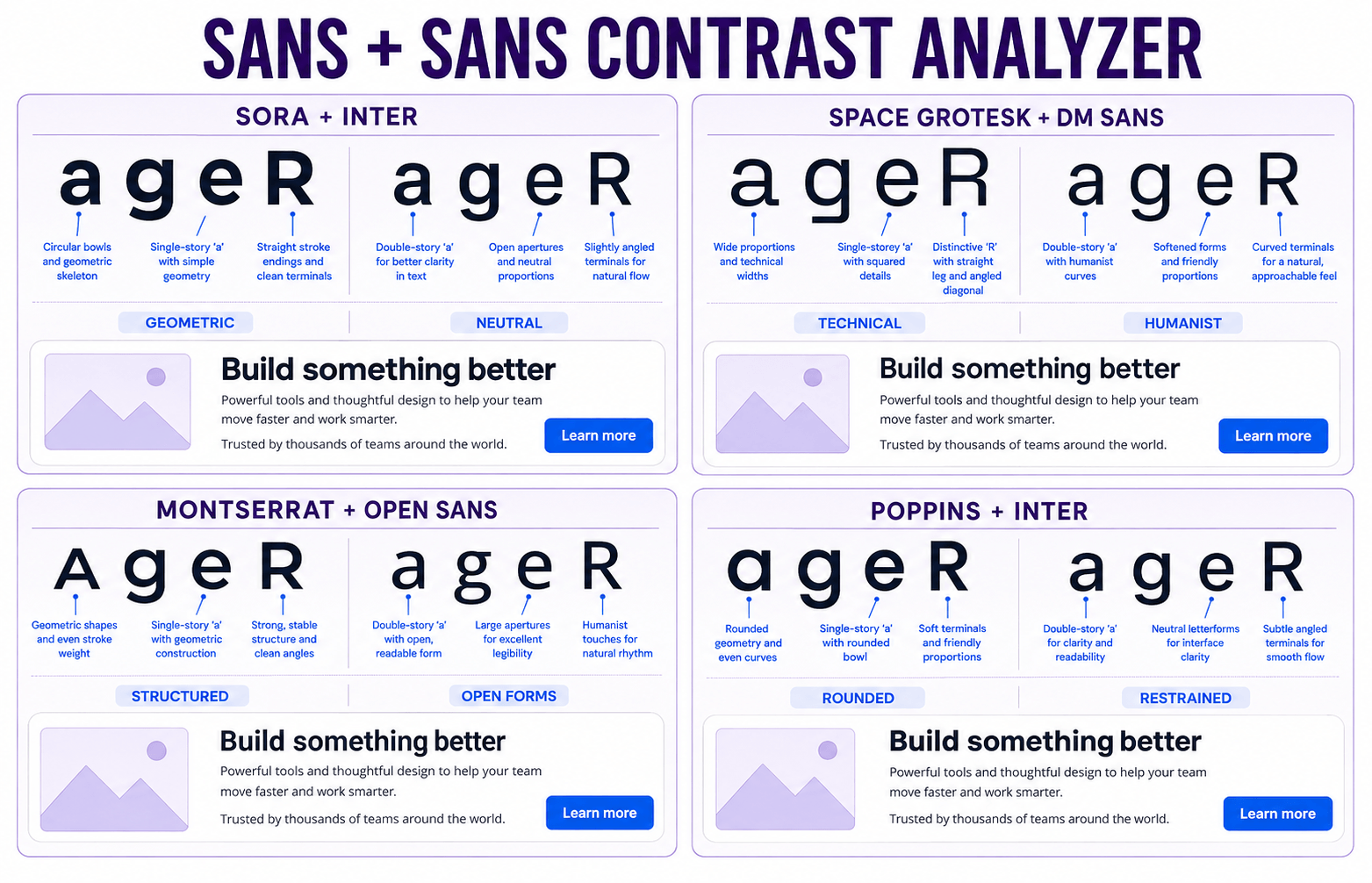
Using two sans-serif fonts sounds risky until you understand one rule:
They must feel different.
Successful sans-serif pairings create contrast through structure, proportion and tone. A geometric sans-serif may feel technical and precise, while a humanist sans-serif introduces warmth and approachability.
Useful sources of contrast include:
- Weight
- Width
- Letterform design
- Overall personality
A few reliable examples include:
- Sora + Inter — Sora’s geometric shapes create a recognizable headline voice while Inter handles dense content and interface text quietly.
- Space Grotesk + DM Sans — Space Grotesk introduces technical character while DM Sans offers a softer, more approachable reading texture.
- Montserrat + Open Sans — Montserrat creates strong, structured headings while Open Sans supports familiar and comfortable body copy.
- Poppins + Inter — Poppins supplies rounded geometric personality while Inter brings restraint to paragraphs and controls.
One font should lead while the other supports. If their shapes, widths and personalities are nearly identical, using two families adds complexity without improving hierarchy.
Sans-serif pairings work particularly well for:
- SaaS platforms
- Startup websites
- Product landing pages
- Mobile applications
- Technology companies
- Corporate brands
They are clean, readable and naturally suited to interfaces. The best minimalist designs rarely depend on unusual fonts. They use familiar fonts exceptionally well through spacing, hierarchy and consistency.
Serif + Serif Pairings (Editorial & Luxury)
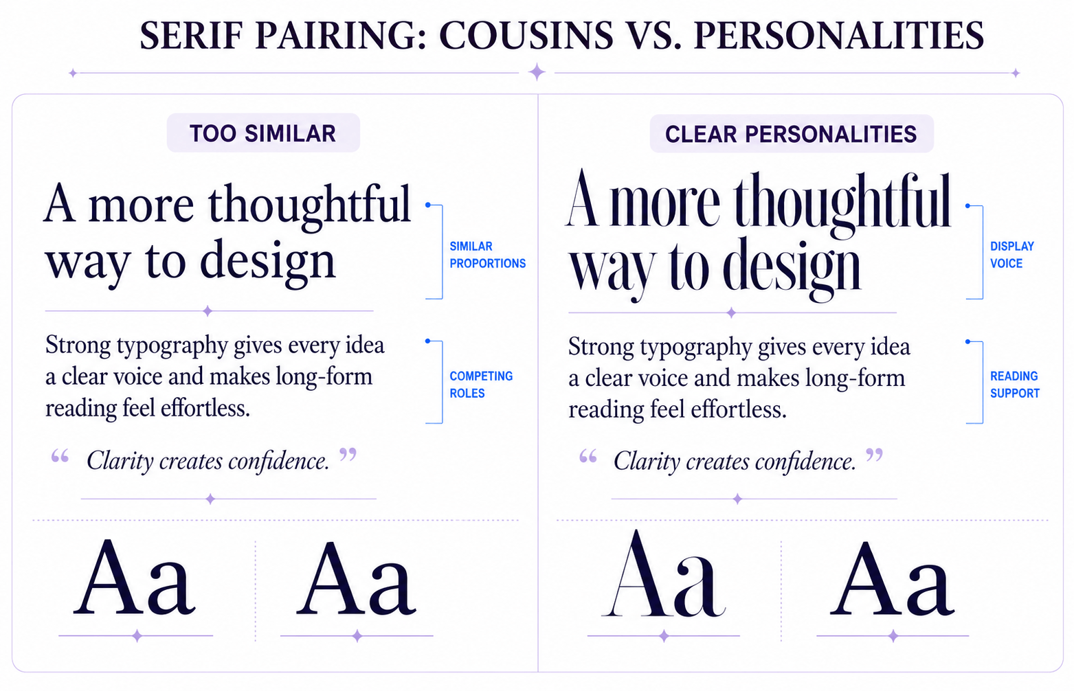
Pairing two serif fonts requires more discipline.
Done well, the result feels sophisticated and editorial. Done poorly, it feels repetitive.
One serif must clearly lead while the other supports reading. For example, you might pair:
- A dramatic high-contrast serif for headlines.
- A calmer transitional serif for longer reading.
The difference does not need to be theatrical, but it must be visible. Readers should immediately understand which font carries personality and which one provides stability.
This approach works particularly well for:
- Editorial publications
- Luxury fashion brands
- Premium consultants
- Book publishing
- Boutique hotels
- High-end lifestyle brands
The common mistake is choosing two serifs from nearly the same visual family. Instead of establishing hierarchy, they compete for the same role.
A useful rule is:
Don’t pair cousins. Pair personalities.
If both fonts share nearly identical proportions, contrast and rhythm, the system may not look terrible—but it will feel indecisive.
Display Fonts: How to Use Them Without Ruining Everything
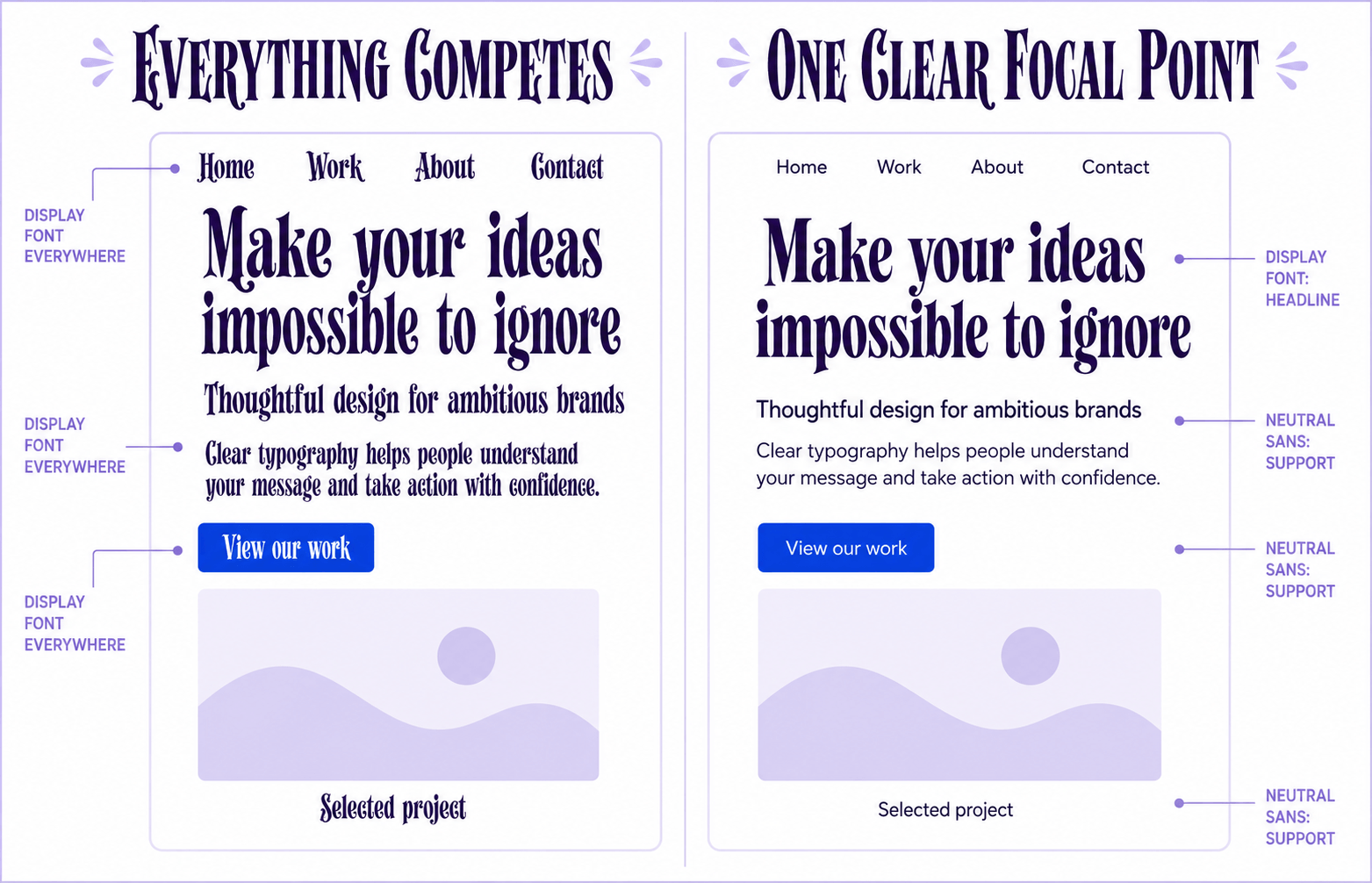
Display fonts exist to attract attention. That is precisely why they require restraint.
A dramatic display font may be perfect for a primary headline, but using it for subheadings, navigation, buttons and body paragraphs quickly weakens its impact.
The result is predictable:
Everything shouts.
Nothing stands out.
As a general rule:
- Use display fonts for primary headlines.
- Occasionally use them for hero sections or campaign graphics.
- Avoid them for body copy.
- Use them sparingly for subheadings.
- Keep interface elements clean and highly readable.
Think of display fonts like strong seasoning. A little transforms the experience. Too much overwhelms it.
Display type must also remain usable. Test intricate letterforms at the actual size and on the smallest supported screen. A font that looks impressive in a large design file may become unclear when a headline wraps onto three lines.
If you want to understand why display and text faces behave differently, our Font Design for Beginners guide explores how typefaces are designed for different reading environments.
Step-by-Step: How to Pair Fonts for a Brand or Website
The principles are useful, but they become valuable only when you can apply them.
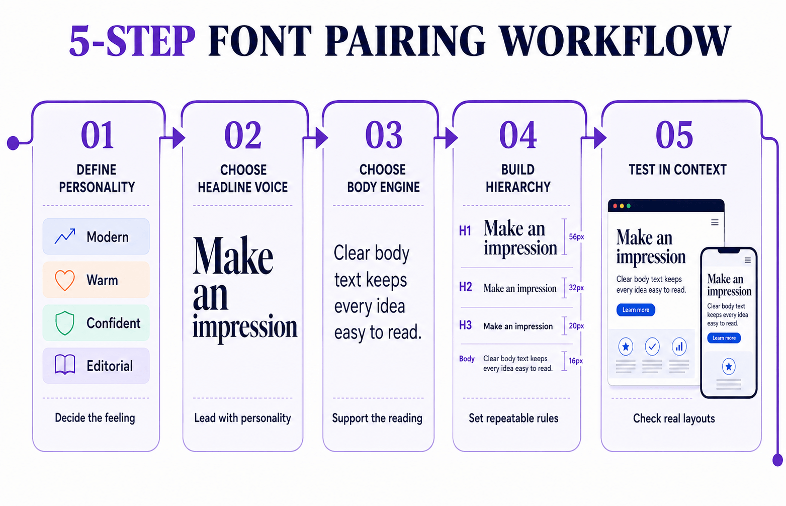
This five-step process works across websites, brand identities, landing pages and editorial projects. It replaces endless browsing with a sequence of deliberate decisions.
Step 1: Define the Brand Personality
Do not begin by browsing fonts.
Begin by defining the feeling the brand should create.
Ask yourself:
- Is the brand modern?
- Professional?
- Friendly?
- Luxurious?
- Playful?
- Bold?
- Editorial?
- Technical?
Typography amplifies personality. It does not create it.
Without a clear brand voice, every typeface looks possible, and none feels completely right. Once the intended personality is defined, unsuitable options become much easier to eliminate.
Our guide on How to Choose the Right Font for Your Brand explores this process in greater detail.
Step 2: Choose the Headline Voice
Choose the expressive font first. This is usually the typeface visitors notice within the first few seconds.
Ask one question:
What should someone feel immediately after landing on this page?
- Authority?
- Innovation?
- Luxury?
- Trust?
- Warmth?
- Confidence?
The headline font answers that question before anyone reads the supporting copy. Choose a typeface whose personality matches the brand rather than one that is merely fashionable.
Step 3: Choose the Body Engine
Now calm the system down.
A body font is not trying to impress anyone. It is trying to make reading effortless. The less attention it demands, the better it is performing its role.
Strong body fonts usually offer:
- Comfortable readability at 16–18px
- Multiple font weights
- True italics
- Excellent mobile rendering
- Broad language support
- Consistent spacing
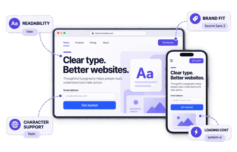
Fonts such as Inter, Source Sans 3, Open Sans and DM Sans remain popular because they handle this work reliably.
Before committing, confirm that the family supports the languages, symbols and punctuation your project requires. A font that lacks essential characters is not a practical choice, regardless of how attractive the pairing appears.
Step 4: Build Your Hierarchy
Once both fonts are selected, establish the rules every page will follow.
Your system should include:
- H1 size
- H2 size
- H3 size
- Body size
- Line-height
- Font weights
- Vertical spacing
Document those decisions before designing more pages. Professional designers do not reinvent typography for every screen. They build a system and apply it consistently.
Step 5: Test Fonts in Real Situations
Never judge a pairing using one attractive headline on a blank canvas.
Test it inside real layouts:
- A homepage hero
- A blog article
- An About page
- A pricing section
- A mobile screen
Real content reveals problems that font pickers hide. A headline may wrap awkwardly on mobile, body copy may feel cramped after several paragraphs or buttons may appear too small beside the surrounding text.
Typography proves itself only when it carries actual content.
Before final approval, also confirm:
- The font licence permits its intended use.
- All required weights and true italics are available.
- The family includes the necessary languages and characters.
- Webfont files do not create an unreasonable performance cost.
- Sensible fallback fonts are defined.
- A variable font is used only when it offers a practical benefit.
Professional Tip: Do not evaluate a pairing with Lorem Ipsum alone. Test real headlines, paragraphs, navigation and buttons. Meaningful content exposes weaknesses much faster than placeholder text.
How to Pair Fonts Case Study: Fixing a Weak Font Pairing
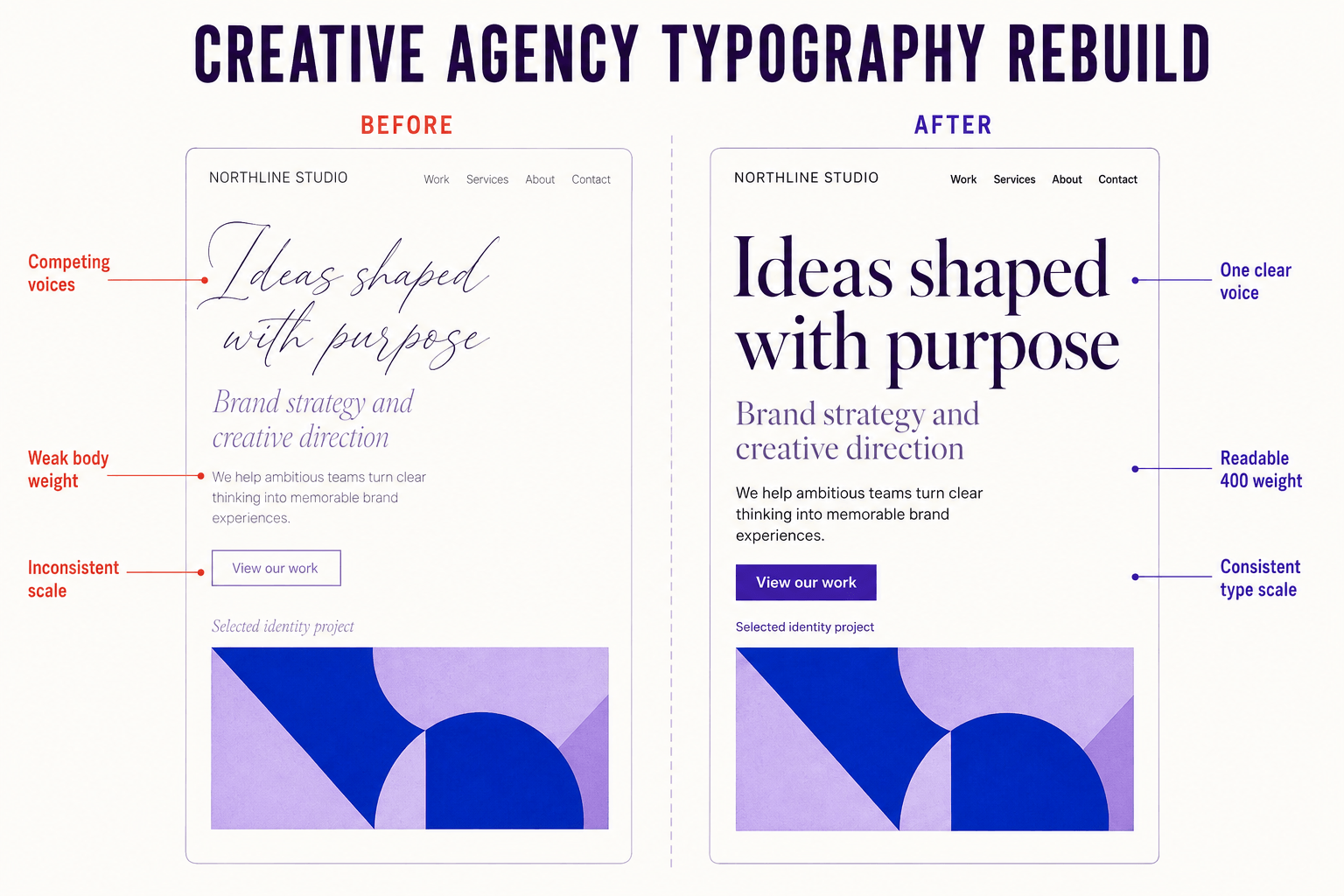
Typography can change how people perceive a brand without changing a single word.
Consider a small creative agency whose website used a thin script for headlines, a light serif for subheadings and a thin sans-serif for body copy.
Before
None of the fonts was inherently poor, but together they created a weak hierarchy.
The script headlines lacked authority, the light body text became difficult to read on smaller screens and every section competed for attention. The agency did not appear untalented; it appeared hesitant.
The system used three expressive typefaces without defining their roles. Headings changed size unpredictably, body copy relied on a light 300 weight and mobile headlines wrapped awkwardly across several lines.
Visitors did not need to complain about the typography for it to become a problem. The design was already making its content harder to scan and read.
After
The agency rebuilt only its typography system.
The script headline was replaced with a confident editorial serif at a strong display weight. Body copy moved to a neutral sans-serif at Regular 400.
Interface text used the same sans-serif at Medium or SemiBold, while a consistent heading scale established clear levels across the website.
Line-height increased for long paragraphs, heading spacing became more predictable and the scale was adjusted separately for smaller screens.
The logo stayed the same.
The colours stayed the same.
The copy stayed exactly the same.
Yet the website immediately felt more established, readable and trustworthy. The improvement came from clearer hierarchy, stronger mobile legibility and a more confident division of roles—not from adding more decoration.
That is the quiet power of good typography. Font pairing is not merely about making a page prettier. It is about making communication clearer.
Common Font Pairing Mistakes Designers Make
Most pairing problems are not caused by terrible fonts. They are caused by good fonts being used without a clear system.
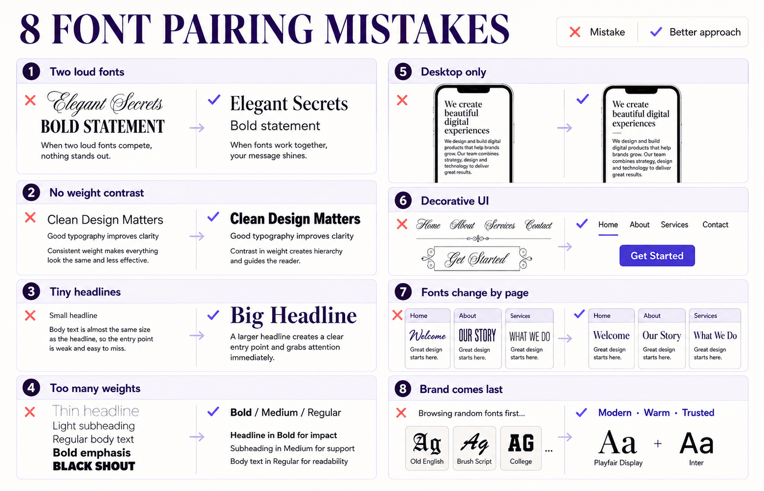
Here are eight mistakes worth checking before you commit to a pairing.
1. Pairing Two Attention-Seeking Fonts
One expressive font creates personality.
Two expressive fonts often create competition.
When both typefaces demand attention, readers do not know where to look first. Let one font become the voice while the other quietly supports it.
2. Ignoring Weight Contrast
Hierarchy does not always require another font family.
If every element uses Regular 400, the page begins to blend together. Introducing Bold, SemiBold or Medium in deliberate places may create all the separation you need.
Many excellent systems rely on one or two families with carefully controlled weights.
3. Making Headlines Too Small
Designers are often overly cautious with headline sizes.
Large headlines establish confidence and give readers a clear starting point. If visitors have to search for the main message, the hierarchy is not doing enough work.
Hierarchy is not about shouting.
It is about leading.
4. Using Every Weight Available
A family may contain ten weights, but your website does not need to use all of them.
Moving constantly from Thin to Black makes the system feel inconsistent. Most successful interfaces rely on three or four carefully assigned weights.
Discipline usually produces stronger typography than variety.
5. Forgetting Mobile Users
A pairing that looks elegant on a desktop monitor can fall apart on a phone.
Always test:
- Heading wraps
- Paragraph spacing
- Navigation
- Button labels
- Line length
- Overall readability
Do not rely on a smaller font size alone. Mobile typography may also require changes to line-height, spacing, width and heading proportions.
For many websites, mobile is the primary reading environment. Treat it that way.
6. Decorating Interface Elements
Buttons, navigation, forms and menus have one responsibility:
Help users complete tasks.
Decorative typography can interfere with that job. Clean sans-serifs generally work better for interface elements because they reduce effort and keep attention on the action.
Save expressive fonts for places where expression adds genuine value.
7. Changing Fonts Across Every Page
A homepage uses Playfair Display.
The blog uses Lora.
A landing page uses DM Serif Display.
Each font may be excellent, but together they weaken the brand.
Professional systems build familiarity through repetition. Visitors may not consciously notice consistency, but they will notice when every page feels unrelated.
8. Choosing Fonts Before Defining the Brand
Many designers browse font libraries first and think about branding later.
Reverse the process.
Define the brand’s personality, goals and audience before evaluating fonts. Then measure every option against that strategy instead of personal preference.
Strong typography begins with a clear idea of what the brand needs to communicate.
How to Test a Font Pairing Like a Pro
Choosing two fonts is only half the job. Test the system in realistic situations before committing to it.
Use this checklist as your final review.
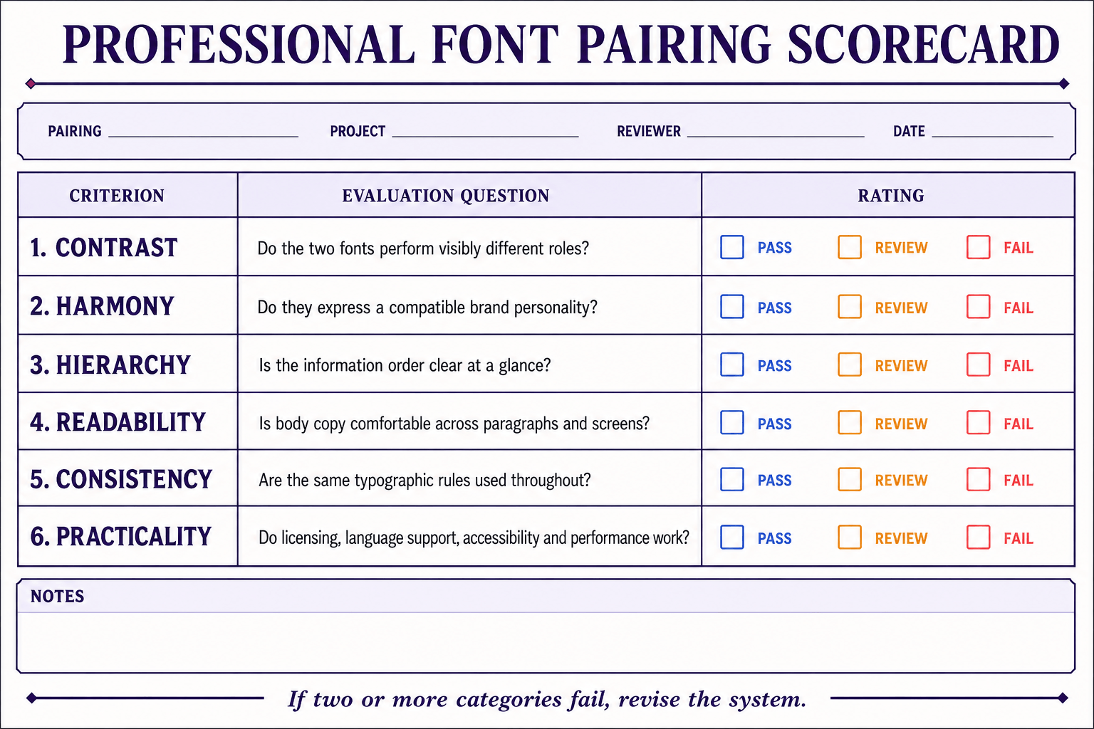
✓ Is the contrast immediately obvious?
Readers should recognize which font leads and which one supports. If the distinction feels weak, adjust size, weight, spacing or font choice.
✓ Is the hierarchy clear at a glance?
Without reading a sentence, visitors should know where to begin. The eye should move naturally from headline to subheading to body copy.
✓ Is the body text comfortable after thirty seconds?
Many fonts create attractive headlines. Fewer remain comfortable across several paragraphs.
Test complete articles rather than isolated sentences. Readers spend far more time with body copy than with headlines.
Avoid very thin body weights, especially at small sizes. Check text and background contrast, browser zoom and increased text-size settings. Readers should still understand the information order even if a preferred webfont fails to load.
✓ Does the system still work on mobile?
Resize the browser, open the design on a phone and ask someone else to scroll through it.
Fresh eyes often reveal awkward wrapping and spacing that the designer has stopped noticing.
✓ Does every interface element feel consistent?
Review buttons, forms, navigation, cards, captions, alerts and menus together.
If one component looks unrelated, revisit its assigned role before adding another typeface.
If a pairing fails two or more categories, revise it rather than forcing it into the design. Sometimes the fonts need to change. In other cases, adjusting weight, size, or spacing will solve the problem without replacing either family.
When a pairing passes all six tests, you are close to a dependable typography system.
Tools & Resources for Learning How to Pair Fonts
The right tools can reduce trial and error, but they cannot replace typographic judgment.
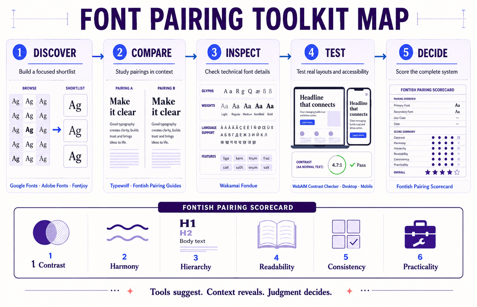
Useful resources include:
- Google Fonts for exploring free web fonts and testing combinations.
- Adobe Fonts for browsing a broader professional type library.
- Fontjoy for generating contrasting font combinations and exploring new directions.
- Typewolf for studying typefaces in real editorial and website contexts.
- Wakamai Fondue for inspecting font features, character support and technical details.
- WebAIM Contrast Checker for checking whether text and background colours meet accessibility requirements.
- Curated Fontish pairing guides for combinations evaluated across branding, editorial and web design contexts.
Use discovery tools to create a shortlist, specimen tools to examine the fonts and accessibility tools to test the finished system. Then use the principles in this guide to decide whether the pairing actually works.
A generator can suggest two fonts that appear attractive together, but it cannot fully understand your brand, content, audience or interface. Treat generated combinations as starting points rather than finished decisions.
If you would rather skip hours of experimentation, the Fontish Pairing System™ offers tested combinations for startups, agencies, ecommerce brands, editorial websites and personal brands.
Frequently Asked Questions
How many fonts should you pair together?
For most websites, two fonts are enough. One establishes personality while the other handles readability and structure.
A third font can work when it has a specific role, but more than three usually introduces unnecessary complexity.
Can you pair two serif fonts?
Yes—provided one serif clearly leads.
The fonts should have visibly different personalities and responsibilities. Two nearly identical serif families usually weaken hierarchy rather than strengthen it.
How do I know if my font pairing looks professional?
A professional pairing feels effortless. The hierarchy is obvious, paragraphs remain comfortable to read and interface elements feel consistent.
When readers remember the content instead of struggling with the typography, the system is probably working.
Is serif plus sans-serif still the safest option?
Yes. Serif and sans-serif combinations remain versatile because they create natural contrast while preserving readability.
They work across branding, editorial design, marketing websites, blogs and digital products.
How to Pair Fonts Like a Designer: The Bottom Line
Learning how to pair fonts is not about memorizing hundreds of combinations or chasing every fashionable typeface.
It is about understanding contrast, hierarchy, spacing and roles.
The strongest pairings create distinction without conflict. They reinforce a brand’s personality without distracting from its message and improve readability from the first headline to the final paragraph.
If there is one lesson worth remembering, it is this:
Don’t choose fonts. Build a typography system.
Once you start thinking about the relationship between typefaces rather than judging each font in isolation, the decisions become easier.
Anyone can place two fonts on the same page.
Professional designers build typography systems that people trust.
Use the scorecard in this guide to evaluate your current typography, then explore the tested font pairing examples on Fontish when you need a stronger starting point.