
 I
I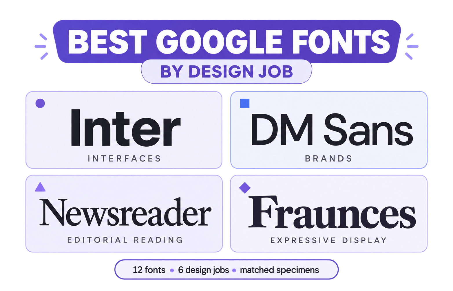
In This Guide
The best Google Fonts are not necessarily the most popular. They are the families that do a particular job well—holding a brand together, keeping long text comfortable, giving headlines presence or supporting products across languages and screens.
With almost 2,000 families in Google Fonts, more choice can simply lead to indecision.
This guide narrows the library to 12 verified families, each with a clear job, strength and warning, and compares rivals such as Inter and Figtree, Newsreader and Lora, and Fraunces and Playfair Display.
We compared them in matched headline, body-sentence and compact-text specimens. These tests reveal fit and wrapping, not performance in finished components, so confirm the finalists in your actual layout.
For the fastest answer, start with Inter for an all-purpose digital system, DM Sans for a contemporary brand voice, Newsreader for long-form reading, Fraunces for expressive display and Noto Sans when language coverage matters. “Best” is a useful shortlist, not a substitute for design judgment.
How We Chose the Best Google Fonts
Any list of the best Google Fonts needs rules. Without them, it is taste wearing a numbered badge
We verified each family in the current Google Fonts catalog, then compared direct rivals using the same words, sizes, weights and column widths.
On 12 September 2026, we ran controlled browser tests using three headlines at 54px/700 and three body sentences at 17px/400.
Unless noted otherwise, specimens used a 600px column, 1.2 line height, zero tracking, normal style, width 100 and optical size matched to the font size.
Any list of the best Google Fonts needs rules. Without them, it is taste wearing a numbered badge
Percentages below show how much wider or narrower the second font was than the first.
These measurements describe width and wrapping under the stated conditions—not readability, multilingual quality or performance in finished components.
The “Better choice” tables are therefore editorial guidance informed by the results and each family’s features, not measured verdicts.
Five criteria shaped the shortlist:
- Clear role: A recognizable job in interfaces, reading, branding, multilingual systems or display typography.
- Real-size performance: Useful for headlines, paragraphs, compact text, and mobile specimens.
- Useful family range: Enough weights, italics, axes or scripts for the recommended role.
- Purposeful character: Distinctiveness that supports the message without becoming restrictive.
- Practical implementation: Suitable language coverage, available styles and reasonable loading requirements.
Popularity helped identify candidates, but it did not decide the recommendations.
For a selection method that applies beyond this library, see How to Choose the Right Font.
The 12-font shortlist at a glance
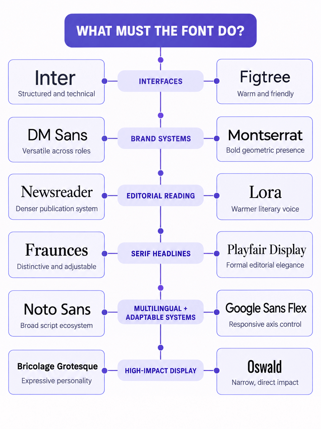
We grouped the finalists by their strongest jobs rather than ranking unrelated families from first to twelfth.
| Font | Best role | Character | Main caution |
|---|---|---|---|
| Inter | Interfaces and broad digital systems | Precise, neutral and technically capable | Needs deliberate art direction to avoid a default product look |
| Figtree | Friendly interfaces and marketing sites | Clean, warm and approachable | Carries less authority in large display settings |
| DM Sans | Contemporary brands and digital products | Polished, friendly and adaptable | Default styling can produce a familiar startup aesthetic |
| Montserrat | Brand headlines and geometric accents | Assertive, structured and recognizable | Wide forms become tiring in long text |
| Newsreader | Editorial layouts and sustained reading | Literary, refined and text-oriented | Appears small at equal CSS sizes and needs careful sizing |
| Lora | Articles and warm brand storytelling | Human, calligraphic and gently expressive | Can feel too soft for strictly technical systems |
| Fraunces | Expressive branding and display typography | Playful, distinctive and highly adjustable | Its personality can overpower supporting content |
| Playfair Display | Editorial, fashion and premium headlines | Elegant, dramatic and high-contrast | Fine strokes become fragile at small sizes |
| Noto Sans | Multilingual products and global systems | Restrained, dependable and cross-script friendly | Provides infrastructure more readily than brand distinction |
| Google Sans Flex | Responsive interfaces and variable systems | Polished, friendly and highly adjustable | Strong Google associations and numerous axes require control |
| Bricolage Grotesque | Creative brands and energetic display work | Lively, unconventional and width-flexible | Too restless for most sustained body copy |
| Oswald | Condensed headlines and compact labels | Direct, narrow and authoritative | Long passages and repeated uppercase quickly become heavy |
These are finalists, not the only Google Fonts worth using. The latter alternatives section covers dependable families that remain valuable without adding another six full comparisons.
The Best Google Fonts by Design Job
Each comparison places two credible families in the same design job and identifies the trade-off that should decide between them.
Inter vs Figtree: Best for Interfaces and Digital Body Text
Quick verdict: Choose Inter for data-rich interfaces and long-term product systems. Choose Figtree when comparable clarity needs a warmer, more personable voice.
Inter is the safer foundation for dashboards, SaaS products, documentation and expanding design systems. Its tall x-height, open forms and controlled spacing keep mixed information orderly, while optical sizing, tabular figures and an optional slashed zero address practical interface needs.
Its limitation is familiarity: without deliberate hierarchy and spacing, it can make a brand feel generic.
Figtree approaches the same work with gentler geometry and a more conversational texture. Its seven weights and matching italics are sufficient for most websites and products.
It feels particularly natural in consumer-facing interfaces and marketing pages, although Inter offers a stronger technical foundation when layouts become dense or data-heavy.
What our interface-text specimens revealed
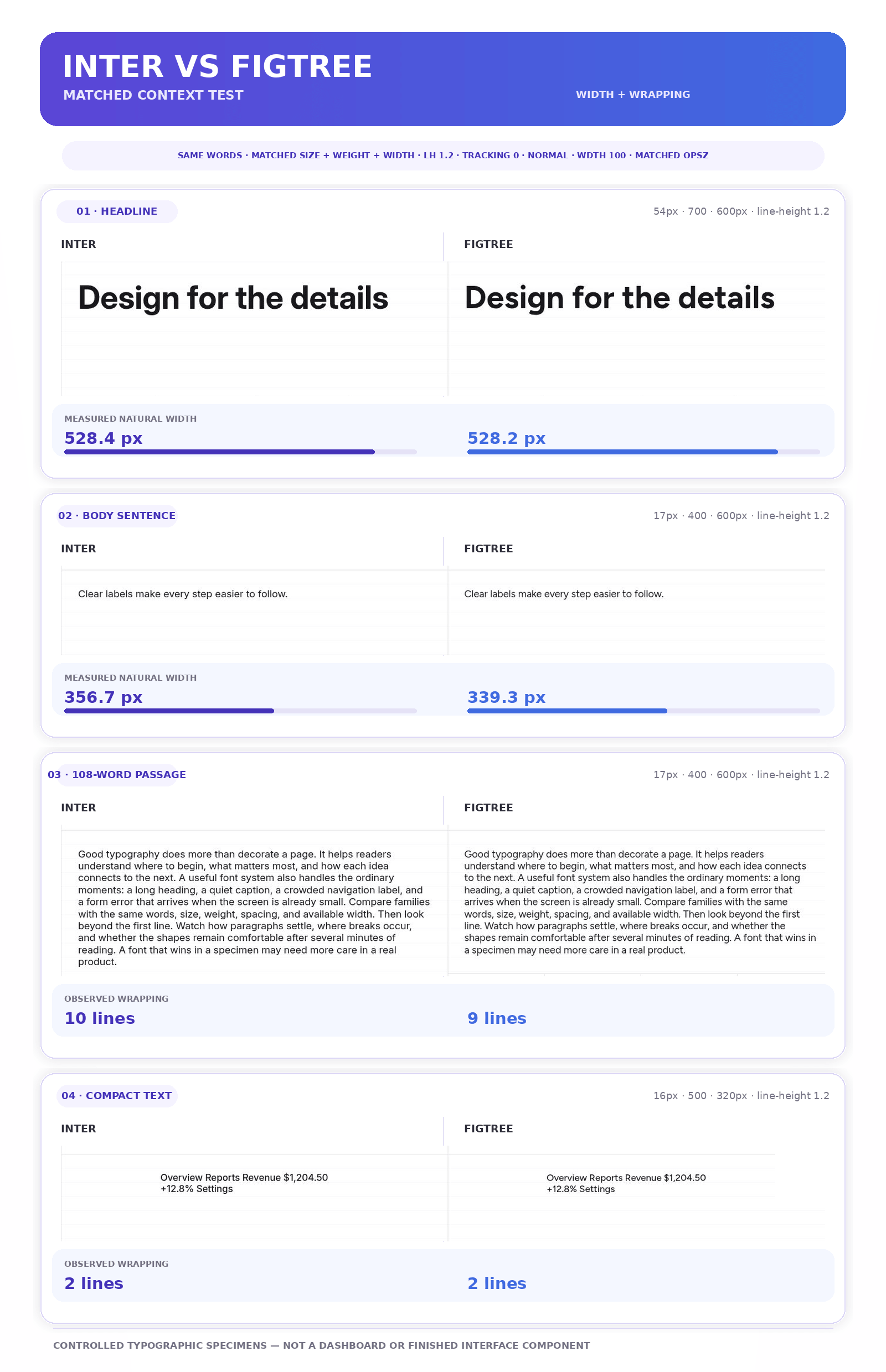
Inter and Figtree were almost identical in two headlines: Figtree was 0.2px narrower in “Design for the details” and 0.1px wider in “Make every word count.” Across the three body sentences, Figtree was 3.8–4.9% narrower, and the 108-word passage took nine lines in Figtree versus ten in Inter.
The compact Latin string took two lines in both. These results suggest a modest density advantage for Figtree in the tested body copy; they do not establish performance in a finished interface or prove that either family’s numerals are easier to read.
| Design question | Better choice | Why |
|---|---|---|
| Building a dense dashboard or professional tool? | Inter | Its restrained forms and interface features manage complex information confidently |
| Designing a friendly consumer app or service? | Figtree | Its softer details make functional text feel less clinical |
| Creating a large design system expected to grow? | Inter | Its optical sizing and specialist features provide more control |
| Trying to avoid the familiar startup-interface tone? | Figtree | It introduces a fresher voice without sacrificing usability |
For either family, try Regular for body copy, Medium for navigation and Semibold for buttons or subheadings. Avoid Light weights in small interface text.
If Inter feels too neutral for the complete identity, keep it in the functional role and give headlines to a more expressive family, as shown in the Libre Baskerville and Inter pairing.
DM Sans vs Montserrat: Best for Contemporary Brand Systems
Quick verdict: Choose DM Sans when one family must carry the brand, website and product interface. Choose Montserrat when headlines and short brand messages need a stronger geometric presence.
DM Sans is a low-contrast geometric sans serif that remains comfortable at smaller sizes. Its circular forms feel friendly without becoming mechanically perfect, and its broad variable weight range and optical sizing help it move from interface copy to substantial headlines.
This versatility makes it a practical one-family system, although scale, spacing and weight still have to prevent the identity from feeling like a familiar startup default.
That range allows the same family to connect a logo lockup, website, presentation and product without making each application feel typographically unrelated.
Montserrat has a broader, more assertive silhouette shaped by its origins in urban posters and signage. It is most persuasive in brand names, campaign headlines, packaging and short statements. It can handle body copy, but its width and repeated circular forms become more noticeable as the text grows.
That assertiveness is valuable near the top of the hierarchy. It becomes harder to manage when every level asks for the same amount of attention.
What our brand-text specimens revealed
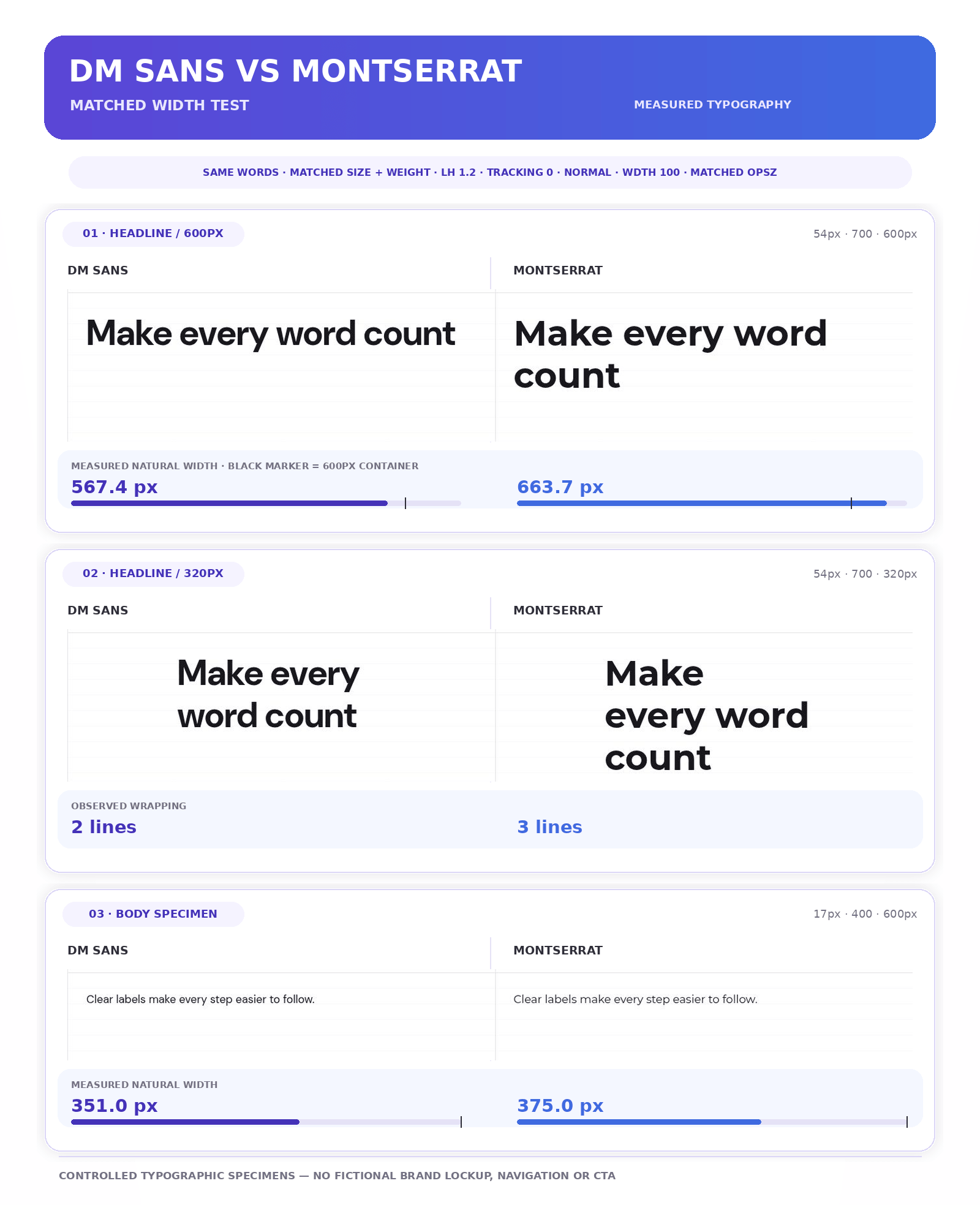
Montserrat measured 15.6–19.1% wider than DM Sans across the three 54px headlines, 6.8–8.2% wider in the three 17px body sentences and 8.3% wider in the 108-word passage.
At 320px, “Make every word count” took three lines in Montserrat and two in DM Sans. This does not make Montserrat inefficient: its width contributes to its recognizable presence. The result applies to these words and settings, not every brand name, menu or product component.
| Design question | Better choice | Why |
|---|---|---|
| Need one family for the brand, website and interface? | DM Sans | It moves between expressive and functional roles more naturally |
| Want bold campaign headlines or a geometric identity? | Montserrat | Its broad forms create a stronger silhouette |
| Working with tight headline or paragraph widths? | DM Sans | It was narrower in all six matched text specimens; check real cards and menus separately. |
| Supporting Cyrillic as well as Latin? | Montserrat | Its main family provides the broader script coverage |
In a DM Sans system, try Regular for paragraphs, Medium for navigation and Semibold or Bold for headings. With Montserrat, reserve the stronger weights for memorable moments and give sustained reading to a quieter companion when necessary.
Our guide to pairing fonts by role and contrast explains how to add that second family without creating competition.
Newsreader vs Lora: Best for Editorial and Long-Form Reading
Quick verdict: Choose Newsreader for a publication-style reading system with flexible hierarchy. Choose Lora when articles and brand stories need a warmer, more personal voice.
Newsreader was designed primarily for continuous reading on screens. Its open shapes, seven weights, matching italics and optical-size axis support both body text and display roles, making it a strong foundation for digital publications, newsletters and content-heavy websites.
Because equal CSS sizes can look different between families, judge it at the intended reading size rather than trusting the number alone.
Lora brings a more calligraphic texture. Its curves, firm serifs and expressive italics suit essays, cultural writing, hospitality and brand storytelling. The italic can also give introductions and quotations a clearer change of voice, although that use was not part of the measured run.
Lora offers less typographic range than Newsreader, but enough for most article systems. Restraint matters: too many bold headings, quotations and decorative treatments can make its personality feel over-directed.
What our reading test revealed
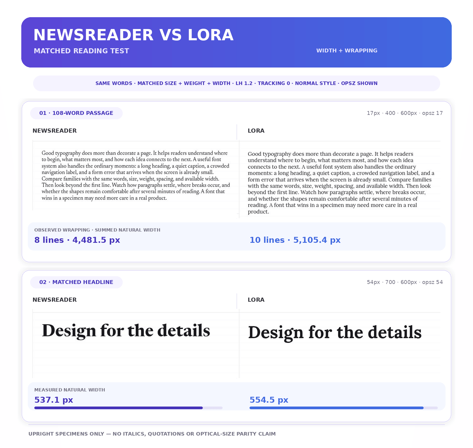
Lora was 1.6–3.2% wider than Newsreader across the three headlines and 12.1–14.2% wider in the body sentences.
In the 108-word passage at 17px/400 and optical size 17, Newsreader used eight lines and Lora ten; their summed natural widths were 4,481.5px and 5,105.4px, respectively. In “Make every word count,” Lora crossed the 600px line-break threshold while Newsreader did not.
That establishes a meaningful density difference for this copy, not a readability verdict.
Apparent size and comfort still require visual judgment. Optical size also affected the result: setting the passage’s optical size to 48 while retaining a 17px CSS size moved Newsreader from eight lines to nine, while Lora remained at ten.
The run did not test italics, quotations, article metadata or controlled apparent-size parity.
| Design question | Better choice | Why |
|---|---|---|
| Building a digital magazine or news publication? | Newsreader | Its optical sizing and broader weight range support a fuller hierarchy |
| Writing essays or personality-led brand stories? | Lora | Its calligraphic texture gives the writing a warmer voice |
| Fitting substantial copy into a compact layout? | Newsreader | It carried more text per line in our comparison |
| Giving quotations and introductions stronger emphasis? | Lora | Its more pronounced italic may give quotations a stronger treatment; compare in the final layout. |
For article text, 18–20px is a useful starting range rather than a fixed rule. Adjust the apparent size first, then compare line length and density again.
Let Newsreader’s optical sizing respond to the text size, and watch the additional wrapping that Lora’s wider forms create.
A restrained sans serif can handle navigation and controls; the Lora and Poppins pairing shows how that division can work in a warm contemporary system.
Fraunces vs Playfair Display: Best for Expressive Serif Headlines
Quick verdict: Choose Fraunces when headlines need a distinctive, adjustable personality. Choose Playfair Display when the design calls for a more familiar form of editorial elegance.
Fraunces is a soft display serif with rounded forms, substantial serifs and lively details. Its Weight, Optical Size, Softness and Wonk axes allow it to move from relatively restrained to deliberately unconventional.
That flexibility can carry a recognizable voice across packaging, campaigns and responsive layouts without switching families. Every axis still needs a reason; maximum irregularity rarely produces maximum originality.
Playfair Display creates a more formal impression through pronounced contrast and fine hairlines. It suits magazines, fashion and premium services, although that familiarity can become a shortcut: the typeface alone cannot make a brand luxurious.
Spacing, imagery and the surrounding typography must support the same direction. Its finer strokes also need sufficient size, strong colour contrast and care over imagery, particularly on smaller screens.
What our headline test revealed
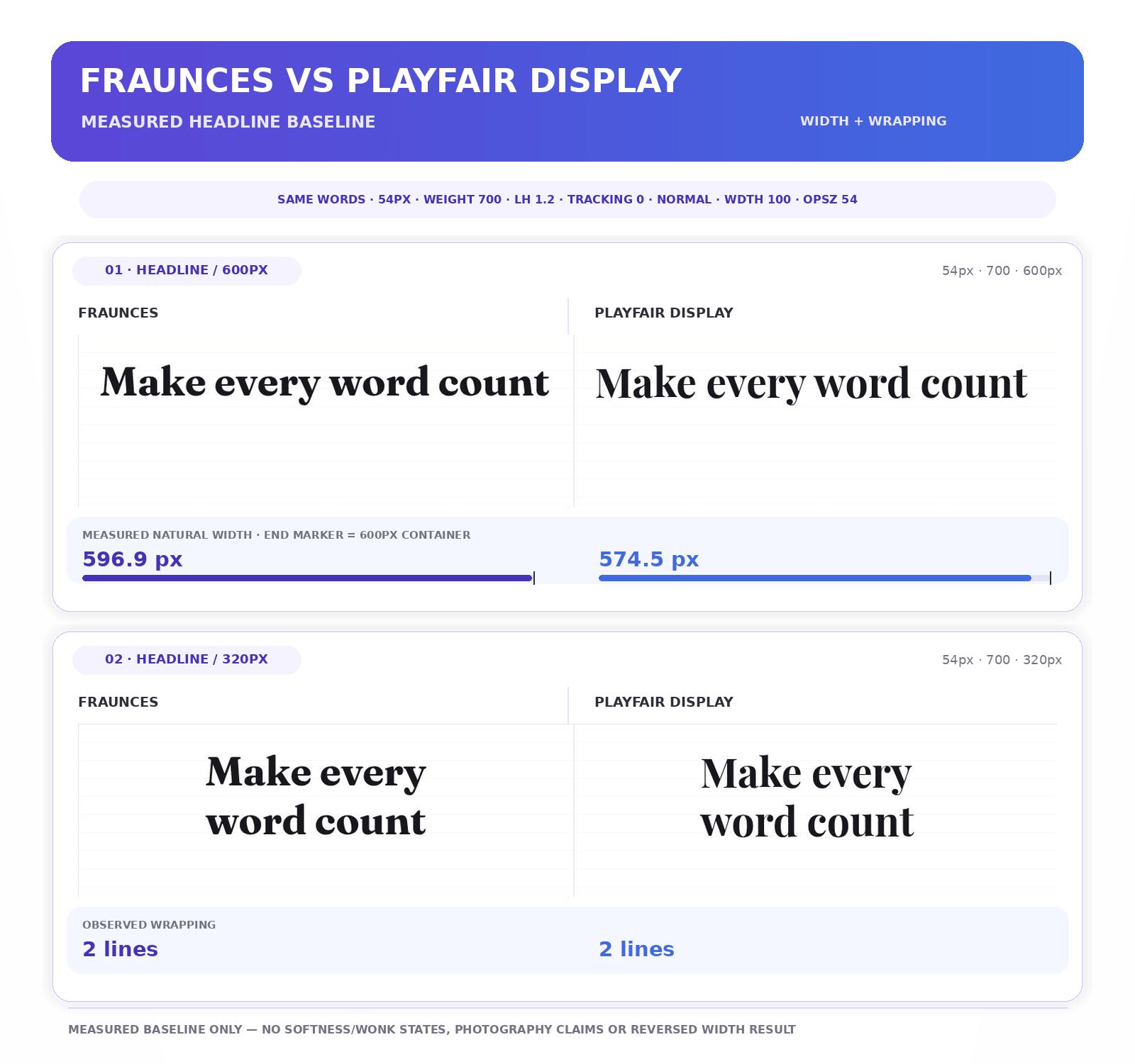
Playfair Display was 3.0–3.8% narrower than Fraunces across the three matched headlines. At 54px/700, “Make every word count” measured 574.5px in Playfair Display and 596.9px in Fraunces; both took two lines at 320px.
The result describes width and wrapping, not clarity at small sizes or performance over photography.
The lab also did not expose Fraunces’ Softness or Wonk controls, so any claim about how those axes change fit remains on hold until a correctly configured test is documented.
| Design question | Better choice | Why |
|---|---|---|
| Building a distinctive contemporary identity? | Fraunces | Its unusual forms and variable controls provide more room for character |
| Seeking recognizable editorial or fashion-style elegance? | Playfair Display | Its high contrast creates an immediate formal tone |
| Need a sturdier-looking display serif? | Fraunces | Its heavier-looking shapes contrast with Playfair’s finer strokes; check actual size and background. |
| Supporting Cyrillic as well as Latin? | Playfair Display | It provides the broader script coverage of this pair |
Begin with a moderate Semibold or Bold in Fraunces and add softness or irregularity only when the brand needs it.
For Playfair Display, Semibold or Bold is often safer than Regular on screens; use a generous size, close but comfortable line spacing, and strong contrast. Avoid spreading the letters merely to manufacture a premium appearance.
Neither is a default for interfaces or long website paragraphs. Let the display serif create recognition and assign routine reading to a calmer companion.
Our Playfair Display font review explores its weights, pairings and limitations in more detail.
Noto Sans vs Google Sans Flex: Best for Multilingual and Flexible Systems
Quick verdict: Choose Noto Sans when language coverage and cross-script consistency lead the decision. Choose Google Sans Flex when a digital system needs precise control over width, tone and responsive behaviour.
Noto Sans is part of a coordinated ecosystem designed to support languages worldwide. The main family covers Latin, Greek and Cyrillic, with companions for scripts such as Arabic, Devanagari and CJK.
A multilingual product must still map its languages, choose the relevant families, and test them together; Noto is an ecosystem, not a single universal file.
That coordination gives global teams a calmer cross-script foundation than an improvised fallback stack. The trade-off is personality: Noto Sans is dependable infrastructure for interfaces and documentation, but it rarely creates a distinctive brand voice by itself.
Google Sans Flex became open source in 2025 and offers six axes: weight, width, optical size, slant, grade and roundedness.
These controls can tune fit and tone, but useful combinations should be tested and named as styles rather than as new settings on every screen. An open-source licence permits use, yet the family can still evoke Google’s identity.
What our Latin type specimens revealed
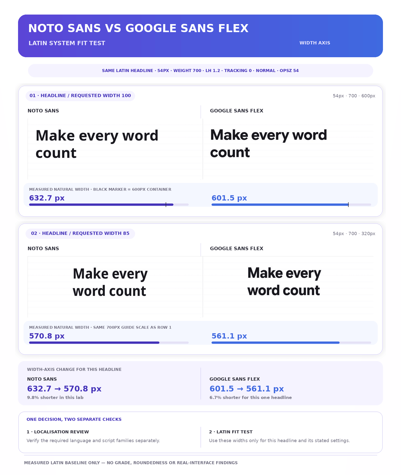
We changed the width setting on “Make every word count” after the baseline Latin run. We did not test multilingual passages or complete interface components.
- At width 100, Google Sans Flex was 2.7–5.4% narrower than Noto Sans across the three headlines and three body sentences, and 3.5% narrower in the 108-word passage.
- Google Sans Flex measured 601.5px at width 100 and 561.1px at width 85—a 6.7% reduction with the font size unchanged.
- Noto Sans also changed in this lab, from 632.7px at width 100 to 570.8px at width 85. Width adjustment was not exclusive to Google Sans Flex in this run.
These results describe Latin fit only. They cannot determine performance in Arabic, Devanagari, Japanese or another script.
Have fluent or native readers review natural passages in every required language; character coverage is the beginning of localisation, not the final inspection.
| Design question | Better choice | Why |
|---|---|---|
| Supporting the broadest range of languages and scripts? | Noto Sans | Its coordinated ecosystem provides a clearer cross-script foundation |
| Building an expressive, responsive interface? | Google Sans Flex | Six axes offer precise control over fit and tone |
| Need grade or roundedness controls? | Google Sans Flex | Google Sans Flex offers both; their effects on fit and wrapping were not measured in this comparison. |
| Avoiding the visual language of a major technology brand? | Noto Sans | It carries less immediate brand recognition |
For Noto, begin with a language map and load only the companion families the product needs. Compare apparent sizes, weights and vertical metrics across scripts.
For Google Sans Flex, verify each useful axis setting in real components, then define approved combinations for body text, labels, headings and compact layouts.
Bricolage Grotesque vs Oswald: Best for High-Impact Display Typography
Quick verdict: Choose Bricolage Grotesque when display typography should contribute to the brand’s personality. Choose Oswald when the message needs compact, dependable impact with minimal setup.
Bricolage Grotesque is an expressive variable sans serif with optical size, width and weight axes. At its default width, irregular proportions and unusual details give creative identities, cultural projects and campaigns a noticeable voice.
The family still needs boundaries: if headings, buttons, captions and paragraphs all receive its most expressive treatment, personality turns into commotion.
Oswald takes a more direct route. Its tall, consistently condensed forms suit posters, sports graphics, news-style headings, event promotions and short labels.
The current variable family provides an upright weight axis from 200 to 700 and supports Latin, Cyrillic and Vietnamese. It lacks width and optical-size axes, but fewer controls can make it easier to standardise.
What our display test revealed
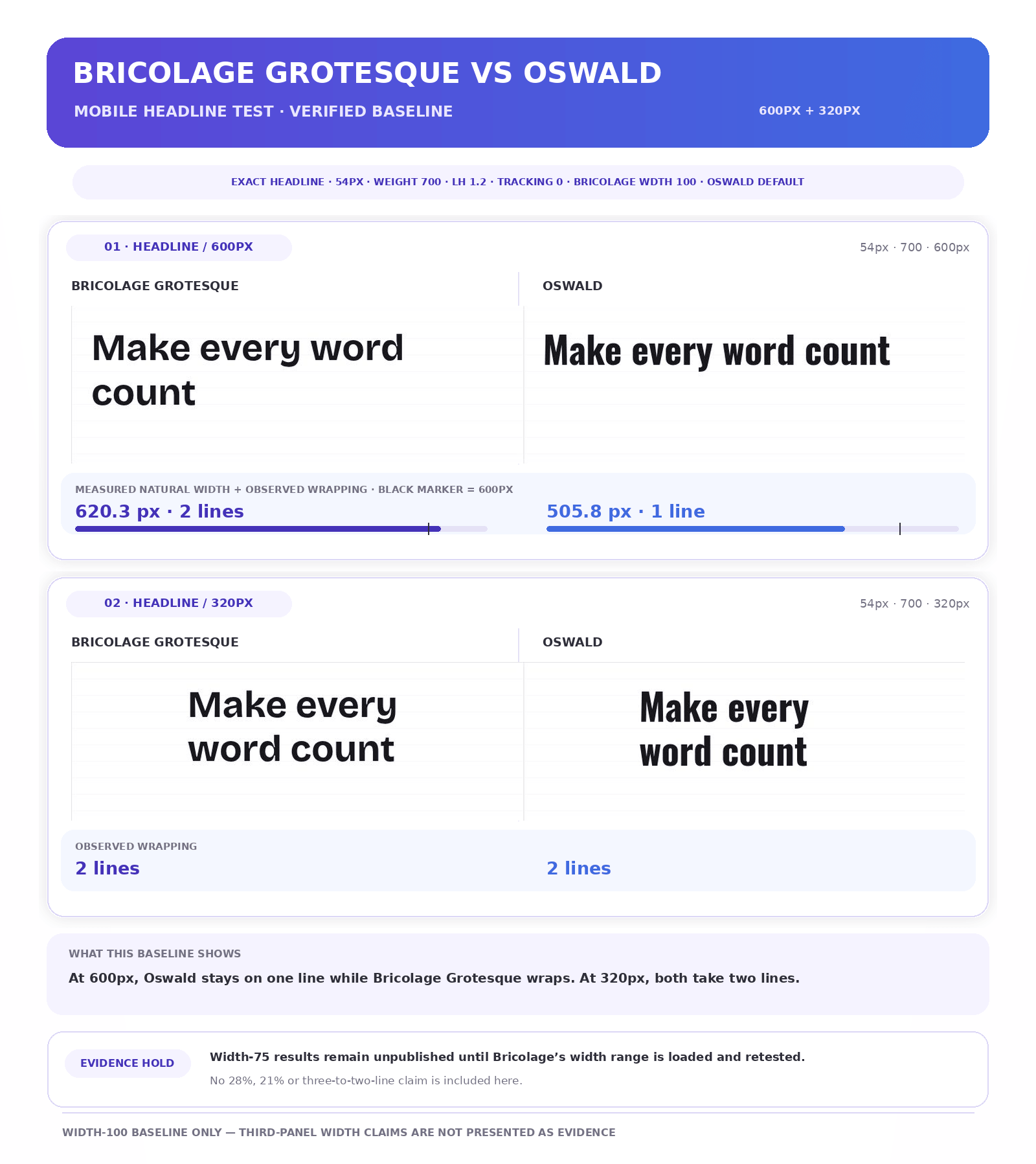
At the requested width setting of 100, Oswald was 15.3–18.5% narrower than Bricolage Grotesque across the three headlines.
In “Make every word count,” Oswald measured 505.8px and remained on one line at 600px; Bricolage measured 620.3px and took two. Both used two lines at 320px.
The result is specific to these words and containers. The lab had loaded only Bricolage’s weight range, so moving its width control from 100 to 75 did not create a valid width-axis comparison.
Any measurable space-saving claim for that axis remains on hold until the correct variable range is loaded and retested.
| Design question | Better choice | Why |
|---|---|---|
| Building a distinctive creative or cultural identity? | Bricolage Grotesque | Its changing proportions and unusual details provide more brand personality |
| Need a familiar poster, sports or news-style headline? | Oswald | Its condensed structure communicates quickly and predictably |
| Need a narrow default headline now? | Oswald | It was 15.3–18.5% narrower in our matched headlines. Bricolage’s width-axis result awaits a configured retest. |
| Supporting Cyrillic alongside Latin? | Oswald | It provides the broader script coverage of this pair |
Start Bricolage at its default form. If condensed styling matters, load the correct variable range and record line breaks at the target widths before defining approved styles.
For Oswald, Medium or Semibold usually supplies enough authority. Test the real words in uppercase and sentence case before changing letter spacing.
Neither family belongs in long paragraphs. Let it deliver the message that deserves attention, then hand the supporting copy to a quieter text face.
Reliable Google Fonts That Still Deserve a Look
The main 12 give us useful head-to-head choices; the five below may be better if you need continuity with an existing system or wider support for a particular script.
| Font | Choose it when… | Watch for |
|---|---|---|
| Roboto | Continuing an interface that already uses Roboto, its italics, language range and width control aid continuity. | Familiarity helps continuity, not distinctiveness. |
| Open Sans | Forms and content-heavy sites needing open letterforms, width control, and support for Latin, Greek, Cyrillic, Hebrew, or Vietnamese. | Its neutrality needs a more memorable visual identity. |
| Poppins | A brand needs strong geometric shapes, nine weights with italics and coordinated Latin and Devanagari support. | The broad, circular forms may crowd small interfaces. Our Poppins font review examines the trade-off. |
| Merriweather | Long-form screen text needs a sturdy serif with a darker, more substantial texture than Newsreader or Lora. Its current variable family adds optical-size and width control. | That visual weight can feel heavy in spacious editorial or luxury layouts. Test the intended size and line length, not only the handsome specimen headline. |
| Source Sans 3 | An institutional, editorial or product system needs a quiet sans with italics, a broad weight range and support for Latin, Greek and Cyrillic. | It handles hierarchy more readily than personality. If the type must carry the brand voice, pair it with a more distinctive display family. |
How to Choose and Test a Google Font
Google Fonts makes browsing easy, but specimen pages give every family oversized text, generous spacing and no awkward navigation labels.
Before committing, move two or three finalists into the conditions where they will work. If the project’s required category or personality is still unclear, begin with our guide to choosing the right font.
Start with one clear job
Write a one-sentence brief:
This font must perform this role for this audience, under these conditions, while feeling these qualities.
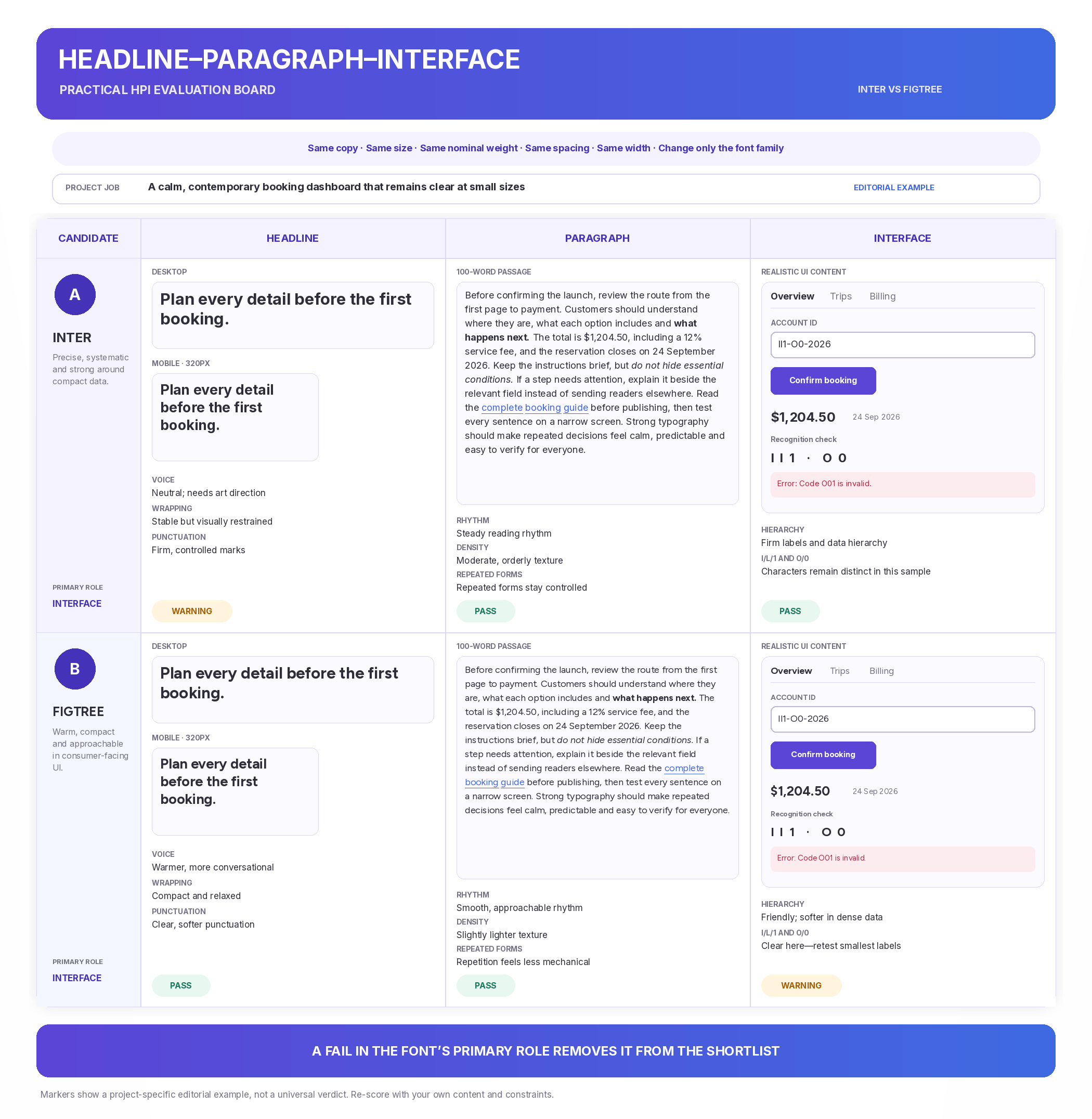
For example: This font must make a booking dashboard easy to scan at small sizes while feeling calm, contemporary and approachable.
That sentence decides which evidence matters. An interface font should not win because it produces the prettiest 60px headline, and an editorial serif does not need to fit six navigation tabs if it will never perform that role.
Run the Headline–Paragraph–Interface Test
The Fontish HPI Test moves each candidate through three realistic contexts. Keep the copy, sizes, nominal weights, spacing, colours and widths consistent; change only the font family.
| Test | Use | Inspect |
|---|---|---|
| Headline | A real 6–12-word title at its intended desktop and mobile sizes | Voice, width, line breaks, punctuation and whether heavier weights feel confident or merely loud |
| Paragraph | At least 100 words containing bold text, italics, links and numerals | Reading rhythm, density, line count and whether distinctive forms become tiring through repetition |
| Interface | Navigation labels, buttons, form fields, prices, dates and an error message at realistic sizes | Recognition, spacing, hierarchy and combinations such as I/l/1 and O/0 |
Run all three tests. The weaker contexts reveal whether one family can support the complete system or needs a partner.
Test narrow screens early with the longest plausible headline, product name, label and button. Include prices, dates, punctuation, accents and every required language. For multilingual work, use natural passages and fluent or native reviewers; character coverage alone does not prove that a script feels balanced.
Test variable axes only when they solve a real problem. Verify their effect on shape, fit and reflow, then turn useful settings into repeatable styles.
Check the real webfont before deciding
Preview each candidate in a browser, not only in a design tool. Compare the page before and after the webfont loads, especially around headings, buttons and navigation, where different character widths can change line breaks or shift nearby elements.
Confirm that the required weights, italics, scripts and axes actually exist. Request only the styles or variable ranges the design uses, following Google’s CSS API guidance. A free font can still become expensive in performance when every available weight is invited.
Record a pass, warning or fail
Give every candidate a result in each HPI context:
- Pass: Performs the job without special correction.
- Warning: Works after a manageable adjustment that can be applied consistently.
- Fail: Creates a problem in a context the project cannot avoid.
A failure in the font’s primary role removes it from the shortlist. If two families finish level, choose the one that supports the required languages, loads fewer unnecessary styles and needs less correction.
The goal is not the most impressive specimen; it is the font that keeps working once the specimen page is gone.
Common Google Fonts Mistakes
Choosing popularity instead of suitability
Popularity is a useful discovery filter, not a fitness test. Montserrat gave our matched headlines a broader geometric presence than DM Sans, but the extra width changed wrapping for “Make every word count” at 320px.
That does not predict the fit of a real menu. Compare the font in the role it will actually play.
Judging the family by its best-looking role
Large display sizes are forgiving. They reveal attractive details while hiding the spacing, density and character-recognition problems that appear lower down the page.
Bricolage Grotesque can make a campaign headline memorable without being the right choice for form instructions or long paragraphs.
Fraunces offers multiple axes and plenty of range, but that does not turn every setting into a neutral dashboard font.
One-family systems can work well when the family proves itself in every assigned role. A large collection of weights, italics and axes provides options—not universal competence.
Pairing two fonts that both want attention
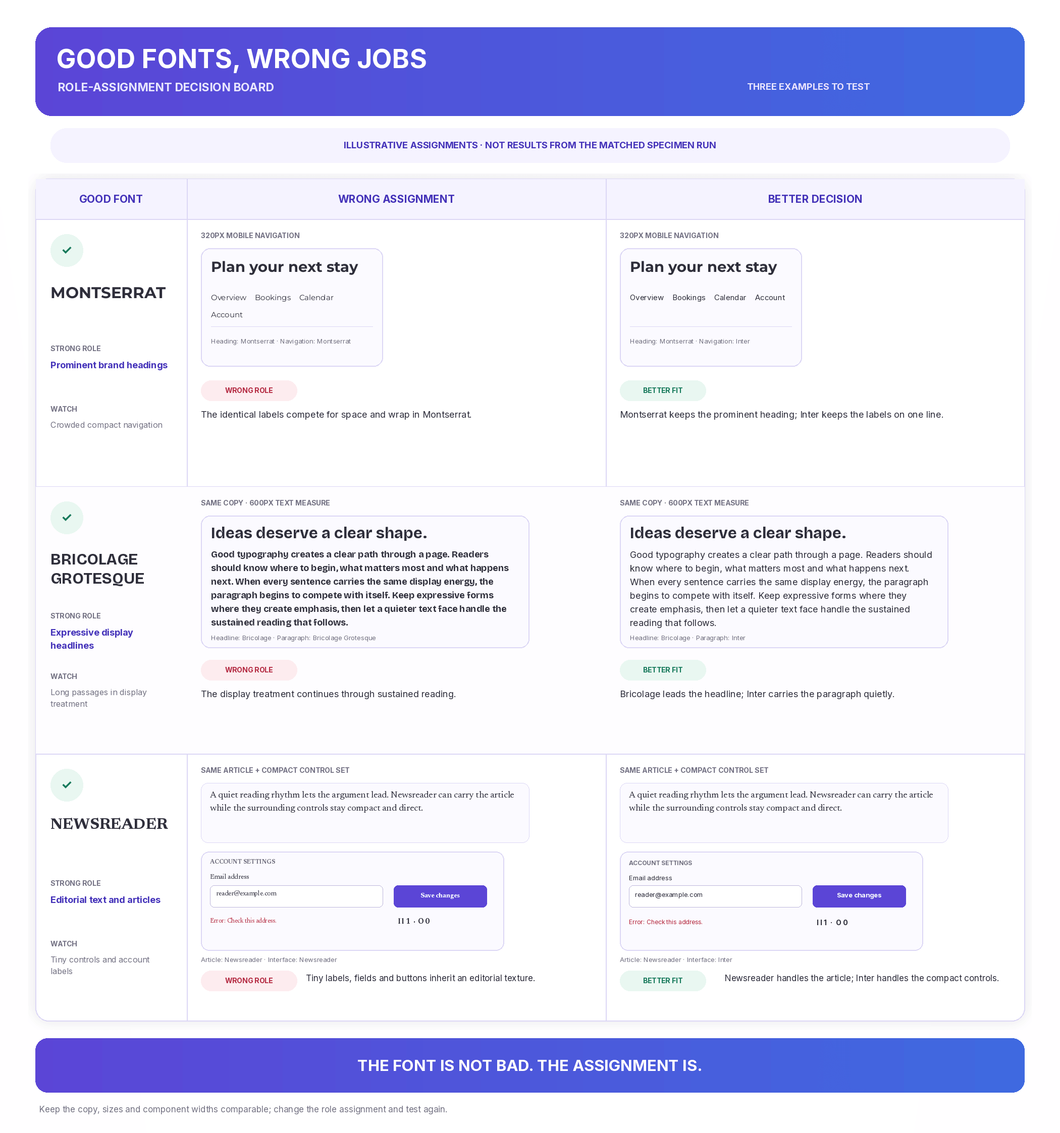
Contrast can establish hierarchy, but contrast alone does not create a useful pairing. Two expressive families may look exciting in isolation and exhausting once headings, quotations, buttons and callouts all begin competing for the lead role.
Assign responsibilities before choosing the pair. Let one family provide the personality while the other handles routine reading or interface work. Then compare their proportions, x-heights, widths and weight so the contrast feels deliberate rather than accidental.
If you keep switching fonts simply to make sections look different, the hierarchy becomes decorative rather than communicative.
Loading every available weight and style
Selecting an entire family can feel harmless when every style is free. The browser is less sentimental about unused font data.
If the design uses regular body text, semibold labels and bold headings, begin with those styles. Add italics or wider variable ranges only when the published content requires them.
Treating language support as a final checkbox
An English mockup may look finished while translated navigation or form errors fall back to a different typeface. Test the actual scripts in buttons, fields and full paragraphs, then ask fluent readers whether the result still feels coherent.
Correcting a poor fit indefinitely
Tracking, line height, size and variable axes are normal typography tools. They become warning signs when every new component requires another rescue operation.
Keep a record of the exceptions. If a font repeatedly causes cramped buttons, unfortunate headline breaks or uncomfortable paragraphs, the layout may not need one more adjustment. It may need a different font.
A few deliberate refinements show care. A growing correction list shows that the typeface and the job have stopped agreeing.
Frequently Asked Questions
Which Google Font is best for websites?
Inter is the strongest general-purpose starting point for body copy, navigation and interface text. Choose DM Sans for a friendlier brand voice or Newsreader for editorial reading. The best choice depends on the website’s main job.
Which Google Font is best for branding?
DM Sans suits adaptable contemporary brands. Fraunces and Playfair Display offer stronger editorial character, while Bricolage Grotesque feels bolder and less conventional.
Test the exact brand name in the intended case and weight before deciding.
Are Google Fonts free for commercial use?
Yes. Google Fonts use open-source licences that generally allow commercial use in websites, apps, print, advertising and logos.
Check the licence on each font’s page before modifying or redistributing its files. The Google Fonts FAQ provides current guidance.
How many Google Fonts should a website use?
One or two families are enough for most websites. Use one capable family for the entire system, or add a second when headings and functional text need different voices.
A third font needs a clear job. “The page looked lonely” is not one.
Can Google Fonts slow down a website?
Yes. Loading too many families, weights or variable ranges can delay text and cause layout shifts.
Request only the styles you use, choose an appropriate behaviour and test on realistic connections. Google’s CSS API documentation explains how to request specific styles efficiently.
Bottom Line
The best Google Font is not the family with no weaknesses. It is the one whose strengths serve the project’s most important job—and whose compromises appear somewhere the design can afford them.
Choose the two strongest candidates from the relevant comparison above. Test them with the same real content in the Headline–Paragraph–Interface Test, including the narrowest mobile layout the design must support.
Keep the family that performs its primary role with fewer corrections, clearer hierarchy and no unavoidable failures.
If defining the brand direction is still the difficult part, the free Brand Font Finder can turn your desired personality, audience and practical requirements into a more focused shortlist.