 I
I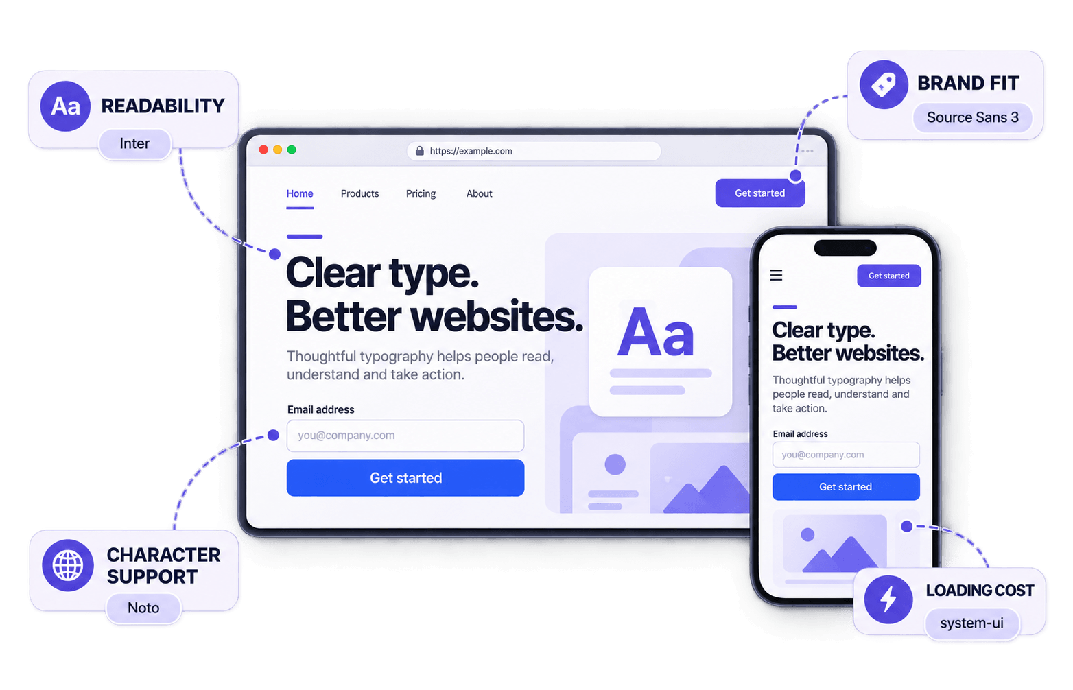
In This Guide
The best fonts for websites do more than look polished in a specimen. They stay clear in paragraphs, navigation and buttons while giving the brand character without making the page slower or harder to use.
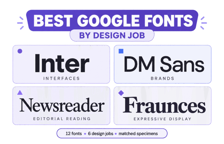
For an all-purpose choice, start with Inter. Source Sans 3 suits content-heavy layouts, the Noto family system supports multilingual sites, and a system-ui stack avoids a web-font download. Source Serif 4 and Merriweather work well for long-form reading.
A font name alone does not determine speed. Performance depends on the files and styles requested, the fallback stack, and what readers see while the font loads. Even a strong family becomes a poor choice when the page downloads six unused weights.
This guide compares practical choices for body text, interfaces, editorial pages, professional services, brand-led websites and multilingual content.
You will also learn to test readability, hierarchy, character coverage and loading cost in a real layout—where fonts cannot hide behind a perfect specimen.
What Makes a Website Font Reliable
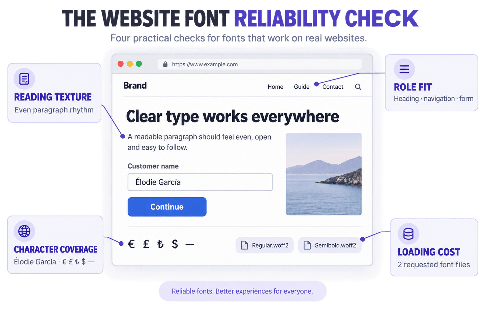
A reliable website font handles its assigned job without creating a more serious problem elsewhere.
We use a simple role-and-risk rule: identify the font’s main job, then identify the failure the website can least afford.
A publication should guard against reading fatigue. A product interface needs clear controls and numbers. A multilingual site cannot tolerate missing characters.
This gives each candidate a relevant standard instead of expecting every font to win every category.
Readability has to survive real content
Readable letters need clear shapes, but readable paragraphs also need an even texture. Look at the x-height, the open spaces inside letters, the spacing between characters, and the distinction between forms such as I, l, 1, O and 0.
Size and layout matter too. A font that feels open at 18 pixels may become cramped at 14, while an overly wide text column can make a perfectly capable family tiring to read.
The serif or sans serif label does not settle the question. Judge the actual typeface in its intended setting.
Speed depends on the font setup
Fonts do not come with fixed speed scores. Performance depends on the number and size of the files the browser must fetch.
A system stack requires no web-font download. A custom family can still load efficiently when you use modern formats and request only the weights, styles and language subsets the page needs. The web.dev font guidance explains the main delivery and fallback considerations.
Variable fonts can be efficient when a design uses a broad range of weights or other axes. They are not automatically smaller than two carefully chosen static files. Self-hosting gives you more control, but it does not guarantee a faster result.
Decide between a workhorse and a specialist
A workhorse can handle paragraphs, navigation, forms, captions and several levels of hierarchy. Inter and Source Sans 3 are good examples.
A specialist contributes stronger character in a narrower role. Source Serif 4 may carry editorial reading, while a distinctive display family may be reserved for major headings.
If one family must run the whole site, choose the workhorse. If the brand needs more personality, pair a specialist with a dependable functional font.
Our guide to choosing the right font covers that broader decision.
Professional means appropriate
Professional is not a single visual style. A financial platform, a children’s learning app, and a cultural journal should not all look typographically identical.
A neutral sans serif can feel controlled but generic. A more expressive font can still feel professional when its tone matches the audience and its role is clearly defined.
Check character and language support early
Coverage is a pass-or-fail requirement. Verify every writing system, accented character, currency symbol and punctuation mark the website needs, including bold and italic styles.
Some large type systems support additional scripts through separate companion families rather than one universal file. Confirm the exact files and fallbacks before the design depends on them.
The Best Fonts for Websites by Role
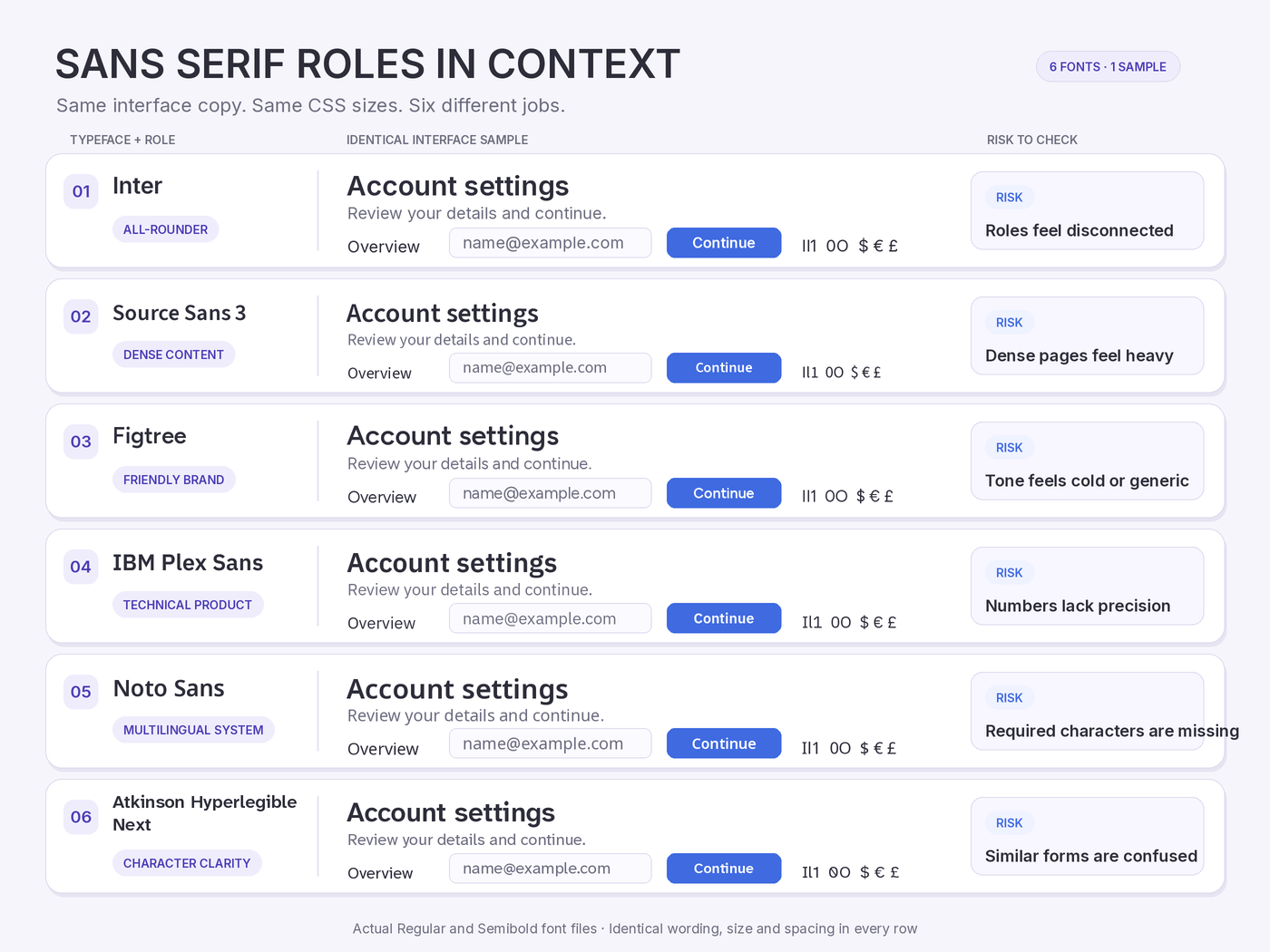
The matrix below turns role and risk into a practical shortlist. Start with the row closest to your project, then test the recommended options in context.
| Website role | Failure to prevent | Start with | Test first |
| General-purpose website or product | Body text and controls feel disconnected | Inter or Source Sans 3 | Paragraphs, navigation and forms |
| Friendly modern brand | Clean typography feels cold or generic | Figtree | Headings and mobile navigation |
| Technical or B2B product | Data and labels lack precision | IBM Plex Sans | Numerals, tables and long labels |
| Multilingual platform | Missing characters or mismatched fallbacks | Noto families | A complete translated page |
| Clarity-sensitive service | Similar characters are easily confused | Atkinson Hyperlegible Next | Forms, codes and account details |
| Publication or long-form site | Paragraphs become tiring | Source Serif 4 or Merriweather | A full article with italics |
| Performance-first website | A custom font adds more cost than value | system-ui or a Georgia stack | First load and platform differences |
These are starting points, not winners. The best fonts for websites are not universally superior; they are dependable in the role the page actually needs.
The notes below explain where each choice earns its place and where it becomes a compromise.
1. Inter: The dependable all-rounder
Inter can handle navigation, forms, pricing cards, headings and body copy without forcing the typography system in several directions. Its tall x-height and clear proportions remain useful at small interface sizes.
For a typical SaaS product, service business or portfolio, start with Regular for body copy and Semibold for headings and controls before adding another weight.
Its neutrality is also the limitation. When stronger brand character matters, keep Inter in the functional roles and give major headings to a more distinctive family.
2. Source Sans 3: Calm under heavy content
Source Sans 3 suits documentation, universities, public services and websites with several levels of navigation and supporting text.
Its open forms create a calm reading texture and keep dense pages from feeling oversized.
Large headings can feel understated. Pair it with Source Serif 4 or a stronger display face when the page needs more editorial contrast.
3. Figtree: Modern with a friendlier edge
Figtree softens geometric structure with warmer details. It feels current without adopting the colder tone common to many technology brands.
Use Figtree when a modern sans needs to feel approachable rather than clinical. It works well in headings, short paragraphs and interface labels without losing its recognisable voice.
Its support is centred on Latin scripts, and the friendly tone may feel too casual for conservative legal or financial brands.
4. IBM Plex Sans: Precision with personality
IBM Plex Sans combines technical precision with recognisable character. Its distinctive shapes suit engineering firms, research organisations, data products and developer tools.
The wider Plex system includes serif, mono and script-specific companions, which can support a coordinated technical identity.
That identity is noticeable. On a softer lifestyle or hospitality brand, Plex may feel more corporate than reassuring. Use it because the tone fits, not simply because the family is extensive.
5. Noto: A Coordinated Multilingual Type System
Noto is the strongest starting point when language coverage shapes the project. Its related families support a wide range of writing systems while maintaining a reasonably consistent voice.
Treat Noto as a coordinated system rather than one enormous universal font. Select the correct family for each required script and test how those families appear together on a real translated page.
Its neutral tone suits global products, institutions and educational platforms. Careless selection can introduce more files and styles than the website needs.
6. Atkinson Hyperlegible Next: Clearer character recognition
Atkinson Hyperlegible Next gives similar characters more distinct forms. That can help when readers must tell I, l, 1, O and 0 apart quickly.
Test it first on healthcare information, learning platforms, forms, account numbers, and short codes, where a single mistaken character can matter.
The font alone does not make a website accessible. Size, contrast, spacing and layout still carry much of that responsibility. Its utility-focused personality may also be too strong for luxury or highly editorial brands.
7. Source Serif 4: Editorial range through optical sizes
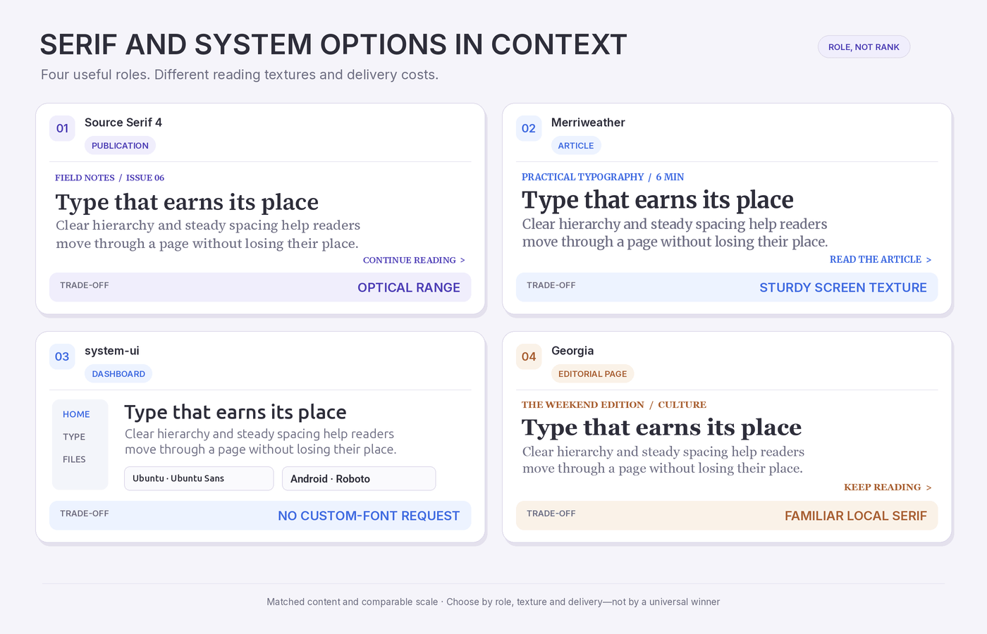
Source Serif 4 is designed to change its details across captions, body text, subheadings and display settings. Smaller optical sizes offer more space and sturdier features; larger settings are tighter and more refined.
This flexibility earns its keep on publications, reports and cultural websites, where captions, body text and large headings need one coherent serif voice. Pair it with a sans serif for compact controls and navigation.
Dense dashboards are not its natural territory. Its strengths become clearer when the content has room to breathe.
8. Merriweather: A sturdy screen serif
Merriweather combines a large x-height with relatively compact proportions, helping articles fit comfortably without appearing delicate.
Merriweather works especially well for blogs, educational websites, consultancies and nonprofit publishing. It feels warmer than a neutral sans serif without becoming too delicate for professional content.
Merriweather becomes dark when heavy weights and tight line spacing are used together. Keep Bold for short headings and give body paragraphs enough line height.
9. system-ui: Speed without another font file
The system-ui keyword uses the platform’s default interface font, so the browser does not need to fetch a custom family.
body {
  font-family: system-ui, sans-serif;
}
Use it for dashboards, account areas, prototypes and utility-focused products. The interface feels familiar on each platform and appears without waiting for a font download.
Appearance and text width will vary between operating systems. Test important layouts across platforms, and consider a dedicated reading face when the website contains long articles.
10. A Georgia stack: The local serif option
Georgia was designed for screen clarity and remains useful for straightforward editorial websites.
body {
  font-family: Georgia, "Times New Roman", serif;
}
This stack uses Georgia when available and falls back to another local serif when it is not. It adds no web font requests, making it suitable for fast blogs, resource sections and early-stage publications.
Georgia is familiar rather than distinctive, and its limited weight range restricts complex hierarchy. It will not create bespoke branding, but it can deliver readable editorial typography with very little machinery.
The Fontish Website Font Test
Even the best fonts for websites need to be tested inside the layout they will actually serve.
Shortlist two or three candidates and compare them under the same conditions. Start with a simple side-by-side specimen, then place the finalists inside an actual page design.
Build one realistic test page
Include the typography the live website will depend on:
- A main heading, subheading and two paragraphs
- Navigation with the longest expected label
- Primary and secondary buttons
- Form labels, placeholder text and an error message
- Prices, dates, percentages and reference numbers
- Real names, languages and special characters
Awkward content is useful here. A long product name or error message reveals more than another perfectly behaved slogan.
Compare equal settings before tuning
Run the comparison twice.
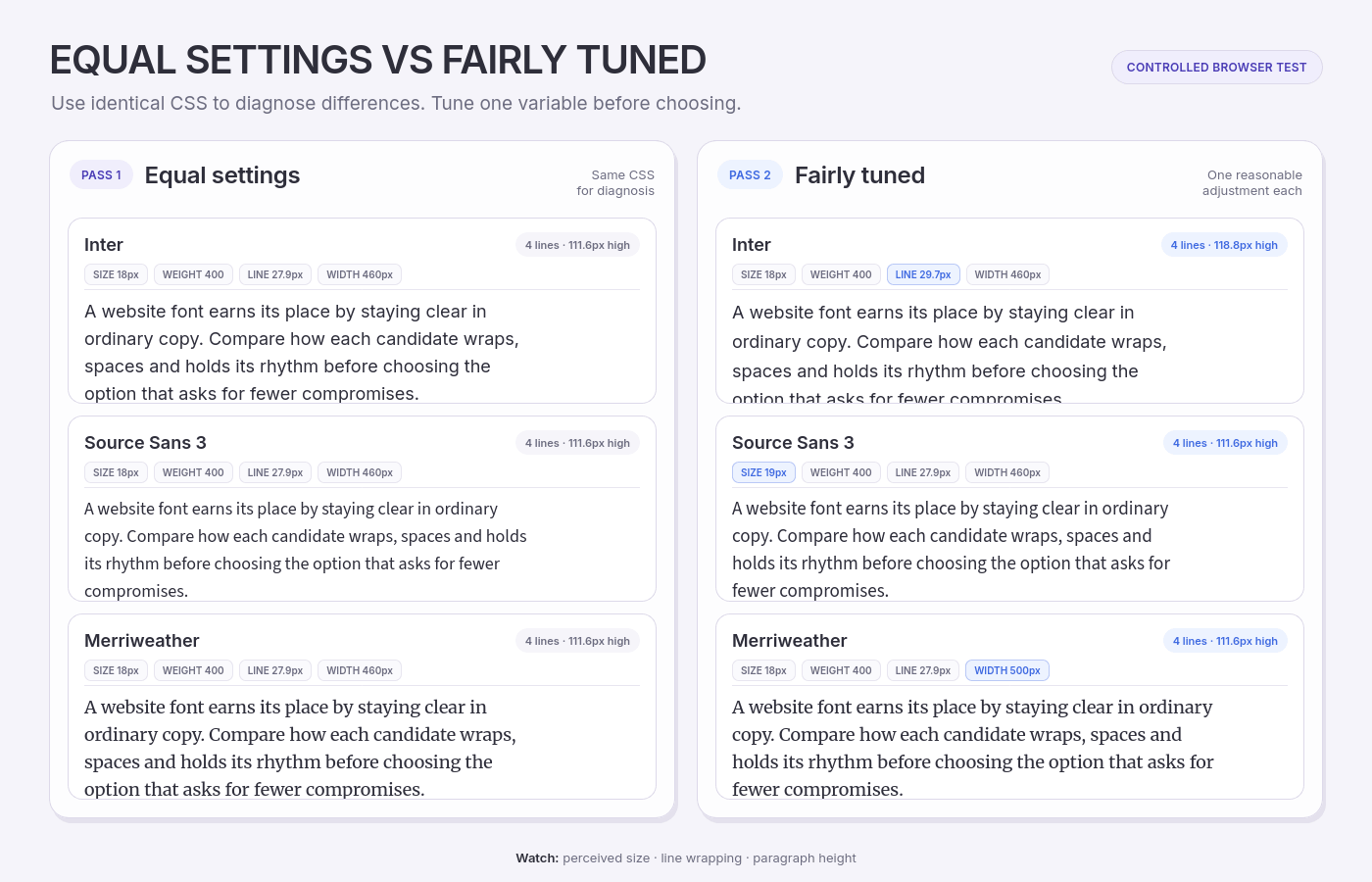
Pass one uses equal settings. Give every font the same size, weight, line height and column width. This exposes differences in proportions, spacing, density and wrapping.
Pass two allows reasonable tuning. Adjust each font to its best practical size, weight and line height. Fonts with the same CSS size do not always appear equally large, so the first comparison should not be the final verdict.
A candidate that improves after one or two adjustments deserves another look. One that needs exceptions across every part of the page is creating a maintenance problem.
Run the five website font checks
1. Read the body text
Read several paragraphs at the intended size and width. Notice whether the texture feels even and whether your eye moves easily from one line to the next.
Look for crowded letters, closed shapes or unusually dark patches. If sensible changes to size or line height solve the problem, mark it for adjustment rather than rejecting it immediately.
2. Stress-test the interface
Check navigation, forms, buttons, alerts, tables and account details. Include the longest labels the website expects and a character line such as:
Il1 0O 5S 8B € £ ₺ $ — 08/11/2026 user@example.com
Similar letters and numbers should remain distinct at small sizes. Important controls should fit without constant manual correction.
If critical controls need repeated manual fixes, fail the candidate for interface use.
3. Test narrow screens and enlarged text
Review the page on a narrow mobile viewport rather than shrinking a desktop screenshot.
Test it at approximately 320 CSS pixels wide and enlarge the text to 200%. These checks reflect the W3C guidance on content reflow and text resizing.
Watch for clipped labels, overlapping text, hidden controls and headings that break into awkward fragments. Rejecting a font because one word wraps earlier would be excessive; repeated interface failures are more meaningful.
4. Verify the required characters
Paste real customer names, locations, currencies and translated content into the test page. Check regular, bold and italic styles separately.
Unexpected fallback fonts and missing required characters are failures, not cosmetic imperfections. If a family relies on companion fonts for additional scripts, test those combinations together.
If you have the font file, the Fontish Font Inspector can help you review its glyph set before testing the complete page.
5. Measure the loading cost
Open Chrome DevTools, select Network, enable Disable cache, reload the page and filter requests by Font. The Chrome DevTools Network reference explains these controls.
Record the number of font files, their transferred size and what the reader sees before they finish loading. Check whether the final font changes line breaks or moves surrounding elements.
There is no useful universal file-size limit. Compare the cost with the value the font adds and with the needs of the specific website.
Use Pass, Adjust or Fail
Give each candidate one verdict for reading, interface fit, responsive behaviour, coverage and loading.
| Verdict | Meaning | Next action |
| Pass | The font performs the role without a meaningful compromise | Keep it on the shortlist |
| Adjust | A reasonable change may solve the problem | Change one setting and retest |
| Fail | The font breaks a critical requirement | Remove it from consideration |
Do not average away a failure in the website’s highest-risk area. A multilingual font cannot fail coverage, and an interface font cannot fail inside controls.
When two candidates pass, choose the simpler implementation. That decision tends to age better than choosing the font that won one attractive screenshot.
Website Font Mistakes That Hurt Readability and Speed
Once the shortlist is sound, most typography problems come from assigning fonts poorly or implementing them carelessly. The best fonts for websites can still underperform when the implementation loads too many families, weights or styles.
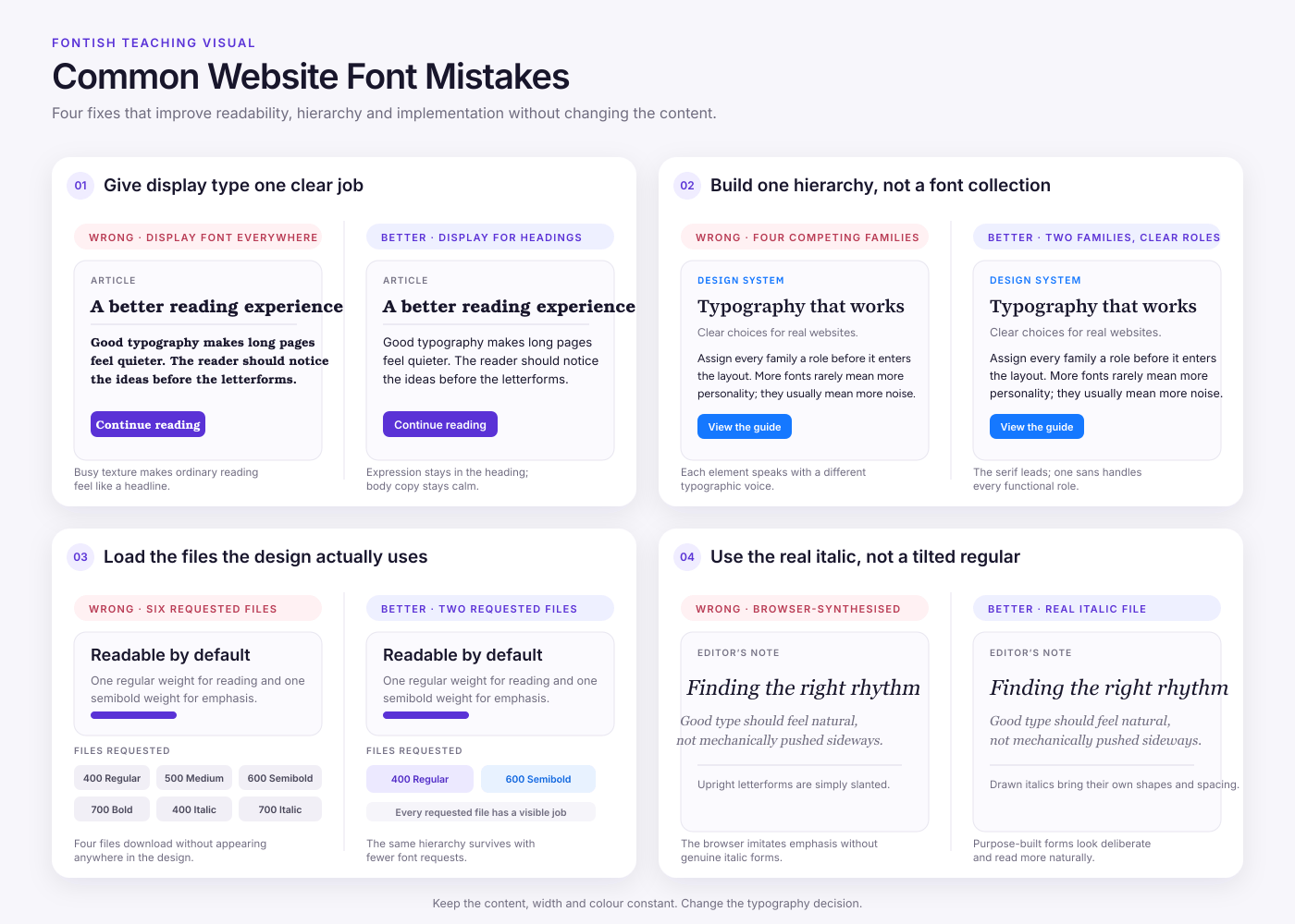
Using a display font as the workhorse
Display fonts gain personality from unusual proportions, strong contrast or exaggerated shapes. Those features may look excellent in a heading and become exhausting across several paragraphs.
Keep expressive families where their character helps. Give body copy, forms and navigation to a font designed for repeated reading and smaller sizes. A font does not need to appear everywhere to influence a website’s identity.
Adding fonts instead of creating hierarchy
When headings and paragraphs feel too similar, adding another family may create more noise without improving the structure.
Try size, weight, spacing and placement first. One versatile family can often produce a complete hierarchy, while a second family should introduce a clear change of role or tone.
If two fonts are competing for the same job, one of them is probably unnecessary.
Loading styles with no assigned job
Every requested style should have a defined use. Regular may handle body text, Semibold may cover headings and controls, and Italic may support genuine emphasis.
If you cannot point to where a style appears, leave it out. You can always add a required weight later; visitors should not download your future possibilities.
Using tracking to rescue the wrong font
Letter spacing can refine typography, but it cannot repair a font that is too wide, too dense or poorly suited to its role.
Positive tracking may help short uppercase labels. Large adjustments across body text usually damage the natural rhythm designed into the typeface. Tightening navigation until every label fits can also make small text harder to scan.
Adjust the font size, available width, wording or typeface before reaching for aggressive tracking.
Letting the browser invent missing styles
When a requested bold or italic style is unavailable, the browser may synthesize one from the regular font. The result can look heavier, slanted or less refined than the type designer intended.
Confirm that the real weights and styles used by the design are available and loaded. The CSS font-synthesis property can control whether browsers create missing variants, but it does not replace the correct font files.
A fake italic is still fake, even when the browser produces it very efficiently.
Skipping the licence and source check
A font file that appears online is not automatically licensed for website use or self-hosting.
Check the licence at the original foundry, designer or trusted distributor. Confirm whether web embedding, commercial use and modification are permitted, then keep a record of the licence with the project files.
Resolve this before the design depends on the font. Licensing problems are much less charming when discovered after launch.
Best Website Fonts: Frequently Asked Questions
What are the best fonts for websites?
Inter is a dependable general-purpose choice, while Source Sans 3 is particularly strong for content-heavy sites.
Professional typography still depends on context. Choose a font that fits the organisation’s tone, handles its main content and performs reliably in the required roles.
What font size is best for website body text?
Start around 16–18 pixels for general body copy. Reading-heavy pages may work better at 18–20 pixels.
Treat those figures as starting points. The font’s x-height, weight, line length and spacing affect how large it feels. Test the finished text on mobile and at 200% enlargement.
Are serif or sans serif fonts better for websites?
Both can work well. Sans serifs are common in interfaces and compact controls, while serifs can give articles and editorial brands a stronger reading voice.
The individual typeface and its settings matter more than the category label. Test the font in the role it will perform.
How many fonts should a website use?
One or two families are enough for most websites. A single versatile family can create hierarchy through size and weight, while a second can separate expressive headings from functional text.
Add another family only when it has a defined job, such as monospace text for code.
Do Google Fonts and other web fonts slow down a website?
They can. Every requested family, weight, style and language subset adds loading work.
Use only the files the design needs and test the first uncached visit. A system stack avoids the custom-font download, but a well-implemented web font may still justify its cost through stronger branding or language support.
Choose the Font That Solves the Right Problem
The best fonts for websites are not the ones that look most impressive in isolation. They are the ones that stay readable, support the required characters, suit the brand and earn whatever they add to the page weight.
For a dependable starting point, choose Inter for general use, Source Sans 3 for content-heavy layouts, Source Serif 4 or Merriweather for editorial reading, Noto for multilingual coverage, or a system stack when speed and simplicity take priority.
Then test, rather than guess. Place two finalists in the same realistic page and tune each one fairly. If a font needs rescuing in every control and breakpoint, it has not really won. Choose the option that performs its role with fewer compromises and makes the rest of the design easier to manage.
Once the choice is settled, use the Fontish Type Scale Builder to turn it into a practical hierarchy for headings, body text, captions and interface labels.