
 I
I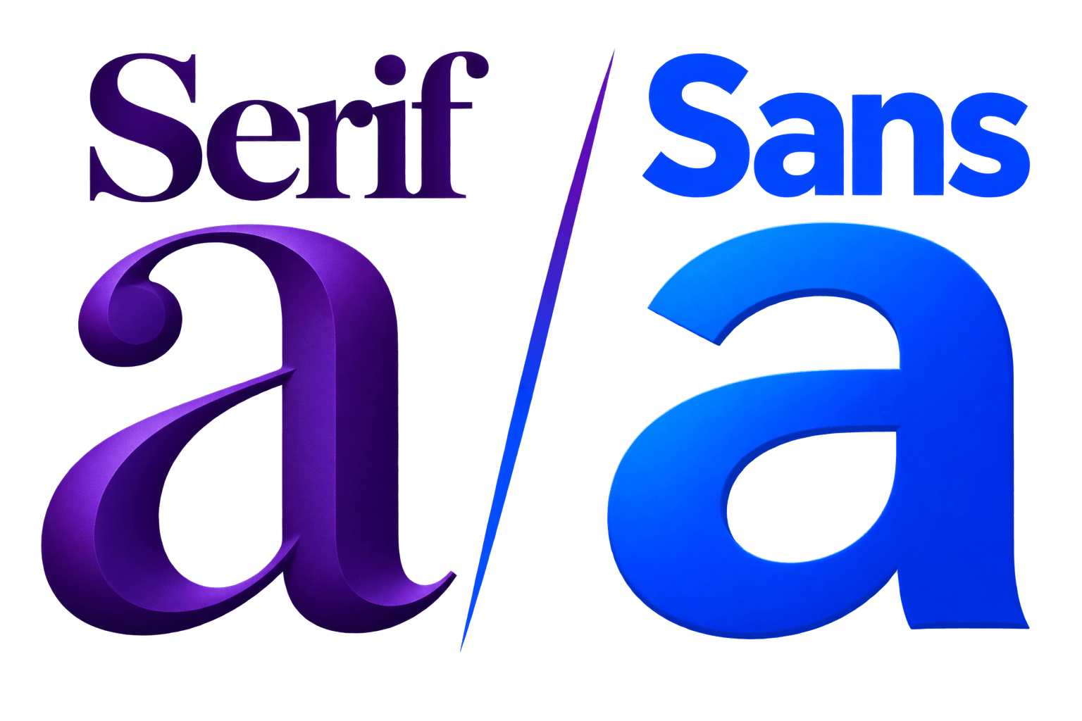
On This Page
Choosing between serif and sans serif can sound like typography’s version of a boxing match. One has decorative strokes. The other does not. Designers have spent decades arguing about which one deserves the belt.
The more useful answer is less dramatic: neither category is automatically better.
The right choice depends on what the text needs to do, where people will read it, and how the typeface behaves at its intended size.
A refined serif can feel modern and work beautifully on a screen. A sans serif can feel traditional, friendly, technical, or severe depending on its construction.
This serif vs sans serif comparison will help you understand the real differences, recognize where each category tends to work best, and choose confidently without relying on rules that expired with low-resolution monitors.
Here is the principle we will use throughout:
The category is your first filter. The role is your final decision.
QUICK ANSWER
Choose a serif when you want editorial character, visible authority, literary warmth, or an expressive reading experience.
Choose a sans serif when you need efficient interface text, compact labels, flexible hierarchy, or a cleaner functional voice.
For many websites and brand systems, the strongest solution is to use both: one typeface creates character while the other handles structure.
What Is the Difference Between Serif and Sans Serif?
A serif typeface has finishing strokes attached to parts of its letterforms. These small extensions appear around stems, terminals, and other structural points.
They may be delicate and tapered, broad and bracketed, sharp and high-contrast, or heavy and rectangular.
A sans-serif typeface omits those traditional serif strokes. The word “sans” means “without,” so the category name literally means “without serifs.”
The Google Fonts definition of sans serif provides a useful introduction to the category and its many substyles.
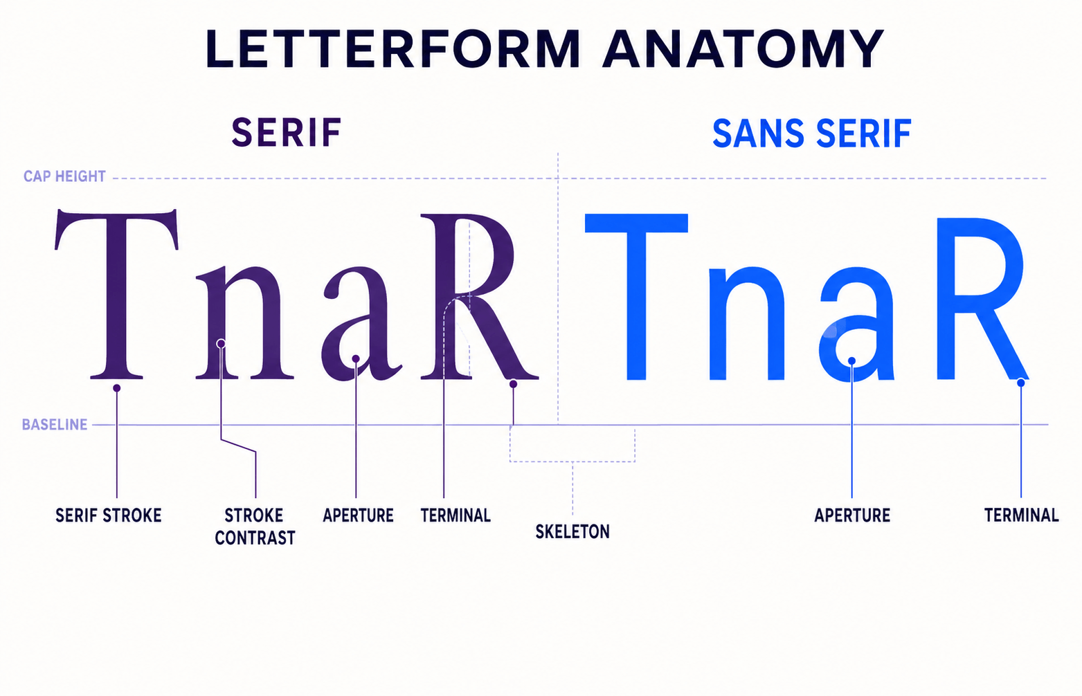
That is the visible difference, but it is only the beginning.
Serif typefaces include old-style families with calligraphic movement, transitional designs with greater contrast, modern serifs with sharp geometry, and slab serifs with heavy block-like forms.
Sans serifs are equally varied.
A humanist sans may feel warm and open. A geometric sans can appear controlled and constructed. A grotesque may look neutral or industrial, while a playful rounded sans can feel nothing like any of them.
This is where the usual “look for the little feet” explanation becomes inadequate. It helps you identify the category, but it tells you very little about whether the typeface will suit a law firm, children’s product, news website, fashion label, or banking app.
Classification helps you narrow the field. It does not tell you the entire personality of a typeface.
As our typography guide explains, classification is a map—not a personality test.
Serif vs Sans Serif at a Glance
| Factor | Serif | Sans serif |
|---|---|---|
| Defining feature | Finishing strokes attached to letterforms | No traditional serif strokes |
| Common visual associations | Editorial, literary, established, elegant | Clear, direct, contemporary, functional |
| Strong applications | Books, magazines, expressive headlines, heritage branding | Interfaces, navigation, dashboards, signage, compact text |
| Possible advantage | Creates distinctive texture and character quickly | Often provides broad weight ranges and efficient screen use |
| Possible weakness | Fine details may weaken at very small sizes | Overly neutral families can make a design feel generic |
| Examples | Libre Baskerville, Lora, Merriweather, Playfair Display | Inter, Poppins, Open Sans, Montserrat |
These are tendencies, not laws.
Playfair Display and a rugged slab serif do not communicate the same personality merely because both have serifs. Inter and Poppins are both sans serifs, but their proportions and tone are noticeably different.
Treat the table as a shortlist of likely strengths. Then judge the actual typeface.
A useful professional shortcut is to make two decisions instead of one:
- Decide which category appears promising.
- Decide whether the specific family can perform the required role.
The first decision makes the search manageable. The second prevents a broad classification from making the design choice for you.
Why the Difference Matters
The choice between serif and sans serif affects the texture of an entire layout.
Serifs add small horizontal, vertical, or angled details around the main letter structures. Across a paragraph, those details create a busier and often more continuous texture.
A serif page may feel editorial, established, warm, formal, or luxurious depending on the family.
Sans serifs usually create cleaner silhouettes and more open areas around letters. This can help labels, buttons, navigation, and compact information feel direct and orderly.
It can also make a brand appear plain if the selected family has little individual character.
Category influences hierarchy too.
An expressive serif heading can separate itself clearly from neutral sans-serif body copy. A bold sans-serif heading over serif paragraphs can reverse that relationship and make the system feel more contemporary.
For a better evaluation, examine the choice across three layers:
- Shape: What do the individual letters look like?
- System: Does the family provide the weights, styles, and features the design needs?
- Situation: Does it perform at the required size, medium, and reading distance?
This prevents a common mistake: choosing by shape alone.
A typeface may have beautiful letterforms but an incomplete italic, weak numerals, limited language support, or no convincing weight for small text. Attractive letters are useful. A functioning typography system is better.
You should also examine:
- X-height and apparent size
- Stroke contrast
- Character width
- Apertures and counters
- Spacing
- Weight range
- Italics
- Distinctive character shapes
A carefully drawn sans serif with cramped spacing may perform worse than an open serif on a small screen. A delicate high-contrast serif may look wonderful at 60 pixels and nearly disappear at 12.
Category gives you clues. Performance supplies the evidence.
Is Serif or Sans Serif Easier to Read?
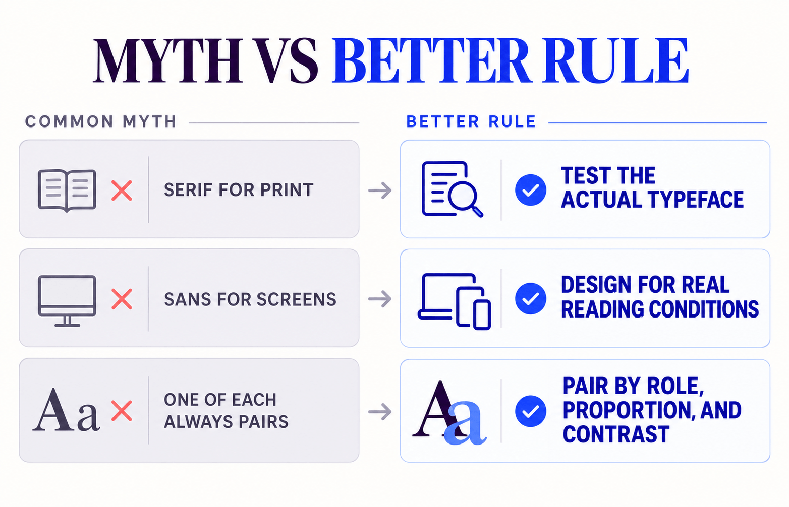
The familiar rule says serif is better for print and sans serif is better for screens.
It is memorable, tidy, and far too confident.
Research has not established a universal readability winner between the two categories. A review of serifs and font legibility found that the evidence is more complicated than the common claim that serifs dramatically improve reading.
Modern displays also render letter details far more clearly than early screens did. A well-designed screen serif can remain crisp at sizes that once turned its finer strokes into digital porridge.
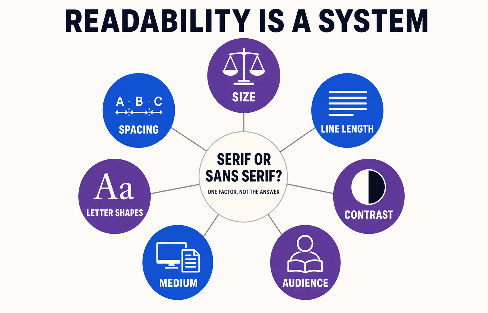
Readability depends on the complete setting:
- Typeface design
- Font size
- Line height
- Line length
- Letter and word spacing
- Color contrast
- Screen or print quality
- Reading distance
- Language and character set
- The reader’s individual needs
Familiarity matters too. People regularly read serif books and sans-serif interfaces, so both categories can feel natural in the contexts where we expect them.
Try the context-switch test
If two fonts appear equally readable in a large desktop mockup, change the conditions.
Test them in a long paragraph. Reduce the viewport to mobile width. Try a small caption, a bold heading, a set of numerals, and a button label. Print the page if the project will also appear offline.
I found that the weaker option often reveals itself when the comfortable conditions disappear.
Perhaps its counters begin to close. Its bold weight becomes clumsy. Its italics feel unrelated, or its wide characters force ugly line breaks.
That evidence is more useful than a blanket rule about serifs.
Do not ask only, “Is serif or sans serif easier to read?”
Ask, “Is this particular typeface easy to read in this particular design?”
That question produces much better typography.
When to Use a Serif Typeface
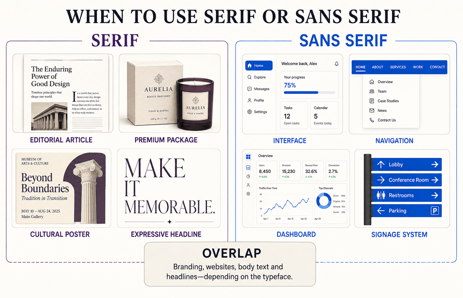
A serif is often a strong choice when the typography needs to carry a noticeable voice.
Editorial and long-form design
Serifs have deep associations with books, newspapers, magazines, and academic publishing. That history can make long-form content feel intentional and editorial before the reader processes a sentence.
This does not mean every serif is suitable for paragraphs.
Look for moderate stroke contrast, open counters, comfortable spacing, and sturdy details that survive at body size.
Imagine an independent journal that publishes essays, interviews, and cultural criticism. A warm serif can give the articles a recognizable editorial texture, while a restrained sans serif keeps menus, categories, and subscription controls efficient.
The serif is not being used because the website is pretending to be a book. It is being used because the reading experience is central to the product.
Heritage and authority-led brands
Law firms, universities, cultural institutions, financial organizations, and established publishers often use serifs to communicate continuity and experience.
The danger is reaching for a generic “serif equals trustworthy” solution.
If every design decision imitates a nineteenth-century banknote, the result may feel old rather than authoritative.
A sharper transitional serif might communicate precision. A warmer old-style family may feel scholarly or approachable. A slab serif can add weight without making the brand feel delicate.
“Use a serif” is therefore only the opening direction. The subclass and individual family determine what kind of authority the design expresses.
Premium or expressive headlines
High-contrast serifs can make large headlines feel elegant, dramatic, or fashion-led.
Warmer old-style serifs can feel literary and human, while slab serifs introduce more weight and confidence.
At display sizes, the category’s structural details become an asset rather than a complication.
When a serif may be the wrong choice
Be cautious when the type will appear in tiny interface labels, low-quality output, dense data tables, or environments where fine details cannot survive.
The problem is not the serif category itself. The problem is selecting a design whose details are too fragile for the job.
When to Use a Sans Serif Typeface
Sans serifs are particularly useful when text must work as part of a system.
Interfaces and navigation
Menus, buttons, form labels, filters, and status messages benefit from clear character shapes and predictable weight changes.
Many sans-serif families include extensive weights and styles that make complex interfaces easier to organize.
Inter is a good example. Its broad family and screen-oriented proportions make it useful for UI text, supporting copy, and navigation.
Consider a banking application that must display balances, account numbers, alerts, filters, transaction tables, and compact mobile controls.
The design needs more than a typeface that looks “modern.” It needs clear numerals, distinguishable characters, useful weights, efficient spacing, and reliable performance at small sizes.
That is a role-based reason to investigate a sans serif.
Compact or information-heavy layouts
Dashboards, tables, presentations, signage, and product interfaces often contain limited space. A practical sans serif can remain clear while allowing designers to build hierarchy through weight and size.
Width matters here.
A very wide geometric sans may be beautiful, but it can consume valuable space and produce awkward line breaks.
This is a good example of category and role pointing in different directions. The category may be suitable, but the individual family may still be a poor choice.
Contemporary brand systems
Sans serifs are common in technology, retail, media, and service brands because they can adapt across websites, packaging, applications, social graphics, and environmental design.
Their personalities still vary considerably.
Some grotesques feel industrial or historical. Rounded sans serifs can feel casual, while geometric families may appear futuristic, playful, clinical, or luxurious.
The Fontish Poppins font review shows how one geometric sans serif can perform across websites, interfaces, and brand systems while still carrying a recognizable personality.
When a sans serif may be the wrong choice
Avoid choosing a neutral sans merely because it seems safe.
If the brand needs distinction, warmth, or a stronger editorial voice, a restrained sans serif may leave the design technically tidy but emotionally vacant.
Clarity matters. So does being remembered.
Practical Serif vs Sans Serif Examples
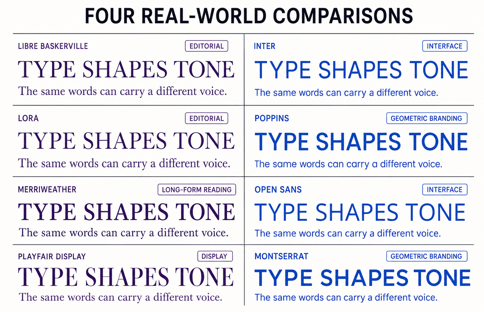
The difference becomes clearer when we compare real families.
Libre Baskerville vs Inter
Libre Baskerville has visible stroke contrast, bracketed serifs, and literary warmth. Inter uses open shapes, a tall x-height, and an extensive functional range.
Choose Libre Baskerville when you want headlines or reading text to feel considered and editorial. Choose Inter when navigation, labels, controls, and supporting copy need quiet efficiency.
Together, they form a useful system: Libre Baskerville creates the voice while Inter organizes the experience.
The Fontish Libre Baskerville and Inter pairing guide demonstrates that division of roles in detail.
Lora vs Poppins
Lora is a contemporary serif with calligraphic movement. It works well when a design needs warmth without becoming overly traditional.
Poppins is geometric, circular, and visually controlled. It can make headings and interface elements feel cleaner and more constructed.
Lora generally creates a more literary texture. Poppins creates a more graphic one.
Our Lora and Poppins font pairing guide shows how to balance those contrasting qualities in a practical typography system.
Merriweather vs Open Sans
Merriweather was designed to remain comfortable in screen-based reading, proving that a serif can work effectively online.
Open Sans is a humanist sans serif with open forms and a practical, approachable tone. It works across body copy, interfaces, and supporting information.
The choice is not “print versus screen.” It is editorial texture versus functional openness.
Playfair Display vs Montserrat
Playfair Display brings strong contrast and dramatic display character. Montserrat uses broad geometric forms and creates a cleaner architectural presence.
Both work best when given enough space.
Neither is an automatic body-copy choice simply because one has serifs and the other does not.
What these comparisons reveal
Changing the category usually changes more than the letter endings.
It alters the page’s color—the overall lightness, darkness, density, and rhythm created by a block of type. It can also change how quickly the hierarchy feels formal, editorial, casual, technical, or promotional.
That is why font comparisons should use realistic paragraphs and interface elements, not just the word “Hamburgefonts” at an enormous size.
A display specimen reveals personality. A working layout reveals consequences.
Can You Use Serif and Sans Serif Together?
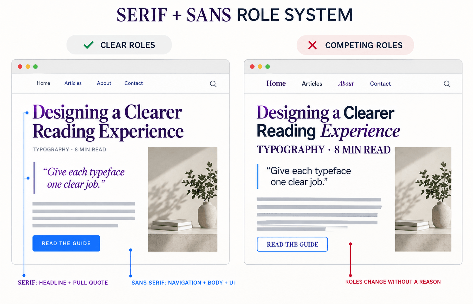
Absolutely. Serif and sans serif combinations are popular because the category contrast can create an immediate hierarchy.
That does not mean any serif and any sans serif will cooperate.
A strong pairing usually combines difference with compatibility. The families should look distinct enough to perform separate roles, yet share enough proportion, openness, or tone to feel intentional.
Start by assigning jobs:
- Use one family for expressive headings
- Use the other for body copy or interface text
- Keep navigation and controls consistent
- Avoid switching fonts simply to decorate individual sentences
- Test both families at their real sizes
Compare their x-heights and overall widths.
A small, delicate serif beside a huge geometric sans may require significant size adjustment. Look at weight too: a heavy heading should not overpower body copy so thoroughly that the page feels split between two unrelated brands.
Use the role-swap test
Preview the pairing once with the serif as the expressive font and the sans serif as the functional font.
Then reverse their roles.
If one arrangement immediately feels more natural, you have learned something important about the strengths of both families. The test may reveal that the serif is too delicate for body copy, the sans serif lacks enough personality for headlines, or the two fonts compete when given equal prominence.
The goal is not to give both typefaces the same amount of attention. It is to give each one the job it performs best.
The Fontish Font Pairing Generator can help you preview combinations with realistic headlines and supporting copy before committing to a complete system.
How to Choose Between Serif and Sans Serif
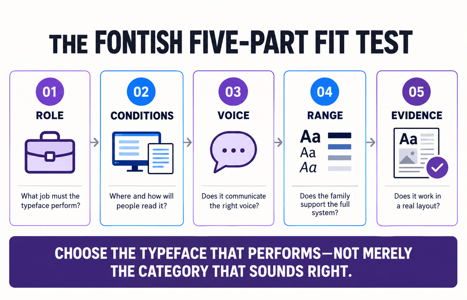
Instead of deciding by category alone, use the Fontish Five-Part Fit Test.
It evaluates whether a font fits the role, conditions, voice, range, and evidence of the actual project.
1. Define the role
Is the typeface responsible for long reading, expressive headlines, navigation, labels, packaging, or an entire brand system?
A font that excels at a 72-pixel headline may struggle in a 14-pixel form label.
Start with the job, not the mood board.
2. Examine the reading conditions
Test the typeface at its real size, on the intended device or material, and at a realistic viewing distance.
A menu printed on textured paper creates different demands from a mobile banking interface. “It looked good in the font picker” is not a testing method.
3. Match the voice
Decide what the typography should communicate: scholarly, welcoming, technical, luxurious, playful, restrained, or something else.
Then evaluate the specific typeface. Do not expect the serif or sans-serif label to make the emotional decision for you.
A useful check is to hide the brand name and color palette temporarily. If the typography still supports the intended voice, the type choice is doing real work rather than borrowing its entire personality from the surrounding design.
4. Check the family range
Confirm that the family includes the weights, italics, language support, numerals, symbols, and licensing your project requires.
A beautiful regular style is not enough if the system needs five weights, tabular numbers, multiple scripts, and a convincing italic.
Check the characters people forget too: currency symbols, quotation marks, accented letters, fractions, arrows, and punctuation.
Typography systems usually fail at the edges, not in the perfectly prepared headline.
5. Test the evidence
Build a realistic sample containing the longest headline, a paragraph, navigation, buttons, small metadata, numerals, and awkward character combinations.
If the design works only in one carefully chosen word, you have selected a specimen—not a system.
A typeface passes the Five-Part Fit Test when it performs the required role, survives real conditions, communicates the intended voice, supports the complete system, and proves itself in a working layout.
That is a more reliable decision than “serif feels classy” or “sans serif looks digital.”
Common Serif vs Sans Serif Misconceptions
Serif always means traditional
Some serifs feel historical, but others are sharp, experimental, playful, or unmistakably contemporary.
Styling, spacing, color, scale, and the surrounding design all influence the result.
Sans serif always means modern
A sans serif can feel modern, but it can also feel industrial, bureaucratic, retro, friendly, or anonymous.
Removing serifs does not automatically install a personality.
Serif is always better for print
Serifs have a strong history in print, but many sans serifs perform beautifully in books, reports, packaging, and signage.
The typeface and setting matter more than the category slogan.
Sans serif is always better for screens
Modern screens can render well-designed serifs clearly.
Sans serifs remain common in interfaces because many offer useful shapes, spacing, widths, and weight ranges—not because serifs become unreadable when electricity is involved.
Sans serif is automatically more accessible
Accessibility cannot be reduced to the absence of serifs.
Character distinction, open apertures, spacing, size, contrast, line length, and user preferences all matter.
A serif and a sans serif automatically make a good pair
Category contrast provides a starting point, not a guarantee.
The families still need compatible proportions, a clear hierarchy, and sensible roles.
Frequently Asked Questions
What is the main difference between serif and sans serif?
Serif typefaces include finishing strokes attached to parts of their letterforms. Sans-serif typefaces omit those traditional strokes.
Both categories contain many subclasses with different proportions, histories, and visual personalities.
Is serif or sans serif better for websites?
Neither category is universally better for websites.
Sans serifs are common in navigation and interfaces, while serifs can work beautifully in headlines and long-form reading. Judge the individual typeface at its intended size and across desktop and mobile screens.
Which is better for a logo?
Choose the category that supports the brand’s personality and remains recognizable at every required size.
A serif can create heritage, sophistication, or expressive distinction. A sans serif can provide clarity, flexibility, or a more direct voice.
The drawing of the actual typeface matters more than its category.
Are serif fonts harder to read on screens?
Not inherently.
Modern displays can reproduce serif details clearly, and many serif typefaces are designed specifically for screen reading. Size, spacing, contrast, stroke strength, and character design have a greater practical effect than the presence of serifs alone.
Can a brand use both serif and sans serif fonts?
Yes. Many strong brand systems use one category for expression and the other for functional text.
Give each typeface a consistent role and test how its proportions, weights, and personalities work together.
Bottom Line
The serif vs sans serif decision is not a contest with one permanent winner.
Choose a serif when its texture, structure, and personality support the message. Choose a sans serif when its shapes, range, and efficiency suit the job.
Use both when the contrast creates a clearer and more useful hierarchy.
Most importantly, test the actual typeface under real conditions.
Readers do not experience a category label. They experience the letters, spacing, hierarchy, and decisions you put in front of them.
Remember the Fontish rule:
The category helps you search. The role helps you choose.
If you are still comparing options, explore the Fontish typography tools to test font personalities, combinations, and type systems before making the final call.