

In This Pairing
Some font pairings attract attention by shouting. Libre Baskerville and Inter do something smarter: they create authority through contrast.
Libre Baskerville brings literary warmth and recognizable editorial character, while Inter keeps navigation, supporting copy, and interface elements precise.
This font pairing works especially well for websites that need to feel established without looking old-fashioned. Think thoughtful publications, professional services, cultural brands, education platforms, and premium blogs.
If you are building a broader type system, our guide to font pairing will help you evaluate contrast, hierarchy, and readability before choosing any two families.
- Editorial websites
- professional services
- education platforms
- and cultural brands
- Playful
- experimental
- ultra-futuristic
- and highly expressive visual identity
- Intelligent
- trustworthy
- structured
- and quietly confident
Libre Baskerville and Inter combine classic serif personality with modern functional clarity. Use Libre Baskerville for prominent editorial text and Inter for everything that must remain fast, clean, and effortless to scan.
✅ Choose it when: You want credibility, warmth, and a polished digital experience.
❌ Avoid it when: You need an aggressively futuristic, playful, or ultra-minimal identity.
The pairing is flexible, but its strongest version is not a 50/50 split. Libre Baskerville should create the memorable moments; Inter should quietly organize the experience around them.
Test Libre Baskerville + Inter in the Fontish Font Pairing Generator before committing it to a full website or brand system.
Taken together, Libre Baskerville and Inter form a balanced typographic system—serif for expressive voice and sans serif for clarity and structure.
Meet the Pair
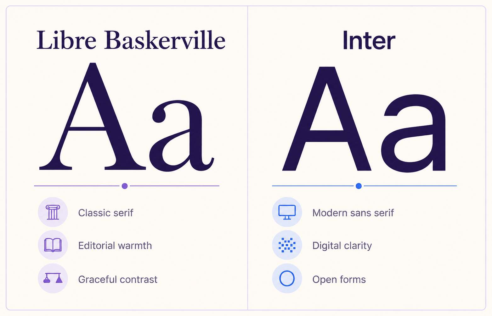
Libre Baskerville: the editorial voice
Libre Baskerville is a screen-oriented revival based on an American Type Founders Baskerville design from 1941. Its taller x-height, wider counters, and slightly reduced contrast make it more practical on screens than a delicate historical revival.
The result still feels literary, but it does not fall apart when used on a modern website.
Its strongest traits are the shaped serifs, graceful curves, and visible thick-to-thin stroke contrast. These details make headlines feel considered rather than merely large.
You can explore the source and design background in the official Libre Baskerville project.
Libre Baskerville is not a huge family, so it rewards restraint. Regular, italic, and bold cover most editorial needs, but they do not offer endless levels of emphasis. That limitation is one reason Inter makes such a useful partner.
Inter: the digital organizer
Inter is a neo-grotesque sans serif designed by Rasmus Andersson for screens and interfaces. Its tall x-height, open forms, extensive weight range, variable-font support, and practical OpenType features give it the flexibility Libre Baskerville lacks.
Where Libre Baskerville asks to be noticed, Inter makes information easy to use. It performs well in paragraphs, menus, buttons, forms, metadata, captions, and dense interface components.
The official Inter website provides current font files, specimens, and technical details.
The useful contrast here is not simply “serif versus sans serif.” It is expressive hierarchy versus functional continuity. One font establishes the voice; the other keeps the system working.
Live Pairing Preview
Good typography does more than decorate a page. It helps readers understand where to begin, what matters most, and how each idea connects to the next.
ABCDEFGHIJKLMNOPQRSTUVWXYZ
abcdefghijklmnopqrstuvwxyz
0123456789 ! ? & % $ # @ ( ) [ ] : ; , .
For the most reliable starting point, set Libre Baskerville headlines between 40 and 64 pixels on desktop, then use Inter at 17 to 19 pixels for body copy.
On smaller screens, reduce the display size without tightening the line height too aggressively.
Why This Pairing Works
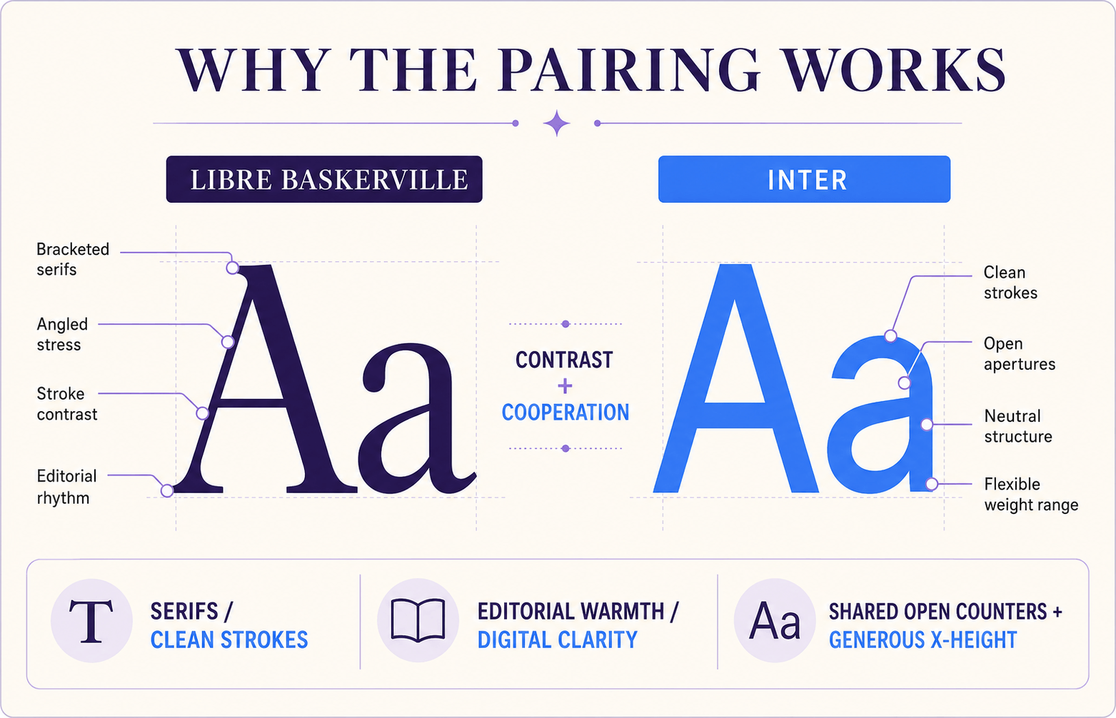
It creates visible contrast without visual conflict
Libre Baskerville has angled stress, bracketed serifs, curved terminals, and a traditional rhythm. Inter has cleaner strokes, open apertures, and a neutral structure.
Their silhouettes are different enough for readers to recognize a hierarchy instantly, yet both are highly readable on screen.
This matters because weak pairings often sit in an awkward middle ground: too similar to create hierarchy, but different enough to look accidental. Libre Baskerville + Inter avoids that trap.
Their proportions cooperate
Both fonts have relatively generous x-heights and open counters. That shared openness helps them feel compatible even though their historical personalities differ.
You get contrast in style without a dramatic mismatch in scale or texture.
One supplies character; the other supplies range
Libre Baskerville gives a layout distinction quickly. Inter then provides the practical weight ladder—Regular, Medium, SemiBold, Bold, and beyond—needed for navigation, captions, labels, cards, and interface states.
Myth to retire: A serif and sans serif pair automatically works because the categories are different. It does not. Category contrast is only the beginning; proportion, spacing, tone, and assigned roles still need to cooperate.
Font Roles
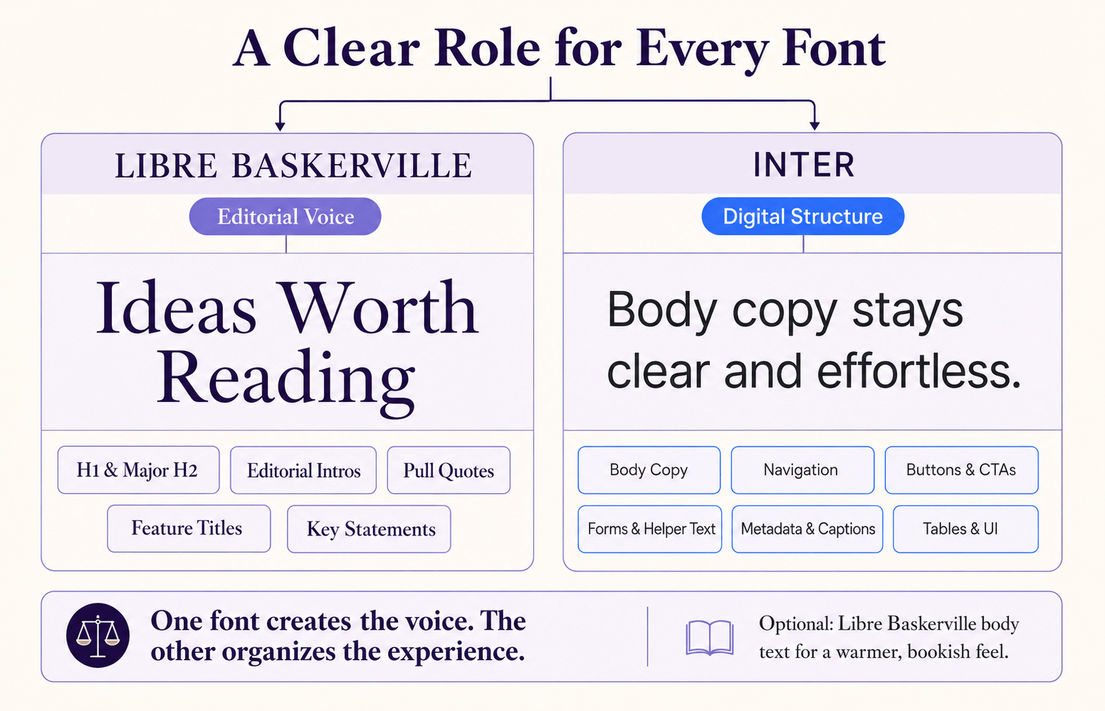
Use Libre Baskerville where personality earns attention:
- H1 and major H2 headings
- Editorial introductions
- Pull quotes and testimonials
- Feature titles
- Short, high-value statements
Use Inter where clarity must remain consistent:
- Body copy
- Navigation and breadcrumbs
- Buttons and calls to action
- Form labels and helper text
- Dates, categories, captions, and metadata
- Tables, dashboards, and UI components
For a warmer long-form article, you can reverse one role and set body copy in Libre Baskerville. If you do, keep Inter for navigation, labels, and controls. The pairing still works, but the page will feel more bookish and less product-oriented.
Avoid switching fonts line by line merely to add variety. A typography system feels professional when each family has a predictable job.
Libre Baskerville and Inter Best Use Cases
Libre Baskerville brings expressive, literary headlines while Inter keeps articles, metadata, and navigation clean and highly readable.
The serif adds trust and authority, while Inter ensures clarity in forms, dashboards, and service information—balancing credibility with usability.
Libre Baskerville delivers a scholarly, institutional tone, while Inter structures learning content, UI elements, and navigation for effortless comprehension.
Note: These use cases work well because they balance expressive editorial tone with clear digital functionality. Libre Baskerville provides authority and narrative weight, while Inter ensures readability and consistency for UI and supporting content, reflecting a natural split between storytelling and structure.
Real-world example:
Imagine an independent policy journal. Libre Baskerville sets the issue title and article headlines, while Inter handles summaries, filters, bylines, footnotes, and the membership interface.
The journal feels credible before a word is read, yet the website behaves like a modern product.
Pairing Formula
H1 and major H2 headings
H3 headings, labels, and buttons
Strong contrast, readable hierarchy, and a polished digital experience.
A reliable weight formula is:
- Libre Baskerville Bold for H1 and major H2 headings
- Libre Baskerville Italic for quotations or selective emphasis
- Inter SemiBold for H3 headings, labels, and buttons
- Inter Regular for paragraphs and supporting content
- Inter Medium for navigation and compact metadata
Do not make every element bold. The pairing gains sophistication from contrast between shape, size, spacing, and weight—not from turning the whole page into a typographic shouting match.
Website Implementation
You can self-host both families or load them through a font service. Fontsource’s Libre Baskerville package is a useful option for developers who prefer package-based installation and self-hosting.
:root {
  --font-display: "Libre Baskerville", Georgia, serif;
  --font-ui: "Inter", system-ui, -apple-system, BlinkMacSystemFont, sans-serif;
}

body {
  font-family: var(--font-ui);
  font-size: 1.125rem;
  line-height: 1.7;
}

h1,
h2 {
  font-family: var(--font-display);
  line-height: 1.15;
  letter-spacing: -0.02em;
}

h1 {
  font-size: clamp(2.5rem, 6vw, 4.5rem);
  font-weight: 700;
}

h3,
nav,
button,
.eyebrow,
.meta {
  font-family: var(--font-ui);
}

button,
.eyebrow {
  font-weight: 600;
}
Load only the weights and styles you actually use.
A sensible first build might include Libre Baskerville Regular, Italic, and Bold, plus Inter Regular, Medium, and SemiBold.
If your stack supports variable fonts, Inter can cover its range with fewer files.
Use font-display: swap when self-hosting, preload only critical files, and test real content rather than a polished two-line specimen.
Long headlines, numbers, punctuation, links, and translated copy reveal problems much faster than “The quick brown fox.”
Open the Fontish Type Scale Builder and test the complete hierarchy at desktop and mobile sizes before publishing.
Common Mistakes
Libre Baskerville and Inter create the clearest hierarchy when each font has a distinct role. The wrong example makes both typefaces compete, while the corrected version lets the serif lead and the sans serif support it.
Libre Baskerville and Inter are both bold, oversized, and visually demanding, leaving readers unsure which element deserves attention first.
Both typefaces demand attention, weakening the hierarchy and making the paragraph unnecessarily difficult to read.
Libre Baskerville brings literary character to the headline, while Inter keeps the supporting message clean, modern, and effortless to read.
Use Libre Baskerville for expressive headings and Inter for body copy, navigation, labels, and interface elements.
Using Libre Baskerville for every interface element
Serifs are not forbidden in interfaces, but Libre Baskerville is a poor choice for tiny filter labels, dense settings panels, and compact buttons. Inter is clearer and more flexible in those roles.
Making the fonts compete for the headline
Avoid placing a large Libre Baskerville title directly beside an equally large, equally bold Inter subheading. Give the serif the leading role and reduce the sans serif in size, weight, or color.
Setting Inter too tightly
Inter can tolerate compact spacing, but very tight tracking across uppercase navigation or small labels reduces clarity. Start near the default spacing and adjust only after testing at the final size.
Overusing Libre Baskerville italic
The italic is expressive, which makes it useful for quotes and emphasis. Used across long passages or multiple cards, it becomes visually busy and loses its special role.
Test type size, line height, weight, color, and spacing together. The professional mistake is judging the pairing from two font names in a dropdown and assuming the rest will solve itself.
Libre Baskerville and Inter Similar Pairings
| Pairing | Personality | Best for | Why consider it |
|---|---|---|---|
| Playfair Display + Inter | Elegant, dramatic, and editorial | Luxury brands, fashion, magazines, premium portfolios | Creates stronger display contrast and more visual drama than Libre Baskerville + Inter |
| Lora + Poppins | Warm, friendly, and approachable | Lifestyle brands, creative education, wellness, modern blogs | Feels softer and more welcoming, with less institutional formality |
| Merriweather + Inter | Practical, dependable, and contemporary | Publications, knowledge platforms, news sites, long-form reading | Provides sturdier serif text and greater comfort at smaller reading sizes |
| Libre Baskerville + Source Sans 3 | Trustworthy, accessible, and understated | Nonprofits, education, public services, cultural organizations | Offers a warmer, more humanist alternative to Inter’s product-oriented precision |
Each alternative shifts the mood in a different direction, so choose based on the personality and practical demands of your project.
The best pairing is not simply the most attractive, it is the one that gives every typeface a clear job.
Quick Reference Cheat Sheet
| Decision | Recommendation |
|---|---|
| Main headline | Libre Baskerville Bold |
| Section headings | Libre Baskerville Bold |
| Body copy | Inter Regular |
| Long editorial body copy | Libre Baskerville Regular as an alternative |
| Navigation | Inter Medium |
| Buttons | Inter SemiBold |
| Labels | Inter Medium, optional uppercase |
| Recommended contrast | Medium to high |
| Ideal visual style | Classic editorial minimalism |
| Best background | Warm white, cream, pale gray, or deep ink |
| Avoid | Equal font dominance, excessive italics, and crowded layouts |
| Overall verdict | Highly recommended |
Frequently Asked Questions
Is Libre Baskerville and Inter a good font pairing?
Yes. Libre Baskerville provides editorial character, while Inter provides modern clarity and a broad range of practical weights. Their different structures create a clear hierarchy without making the page feel disconnected.
Which font should I use for headings?
Use Libre Baskerville for major headings when you want the pairing’s classic personality to lead. Inter works well for H3 headings, labels, and interface titles where compact clarity matters more than decoration.
Can Libre Baskerville be used for body text with Inter?
Yes. Libre Baskerville was adapted for on-screen reading and can work well for long-form body copy. Keep the size generous—usually at least 17 pixels on the web—and use Inter for navigation, metadata, and controls.
What weights work best for Libre Baskerville + Inter?
Start with Libre Baskerville Bold for major headings, Regular for occasional editorial text, and Italic for short emphasis. Pair those with Inter Regular for body copy, Medium for navigation, and SemiBold for buttons or subheadings.
Are Libre Baskerville and Inter free for commercial use?
Both families are distributed under the SIL Open Font License 1.1, which permits commercial use. Review the license files included with the fonts, especially if you plan to modify or redistribute them.
Libre Baskerville + Inter: Bottom Line
Libre Baskerville and Inter succeed because neither font tries to do the other’s job. Libre Baskerville creates distinction, voice, and trust. Inter turns that personality into a clear, flexible digital system.
Start with a simple division: Libre Baskerville for the moments readers remember and Inter for the information they need to use.
Then refine the scale, weights, spacing, and responsive behavior with real content. Get those roles right, and Libre Baskerville + Inter can make a website feel classic, current, and quietly confident all at once.
Build your first Libre Baskerville and Inter specimen in the Fontish Pairing Generator, test it on mobile, and save the strongest hierarchy as the foundation of your design system.