
 I
I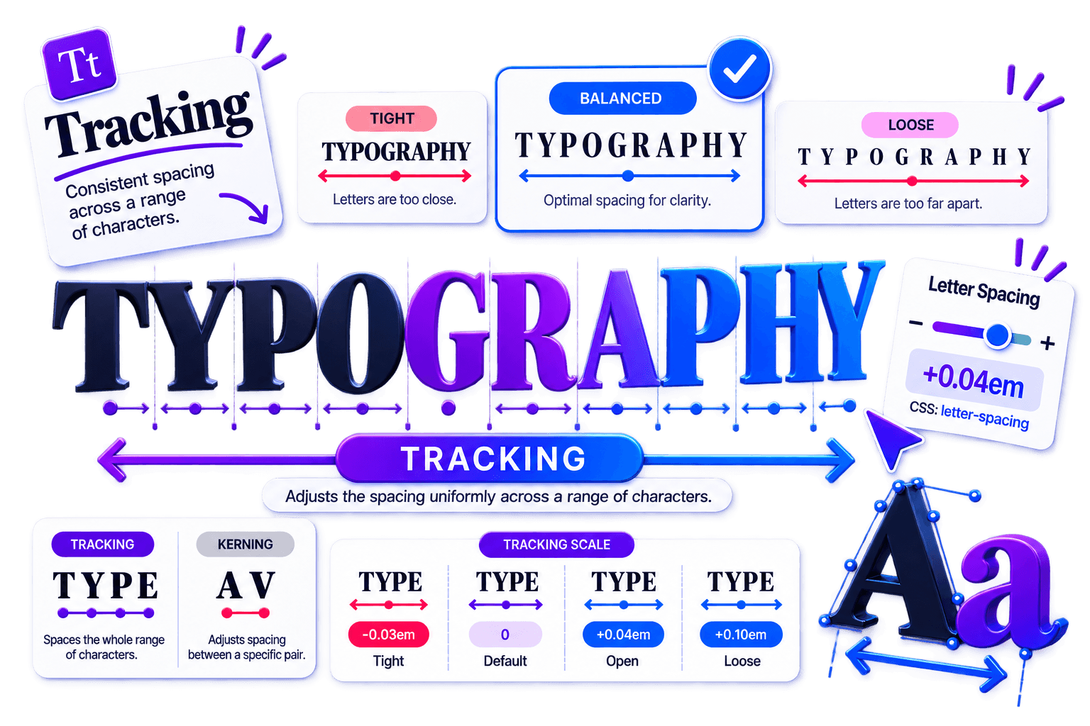
On This Page
Tracking is the quiet spacing control that can make a good font look deliberate or make an expensive typeface look oddly homemade.
It changes the overall space across a selected group of letters, shaping how compact, open, calm, or energetic the text feels. Within the broader system of typography, it is one of the fastest ways to refine horizontal rhythm.
The adjustment is subtle.
Readers may never point at the spacing and say, “Excellent tracking,” but they will feel the result in clearer headlines, cleaner labels, and wordmarks that look considered instead of merely typed.
The trick is restraint.
Tracking can improve hierarchy and tone, but it cannot rescue the wrong font, poor kerning, or an overcrowded layout.
Start with the typeface designer’s spacing, make small optical corrections, and judge the result in its real context—not on a lonely word floating at 400% zoom.
Tracking is the uniform adjustment of spacing across a selected range of characters. In web design, tracking is normally implemented with CSS letter-spacing. The concepts are closely related, although browser rendering and professional layout applications may measure and apply the adjustment differently.
What Is Tracking in Typography?
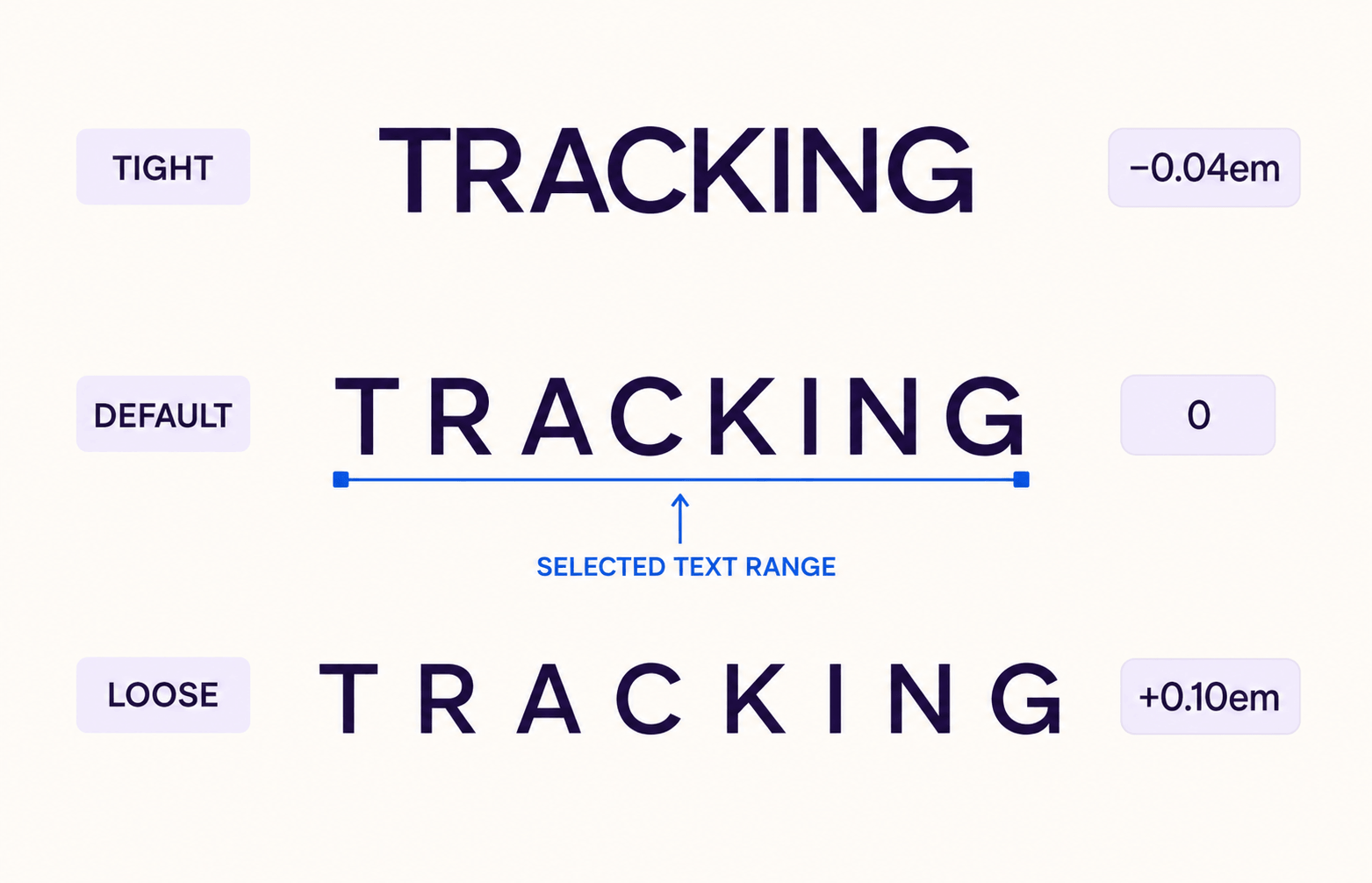
Tracking in typography means loosening or tightening the spacing throughout a word, line, or block of text.
Unlike kerning, which corrects the space between a particular pair such as “AV” or “To,” tracking applies an overall adjustment to the selected characters. Adobe’s explanation of kerning and tracking makes the same distinction: kerning works pair by pair, while tracking changes a range.
In many professional layout applications, tracking is measured in thousandths of an em. A value of +20 therefore adds 20/1000 em between characters; because the em scales with type size, the visible space grows as the text grows.
The number is useful for repeatability, but it is not a universal recipe. +20 in a narrow sans serif can look very different from +20 in a wide display face.
Simple model: Built-in character spacing + tracking adjustment = final overall letter spacing.
The browser equivalent is CSS letter-spacing. Positive values open the text; negative values tighten it. Because the property adds to the font’s natural spacing, letter-spacing: 0 is not “no spacing”—it preserves the font’s built-in spacing without adding an extra adjustment.
Why Tracking Matters in Design
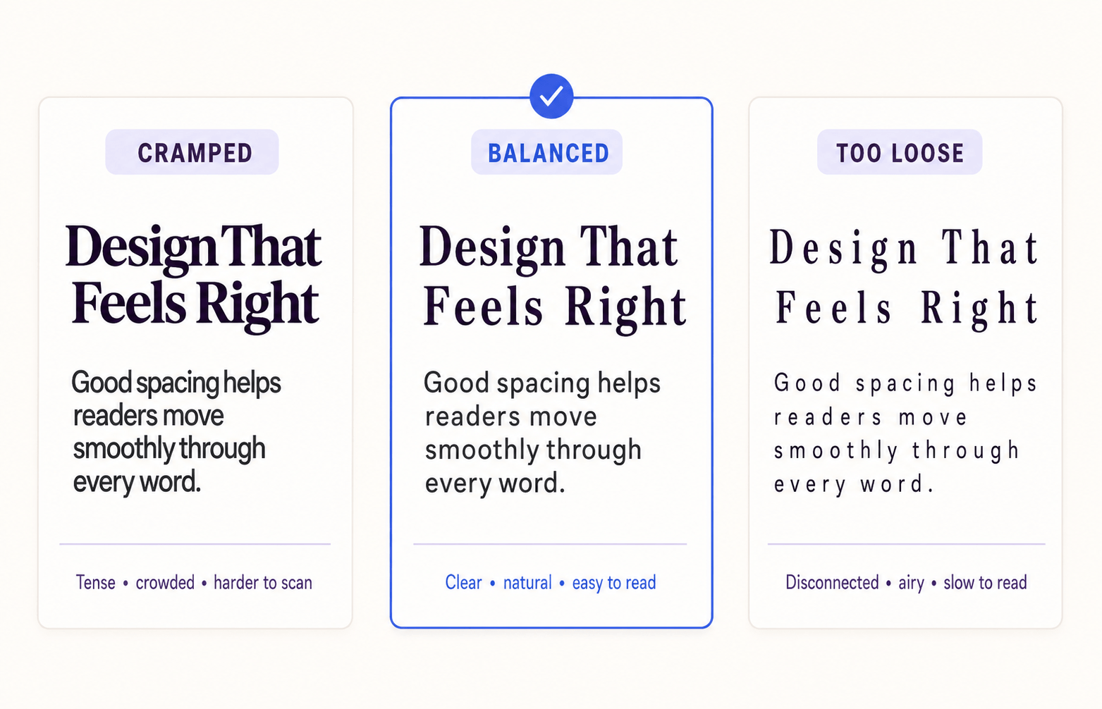
Tracking changes both function and personality. When letters are too close, shapes collide, and word recognition slows.
When they are too far apart, familiar word shapes begin to dissolve into individual characters. Balanced spacing keeps the letters distinct while preserving the word as one readable unit.
It also provides a layer of hierarchy without another font size or weight.
A compact display headline can feel forceful; a gently opened uppercase eyebrow can feel refined and easy to scan. The effect is strongest in large type, where every gap becomes visible.
Body copy usually needs less intervention because well-made fonts are already spaced for continuous reading.
MYTH DEBUNKED: “Wide tracking always looks premium.” It does not. Luxury comes from proportion, type choice, layout, and restraint. Excessive spacing merely makes the word look lost.
Accessibility sets a useful boundary: text must remain readable when users override spacing. WCAG 2.2 text-spacing guidance requires content to stay functional when letter spacing is increased to at least 0.12 times the font size.
That is a resilience test, not a recommendation to apply 0.12em to every design by default.
How Tracking Works
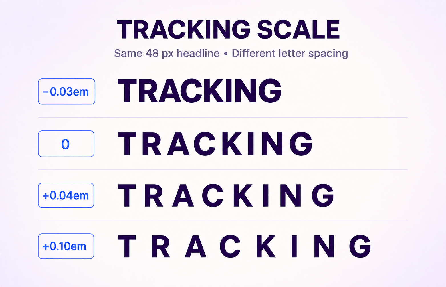
Begin with the font’s default spacing at the real size and width. Then move in small increments and compare nearby options.
For a web headline, you might test letter-spacing: -0.02em, 0, and 0.03em; for an uppercase label, a wider range may be appropriate. These are test points, not commandments from the typography mountain.
Body text rewards restraint. Keep tracking at normal or very close to it unless testing reveals crowding. Large headings offer more freedom, but check every line break: a value that improves one line can force an awkward wrap on another.
Uppercase text often accepts positive tracking well because capitals have more uniform silhouettes; lowercase words depend more heavily on familiar internal rhythm.
Practical web example: .eyebrow { text-transform: uppercase; letter-spacing: 0.08em; }
Tracking also interacts with weight, width, and size.
Heavy or condensed type may need a touch more room at small sizes, while very large bold headlines can often be tightened.
Use the Fontish Type Scale Builder to settle hierarchy and size first, then tune spacing at desktop and mobile widths. If a font’s overall proportions are fighting the project, revisit how to choose the right font before trying to repair everything with tracking.
MINI CASE STUDY: A 48 px uppercase editorial masthead was tested at 0, +0.04em, and +0.10em. The middle setting created clearer separation without breaking the word shape; +0.10em looked airy in isolation but weak beside the page’s dense body copy. The winning value came from the layout relationship, not the number alone.
Common Mistakes Designers Make With Tracking
Compare universal letter spacing with role-based tracking that responds to the text’s size, case, weight, and purpose.
The same wide tracking is applied to every text style.
Applying one tracking value everywhere makes headings feel weak, body text harder to read, and compact interface labels unnecessarily wide.
Each text role receives only the spacing adjustment it needs.
Adjusting tracking by role preserves readable body copy while giving headlines and uppercase labels the right visual rhythm.
❌ Professional mistake: applying one tracking value to every text role. A setting that suits a 56 px hero headline can damage a 16 px paragraph, a compact navigation label, or a button with limited width. Typography systems need role-based spacing, not one global magic number.
❌ Adding wide tracking to long body paragraphs until words begin to fall apart.
❌ Over-tightening bold headlines until counters close or letters touch.
❌ Using tracking to fix one awkward pair that actually needs kerning.
❌ Copying a “premium” value from another font without testing the current typeface.
❌ Checking only a desktop artboard and ignoring mobile wraps, localization, and zoom.
✅ Testing complete words, punctuation, numbers, and responsive states.
Do not use tracking as a substitute for word spacing, line length, or leading. Diagnose the direction and scale of the problem first: one pair, all letters, all words, or all lines. The correct control becomes much easier to choose.
Professional Tips for Mastering Tracking
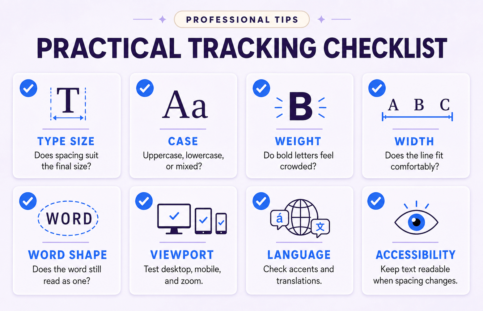
✅ Start at the typeface default. Change tracking only when you can name the problem or intended effect.
✅ Adjust in small steps and compare three versions side by side; memory is a poor spacing ruler.
✅ Zoom out to judge texture, then return to 100% to inspect collisions and word recognition.
✅ Test uppercase, lowercase, numbers, punctuation, links, and accented characters.
✅ Review the final text in context, including neighboring headings and body copy.
✅ Inspect mobile, large screens, browser zoom, and translated strings before publishing.
Designer tip: Squint slightly or blur the screen. A well-tracked headline should hold together as one shape. If it turns into a dark brick, loosen it; if it becomes a row of unrelated symbols, tighten it.
For a new typeface, inspect its built-in character set and spacing behavior with the Fontish Font Inspector.
If the design uses two families, test tracking after assigning clear roles; the guide to pairing fonts helps establish that system before spacing refinements begin.
Tracking vs. Related Typography Concepts
Before comparing tracking with other core typography controls, it helps to understand how each spacing system affects text at a different level.
The table below breaks down the key differences between tracking, kerning, leading, and word spacing so you can quickly see when to use each one and avoid common spacing mistakes.
| Concept | What it controls | Best used for |
| Tracking | Overall spacing across a selected character range | Changing density, rhythm, and tone |
| Kerning | Space between specific letter pairs | Correcting exceptions such as AV, To, or Wa |
| Leading | Vertical baseline-to-baseline distance | Improving paragraph rhythm and multiline readability |
| Word spacing | Space between words | Refining justified text or special display treatments |
The simplest diagnosis is scale. If one pair looks wrong, kern it. If the whole word or line feels too dense or airy, adjust tracking.
If lines collide or drift apart vertically, change leading. If the gaps between words are the issue, address word spacing or justification. The Fontish Typography Dictionary is a useful place to keep these controls straight.
Advanced insight: Tracking and manual kerning are cumulative in professional layout software. Establish the overall rhythm with tracking first, then correct exceptional pairs with kerning. Reversing that order can turn a clean system into a collection of tiny compensations.
The Bottom Line
Tracking is not decoration; it is control over the horizontal rhythm of type. Used carefully, it improves headline texture, strengthens hierarchy, clarifies uppercase labels, and helps a wordmark feel intentionally drawn rather than casually typed.
The professional habit is simple: respect the font’s default spacing, adjust by role, compare nearby values, and test the final words in the real layout.
Open one current design and make three small tracking variations. The best option should not announce the spacing—it should make the typography feel inevitable.
Frequently Asked Questions
What is tracking in typography?
Tracking is the uniform adjustment of spacing across a selected range of characters. It can tighten or loosen a word, line, or text block without changing the typeface itself.
What is the difference between tracking and kerning?
Tracking changes overall spacing across multiple characters, while kerning adjusts the space between one specific pair. Use tracking for rhythm and density; use kerning to fix exceptions.
Does tracking affect readability?
Yes. Tracking that is too tight can merge letter shapes, while tracking that is too loose can break familiar word shapes apart. Body text usually performs best near the font’s default spacing.
How do I set tracking in CSS?
Use the letter-spacing property, such as letter-spacing: 0.04em. Relative em values scale with the font size, but every typeface and text role still needs visual testing.
Should uppercase text use more tracking?
Often, but not automatically. Uppercase labels and display words frequently benefit from modest positive tracking, while bold or very large capitals may already have enough space. Judge the typeface, size, and context together.