
 I
I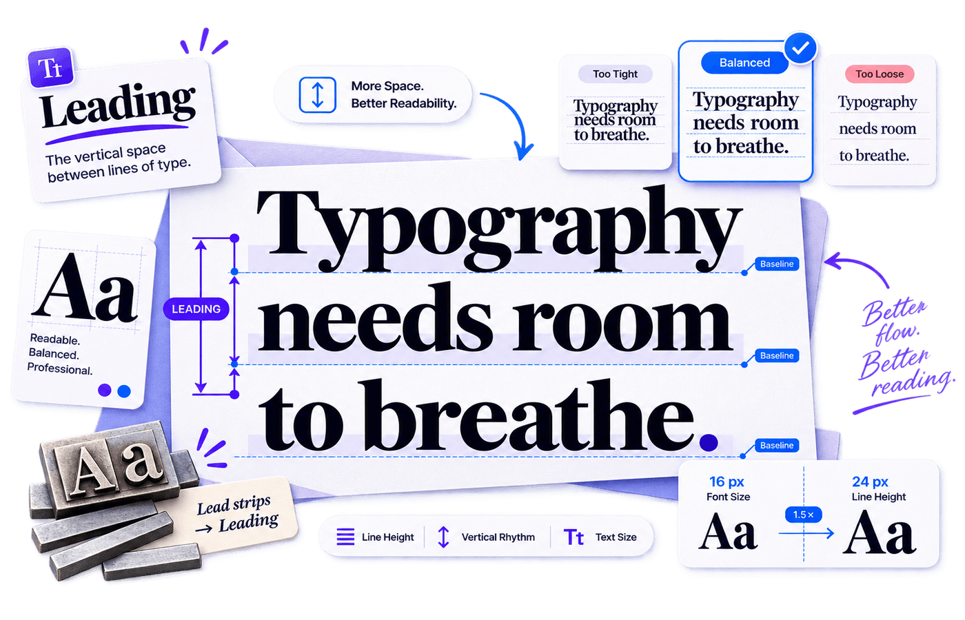
On This Page
Leading is the vertical space between one line of text and the next. It might seem like a tiny detail, but it’s one of the biggest reasons a paragraph feels effortless to read—or strangely exhausting.
Think of leading as the breathing room in your typography. Too little, and lines crowd together. Too much, and the eye struggles to connect one line to the next. Get it right, and your content feels balanced, readable, and surprisingly comfortable.
The name comes from traditional letterpress printing, where thin strips of lead were placed between rows of metal type to increase line spacing.
We no longer stack pieces of metal between letters, but the principle hasn’t changed.
In modern web and print design, leading controls the vertical rhythm of text and is typically managed using the CSS line-height property.
Leading is the distance from one baseline of text to the next. In web design, it is usually controlled with the CSS line-height property.
What Is Leading in Typography?
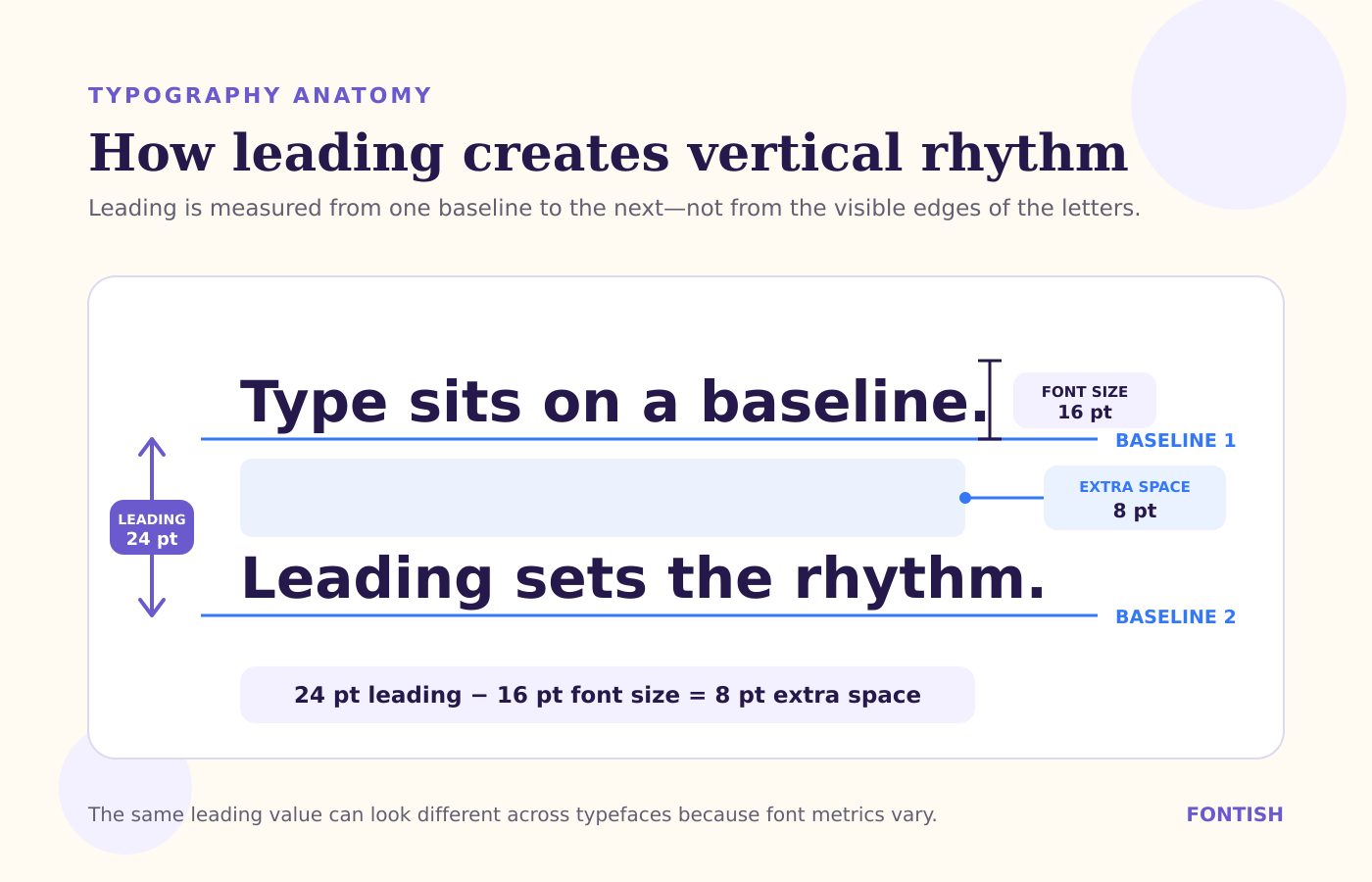
In traditional typography, leading referred to the extra strips placed between lines of type. In modern design software, the term is often used more broadly for the total baseline-to-baseline distance.
So when a designer says “16-point type with 24-point leading,” the text size is 16 points and each baseline sits 24 points below the previous one.
That leaves 8 points of additional vertical room. The basic relationship is simple:
Simplified traditional calculation: leading value − font size = additional vertical space.
Example: 24 pt − 16 pt = 8 pt of extra space.
On the web, CSS uses line-height to define the height of each line box. The browser generally distributes the extra space above and below the glyphs as “half-leading.”
Because typefaces have different ascenders, descenders, and internal metrics, the same line-height can look different from one font to another.
Why Leading Matters in Design
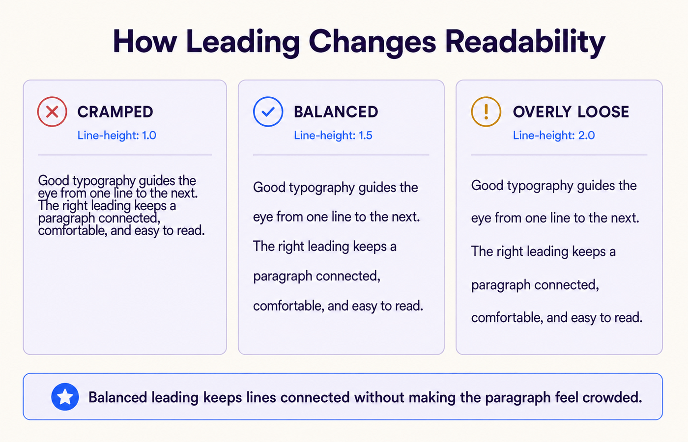
Good leading creates an easy vertical path for the eye. When the spacing is too tight, descenders and ascenders begin to crowd each other, especially in typefaces with tall lowercase forms.
When it is too loose, each line starts to feel like a separate paragraph, and the reader has to work harder to find the next one.
Leading also changes tone. Tight spacing can feel energetic, dense, or editorial.
Generous spacing can feel elegant and relaxed. Neither is automatically correct; the right choice depends on the text size, line length, typeface, medium, and reading task.
MYTH DEBUNKED: “More line spacing always improves readability” is false. Extra space helps only up to the point where the lines stop feeling connected. Leading should create rhythm, not scatter the paragraph.
For accessibility, flexible spacing matters as much as the initial value.
The W3C explains that content should remain usable when readers increase line height to at least 1.5 times the font size. That is a robustness test, not a command that every heading, label, or button must use 1.5 by default.
How Leading Works
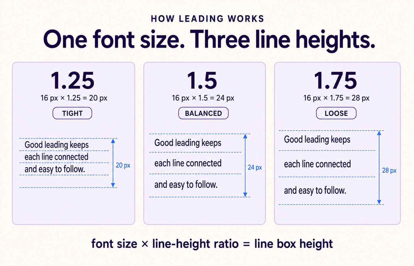
Start with the font size, then choose a line-height ratio. A unitless CSS value is usually the most resilient because it scales with inherited font sizes.
For example, 16 px text with line-height: 1.5 produces a 24 px line box. If the font size changes to 20 px, the line box becomes 30 px automatically.
WEB EXAMPLE:body { font-size: 18px; line-height: 1.6; }
18 × 1.6 = 28.8 px line height.
For digital body copy, 1.5–1.7 is a strong accessible starting range, although some typefaces and layouts may work slightly below or above it after careful testing.
Large display headings often need tighter leading, perhaps 0.95–1.2, because their letterforms already create strong visual mass.
Small text, long lines, and typefaces with a high x-height often benefit from more room.
Line length and leading work as a pair. Longer lines require a larger horizontal return, so a little more leading helps the eye locate the next line. Narrow columns can often use tighter spacing.
If you change the width of a text block, check the leading again rather than assuming the old setting still works.
A practical workflow is to establish font size and hierarchy first with the Fontish Type Scale Builder, then tune leading at real desktop and mobile widths.
Example: A Responsive Blog Article
Imagine an article using 18 px body text across a wide desktop column and a narrow mobile screen.
A line-height of 1.55 may feel balanced on desktop, while the mobile layout may need a small adjustment because the text wraps more frequently.
Testing both layouts prevents the desktop version from feeling cramped and the mobile version from becoming unnecessarily tall.
Common Mistakes Designers Make With Leading
Compare a universal line-height with leading adjusted for each text role and screen size.
The same line-height is applied to headings, body text, and captions.
A single value makes headings feel loose, body text cramped, or both—especially when the viewport changes.
Leading is tuned for the text role, typeface, line length, and viewport.
Role-specific leading creates clearer hierarchy, smoother reading, and more consistent vertical rhythm.
PROFESSIONAL MISTAKE: Applying one line-height value to every text style. Body copy, display headings, captions, buttons, and pull quotes have different jobs and should not all inherit the same visual rhythm.
A second mistake is judging leading with one perfect two-line sample. Real articles contain capitals, punctuation, links, emphasized words, and paragraphs of different lengths.
Test a complete content block, not a showroom sentence.
- ✕ Using fixed pixel line heights that fail when users resize text.
- ✕ Increasing leading to compensate for lines that are simply too long.
- ✕ Ignoring the typeface’s x-height, weight, and ascenders or descenders.
- ✓ Testing body copy at several viewport widths and zoom levels.
- ✓ Checking headings separately, especially when they wrap to two or three lines.
One more trap: do not confuse space between lines with space between paragraphs.
Leading controls rhythm inside a paragraph; paragraph spacing separates distinct ideas. Using excessive line-height to create paragraph separation weakens both.
Professional Tips for Mastering Leading
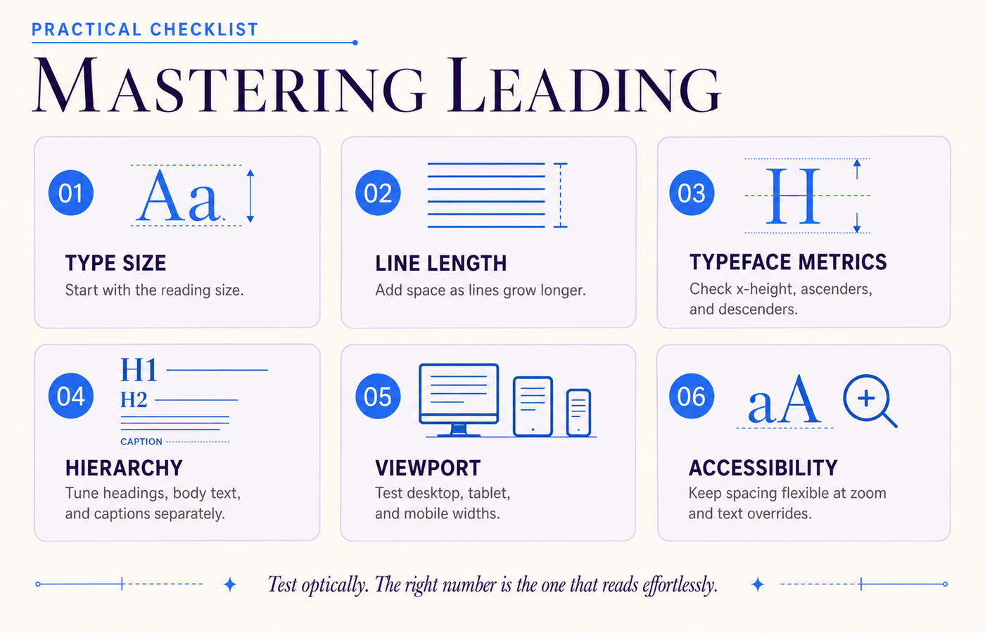
Begin optically. Set a sensible ratio, step back, and look for a continuous block of text rather than individual stripes. Then read it at normal speed. If your eye skips lines, tighten or loosen the setting in small increments.
- For body text, test 1.4, 1.5, and 1.6 before making finer adjustments.
- For display headings, reduce leading until the lines feel connected without collisions.
- Increase leading slightly for long lines, small sizes, or heavy weights.
- Test bold, italic, linked, and accented characters—not only plain English text.
- Use unitless
line-heightin CSS when inheritance and responsive scaling matter.
When choosing a typeface, consider spacing behavior alongside personality. Our guide to choosing the right font shows how readability, context, and practical constraints should work together.
DESIGNER TIP: Blur your eyes slightly or zoom out. A well-led paragraph should appear as an even gray texture with clear line separation—not a dark slab and not a stack of floating ribbons.
Leading vs. Related Typography Concepts
| Concept | What it controls | Typical use |
|---|---|---|
| Leading | Vertical distance between lines | Paragraph rhythm and readability |
| Tracking | Overall spacing across a range of characters | Tone, density, and uppercase labels |
| Kerning | Space between specific character pairs | Polishing logos, headlines, and display type |
| Paragraph spacing | Space between separate paragraphs | Grouping and separating ideas |
If leading is vertical rhythm, tracking is horizontal atmosphere. Changing tracking will not fix crowded lines, and changing leading will not repair an awkward “AV” or “To” pair. Diagnose the direction of the spacing problem before touching a control.
For beginners looking to better understand how typography affects readability, the Fontish guide to font design offers a simple introduction to key principles.
The Bottom Line
Leading is one of typography’s quiet power tools. Readers may never name it, but they feel it in every comfortable paragraph and every cramped block of copy.
Start with a sensible ratio, adjust for the typeface and line length, then test the result in the real layout.
The goal is not to find one magical number. It is to create a clear vertical rhythm that keeps lines connected, gives letters room to breathe, and helps the reader forget about formatting altogether.
Open your current design, test three nearby values, and choose the one that makes reading feel effortless.
If you want to see how leading behaves in real-world typefaces, our font review articles on Poppins and Playfair Display are a great next step.
Frequently Asked Questions
What is the difference between leading and line spacing?
They are commonly used as synonyms. Historically, leading meant extra space added between metal lines of type, while modern software often uses “leading” or “line spacing” for the full baseline-to-baseline measurement.
What is a good leading value for body text?
A line-height around 1.4–1.7 is a useful starting range for digital body text. The best value depends on the font, size, weight, line length, and screen width, so always test the actual content.
Should leading be larger than the font size?
Usually, yes for body copy. For example, 16 px type may use a 24 px line height. Large display headings can use a line height close to—or occasionally slightly below—the font size when the letterforms allow it.
How do I set leading in CSS?
Use the line-height property. A unitless value such as line-height: 1.5 is often preferable because it scales with the element’s font size and inherits more predictably.
Does WCAG require a line-height of 1.5?
WCAG 2.2 Success Criterion 1.4.12 does not simply require every design to begin at 1.5. It requires content to remain functional and readable when users override line height to at least 1.5 times the font size.