 I
I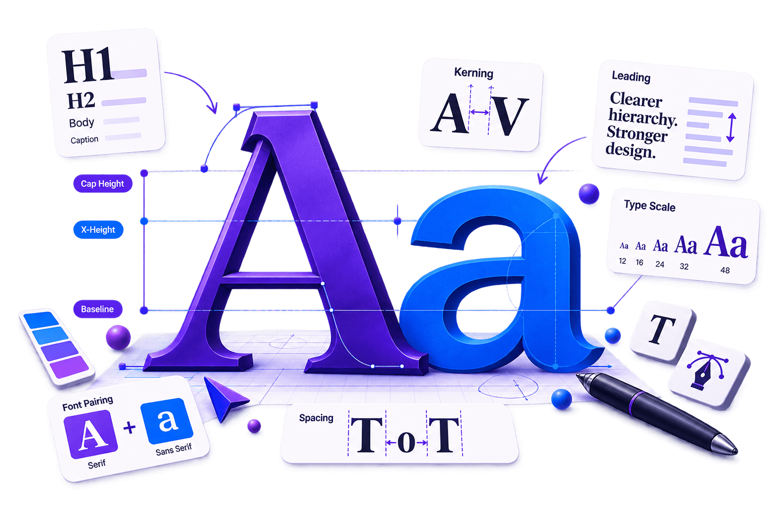
In This Guide
Typography is the art and practical craft of arranging type so written language is clear, readable and visually appropriate.
It includes the typefaces you choose, but also their size, weight, hierarchy, spacing, line length, alignment and relationship with the surrounding design.
For beginners, that distinction matters because typography is not simply “choosing a nice font”. A beautiful typeface can still produce a miserable page when the body text is tiny, the lines stretch across the screen and every heading shouts at the same volume.
Good typography gives words structure. It tells readers where to begin, what matters and how ideas are connected.
This guide turns the essential typography principles for beginners into a practical system. For deeper explanations of individual concepts, explore Fontish’s leading explainer, tracking explainer and complete font-pairing guide.
Typography Is the Design of Written Language
Typography shapes how written information looks, feels and functions.
It influences whether readers can recognise individual characters, follow a paragraph comfortably and understand the order of information on a page.
It also helps establish a brand’s personality before someone has consciously processed every word.
A sturdy grotesque can feel direct and modern. A high-contrast serif may feel editorial or luxurious. A rounded sans serif can appear friendly and approachable.
These signals are useful, but clarity must come first. Personality cannot rescue text that nobody can comfortably read.
Why Typography Matters in Design
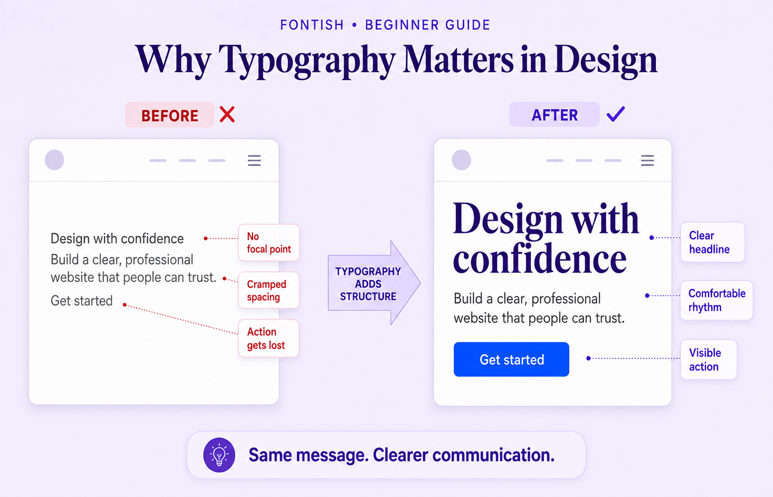
People usually notice typography when it fails.
A confusing checkout label, a dense legal paragraph or a headline with awkward letter spacing interrupts the message. When typography works, readers spend less effort decoding the page and more effort understanding it.
Strong typography helps a design:
- Establish a clear information hierarchy.
- Make long passages easier to read.
- Communicate an appropriate personality.
- Create consistency across pages and components.
- Guide attention towards important actions.
- Remain usable across different devices and reading conditions.
Typography is therefore not decoration applied after the “real” design is finished. It is part of how the design communicates.
Typeface vs. Font: The Difference Without the Pedantry

A typeface is the overall design family, such as Inter, Lora or Playfair Display.
A font is a particular style or implementation within that family, such as Inter Bold Italic or Lora Regular. Historically, a font meant one physical set of type at a specific size and weight. Digital tools have made the boundary less obvious, so people often use the two words interchangeably.
You do not need to correct everyone in the room. You do need to understand the distinction when building a typography system.
“Use Inter” identifies the typeface.
“Use Inter SemiBold at 18px for card titles” identifies a usable typographic decision.
A font family may include several weights, widths, italics, language sets and variable axes. Check what the family actually provides before building a design around a style that disappears when the project reaches production.
The Fontish font resources can help you evaluate a family beyond its most attractive specimen image.
Essential Type Anatomy You Actually Need
Type anatomy gives designers a shared vocabulary for understanding why one typeface feels open, compact, elegant or sturdy.
You do not need to memorise every label before breakfast. Start with the features that have the greatest effect on selection and readability.
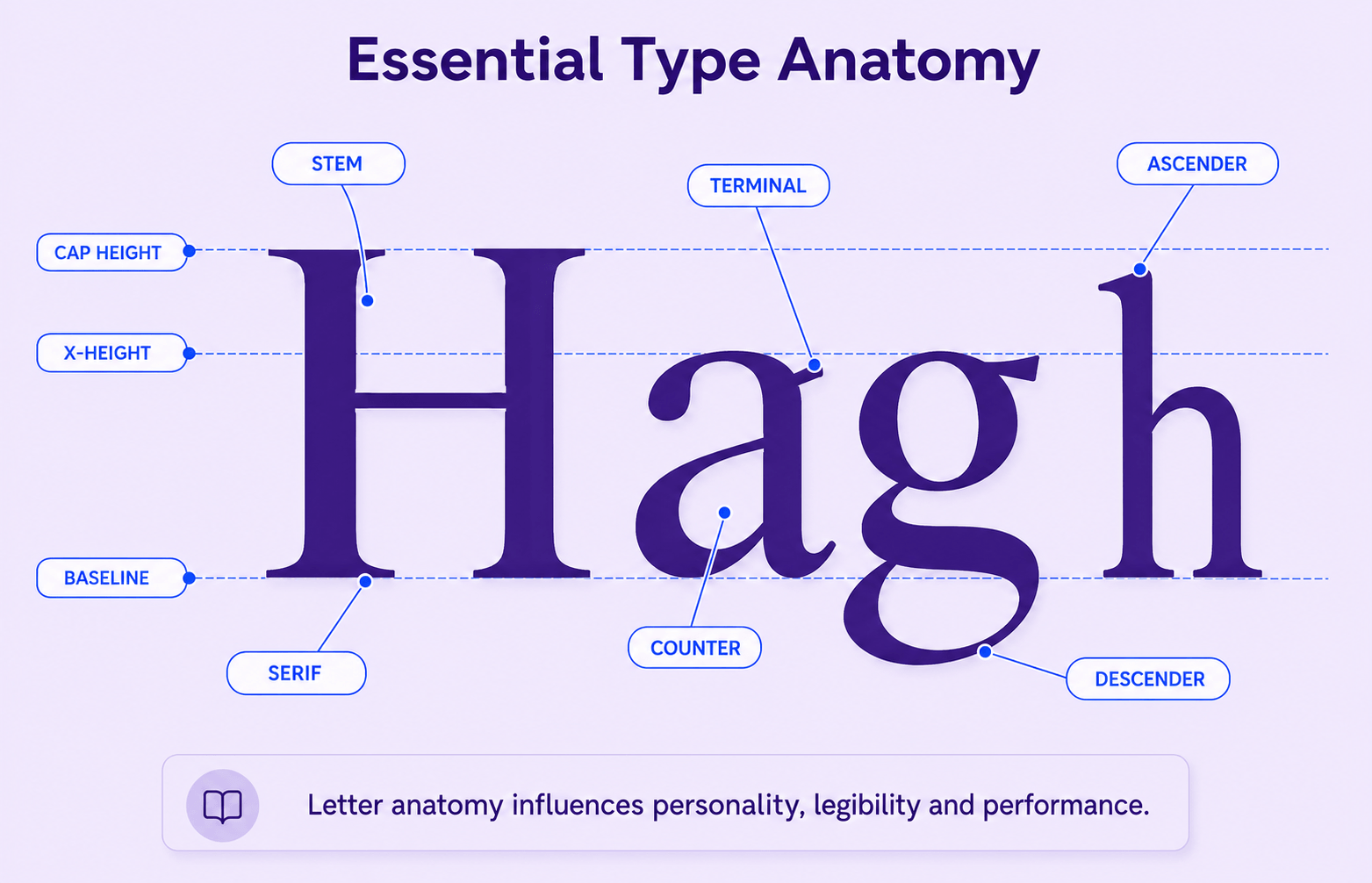
Baseline, X-Height and Cap Height
The baseline is the invisible line on which most letters sit.
X-height measures the height of the lowercase “x” and roughly describes the main body of lowercase letters. Cap height measures the height of uppercase letters.
A generous x-height can make text appear larger and clearer at small sizes, although letter shape, spacing and stroke contrast still influence the final result.
Ascenders, Descenders, Counters and Terminals
Ascenders rise above the x-height, as seen in letters such as “b” and “h”.
Descenders fall below the baseline, as seen in “g” and “p”.
Counters are the enclosed or partly enclosed spaces inside letters. Open counters and distinctive letterforms can improve character recognition, particularly in small interface text.
Terminals are the ends of strokes. Their shape contributes strongly to a typeface’s personality.
Serifs, Stems and Stroke Contrast
Serifs are finishing strokes attached to the main structure of many letterforms. Stems are the principal vertical or diagonal strokes.
Stroke contrast describes the difference between the thickest and thinnest parts of a letter. High contrast can look refined in a large headline but become fragile at small sizes.
Lower contrast often survives small screens and compact interface labels more reliably.
The Major Font Classifications
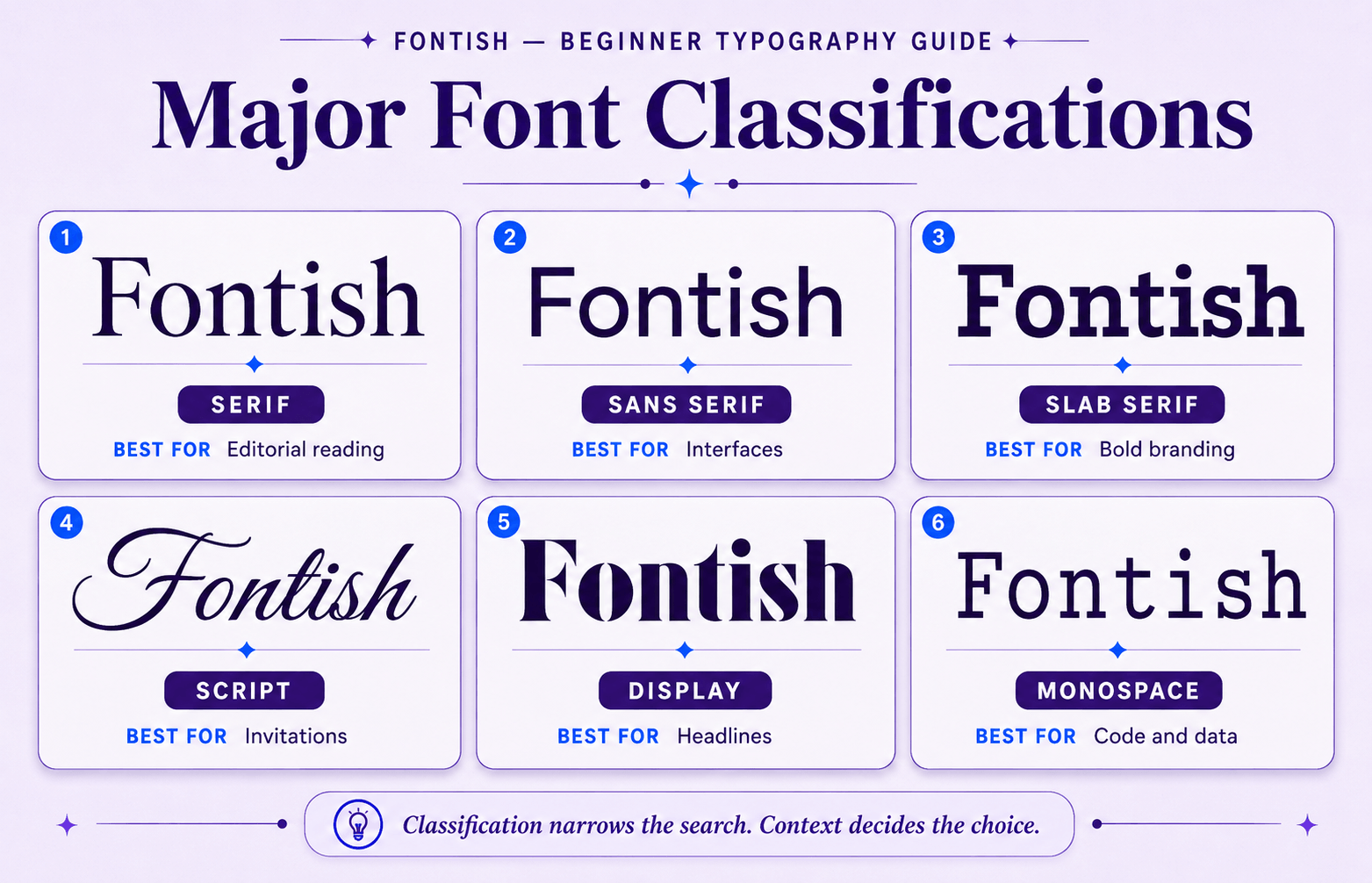
Font classification helps you narrow your choices and predict how a typeface might behave.
It is a map, not a personality test. Two serif typefaces can communicate very different moods, and a sans serif is not automatically modern simply because its feet have gone missing.
Serif
Serif typefaces include finishing strokes on many letterforms.
Old-style serifs often feel warm and literary. Transitional and modern serifs can appear sharper or more formal, while slab serifs use heavier, block-like forms.
Serifs are effective for editorial reading, heritage brands and expressive headlines when their details remain clear at the intended size.
Sans Serif
Sans-serif typefaces omit traditional serif strokes.
Humanist sans serifs borrow proportions and movement from handwriting. Grotesques often feel neutral or industrial, while geometric sans serifs use simplified circular and structural forms.
Sans serifs are common in interfaces because many families provide broad weight ranges and clear character shapes, not because removing serifs automatically makes a font accessible.
Slab Serif, Script, Display and Monospace
Slab serifs feel solid and attention-grabbing.
Script fonts imitate handwriting or calligraphy and should generally be used sparingly. Display typefaces are designed for impact at larger sizes, while monospace fonts assign every character the same width and work naturally for code, data and technical material.
Do not force one of these classifications into long body copy simply because its demonstration word looked excellent.
When comparing typefaces, test real content. A specimen word is useful for inspecting shapes; navigation labels, prices, error messages and paragraphs reveal whether the font belongs in the project.
Hierarchy and Type Scales: Decide What Readers See First
Typographic hierarchy is the visual ranking of information.
It separates the page title from section headings, body copy, captions, labels and metadata. Size is the most obvious tool, but weight, spacing, colour, case and position also create emphasis.
A dependable system uses a small number of repeatable roles. Begin with the body text, then define a restrained ladder above and below it.

For a website, practical starting ranges might include:
- Body text: 16–19px
- Subheadings: 20–24px
- Section headings: 30–38px
- Page titles: 44–56px
These are starting ranges, not commandments carved into a stone tablet. The right values depend on the typeface, content, layout and audience.
Build Hierarchy With More Than Size
If every level differs by only two pixels, readers may not perceive the intended structure.
If every level changes size, family, weight, colour and case, the design can become theatrical.
Choose one dominant signal—usually size—then reinforce it with one or two quieter signals such as weight and spacing.
Consider a portfolio with a 48px project title, 32px section titles, 22px card headings and 18px body text. If every heading uses the same bold weight, the cards may compete with the page title.
Changing the card headings to Medium and adding more space above major sections can restore the hierarchy without introducing another font.
Use a Type Scale, Then Correct It Optically
A mathematical type scale creates consistent ratios between sizes.
Ratios around 1.2 to 1.333 often work well for interface-heavy systems, while larger ratios can suit expressive editorial pages. Treat the scale as scaffolding rather than a law.
A calculated 47.8px heading is allowed to become 48px. A long mobile title may need a smaller step than the desktop version.
Numbers create consistency. Optical correction makes the system feel finished.
Kerning, Tracking and Leading Control the Rhythm
Spacing is where decent typography becomes convincing.
Kerning, tracking and leading are related, but each controls a different part of the reading experience.
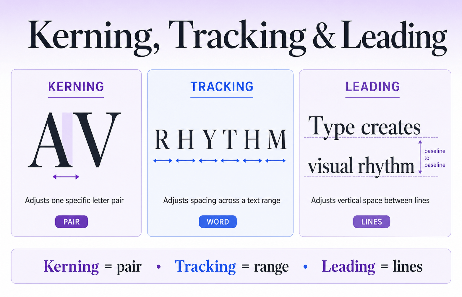
Kerning Adjusts Specific Letter Pairs
Kerning changes the space between two individual characters, such as “A” and “V” or “T” and “o”.
Well-made fonts include kerning data, so body copy rarely requires manual correction. Large headlines, logos and short display words deserve closer inspection because awkward gaps become more visible as the type grows.
Adobe’s kerning guide provides a useful visual introduction.
Tracking Adjusts a Range of Characters
Tracking adds or removes spacing across a selected word, line or block of text.
Uppercase labels can often tolerate slightly positive tracking. Large headlines may benefit from a small negative adjustment.
Excessive tracking in body text breaks familiar word shapes and makes reading feel like hopping between paving stones. The Fontish tracking explainer provides focused examples and practical settings.
Leading Controls Vertical Space Between Lines
Leading is the baseline-to-baseline distance between lines of text. On the web, it is controlled with the CSS line-height property.
Body text often needs a line-height around 1.4 to 1.7 times its font size. The correct value depends on the typeface’s x-height, line length, language and weight.
Large display headings usually require tighter leading because their letterforms already occupy more visual space. The Fontish leading explainer shows how to adjust it by role.
Professional mistake: Applying one spacing value everywhere.
A universal letter-spacing rule and a single line-height may look efficient in a stylesheet, but headings, buttons, paragraphs and captions have different optical requirements. Typography tokens should remain consistent by role—not identical across every role.
Alignment, Line Length and White Space
Typography lives inside a layout.

Even a well-chosen font becomes difficult to read when the text column, alignment and surrounding space work against it.
Prefer Left Alignment for Most Long-Form Latin Text
Left-aligned text creates a predictable starting edge and a natural rag on the right.
Centred text works for short invitations, hero lines and compact labels. Long centred paragraphs make every new line a small search exercise.
Fully justified text can produce distracting rivers of white space unless line width, hyphenation and word spacing are carefully controlled.
Control Line Length
For long-form web copy, a practical target is approximately 45–75 characters per line. Around 60–70 characters often provides a comfortable centre for many layouts.
Treat this as a testing range, not a universal law. Typeface width, language, font size and reading context all influence the result.
Very long lines make it difficult for the eye to find the beginning of the next line. Extremely short lines interrupt reading with constant returns.
Use Spacing to Group Meaning
Space above a heading should usually be greater than the space below it because the heading belongs to the content that follows.
Paragraph gaps should reveal structure without turning the article into a collection of floating islands. Reuse a small spacing scale so readers learn the rhythm unconsciously.
White space is not empty space. It is part of the information architecture.
Readability and Legibility Are Related, Not Identical

Legibility describes how easily individual characters can be distinguished.
Readability describes how comfortably someone can move through words, sentences and longer passages.
A typeface may contain clear individual letters but still produce a poor reading experience when its line length, contrast or leading is wrong.
Test commonly confused characters such as:
- I, l and 1
- O and 0
- rn and m
Inspect apertures, counters and punctuation. Then test complete paragraphs because readers do not consume a design one heroic glyph at a time.
WebAIM’s guidance on typefaces and fonts offers a useful accessibility-oriented reference for flexible sizing and text presentation.
Myth: Serif Is Readable and Sans Serif Is Legible
This familiar rule is too simple to be useful.
Both categories contain excellent and terrible options for print and screens. Familiarity, character distinction, spacing, rendering quality, size and context usually matter more than whether the typeface includes serifs.
Test the actual family in the environment where people will use it.
How to Select and Pair Fonts Without Guessing
Start with the job, not the font marketplace.
Define where the typography will appear, which languages and characters it must support, how many weights you need, how quickly it loads and what tone the brand should communicate.
A restrained system that handles every required role is more valuable than a dramatic headline font with no useful italic, punctuation or currency symbols.

Choose the Body Typeface First
Body copy carries most of the reading, so choose it for clarity, range and reliability.
Test regular and bold weights, italics, links, numbers, punctuation and long paragraphs. Then introduce a display face only if it adds meaningful contrast or personality.
Pair Through Contrast and Compatibility
Strong pairings differ clearly in structure, mood or texture while sharing enough proportion or rhythm to coexist.
A classic serif headline paired with a clean sans-serif body is a dependable model, but it is not the only option. You can pair two sans serifs through differences in width and tone or use one versatile superfamily and let size and weight create contrast.
Avoid pairing fonts that are almost—but not quite—the same. That usually looks accidental.
Define the Content Requirements
Before choosing sizes, fonts or hierarchy, you need to understand what the typography is actually required to do.
List every type of content the interface will contain, not just idealised examples. This includes navigation labels, product names, prices, error messages, form hints, legal text, timestamps, and user-generated content.
Each of these has different constraints. A product title may need to wrap across two lines. Defining these upfront prevents a system that only works for perfect, short, designer-written text.
This step turns typography from decoration into problem-solving.
Assign Clear Font Roles
Once content requirements are clear, assign each type of text a specific role in the system. A role defines not just appearance, but behaviour and purpose.
For example:
- Display: large, expressive headings used sparingly
- H1: page titles that anchor structure
- H2/H3: section hierarchy
- Body: default reading text
- Small: secondary or supporting information
- Label: interface controls and inputs
- Code: technical or monospace content
Each role should have a defined font family, size, weight, line-height and spacing rules. The key is consistency: the same role should always behave the same way, regardless of where it appears.
This prevents ad-hoc styling decisions and ensures the system scales predictably as the interface grows.
Test With Real Content
Typography systems often fail when they meet real-world data. Placeholder text hides problems that only appear with actual usage.
Replace mock content with real or worst-case examples: long product names, multi-line error messages, translated strings, unusual punctuation, and numeric edge cases. Test how the system behaves when content expands, wraps or breaks expectations.
Also test under real conditions: small screens, zoomed browsers, slow font loading, and increased system spacing.
This step validates the system in the environment it was actually designed for.
The Fontish font-pairing guide explains a repeatable selection process. The Libre Baskerville and Inter pairing demonstrates how editorial warmth and interface clarity can divide responsibilities.
Typography for Websites and Interfaces
Web typography must survive responsive layouts, unpredictable content, loading delays and user preferences.
Design a system of roles and tokens instead of styling each component from memory.

Define Tokens for Family, Size, Weight, Line Height and Spacing
Create named roles such as Display, H1, H2, Body, Small, Label and Code.
Each role should specify:
- Font family and fallbacks
- Font size
- Font weight
- Line-height
- Letter spacing
- Colour
- Intended use
In CSS, a coherent custom-property system allows deliberate adjustments to propagate throughout the interface.
MDN’s documentation for font-family, font-size and line-height provides authoritative implementation guidance.
Plan Font Loading and Fallbacks
A web font may arrive after the first page render.
Choose fallback fonts with reasonably similar proportions, define a sensible system stack and use font-display intentionally.
Subset files only when you understand the language and character consequences. A tiny file is not a victory if a customer’s name becomes an empty square.
Design Components With Real Content
Test long navigation labels, two-line buttons, prices, dates, form errors and translated content.
Fixed-height components often expose typography problems first. Allow text to wrap where possible, and do not crop essential words merely to preserve an immaculate card grid.
Accessibility and Responsive Typography
Accessible typography is not a separate aesthetic.
It is a system that remains understandable when readers zoom, resize text, override spacing, change devices or read in another language or script.

Use Sufficient Contrast and Flexible Sizing
WCAG 2.2 requires a minimum contrast ratio of 4.5:1 for normal text and 3:1 for qualifying large text at Level AA.
Check combinations with the WebAIM Contrast Checker. Use relative units where they support user scaling, and never disable browser zoom.
Allow Text-Spacing Overrides
WCAG 2.2 Success Criterion 1.4.12 does not require every website to use one prescribed spacing setup.
It requires content and functionality to survive when users increase line, paragraph, letter and word spacing. The official W3C text-spacing explanation describes the test values and intent.
Avoid inflexible heights and containers that depend on text occupying an exact number of lines.
Make the Scale Responsive, Not Merely Smaller
Use fluid sizing carefully with clamp() or breakpoint-based tokens, but preserve clear differences between roles.
Test the design at:
- 320 CSS pixels
- 200% browser zoom
- Increased system text sizes
- Increased text spacing
- Long translated content
Watch for clipped labels, overlapping headings and controls whose text no longer fits.
W3C’s C35 technique provides guidance for containers that must tolerate expanded spacing.
Languages and scripts also alter vertical metrics and visual density. A line-height tuned for English may clip Arabic marks or crowd scripts such as Thai and Devanagari. Test the languages the project genuinely needs to support.
Common Typography Mistakes and Better Rules
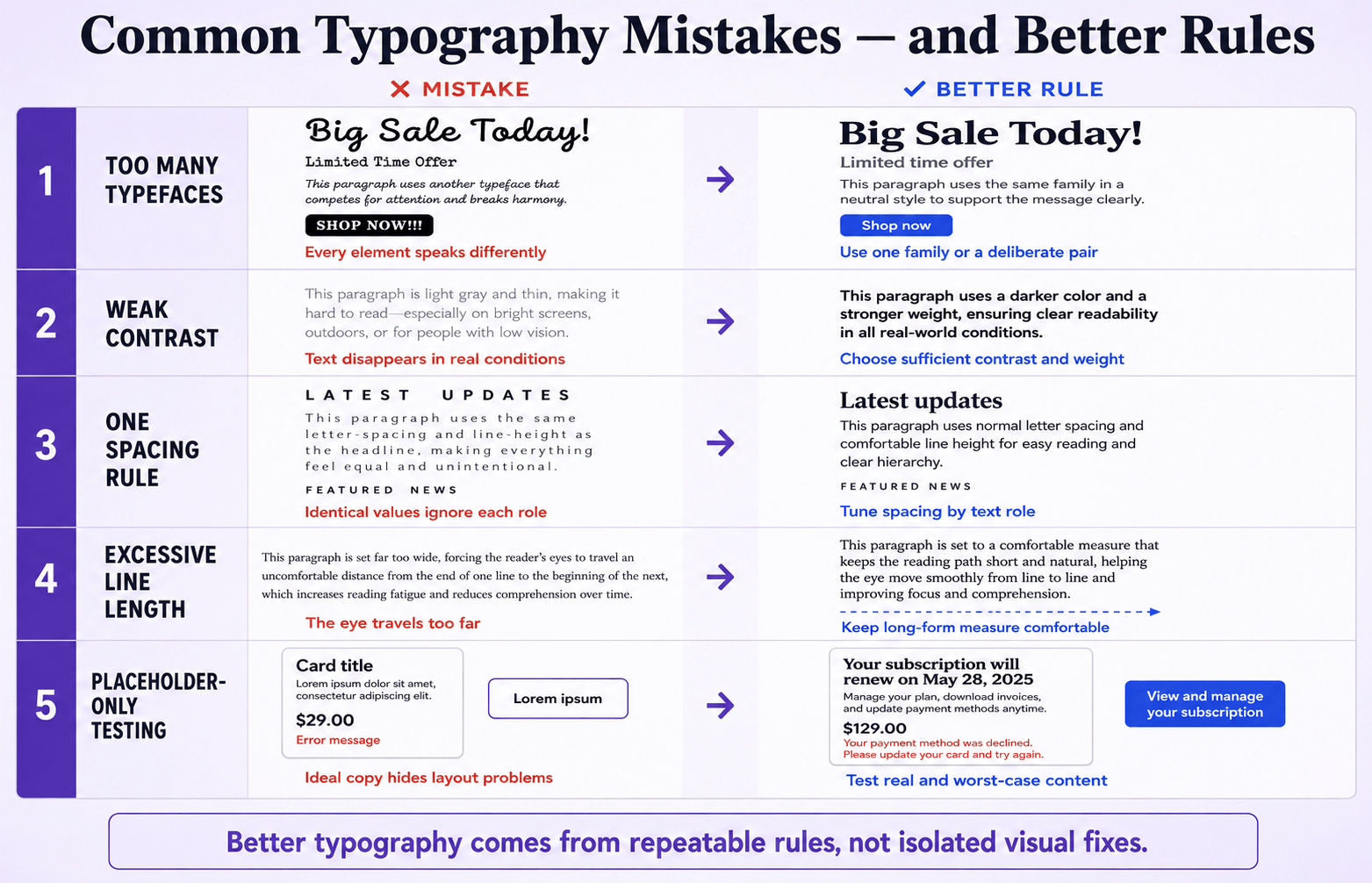
Using Too Many Typefaces
More fonts create more decisions, not automatically more hierarchy.
Begin with one capable family or a deliberate pair. Add another only when it performs a role the existing system cannot express.
Choosing Personality Before Performance
A brand font must support the content, languages, sizes and platforms where it will work.
Test it in paragraphs, forms and mobile headings before falling in love with the capital “R”.
Making Body Text Too Small or Too Light
Thin grey text may look elegant in a static mock-up and disappear on a modest screen in daylight.
Use comfortable sizes, sufficient contrast and weights that maintain their shape at the intended resolution.
Forcing One Rule Across Every Role
The same tracking, line-height and casing rarely suit headlines, labels and paragraphs.
Build role-based tokens and correct them optically. Consistency means repeatable logic—not robotic sameness.
Testing With Perfect Placeholder Copy
Lorem Ipsum never complains that a button label is too long. Real content does.
Test realistic names, numbers, errors, translations, punctuation and worst-case headings before publication.
A Practical Typography Workflow

- Define the content roles. List every text role the design requires, including page titles, section headings, body copy, captions, labels, buttons, form help and code.
- Choose a dependable body typeface. Test paragraphs, weights, italics, numerals, punctuation, language support and performance.
- Set the body foundation. Establish a comfortable size, line-height and maximum line length before building the hierarchy around it.
- Build a restrained scale. Assign sizes and weights to roles. Make the differences clear enough to scan without creating visual whiplash.
- Add a second typeface only when useful. Define exactly which roles it owns and why its contrast improves communication.
- Tune spacing by role. Review kerning in display text, tracking in labels and headings, and leading in every multiline style.
- Test real content and stressful states. Include long words, narrow screens, zoom, spacing overrides, slow font loading and multiple languages where relevant.
- Document the tokens. Record family, fallbacks, size, weight, line-height, tracking, colour and usage rules so the system can be repeated.
Pre-Publishing Typography Checklist
Use this checklist to audit the finished typography system:
- Hierarchy: Can a new reader identify the page title, major sections and body copy within a few seconds?
- Typefaces: Does every family have a defined role, usable licence, required weights and sufficient language coverage?
- Body text: Is the size comfortable, the weight sturdy enough and the line length controlled?
- Spacing: Have kerning, tracking, leading and paragraph spacing been reviewed by role?
- Alignment: Is long-form copy easy to follow without unnecessary centring or distracting justification gaps?
- Contrast: Do text and interactive states meet the required contrast targets?
- Responsive behaviour: Does the hierarchy still work at narrow widths, on large screens and at increased zoom?
- Stress testing: Can text spacing increase without clipping, overlap or lost functionality?
- Content testing: Have long labels, real headlines, numbers, punctuation, error messages and translations been checked?
- Implementation: Are typography tokens documented and used consistently across components?
- Loading: Are fallback fonts,
font-displaybehaviour and file sizes acceptable? - Final eye test: Does anything feel cramped, weak, noisy or strangely isolated when you step back from the page?
Frequently Asked Questions
What Are the Essential Typography Principles for Beginners?
Begin with hierarchy, readability, consistent roles, controlled spacing, suitable line length and accessible contrast.
Choose a dependable body typeface first. Then use size, weight and space to organise the content. Decorative decisions should support communication rather than replace it.
What Is the Difference Between Typography and Font Design?
Font design creates letterforms and the files that contain them.
Typography selects and arranges those letterforms within a specific communication system. A type designer builds the instrument; a typographer decides how it plays in the composition.
How Many Fonts Should a Beginner Use in One Design?
One font family is often enough, particularly when it includes several useful weights.
Two typefaces can create stronger contrast when their roles are clearly divided. Three or more may work, but each additional family increases the risk of inconsistency and visual noise.
What Is the Best Font Size for Website Body Text?
There is no universal size, but 16–19 CSS pixels is a practical testing range for many desktop and mobile reading environments.
The correct choice depends on the typeface’s x-height, weight, contrast, line length and intended audience. Judge the complete paragraph rather than the number displayed in the design panel.
How Do I Know Whether a Font Pairing Works?
Assign each typeface a role, then determine whether the contrast looks intentional and the proportions feel compatible.
Test real headings, body copy, numbers and interface labels. If the fonts are difficult to distinguish or repeatedly compete for attention, simplify the pairing.
Are Serif or Sans-Serif Fonts More Readable on Screens?
Neither category wins automatically.
Well-drawn serif and sans-serif typefaces can both perform beautifully on screens. Character distinction, size, spacing, rendering, contrast and familiarity usually matter more than the presence of serifs.
How Should Typography Change on Mobile Devices?
Preserve the hierarchy while reducing oversized display steps, controlling line length and allowing text to wrap.
Test navigation, forms, touch labels and zoomed text. Mobile typography should respond to its viewport and content—not simply shrink every desktop value by the same percentage.
The Bottom Line
Typography is a system for helping language do its job.
Start with a readable body style, build an obvious hierarchy, tune spacing by role, and test the design under the conditions in which people will actually read it.
That alone puts you ahead of many designs that chose a fashionable font and hoped for diplomatic immunity.
Your next step is practical: take one current page and audit its roles, type scale, line length, spacing and contrast using the checklist above.
Then use the Fontish font-pairing guide or explore the Fontish typography tools to refine anything that needs more than a quick adjustment.