I
I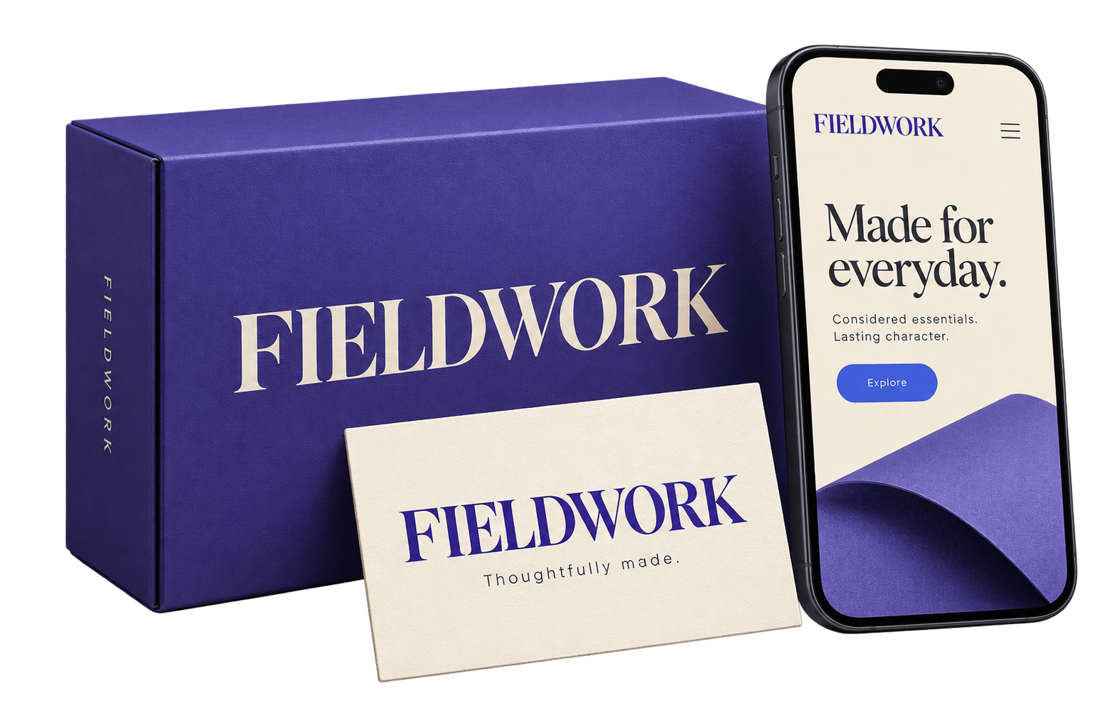
In This Guide
A font can look brilliant in a logo and become hard work everywhere else.
The letters that give your packaging character may crowd a mobile headline or make a price list surprisingly difficult to scan. Choosing the best fonts for branding means looking beyond the first attractive sample.
Your typeface needs to express something about the business and handle the places where people encounter it. A neighbourhood bakery and a financial platform may both want to feel trustworthy, but they have different stories to tell—and different text to set.
This guide brings together seven font recommendations, practical pairing directions, and a framework for testing your choices.
You’ll see which roles suit each family, where its strengths become limitations, and how to build a typography system that works after the logo presentation is over.
Best Fonts for Branding: Our Shortlist
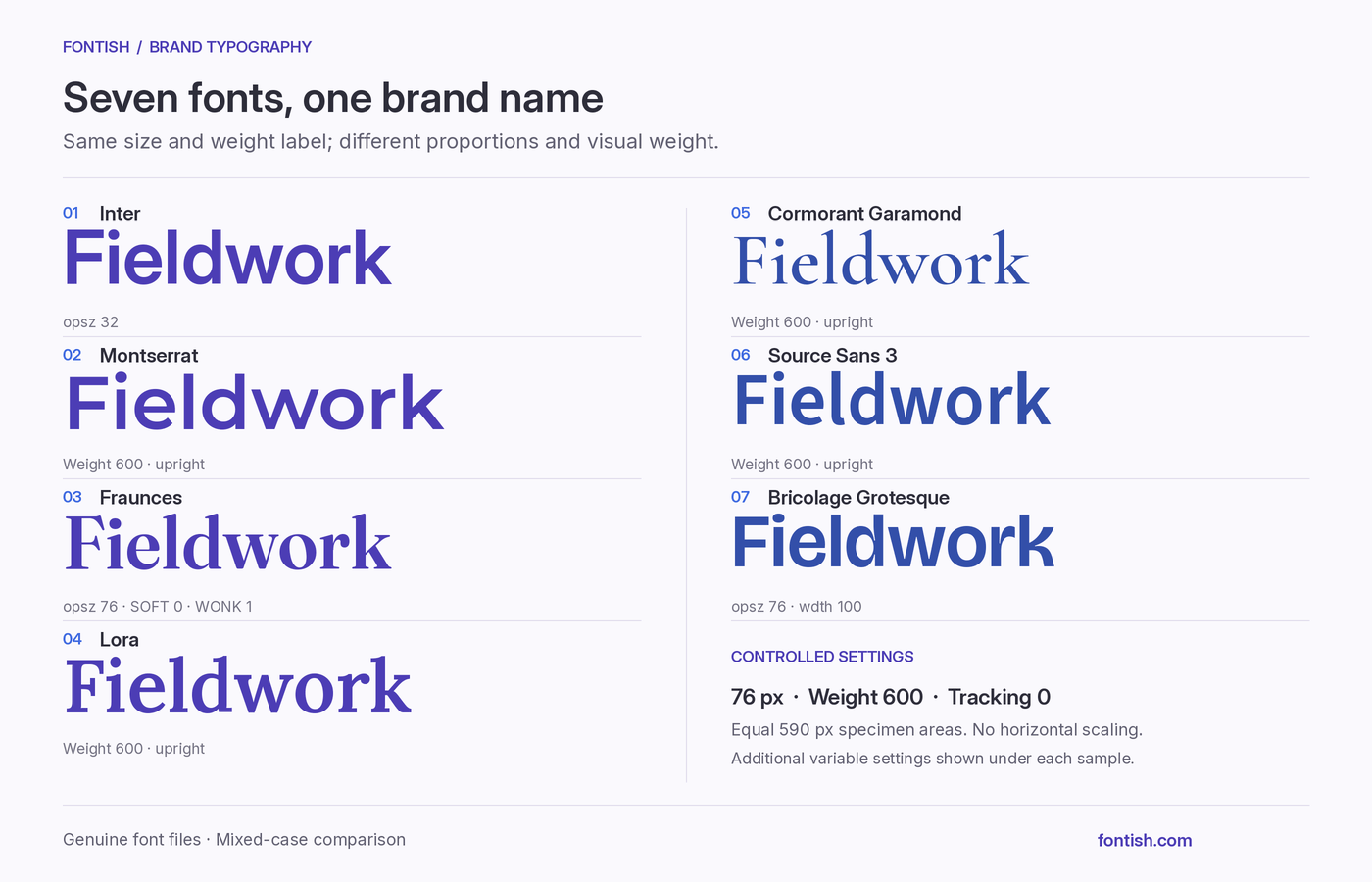
These seven candidates cover different branding roles: dependable digital communication, confident headings, expressive packaging, editorial reading, and delicate display text.
The selection focuses on open-source families with useful differences in character and function.
Commercial typefaces can also be excellent choices; this shortlist gives you accessible starting points without claiming to cover every option. The numbers organise the list rather than rank the fonts.
| Font | Strongest reason to shortlist it | Main limitation to test |
|---|---|---|
| Inter | Consistency between a website, digital product, and supporting information | Whether the overall treatment creates enough distinction |
| Montserrat | Broad, confident letterforms for prominent headings | Width and wrapping in narrow layouts |
| Fraunces | Expressive serif character for packaging and short brand messages | Whether lively details overwhelm supporting information |
| Lora | Serif character for brands with substantial editorial content | Density and fit in compact layouts |
| Cormorant Garamond | Delicate, high-contrast forms for spacious display applications | Fine strokes at small sizes and in production |
| Source Sans 3 | A flexible foundation for detailed communications and documents | Whether the hierarchy feels deliberately designed |
| Bricolage Grotesque | An unconventional sans serif voice for headline-led identities | Consistency across variable-font settings |
A campaign heading has different responsibilities from a product description or booking form. Choose candidates for the roles you need, then use the examples below to judge their strengths and tradeoffs.
1. Inter: a practical foundation for digital brands
Inter’s official project describes a family designed for screens, with a tall x-height and a range of upright and italic styles. Its relatively restrained forms make it a practical candidate when the identity must extend into a digital product.
For a budgeting app, for example, Inter could connect the landing page headline, transaction descriptions, balance figures, and buttons. Customers would encounter a consistent typographic voice as they moved from learning about the service to using it.
That breadth is its strongest argument here.
Inter can support a distinctive identity, but selecting it does not establish one. Headline proportions, spacing, colour, and a recognisable wordmark still need attention; otherwise, a competent interface can become the entire visual identity by default.
Pairing direction: Start with Inter alone. Add an expressive heading face when the brand needs a clearer distinction between campaign messages and functional text.
Our Inter font review takes a closer look at its weights, small-text behaviour, and alternatives.
2. Montserrat: confident headings with a generous footprint
Montserrat draws on lettering from the Montserrat neighbourhood of Buenos Aires, as the project’s official description explains. Its broad proportions and geometric shapes make it worth considering for prominent, straightforward messages.
An events business could use a substantial weight for “Make room for a good night” across posters and its website, with a calmer companion handling schedules and venue details. The heading would carry much of the campaign’s visual presence without needing an elaborate display style.
The width needs careful testing.
A phrase that feels spacious on a poster may stack into several lines on a phone, especially when the copy gets longer.
Choose Montserrat when your layouts can accommodate that footprint rather than repeatedly squeezing it into narrow spaces.
Pairing direction: Try Merriweather for longer editorial copy when you want a serif contrast. Our Montserrat and Merriweather pairing guide explains how to assign their roles and balance the hierarchy.
3. Fraunces: expressive character for prominent brand moments
Fraunces is a soft-serif family with controls for optical size, weight, softness, and selected unconventional letterforms. The official Fraunces project explains how those controls change its forms.
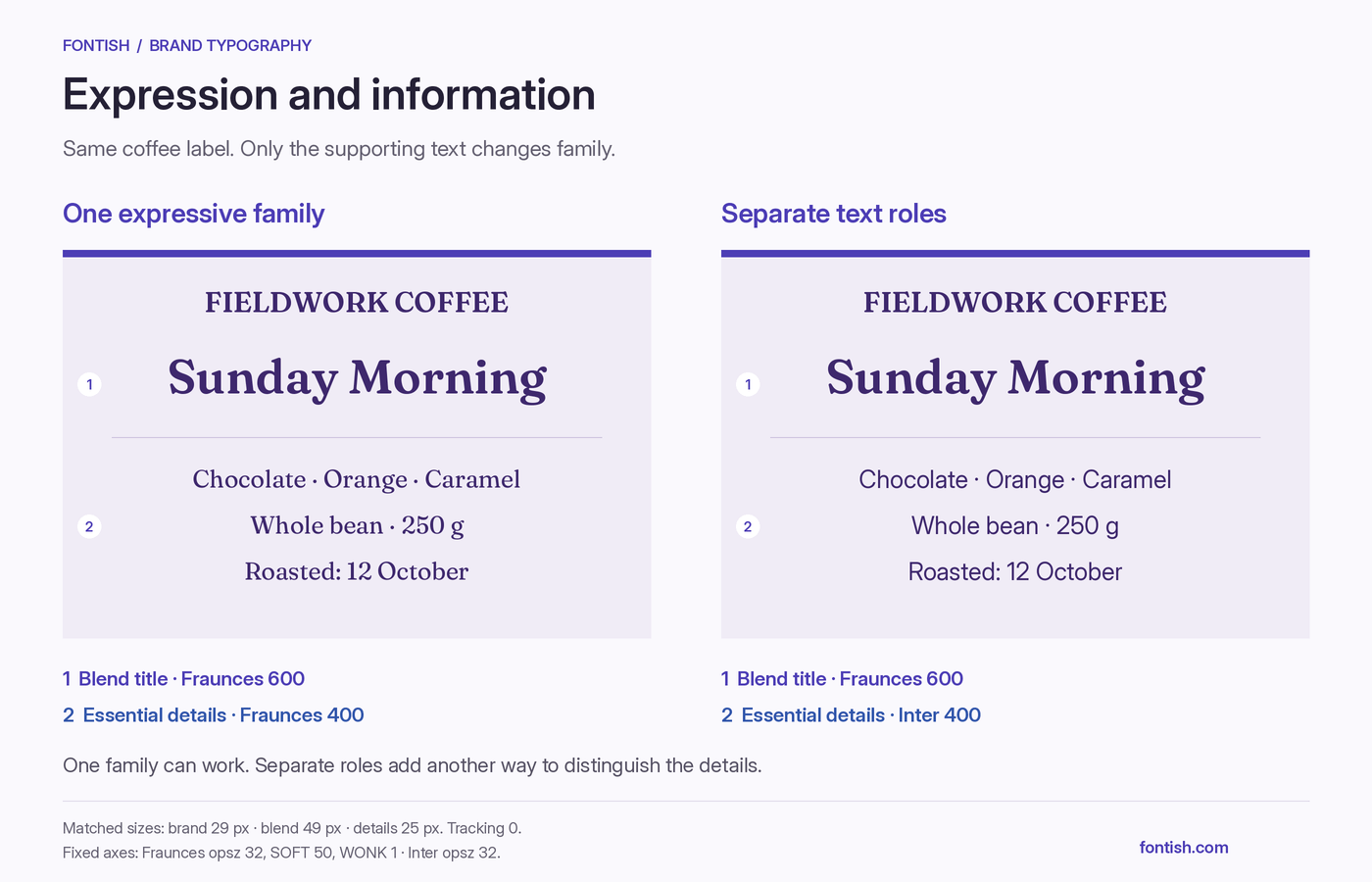
Its rounded details and lively shapes offer a useful direction for food, hospitality, or independent retail identities. A hypothetical coffee roaster could use Fraunces for the brand name and a blend title such as “Sunday Morning,” while a quieter sans serif handles origin information and brewing instructions.
The distinction between those jobs matters. An expressive treatment can make the blend memorable, but repeating it across every label may leave the customer hunting for the roast date.
Pairing direction: Try Fraunces for prominent text with Inter for information. Compare a restrained setting with a softer, more expressive one, then document the treatment you choose.
4. Lora: editorial character for brands built around reading
Lora is a text-focused serif with calligraphic influences. Its curved details add character to paragraphs, making it a strong choice when articles, stories, or detailed guides are a substantial part of the brand experience. The files are available through the official Lora project.
For an independent publisher or consultancy, that character can extend through the content rather than appearing only in a headline. A travel company might use Lora across destination stories, with a sans serif handling booking controls and itinerary details.
Include those information-heavy pages in the trial.
A treatment that suits a leisurely story may feel dense in a compact comparison layout, even though the typeface remains a good choice for the editorial pages.
Pairing direction: Test Lora with Source Sans 3, comparing their apparent sizes before setting the hierarchy. Assign the serif to reading and the sans serif to navigation, labels, and forms.
5. Cormorant Garamond: delicate display character for spacious layouts
Cormorant Garamond belongs to Cormorant, a display family inspired by the Garamond tradition. The official Cormorant project identifies its display purpose and provides the font files.
Its fine strokes and pronounced contrast give large text a delicate, composed appearance. That makes it worth considering for a boutique hotel, jewellery studio, or arts organisation whose layouts give typography room to be seen.
Picture a jewellery studio using it for collection names on spacious printed cards. A sturdier sans serif could handle measurements, materials, and purchase information. This lets the display lettering establish the tone while the supporting text remains easy to consult.
Small tags require a separate check.
Fine details may weaken when reduced or reproduced through a demanding process, so proof the actual application before extending the treatment across every item.
Pairing direction: Try Cormorant Garamond for display text with Inter for supporting information. Adjust their sizes so the delicate heading remains present beside the sturdier sans serif.
6. Source Sans 3: a useful system for brands with plenty to explain
Source Sans 3 offers upright and italic styles across several weights. Adobe’s official Source Sans repository provides the family and describes its suitability for interface environments.
It also belongs on a shortlist for education, professional services, or organisations producing substantial documents. A training provider could use it across course descriptions, enrolment forms, lesson materials, and presentation slides, giving customers a consistent experience before and after they sign up.
Its role overlaps with Inter. Compare both in your longest paragraph, busiest form, and a staff presentation rather than assuming one belongs exclusively in interfaces and the other in documents.
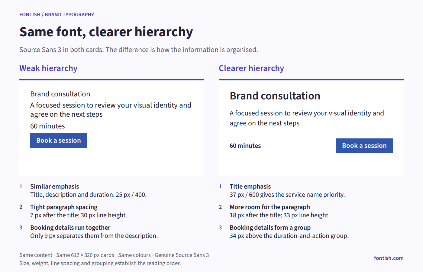
Source Sans 3’s quiet appearance benefits from deliberate styling. A clear heading scale and consistent spacing can establish a recognisable treatment without adding another family.
Pairing direction: Try Source Sans 3 alone first. Add Lora when a serif reading voice would strengthen the brand’s editorial side.
7. Bricolage Grotesque: an expressive sans serif for headline-led identities
Bricolage Grotesque is a variable family with axes for weight, width, and optical size. Its official project provides the files and documents those capabilities.
Its unconventional proportions make it worth considering when a restrained sans serif gives prominent messages too little character. For a creative studio or cultural event, the letters can become a noticeable part of the identity.
Imagine an independent design festival using “Ideas worth making” on posters, tickets, and its homepage. Bricolage Grotesque could give the phrase a distinctive presence, while a quieter face handles dates, directions, and booking information.
The flexibility needs boundaries. Changing width and weight for every asset may produce individually interesting designs that feel unrelated. Choose a small set of repeatable treatments and check them across formats.
Pairing direction: Test Bricolage Grotesque for headlines with Inter for supporting copy. Make their jobs clear through differences in size, weight, and placement.
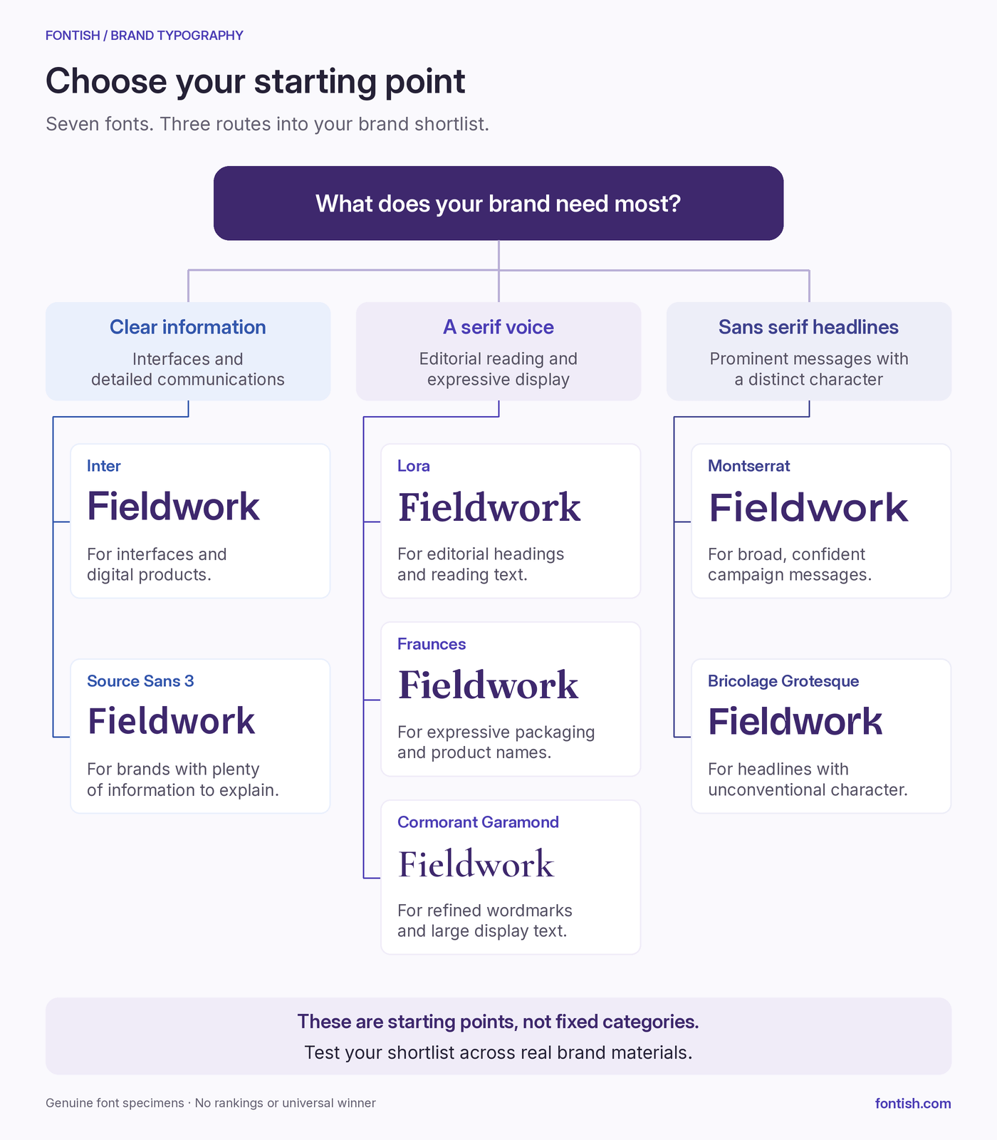
Choose two or three candidates of these best fonts for branding that serve your essential applications. If a font fails a requirement, it should leave the shortlist, however appealing its specimen looks.
What Makes a Font Right for Your Brand?
The best fonts for branding shortlist becomes more useful when you can explain what you are looking for. Focus on visible features, clear roles, and a system your business can maintain.
Turn brand personality into visible features
“Premium” and “approachable” are useful starting points, but neither identifies a typeface. Translate those words into features you can compare.
Strong differences between thick and thin strokes can create a delicate appearance.
Broad proportions and rounded shapes may soften a message, while narrow letters can make heavy headings feel concentrated and forceful. These cues depend on the surrounding colour, imagery, wording, and layout.
If you need help identifying what you are comparing, our type anatomy guide explains counters, apertures, proportions, and other parts of letterforms.
For a skincare brand seeking a calm, precise identity, inspect the product name, ingredient list, and instructions together. The expressive text should support the same impression as the information customers need to use the product.
Give expressive and functional text different jobs
Your campaign headline and returns policy do not need the same amount of personality. Assign roles before adding families:
- Brand expression: wordmarks, campaign headings, and prominent packaging text.
- Everyday communication: paragraphs, product descriptions, emails, and presentations.
- Utility: prices, labels, navigation, forms, and instructions.
One versatile family may cover all three. A second earns its place when it improves a specific role, such as sustained reading or expressive headings.
A custom wordmark can sit outside this system. Its lettering may be drawn or modified for the brand, while everyday communications use a more adaptable family.
Choose capabilities you will actually use
A large family is useful only when its styles meet your needs. Regular and bold may be enough for a small business; reports and editorial content may also call for genuine italics and intermediate weights.
Check language coverage with real names, place names, accents, and translations. An English specimen can’t tell you whether a font covers everything your customers need.
Choose for the foreseeable workload. Installing more styles does not automatically make the system stronger.
Build recognition through consistent treatment
A familiar font can become recognisable through a consistent relationship between weight, scale, spacing, and layout. An unusual one can feel anonymous if that relationship changes every week.
Define a few repeatable rules, then allow them to adapt across formats. A delivery label and a landing page have different constraints, but their typography can still express the same business.
How to Test Fonts for Your Brand
Put your shortlisted fonts into the same small set of brand materials. The aim is to discover which system meets the brief with sensible adjustments.
1. Separate requirements from preferences
Write down the intended impression, essential applications, and practical constraints. “Approachable and organised” becomes useful when paired with “must handle appointment reminders, service prices, and a mobile booking page.”
| Brief element | Example for a neighbourhood clinic |
|---|---|
| Intended impression | Calm, approachable, organised |
| Essential materials | Website, appointment cards, signage, forms |
| Important text | Practitioner names, dates, times, phone numbers |
| Required styles | Regular, bold, and italics for supporting copy |
| Language needs | Every language used in patient communications |
| Production constraints | Small printed cards and documents staff can edit |
Missing a required character is grounds for rejection. Preferring another font’s capital R is a preference to weigh after the requirements are met.
2. Use a representative asset and a demanding one
A polished homepage heading shows potential. A crowded label or long product name reveals constraints.
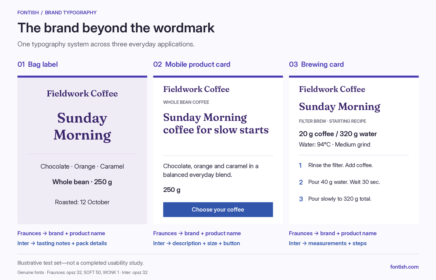
For a coffee roaster, compare a bag label, a mobile product card, and a brewing instruction card. Together, they cover brand expression, purchasing information, and detailed reading.
Use actual wording, including the longest realistic names, so short, convenient samples don’t hide a poor fit.
3. Compare equal settings, then tune
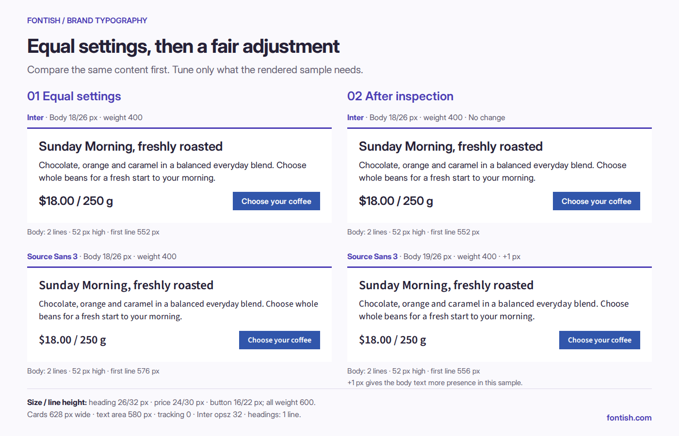
Begin with matching font size, nominal weight, line spacing, and available width. This reveals differences in apparent size, wrapping, and density. A weight labelled 700 in one family may look heavier than 700 in another.
Then make reasonable adjustments for each candidate. One may need a larger body size or more line spacing; another may benefit from a lighter heading weight. Keep the content and layout constraints consistent while you make those changes.
Record the reason for each adjustment. If a candidate needs rewritten headings and compressed spacing throughout the test set, its proportions may be wrong for the job.
4. Inspect the finished application
Read website samples on a phone and print proofs at the intended size. For embroidery, engraving, or another specialist process, ask the supplier to test the treatment.
Check whether customers can use the information:
- Can they quickly find the appointment time?
- Are prices and product variants easy to distinguish?
- Do
I,l, and1remain clear where they occur? - Can instructions be read comfortably without zooming?
Inspect the layout as well as the letters. Wide paragraphs, crowded lines, and weak hierarchy can undermine a suitable font.
5. Verify licensing and team access
Check the licence supplied with the exact files against your intended uses. The SIL Open Font License website provides the licence text and FAQs for fonts distributed under that licence.
Keep the source, licence information, and approved versions with the brand resources.
Confirm that collaborators can use those fonts in their working applications, then open an editable document or presentation on another team member’s device to catch substitutions and changed line breaks.
A system that works only on the designer’s computer is not ready for handover.
6. Make the decision visible
Use a short assessment rather than relying on the most attractive headline.
| Criterion | What to record |
|---|---|
| Brand expression | Visible features supporting the intended impression |
| Readability | Performance of paragraphs and essential details |
| Layout fit | Wrapping, width, and density problems |
| Coverage | Availability of required styles and characters |
| Production | Behaviour in the intended output process |
| Team usability | Access and consistent use across working applications |
Mark each item works, needs adjustment, or fails a requirement, with a brief explanation. Do not average away a critical failure.
If two candidates perform equally well, favour the one that needs fewer exceptions. Document the chosen roles and treatments so the next person can produce a new asset that still belongs to the brand.
Common Mistakes
Some mistakes appear only after the identity leaves the presentation. These habits can turn a promising choice into an awkward system.
Copying the industry’s usual treatment
Competitor research helps you understand conventions customers recognise. Following them too closely can make your business difficult to distinguish.
If nearby skincare brands all use delicate serifs with widely spaced capitals, the same treatment may communicate the category without identifying you. Sturdier forms, conversational lowercase, or a different headline rhythm could offer distinction while keeping the business understandable.
Treating “premium” as a thin weight
Fine strokes and generous spacing can create a refined appearance at large sizes. On a small label, that delicacy may become a weakness.
A stronger weight does not automatically cheapen the identity. Composition, materials, imagery, and careful production also shape the impression, so judge the finished application before choosing the thinnest option by habit.
Expecting the logo font to handle everything
A wordmark contains a short, controlled sequence of letters. Body copy must handle changing words, punctuation, and sustained reading.
If the expressive choice struggles outside the logo, keep its role narrow. A supporting family can connect through proportion, alignment, and colour without copying every letterform.
Adding a family whenever a layout feels flat
A new font can make a design different without making it clearer. First check whether size contrast, weight, or spacing would solve the problem.
If another family is still needed, give it a usable instruction such as “campaign headings.” “For when we want something interesting” leaves the next designer guessing.
Distorting letters to rescue a poor fit
Squeezing text horizontally changes the letterforms and can create inconsistency beside the same font used normally.
Try another size, a better line break, or a designed width variation where available. If the mismatch keeps recurring, choose a narrower candidate rather than making distortion part of the brand’s routine.
Replacing the font before fixing the layout
A suitable family can still look uncomfortable in an overly wide paragraph or a crowded heading stack.
Change one setting at a time to identify the cause. Replace the font when its forms or capabilities fail the brief; refine the treatment when the problem comes from its application.
Frequently Asked Questions
What makes a font good for branding?
It supports the intended identity and works across the business’s actual materials. Look for suitable letterforms, readable text at essential sizes, useful styles, and the characters your content needs.
The team must also be able to apply it consistently. Visual appeal alone is not enough.
Should a brand use serif or sans serif fonts?
Either can work. A sturdy serif and a delicate display serif can create very different impressions, just as two sans serifs can differ in warmth, width, and intensity.
Our serif vs sans serif comparison explains how those differences affect design decisions. Compare specific candidates in context: the category is a starting point, not a personality guarantee.
How many fonts does a brand need?
Start with one family that covers the essential roles. Add a second when it improves something specific, such as expressive headings or sustained reading. Two families are often sufficient for a small system, provided each has a clear responsibility.
Does a brand need a unique font to stand out?
No. A familiar typeface can support a distinctive identity through consistent styling and composition.
A custom typeface offers more control, but it needs a clear purpose. Identify what existing families cannot deliver before deciding whether commissioning one is worthwhile.
Should you change your font when rebranding?
Change it when the typography no longer serves the direction or fails practical requirements. Otherwise, stronger hierarchy and more consistent application may be enough.
Test a refined version of the existing system alongside new candidates. That helps you judge the improvement against any recognition you would lose.
Bottom Line
The best fonts for branding give your business a recognisable voice and handle its everyday communication. Choose the family—or pairing—that earns its place across both.
If two candidates feel equally convincing, favour the one that keeps essential text clear and makes consistent work easier. Those strengths will matter long after the identity presentation.
Put your two strongest candidates into one real brand asset. Include the headline and the small details, then inspect it at the size your customers will see. You’ll have a better basis for choosing than another evening spent scrolling through font previews.