
In This Pairing
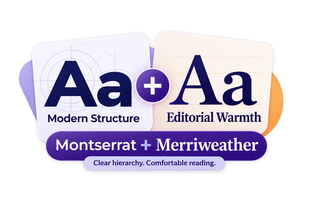
Montserrat and Merriweather are a popular pairing for a good reason: one brings geometric structure, while the other adds a warmer reading voice. The contrast is clear, but not so dramatic that the page feels divided between two unrelated brands.
The safest setup is Montserrat for headings and interface text, with Merriweather carrying the paragraphs.
Used that way, the pair feels modern, trustworthy and editorial. In this guide, we’ll show you where the combination works, how to size it and which small mistakes can make two good fonts look oddly uncomfortable together.
- Editorial websites
- Educational brands
- Consulting firms
- Nonprofits
- Content-led businesses
- Highly technical interfaces
- Very playful brands
- Delicate luxury identities
- Modern
- Trustworthy
- Editorial
- Approachable
Montserrat and Merriweather work well for content-rich websites and professional brands. Use Montserrat at 600 or 700 for headings and interface labels, then Merriweather at 400 for body copy. The contrast creates clear hierarchy without feeling severe.
Watch the density. Montserrat headlines can wrap early, while Merriweather may look larger and darker at the same CSS size. Test both with real content—especially on mobile—before finalising the scale.
Meet the Pair
Montserrat and Merriweather bring different strengths to the same typography system. Montserrat establishes structure and emphasis; Merriweather makes longer passages feel warmer and more inviting to read.
Montserrat: the confident organiser
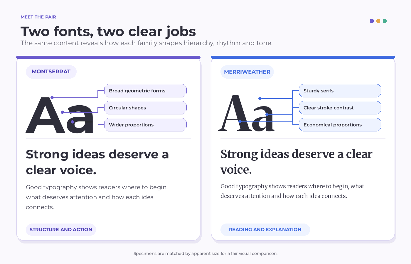
Montserrat is a geometric sans serif created by Julieta Ulanovsky and inspired by historic signs, posters and painted lettering from the Montserrat neighbourhood of Buenos Aires.
That urban influence gives it more personality than a completely neutral sans serif without making it difficult to use.
Broad capitals, circular forms and a generous range of weights help Montserrat create strong headlines, clear navigation and confident calls to action.
SemiBold and Bold usually provide enough authority; the heaviest weights can become bulky surprisingly quickly.
Montserrat can handle paragraphs, but its wide proportions consume space and may become tiring across a long article. In this pairing, it works better as the font that establishes structure than the one responsible for every sentence.
The official Montserrat project provides the current font files, development history and licence information.
Merriweather: the reading voice
Merriweather is a serif family from Sorkin Type designed with editorial reading and space-conscious typography in mind.
Its sturdy serifs and economical proportions give paragraphs a clear rhythm without making them feel cramped or overly traditional.
The family introduces warmth where Montserrat can feel firm and geometric. Regular works well for sustained reading, while Bold can support quotations, introductions and occasional serif-led headings.
Merriweather also includes variable weight, width, and optical size controls in its current family. That flexibility is useful, but the standard styles are enough to build a dependable website hierarchy.
The official Merriweather repository contains the latest project information, available formats and licence details.
Montserrat gives the page its framework. Merriweather gives the content its reading texture. That clear division is the foundation of the pairing.
Live Pairing Preview
Good typography helps readers understand where to begin, what deserves attention and how each idea connects to the next. The best pairings create hierarchy without making the reader notice how hard the fonts are working.
ABCDEFGHIJKLMNOPQRSTUVWXYZ
abcdefghijklmnopqrstuvwxyz
0123456789 ! ? & % $ # @ ( ) [ ] : ; , .
A dependable desktop starting point is Montserrat Bold at 48–58px with a line height near 1.1, supported by Merriweather Regular at 17–19px with a line height between 1.55 and 1.7. These are starting values, not commandments carved into a very typographic stone tablet.
Judge the fonts by perceived size rather than matching numbers. Montserrat’s broad headings may wrap early, while Merriweather can appear darker than expected at the same nominal size.
Test real headlines on mobile and give the body copy enough line height before making the final decision.
Why This Pairing Works
Montserrat and Merriweather do more than place a sans serif beside a serif. Their shapes, proportions and natural roles create a hierarchy that readers can understand almost immediately.
The contrast is clear without becoming theatrical
Montserrat uses clean geometric forms and simplified strokes. Merriweather introduces serifs, stroke variation and a more literary rhythm.
The difference is visible enough to separate headlines from paragraphs, but neither family is especially delicate, eccentric or ornamental. Both have a sturdy presence, which keeps the combination feeling deliberate rather than mismatched.
Their different widths create useful rhythm
Montserrat tends to spread across a line, especially in heavier weights. Merriweather uses space more economically, allowing paragraphs to settle into a calmer reading texture.
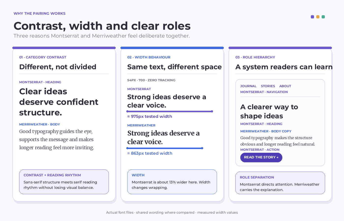
In a Fontish specimen test, we set “Strong ideas deserve a clear voice.” in both families at 54px, weight 700 and zero tracking. Montserrat measured approximately 975px wide, compared with 863px for Merriweather—making Montserrat roughly 13% wider at identical settings.
At 42px inside a 320px-wide frame, both versions occupied three lines, but their breaks were noticeably different. Montserrat ended with “clear voice.” while Merriweather left “voice.” alone on the final line.
That is the useful lesson: a narrower font does not automatically produce a better headline. Test the actual words, then adjust the size or available width until the line breaks feel deliberate.
The pairing suggests a natural hierarchy
Some font combinations require several rounds of experimentation before their roles become clear. Montserrat and Merriweather arrive with useful instincts already built in.
Montserrat naturally handles attention, navigation and action. Merriweather naturally supports reading, explanation and editorial depth. Once those responsibilities are fixed, the rest of the typography system becomes easier to keep consistent.
Font Roles
The cleanest version of this pairing gives each font a defined responsibility. Montserrat handles the parts readers scan and act on, while Merriweather supports the parts they settle down to read.
| Element | Recommended font | Why it works |
|---|---|---|
| H1 headings | Montserrat Bold | Creates a strong, modern entry point without needing decorative styling |
| H2 and H3 headings | Montserrat SemiBold or Bold | Keeps the hierarchy consistent while allowing smaller headings to feel lighter |
| Body copy | Merriweather Regular | Adds warmth and supports comfortable reading across longer passages |
| Introductions | Merriweather Regular or Bold | Gives opening copy more editorial presence without competing with the headline |
| Navigation | Montserrat Medium or SemiBold | Remains clear and compact at smaller sizes |
| Buttons and labels | Montserrat SemiBold | Provides enough firmness for short interface text |
| Pull quotes | Merriweather Bold or Italic | Creates emphasis while remaining connected to the reading voice |
| Captions and metadata | Montserrat Medium | Separates supporting information from the main article text |
These roles are not unbreakable rules. Merriweather can take the lead on major headlines when the brand needs a more traditional or literary tone, and Montserrat can handle short supporting paragraphs in interface-heavy layouts.
What matters is consistency. If every component chooses its font independently, the pair stops feeling intentional and starts looking like two typefaces arguing over the same chair.
Best Use Cases
The following use cases show where Montserrat and Merriweather feel most natural, and how their contrast can create clear hierarchy, tone and readability across different projects.
Montserrat gives article titles and section headings confident structure, while Merriweather keeps long posts comfortable to read. The pairing suits magazines, blogs and newsletters that need clarity without losing warmth.
Courses and resource libraries need clear structure around substantial content. Montserrat organises lessons, navigation and calls to action; Merriweather gives explanations and study material a calmer reading texture.
For consultants, agencies and professional firms, Montserrat communicates confidence while Merriweather adds warmth and credibility. The result feels polished and dependable without becoming stiff or overly corporate.
Note: Across all three use cases, the principle stays consistent: let Montserrat direct attention, and Merriweather carry the explanation. The pairing is strongest when a project needs confident structure without sacrificing reading comfort.
Pairing Formula
A useful type system does not need many styles. It needs a clear difference between attention, navigation and reading.
primary structure and interface voice
Headings, navigation, and buttons
secondary reading and editorial voice
Body copy, introductions, and pull quotes
Clear hierarchy, modern structure, and a warmer voice for longer content.
Use these desktop values as a practical starting point:
| Role | Size | Weight | Line height |
|---|---|---|---|
| H1 | 48–58px | 700 | 1.05–1.12 |
| H2 | 30–38px | 600–700 | 1.15–1.25 |
| Body copy | 17–19px | 400 | 1.55–1.7 |
| Navigation and buttons | 14–16px | 600 | 1.2–1.4 |
Treat the numbers as a first draft. If the layout feels crowded, reduce Montserrat’s size or weight and add space around the headings before changing fonts. This pairing usually needs better breathing room, not a third typeface.
Website Implementation
The simplest setup is to load only the styles the design actually uses. This keeps the pairing flexible without making visitors download half the type foundry.
Load the fonts
<link rel="preconnect" href="https://fonts.googleapis.com">
<link rel="preconnect" href="https://fonts.gstatic.com" crossorigin>

<link
  href="https://fonts.googleapis.com/css2?family=Merriweather:ital,wght@0,400;0,700;1,400&family=Montserrat:wght@500;600;700&display=swap"
  rel="stylesheet"
>
This request loads three Montserrat weights and the essential Merriweather styles. The display=swap setting lets fallback text appear while the webfonts load. See the Google Fonts CSS API documentation for additional options.
Assign clear roles
:root {
  --font-heading: "Montserrat", sans-serif;
  --font-body: "Merriweather", serif;
  --colour-text: #252238;
  --colour-accent: #5141c2;
}

body {
  color: var(--colour-text);
  font-family: var(--font-body);
  font-size: 1.125rem;
  line-height: 1.65;
}

h1,
h2,
h3,
.site-navigation,
.button {
  font-family: var(--font-heading);
}

h1 {
  font-size: clamp(2.5rem, 6vw, 3.625rem);
  font-weight: 700;
  line-height: 1.08;
}

h2,
h3 {
  font-weight: 600;
  line-height: 1.2;
}

.site-navigation,
.button {
  font-size: 0.9375rem;
  font-weight: 600;
  letter-spacing: 0.01em;
}
Treat these values as a starting point, then check real headlines and paragraphs on smaller screens. A technically correct type scale can still produce an awkward three-word orphan.
Common Mistakes
Montserrat and Merriweather work best when the hierarchy is obvious. The comparison below shows the most common failure: giving both fonts equal visual authority.
MONTSERRAT AND MERRIWEATHER ARE BOTH BOLD, OVERSIZED, AND VISUALLY DEMANDING, LEAVING READERS UNSURE WHICH ELEMENT DESERVES ATTENTION FIRST.
Both typefaces demand attention, weakening the hierarchy and making the supporting message unnecessarily difficult to read.
Montserrat gives the headline confident structure, while Merriweather keeps the supporting message warm, calm, and comfortable to read.
Use Montserrat for strong headings and interface cues, and Merriweather for body copy, introductions, and longer explanations.
Using Montserrat Black for every heading
Montserrat’s heaviest weights can make a page feel dense and overly promotional. Start with 600 or 700, and reserve heavier styles for short, deliberate moments.
Matching the fonts by number alone
A 20px sans serif and a 20px serif do not necessarily look equally large. Compare their visual presence rather than assuming identical values will create balance.
Squeezing Merriweather’s line spacing
Merriweather needs enough room for its serifs and varied letter shapes to breathe. For body copy, a line height between 1.55 and 1.7 is usually a sensible starting range.
Letting the roles drift
If Montserrat and Merriweather take turns handling headings, buttons, captions and paragraphs without a clear system, the contrast starts to feel accidental. Give each font a defined job and break the rule only with a reason.
Loading every available style
More weights do not automatically produce a more sophisticated design. They mostly produce a larger font request and more opportunities for inconsistency.
If the pairing feels wrong, troubleshoot it in a fixed order: reduce Montserrat by one weight step, check the headline size and wrapping, add more space between the heading and body, then increase Merriweather’s line height if the paragraph still feels dense.
Change one variable at a time. Otherwise, two perfectly good fonts may be blamed for a problem caused by their settings.
The pairing is strongest when the system stays simple: Montserrat organises the page, while Merriweather makes it worth reading.
Similar Pairings
If Montserrat and Merriweather are close—but not quite right—these pairings shift the mood without abandoning the same basic sans-and-serif strategy.
| Pairing | How the mood changes |
|---|---|
| Lora + Poppins | A softer, friendlier look with more warmth in both fonts |
| Libre Baskerville + Inter | A restrained, traditional reading voice supported by a highly neutral interface |
| Playfair Display + Inter | More drama, contrast and luxury in headlines |
Stay with Montserrat and Merriweather when you want the sans serif to lead the hierarchy and the serif to give longer reading a warmer, more established voice.
Quick Reference
| Setting | Recommendation |
|---|---|
| Main headings | Montserrat 600–700 |
| Body copy | Merriweather 400 |
| Navigation and buttons | Montserrat 500–600 |
| Body size | 17–19px |
| Body line height | 1.55–1.7 |
| Overall character | Modern, editorial, confident and approachable |
| Best suited to | Content-rich websites, education and professional services |
| Main risk | Dense headings and cramped body copy |
| First adjustment | Reduce heading weight and increase spacing |
Frequently Asked Questions
Do Montserrat and Merriweather go together?
Yes. Montserrat supplies clear geometric structure, while Merriweather adds serif detail and a more comfortable reading rhythm. Their contrast makes headings and paragraphs easy to distinguish without making the design feel disjointed.
Which font should I use for headings?
Montserrat is the safer default for headings, navigation and buttons because its broad forms and stronger weights create an immediate hierarchy. Merriweather can handle selected headlines when you want the design to feel more literary or traditional.
What weights work best for this pairing?
Start with Montserrat SemiBold or Bold for headings and Merriweather Regular for body copy. Add Montserrat Medium for navigation and Merriweather Bold or Italic only when the design needs another meaningful level of emphasis.
Can I use Montserrat and Merriweather for branding?
Yes. The pairing works particularly well for editorial brands, educational organisations, consultancies, nonprofits and professional services that need to feel modern without becoming cold.
Fonts alone will not create the identity, though. Colour, spacing, imagery and writing style still determine whether the finished brand feels formal, friendly or quietly authoritative.
Are Montserrat and Merriweather free for commercial use?
Yes. Both families are available under open font licences that permit commercial use. Check the current terms in the official Montserrat project and Merriweather repository before redistributing or modifying the font files.
Bottom Line
Montserrat and Merriweather are dependable choices when a design needs a clear, modern structure without sacrificing reading comfort.
Let Montserrat organise the hierarchy, let Merriweather handle the longer conversations, and resist the temptation to make both fonts compete for attention.
Begin with Montserrat Bold for headings, Merriweather Regular for body copy and generous spacing around both.
Then test real content on desktop and mobile. If you want to evaluate this pairing against other options, use the same role-based process in our guide to pairing fonts like a designer.
Find the Right Pairing for Your Next Project
Montserrat and Merriweather are a dependable match, but they are not the only option. Explore more combinations by mood, contrast and practical role with the Fontish Font Pairing Generator.