
 I
I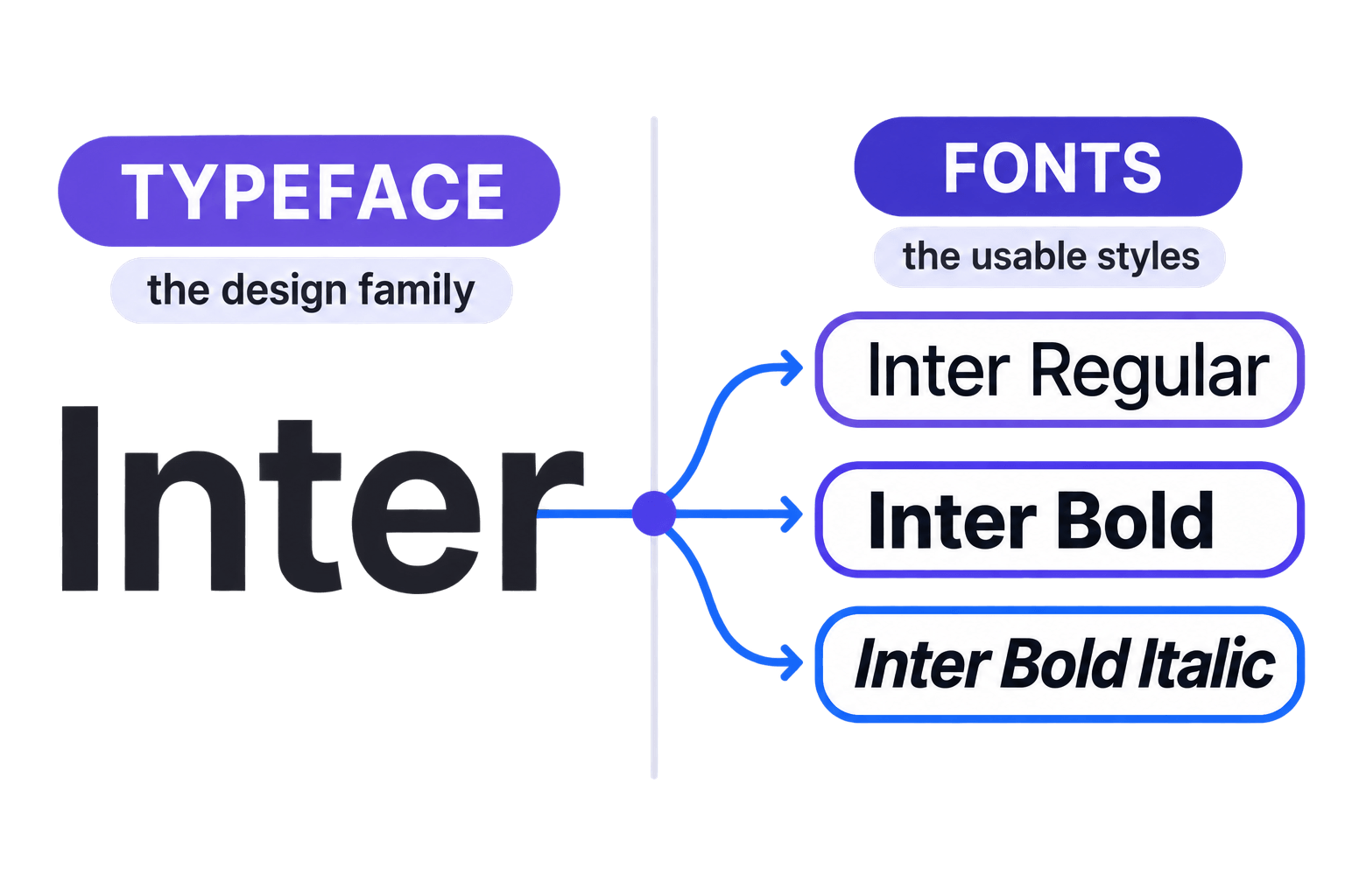
On This Page
A typeface is the overall visual design of a set of letters, numbers, and symbols. A font is a specific, usable version of that design, usually defined by its weight, style, width, or digital file.
Inter is a typeface. Inter Bold Italic is a font within that family.
That is the traditional distinction. In everyday conversation, however, “font” has become the normal catch-all word for almost anything you select from a design app menu.
Saying “I like that font” will not get you escorted from the studio. Knowing the difference simply gives you better language when the details matter.
What Is the Difference Between a Font and a Typeface?
The simplest way to understand the font vs typeface difference is to separate the design from the version being used:
- Typeface: The complete visual design or coordinated family.
- Font: A specific style, weight, width, instance, or file within that family.
For example:
- Typeface: Inter
- Font: Inter Regular
- Font: Inter Semibold
- Font: Inter Bold Italic
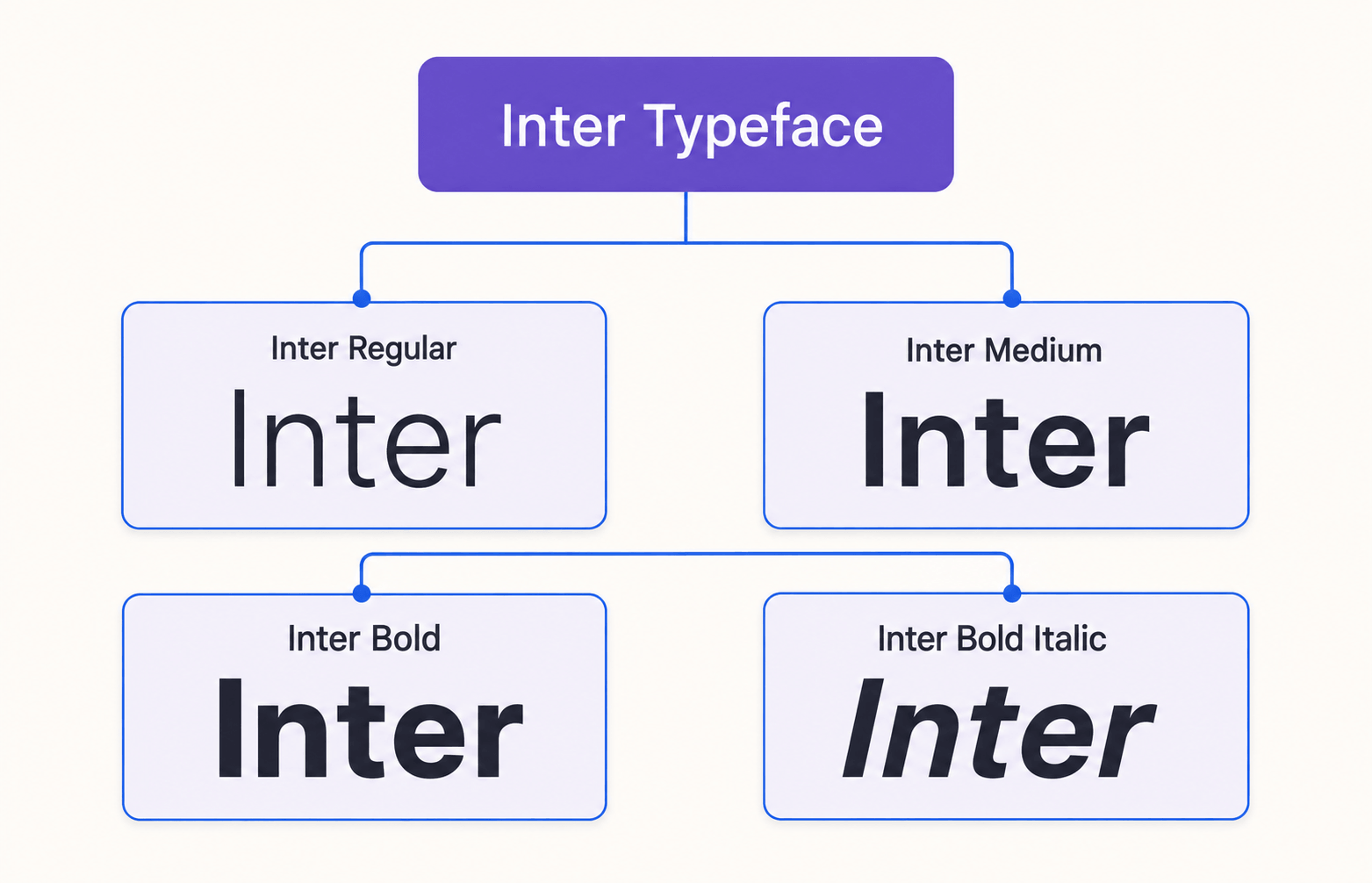
All three fonts share Inter’s underlying letterform design, proportions, spacing logic, and personality. Each font applies that system in a particular way.
What Is a Typeface?
A typeface is the underlying design system that gives a collection of characters its shared appearance.
Its letterforms follow the same visual logic: proportions, stroke contrast, terminals, curves, spacing rhythm, character construction, and overall personality.
For example, Playfair Display is a typeface. Its high contrast, sharp details, and editorial character remain recognizable whether you use Regular, Medium, Bold, or Italic.
Those variations belong to one related design family.
You may also hear the terms type family or font family. Modern software often uses these almost interchangeably with typeface because the family groups all the coordinated styles under one name.
A typeface, therefore, describes more than one selectable menu option. It represents the broader visual idea connecting those options.
What Is a Font?
A font is a particular implementation or instance of a typeface.
In a traditional family, that means one defined combination such as Regular, Semibold, Bold Italic, Condensed, or another named style.
In digital work, “font” can also refer to the actual file that software installs, loads, or embeds.
Inter Regular, Inter Medium, Inter Bold, and Inter Bold Italic are individual fonts within the Inter family. Each provides a specific set of characteristics that can be applied to text without abandoning the family’s underlying design.
Historically, the distinction was even more literal. In metal typesetting, a font was a physical collection of type in one size and style—12-point Caslon Roman, for example.
Digital typography removed the box of metal sorts, but the idea of a specific, usable instance survived.
Typeface, Font Style, and Font File
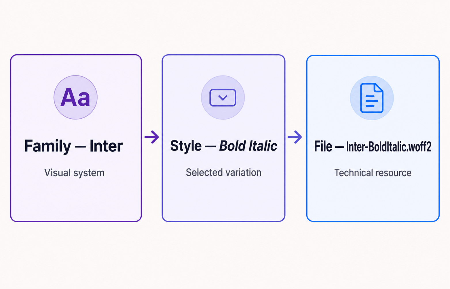
Modern typography becomes easier to understand when you separate three related layers.
1. The Typeface
This is the overall design family: Inter, Poppins, Playfair Display, Libre Baskerville, or another coordinated design.
2. The Font Style
This is the particular expression you choose: Regular, Medium, Bold, Italic, Condensed, or Bold Italic.
3. The Font File
This is the technical resource your computer, design application, or website loads. It might be a static .otf, .ttf, or .woff2 file—or one variable font file capable of producing many styles.
This creates a useful Fontish model:
Family → Style → File
The family determines the visual identity. The style determines the role or emphasis. The file delivers that choice to the software.
These layers often overlap in everyday language, but separating them helps when you are licensing fonts, building a website, handing files to another designer, or documenting a brand system.
Font vs Typeface: Side-by-Side Comparison
| Feature | Typeface | Font |
|---|---|---|
| Meaning | The overall letterform design or coordinated family | A specific style, weight, width, instance, or usable file |
| Example | Inter | Inter Bold Italic |
| Main concern | Visual identity and design system | Practical selection and implementation |
| Typical decision | Choose the family that fits the project | Choose the exact styles needed for each role |
| In software | Often shown as “Font Family” | Often shown as style, weight, or individual files |
| In branding | Establishes the overall typographic voice | Assigns that voice to headings, body text, labels, and emphasis |
| In web design | Used in the font-family declaration | Requested through weight, style, stretch, and loaded font resources |
The shortest useful formula is:
Typeface = the design family. Font = the specific version you use.
It is not perfect in every modern technical context, but it accurately guides most design conversations.
Why the Font vs Typeface Difference Matters
The distinction matters less as a vocabulary test and more as a way to make better decisions.
Choosing a typeface asks whether the family fits the audience, tone, reading conditions, language coverage, brand personality, and intended uses.
Choosing fonts asks which weights and styles are needed to build hierarchy and make that family work.
Imagine that you choose Libre Baskerville for an editorial website. That is the typeface decision.
Selecting Regular for article text, Bold for emphasis, and Italic for citations is a font-level decision. One establishes the voice; the other turns that voice into a functioning system.
This language also makes feedback more precise.
“Change the typeface” suggests replacing the entire design family.
“Use a heavier font” suggests keeping the family and changing its weight.
Those are very different revisions, especially when a team is dealing with brand guidelines, licences, web files, design tokens, and reusable components.
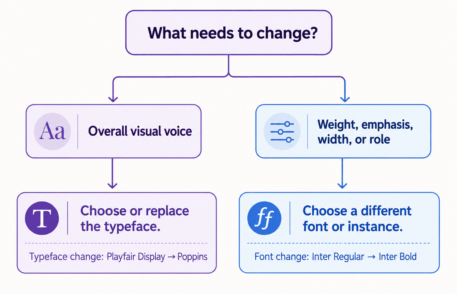
The Fontish Two-Decision Test
When a typography discussion becomes unclear, ask two questions:
- Are we changing the overall visual voice?
- Or are we changing how the existing voice is being applied?
If the visual voice needs to change, you are probably making a typeface decision.
If the family still works but the hierarchy, emphasis, width, or style needs adjustment, you are probably making a font decision.
This test is more useful than correcting terminology for its own sake. It translates the vocabulary into an action the designer can take.
If you are still choosing the family itself, use the Fontish guide to choosing the right font for your brand to evaluate personality, readability, language support, licensing, and real-world use.
When to Use “Typeface” and “Font”
Use “Typeface” for the Broader Design
Typeface is the more precise word when you are discussing:
- The overall appearance or personality of a family
- The designer’s letterform concept
- A branding decision involving the family as a whole
- The history or classification of a design
- The shared characteristics across multiple weights and styles
You might say:
“Inter is the primary typeface in our brand system.”
That statement refers to the entire family, not one weight or file.
Use “Font” for the Specific Thing You Apply
Font is usually the better word when you are discussing:
- A particular weight or style
- An installed or downloaded file
- A web font loaded by a website
- The exact option selected in a design application
- A missing, corrupted, or incorrectly licensed resource
You might say:
“Use the Semibold font for navigation labels.”
That instruction identifies a particular member of the chosen family.
In casual conversation, use whichever word keeps the discussion natural. Precision becomes useful when it prevents ambiguity—not when it turns a five-minute design review into a courtroom drama.
Practical Font vs Typeface Examples
Example 1: A Brand Identity
A café chooses Poppins as its supporting typeface because its geometric shapes feel approachable and modern.
The brand system uses Poppins Regular for body text, Poppins Semibold for navigation, and Poppins Bold for short promotional headings.
Poppins is the typeface. The named styles are the fonts used to perform different roles.
Example 2: A Website Pairing
A publication uses Playfair Display with Inter.
The design contains two typefaces. Within that pairing, the developer may load Playfair Display Bold for headings and Inter Regular plus Inter Semibold for body copy and interface labels.
The website therefore uses two families but at least three font styles.
Example 3: A CSS Declaration
In CSS, font-family selects the preferred family, while font-weight, font-style, and font-stretch request particular characteristics.
For example:
.article-title {
  font-family: "Inter", sans-serif;
  font-weight: 700;
  font-style: normal;
}
Inter is the chosen family. The weight value requests a bold font or instance within that family.
A browser may load separate static files for each style or obtain several instances from one variable font file. The code still separates the family-level decision from the style-level decision.
Example 4: A Client Revision
A client says, “The font does not feel premium enough.”
The word “font” is not the real problem. The useful question is whether the entire typeface feels unsuitable or whether the current weight, scale, spacing, and application are weakening it.
If the shapes themselves feel wrong, test another typeface.
If the family is appropriate but the design feels timid, try a stronger weight, better hierarchy, tighter display spacing, or a more deliberate pairing before replacing it.
That is the practical value of understanding the distinction: it helps diagnose the design rather than merely label it.
What About Variable Fonts?
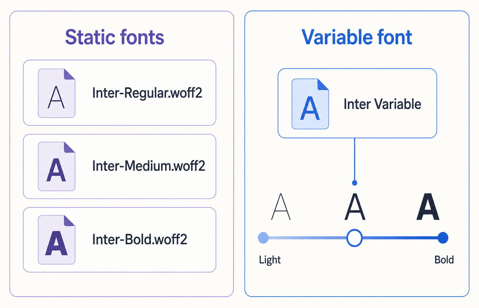
Variable fonts make the traditional definition less tidy because one file can contain a continuous range of weights, widths, slants, optical sizes, or other axes.
Instead of loading separate Regular, Medium, and Bold files, a designer or browser can generate many instances from a single variable font file.
A variable Inter file, for example, may allow you to select weight values ranging from light to very bold without installing a separate static file for every step.
The basic font vs typeface distinction still helps:
- The typeface describes the broader design system.
- The variable font is a technical implementation of that system.
- An instance is the particular configuration produced from its available axes.
So the old “one font equals one fixed file” shortcut no longer covers every case. Variable fonts can produce many usable instances from a single resource.
Common Font vs Typeface Misconceptions
“Using Font Instead of Typeface Is Wrong”
Not in most everyday contexts.
Language changes, and “font” is now widely understood as the thing that controls how text looks. Correcting a client who asks for a “more professional font” rarely improves the project.
Translate the request into better questions about personality, readability, hierarchy, and suitability.
“A Typeface Is the Regular Style”
The Regular style is one member of the family, not the entire typeface.
Bold, Italic, Condensed, and other coordinated styles can all belong to the same typeface design.
“Every Font Is a Separate Visual Design”
Several fonts may share the same underlying typeface.
Inter Regular and Inter Bold differ in weight, but they were designed to work as members of the Inter family rather than as unrelated designs.
“A Font Is Always One File”
That explanation works for many static fonts but not every modern implementation.
A variable font file can contain a design space capable of producing many weights, widths, or other instances.
Conversely, one usable style may sometimes be supplied in several file formats for different platforms and technical requirements.
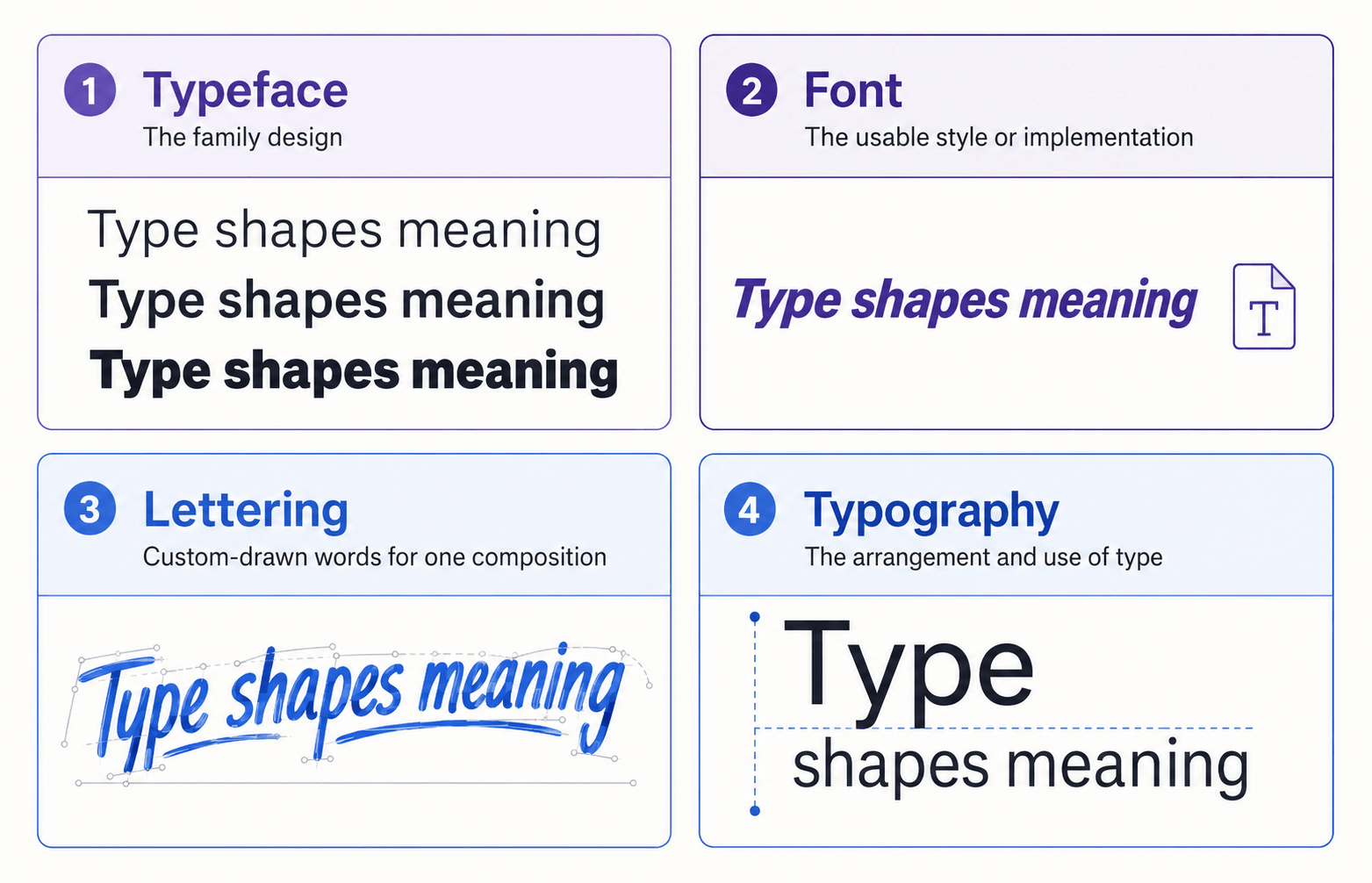
“Font, Lettering, and Typography Mean the Same Thing”
A font is a reusable system for displaying text.
Lettering is usually custom-drawn for a particular composition.
Typography is the broader practice of selecting, arranging, spacing, and using type.
They overlap, but they solve different problems.
For the wider system, including hierarchy, spacing, alignment, readability, and pairing, see Typography Explained.
Frequently Asked Questions
What is the difference between a font and a typeface in simple terms?
A typeface is the overall design family, such as Inter. A font is a specific version or implementation, such as Inter Bold Italic.
Think of the typeface as the family design and the font as the exact style you use.
Is Arial a font or a typeface?
Arial is usually described as a typeface or font family.
Arial Regular, Arial Bold, and Arial Italic are individual fonts or styles within that family. In casual speech, calling Arial a font is also completely normal.
Is Times New Roman a font or a typeface?
Times New Roman is the name of a typeface family. Times New Roman Bold Italic is a specific font within it.
Software menus often label the family as a font, which is one reason the terms blur in everyday use.
Why do computers call typefaces fonts?
Digital interfaces use “font” as a convenient umbrella term for the files, families, and styles users can select.
The shorter word is now common in menus, file management, and everyday conversation, even when the selection represents an entire typeface family.
Do variable fonts change the font vs typeface definition?
Variable fonts complicate the idea that one font must equal one fixed style.
A variable font file can generate many instances across weight, width, slant, optical size, or other axes, but the typeface still refers to the broader visual design system.
The Bottom Line
A typeface is the visual design family. A font is the specific style, instance, or file used to set text.
Choose the typeface when you are deciding how the work should feel. Choose the fonts when you are deciding how that family will handle headings, body copy, emphasis, interfaces, and other practical roles.
When the terminology becomes confusing, use the Fontish Two-Decision Test:
Are you changing the overall visual voice, or changing how the existing voice is applied?
You do not need to police every casual use of the word “font.” Use the distinction when it makes a decision clearer, then move on to the work readers can actually see.
To test a shortlisted typeface using real headings, paragraphs, glyphs, and styles, open the Fontish Font Inspector and judge the versions you plan to use—not just the prettiest specimen.