
 I
I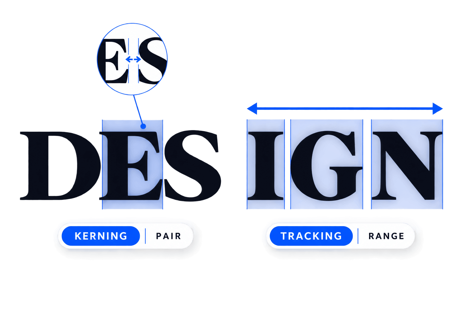
On This Page
Kerning and tracking both change the space between letters, but they solve different problems.
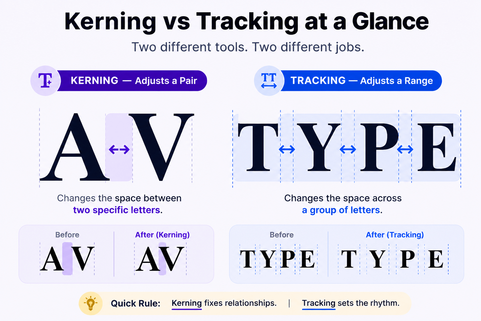
Kerning adjusts the space between a specific pair of characters, while tracking adjusts spacing across a selected word, line, or range of text.
That distinction sounds simple until you’re staring at a headline that somehow looks wrong. Is one letter pair creating an awkward hole? Is the whole word too cramped? Should you move two letters or all of them?
The difference tells you which spacing problem you’re actually looking at.
The easiest way to remember it is this: kerning fixes individual relationships; tracking controls overall spacing rhythm.
Kerning vs Tracking at a Glance
| Kerning | Tracking | |
|---|---|---|
| Controls | A specific character pair | A range of characters |
| Scope | Local | Overall/range-based |
| Typical problem | One awkward gap | Text feels generally too tight or loose |
| Example | Correcting AV or To | Opening the spacing across DESIGN |
| Common uses | Logos, headlines, display type | Headlines, labels, wordmarks, short text |
| Main risk | Inconsistent pair spacing | Weakening word cohesion and readability |
Here’s the practical rule I’d use before touching any spacing control:
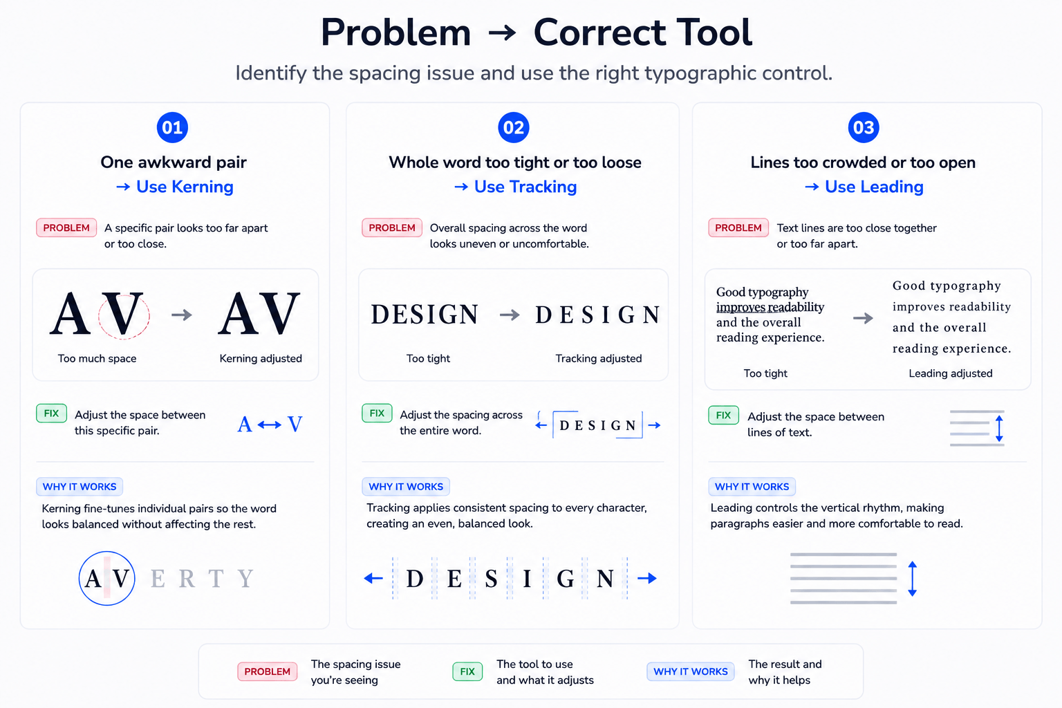
One awkward gap → Kerning
Whole word or range feels wrong → Tracking
Lines are too close or too far apart → Leading
That “scale of the problem” matters more than memorizing software terminology. Diagnose from the outside in: look at the whole text shape first, then the spacing rhythm, then individual pairs.
If you zoom straight into one gap, you may end up correcting a pair that only looked wrong because the entire word was too tightly tracked. The control should follow the diagnosis, not the other way around.
What Is Kerning?
Kerning in typography is the adjustment of space between specific pairs of characters.
Why specific pairs? Because letters are not rectangular blocks with visually identical edges. An uppercase A slopes inward. A V does too. A T has a wide horizontal top, while a lowercase o is round.
Put different shapes beside each other and the negative space between them can appear uneven even when their underlying spacing values are technically consistent.
Pairs such as:
AVVAToTaWAYo
can therefore need special treatment.
Your eye is judging the shape of the empty space, not whether every gap has the same numerical width. Two gaps can measure differently and still look equally balanced.
Font designers normally build kerning information into a typeface, so you should not assume every pair needs manual correction. In everyday body copy, the font’s existing spacing and kerning usually do most of the work.
Manual kerning becomes more valuable when type gets large and conspicuous — logos, wordmarks, packaging, posters and display headlines are less forgiving of one strange gap.
Metrics, Optical and Manual Kerning
In Adobe InDesign, there are several ways that pair spacing can be handled.
Metrics kerning uses kerning information contained in the font itself. In other words, the type designer has already defined adjustments for particular character pairs.
Optical kerning lets the software calculate spacing based on the shapes of adjacent characters rather than relying only on the font’s built-in kerning information.
Manual kerning is the designer stepping in and changing a particular pair directly.
Adobe recommends metrics kerning as the default in many situations, while optical kerning can be useful when a font has inadequate built-in kerning or when different typefaces or sizes meet. The important point is that kerning remains a pair-level adjustment.
What Is Tracking?
Tracking in typography changes spacing across a range of characters rather than fixing one particular pair.
Imagine the word:
DESIGN
If the gap between S and I alone looks awkward, you have a kerning problem.
If the entire word feels cramped and you want every character to breathe a little more, that is where tracking enters the picture.
Tracking changes the texture of a word or line. Tight spacing can make type feel compact and forceful; looser spacing can make it feel calmer and more open.
Uppercase labels are a familiar example. A small all-caps label can sometimes benefit from additional tracking because the extra space helps distinguish the individual capital forms.
That does not mean more tracking automatically equals better typography.
And it definitely does not mean:
L U X U R Y
is a design strategy.
Excessive tracking can break the visual cohesion that helps us recognize words quickly, particularly in body copy. Tracking is best treated as a controlled adjustment, not a decoration slider.
The Real Difference: Local Spacing vs Overall Spacing
The most useful way to understand kerning vs tracking is to stop thinking about them as two versions of the same tool.
They operate at different scales.
Suppose a word contains six letters and five visible spaces between them.
With tracking, you change the overall spacing across that selected range. All those letter relationships become tighter or looser together.
With kerning, you target one particular relationship.
So if four gaps look balanced but the fifth looks enormous, tracking is a poor repair tool. Tightening the whole word may reduce that troublesome gap, but it also changes the four gaps that were already working.
You have solved one problem by creating several smaller ones. Typography has a sense of humor like that.
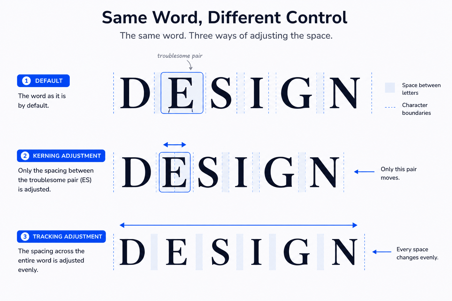
Kerning changes relationships
Kerning is concerned with how two neighboring character shapes interact.
Think about AV. The diagonal forms can create an unusually large visual opening if they are treated like two characters with vertical sides. Kerning allows those forms to sit closer together without appearing crowded.
That is why judging kerning purely with measurements can be misleading. What matters is the visual negative space produced by the shapes.
Tracking changes density
Tracking changes the overall texture of the selected text.
Tighten it, and a headline may feel denser and more compact. Loosen it, and the same headline may feel more open.
Kerning asks, “How do these two characters relate?”
Tracking asks, “How does this entire range of text feel?”
Think of the word as a small visual system: tracking establishes the baseline rhythm; kerning handles the exceptions created by particular letter shapes.
That is why good spacing can use both at once.
When Should You Use Kerning?
Kerning deserves the most attention when individual character relationships are highly visible.
Logos and wordmarks are obvious candidates. When a company name consists of only a handful of large letters, one ugly gap can affect the balance of the entire mark.
Large headlines deserve similar scrutiny. A kerning issue that disappears at 16 pixels can become painfully obvious when the same letters are displayed at 80 pixels.
Kerning is also useful for:
- Display typography
- Posters and editorial covers
- Packaging
- Short titles
- Custom lettering treatments
- Prominent navigation or interface typography where a specific pair genuinely looks wrong
The common thread is visibility.
You generally do not need to manually kern every pair in a paragraph. A well-made font already contains spacing and kerning decisions designed to handle ordinary text.
Instead, pay closer attention as typography becomes larger, shorter and more visually important.
When Should You Use Tracking?
Use tracking when the spacing issue belongs to the whole selected range, not one pair inside it.
It is particularly useful for short pieces of typography where overall density contributes to hierarchy or tone.
Common examples include:
- Uppercase labels
- Eyebrows and kickers
- Short headlines
- Wordmarks
- Navigation labels
- Display typography
- Compact or deliberately open typographic treatments
Tracking can also help tune how a heading sits within a layout. A small adjustment may make a line feel less cramped or give uppercase characters enough room to remain distinct.
Heavy-handed tracking, however, can quickly make words feel disconnected. And although widely tracked capitals are often associated with premium branding, spacing letters farther apart does not magically make a design sophisticated.
Good typography is annoyingly resistant to shortcuts.
Be especially cautious when the reason for changing tracking is simply “I need this headline to fit.” Aggressive negative tracking can turn a layout problem into a typography problem.
Before compressing the letters, consider the type size, container width, line break or wording. A spacing control should solve a spacing problem first.
For longer passages, start with the typeface’s intended spacing and make changes only when you have a clear reason.
How Kerning and Tracking Work Together
Kerning and tracking are not competing settings. You can use both in the same piece of typography because they control different layers of spacing.
Manual kerning and tracking values are cumulative. A tracked word can still contain individual pairs that receive their own kerning adjustments.
Imagine you are spacing a six-letter wordmark. The default version feels slightly cramped, so you introduce a modest amount of tracking.
The overall rhythm improves, but one diagonal pair still creates a larger pocket of negative space. You do not need to undo the tracking — simply kern that pair separately.
That is the practical relationship between the two controls: tracking establishes the broader rhythm; kerning refines the exceptions inside it.
Kerning vs Tracking vs Leading
Kerning and tracking are often discussed alongside leading in typography, but leading works on a different axis.
| Term | What it controls | Think |
|---|---|---|
| Kerning | Space between a specific character pair | Pair |
| Tracking | Spacing across a character range | Word/range |
| Leading | Vertical distance between lines of text | Lines |
So:
Kerning → A ↔ V
Tracking → T ↔ Y ↔ P ↔ E
Leading → distance between Line 1 and Line 2
If a paragraph feels vertically cramped, changing tracking is not the solution. If one pair in a logo looks strange, changing leading obviously will not help either.
Different spacing problem, different control.
For the wider system — including hierarchy, alignment, type scale and other fundamentals — our Typography Explained guide connects these individual controls to the bigger typographic picture.
Common Kerning and Tracking Mistakes
Understanding the definitions is easy. Applying them without making the type worse is the interesting part.
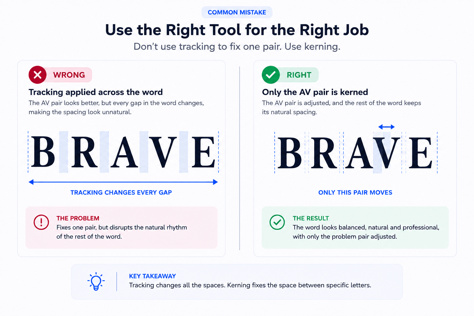
Using tracking to fix one bad pair
Suppose AVENUE looks balanced except for the first pair. Reducing tracking across the entire word affects every character relationship even though only AV needed attention.
Kern the problematic pair instead.
Kerning every letter manually
The opposite mistake is treating kerning like tracking performed one pair at a time.
If virtually every gap needs to become wider, adjust the overall tracking first. Then inspect whether individual relationships still need correction.
Overtracking body copy
Large amounts of tracking can interrupt the familiar visual grouping of letters into words.
Body text is not the place to demonstrate how enthusiastically you discovered the tracking control. Start with the font’s intended spacing and prioritize reading rhythm.
Assuming equal spacing means visually equal spacing
Typography is judged by the eye, not by forcing identical numerical gaps between every pair.
Round, diagonal and overhanging character forms produce different negative spaces, so optical balance may require numerically unequal spacing. This is precisely why kerning exists.
Fixing spacing at the wrong size
Do not perfect a microscopic gap while zoomed in to 800% and forget to check whether anyone can see your heroic correction at the final size.
Make adjustments close to the intended output size, then zoom back out. Display type deserves closer pair-level attention because those relationships become more visible as the type grows.
Ignoring the font’s built-in spacing
Good typefaces already contain deliberate spacing and kerning work.
TypeType distinguishes a font’s base glyph spacing from kerning adjustments used for combinations that need additional optical correction.
Manual kerning should refine a real problem, not automatically replace the type designer’s spacing system.
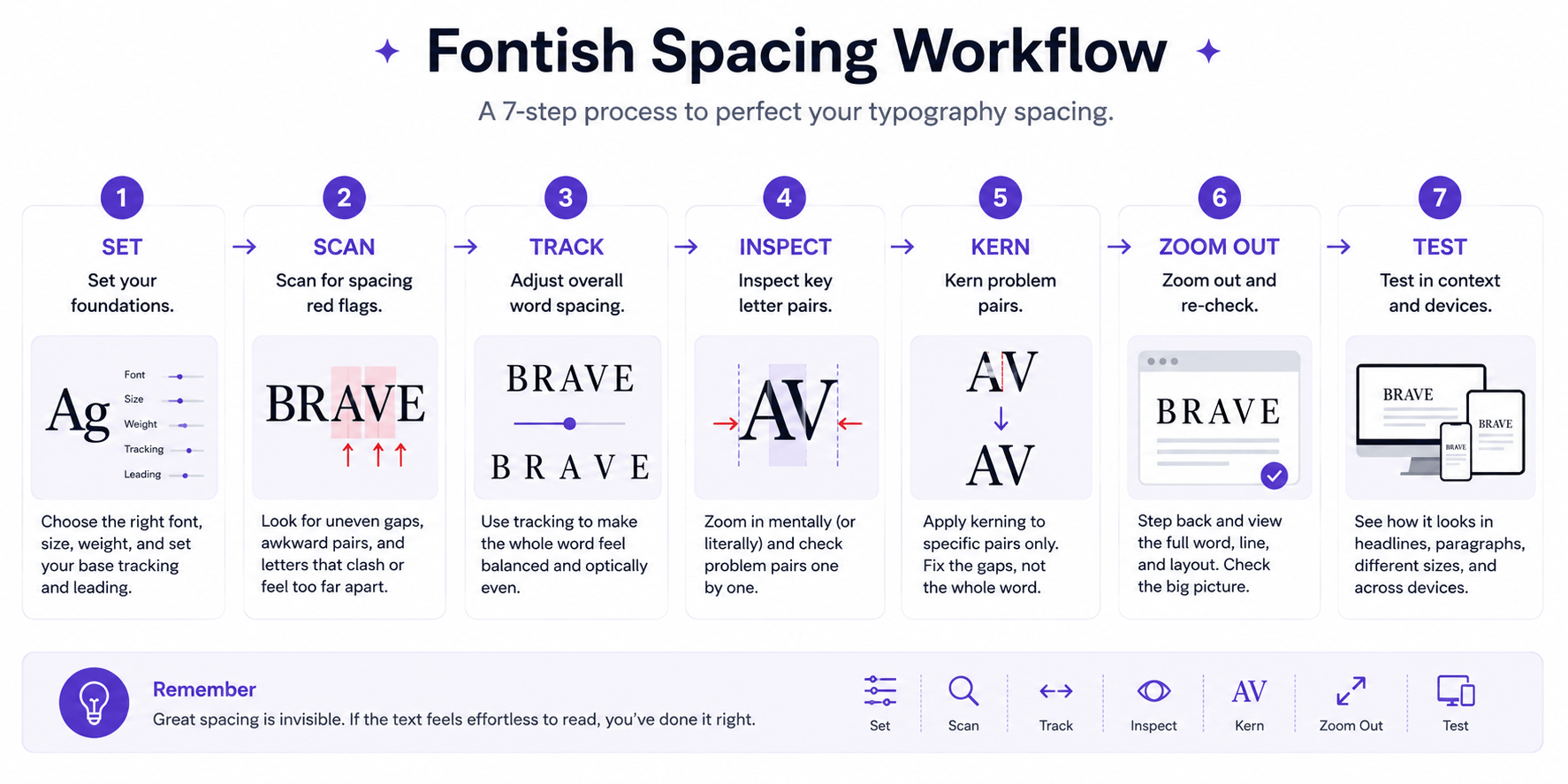
A Simple Kerning vs Tracking Workflow
You do not need to stare at every gap until the letters begin questioning your life choices.
Use a repeatable process instead.
1. Set the type at a realistic size
Judge a logo, headline or label close to the size and context in which people will actually see it. Spacing can look very different at different scales.
2. Look at the whole word first
Before moving individual letters, inspect the overall texture.
A useful diagnostic is a whole → rhythm → pair scan:
Whole: Does the word feel generally too open or compressed?
Rhythm: Do the spaces create a reasonably consistent visual beat?
Pair: Does one combination interrupt that beat?
This prevents you from micro-adjusting letters before you know whether the larger spacing system works.
3. Adjust tracking if the overall rhythm needs it
If the entire range needs more or less space, make a restrained tracking adjustment.
Do not use tracking to solve one local pair problem.
4. Inspect individual pairs
Look for interruptions in the rhythm: obvious holes, collisions or pairs that appear noticeably different from their neighbors.
5. Kern the exceptions
Correct only the individual relationships that genuinely need attention.
6. Zoom back out
A pair can look beautifully engineered in isolation and still feel wrong inside the complete word. Review the entire typographic shape after making your adjustments.
7. Test in context
Check the type against its surrounding text, imagery, layout and background. For digital work, test the actual responsive sizes rather than relying on one desktop artboard.
Then check it at normal viewing distance. If a correction only becomes visible at extreme zoom, it may be technically precise but practically meaningless.
The goal is not perfectly engineered gaps. It is convincing visual rhythm at the size people will actually see.
Frequently Asked Questions
What is the main difference between kerning and tracking?
Kerning adjusts the spacing between a specific pair of characters, while tracking changes spacing across a selected range. One awkward pair points toward kerning; a whole word that feels too tight or loose points toward tracking.
Should you adjust kerning or tracking first?
It depends on the problem. If the whole word needs adjustment, set the tracking first, then kern individual pairs that still look wrong. If only one pair is the problem, go straight to kerning.
Is tracking the same as letter spacing?
They describe closely related concepts. In typography software, tracking typically adjusts a selected range; on the web, CSS uses letter-spacing. The practical idea is similar, although implementation and units can differ.
Do you need to manually kern every font?
No. Well-made fonts generally include built-in spacing and kerning. Manual kerning is most useful when a pair still looks awkward in prominent typography such as a logo, wordmark or large headline.
What is the difference between kerning, tracking and leading?
Kerning adjusts a character pair, tracking controls horizontal spacing across a range, and leading controls vertical spacing between lines.
Pair → Kerning
Range → Tracking
Lines → Leading
Bottom Line
When typography looks badly spaced, don’t start moving letters at random. First, ask how large the problem is. A local problem points toward kerning; an overall spacing problem points toward tracking.
The distinction I find most useful is still the simplest:
Kerning fixes relationships. Tracking controls rhythm.
Once you understand kerning vs tracking and can diagnose which one is actually wrong, spacing type becomes much less mysterious — and a lot less dependent on nudging letters around until they happen to look respectable.
Next, go deeper with the Fontish guides to kerning, tracking and leading to see how each spacing control works on its own.