
 I
I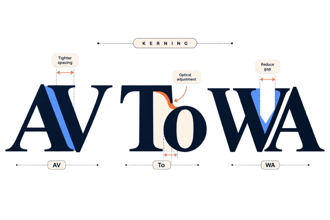
On This Page
Some letter combinations just look wrong.
You can use a beautifully designed font, set everything at the correct size, and still find that an AV, WA, or To combination leaves an awkward pocket of space. Nothing is technically broken, but your eye knows something is off.
That is where kerning comes in.
Kerning is the adjustment of space between specific letters or glyphs so that they look visually balanced. It is one of those small typography details that becomes surprisingly difficult to unsee once you understand it.
In this dictionary guide, we’ll look at what kerning means, why certain letter combinations cause problems, how kerning differs from tracking and leading, and how to kern type by eye without nudging letters around until Tuesday.
What Is Kerning in Typography?
Kerning is the adjustment of spacing between specific pairs of letters or glyphs to create more visually balanced typography.
The important word there is visually.
Good kerning does not necessarily make the measurable distance between every letter identical. In fact, doing that can make type look worse.
Consider these combinations:
AV
WA
To
Yo
The shapes of the letters create different areas of negative space. An uppercase A and V, for example, both contain diagonal strokes. If they are positioned according to simple rectangular boundaries, the pair can appear unusually far apart.
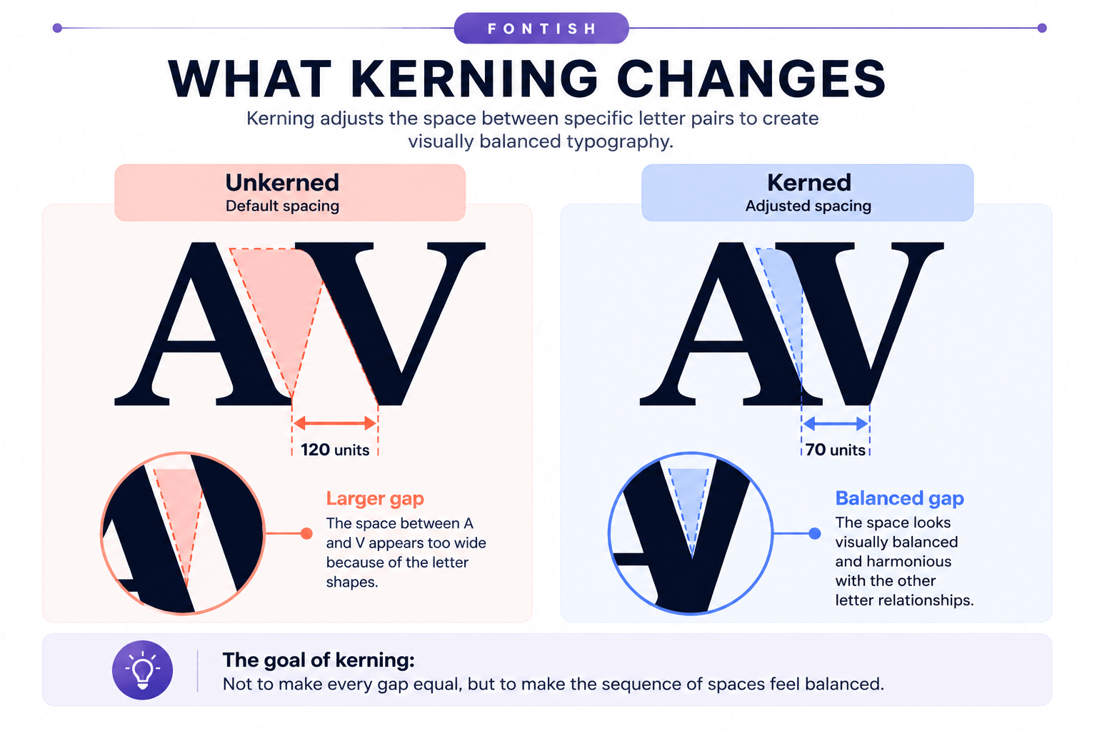
Kerning allows those shapes to sit closer together so the spacing looks right, even when the mathematical distances are unequal.
Why Equal Spacing Can Look Unequal
Letters are not boxes.
An H has relatively vertical outer edges. An O is curved. A V narrows toward its bottom point, while a T has a horizontal top that extends over the space beside it.
Put different shapes next to one another and they create very different pockets of white space.
This is why good spacing is largely an optical problem.
Imagine the pairs HH and AV. Giving both pairs exactly the same measured distance between their outermost boundaries does not guarantee that they will appear equally spaced.
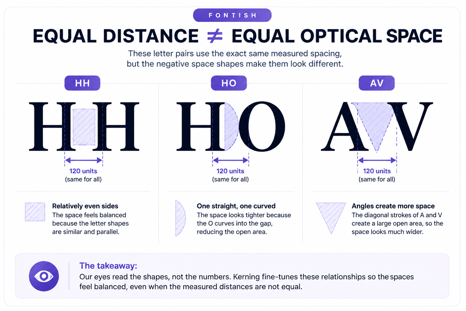
The goal of kerning is therefore not:
Make every gap identical.
It is:
Make the sequence of spaces feel balanced.
That distinction is the foundation of good kerning.
Why Kerning Matters
Poor kerning can make otherwise good typography feel amateurish.
You may not consciously think, “the spacing between those two glyphs needs a negative adjustment.” Most readers certainly won’t. They simply notice that the word looks awkward.
Kerning becomes especially important when type is large or visually prominent.
Think about:
- Logos and wordmarks
- Website hero headlines
- Posters
- Packaging
- Magazine covers
- Advertisements
- Title treatments
- Large interface typography
At these sizes, individual letter relationships become much easier to see.
A tiny spacing problem buried inside a paragraph may go unnoticed. Put the same awkward pair inside a 90-pixel headline and suddenly it has its own postcode.
Kerning also affects the rhythm of a word. When one gap is noticeably wider or tighter than its neighbors, your eye can momentarily separate letters that should read as a cohesive unit.
That does not mean every piece of text requires manual kerning. Well-made fonts already contain spacing and kerning information designed to handle normal text.
A designer’s job is knowing when the default is good enough and when prominent typography deserves closer inspection.
How Kerning Works
Every glyph in a digital font occupies space.
The font designer establishes default spacing around those glyphs, but certain combinations need additional adjustment because their shapes interact in unusual ways.
Kerning information can therefore instruct layout software to adjust the positioning of specific glyph combinations.
In modern OpenType fonts, kerning can be implemented through pair positioning in the GPOS (Glyph Positioning) table. Pair adjustment lets two glyphs be positioned in relation to one another.
You do not need to understand OpenType tables to kern a headline, but the technical detail explains something useful:
A font can already contain carefully designed kerning before you touch anything.
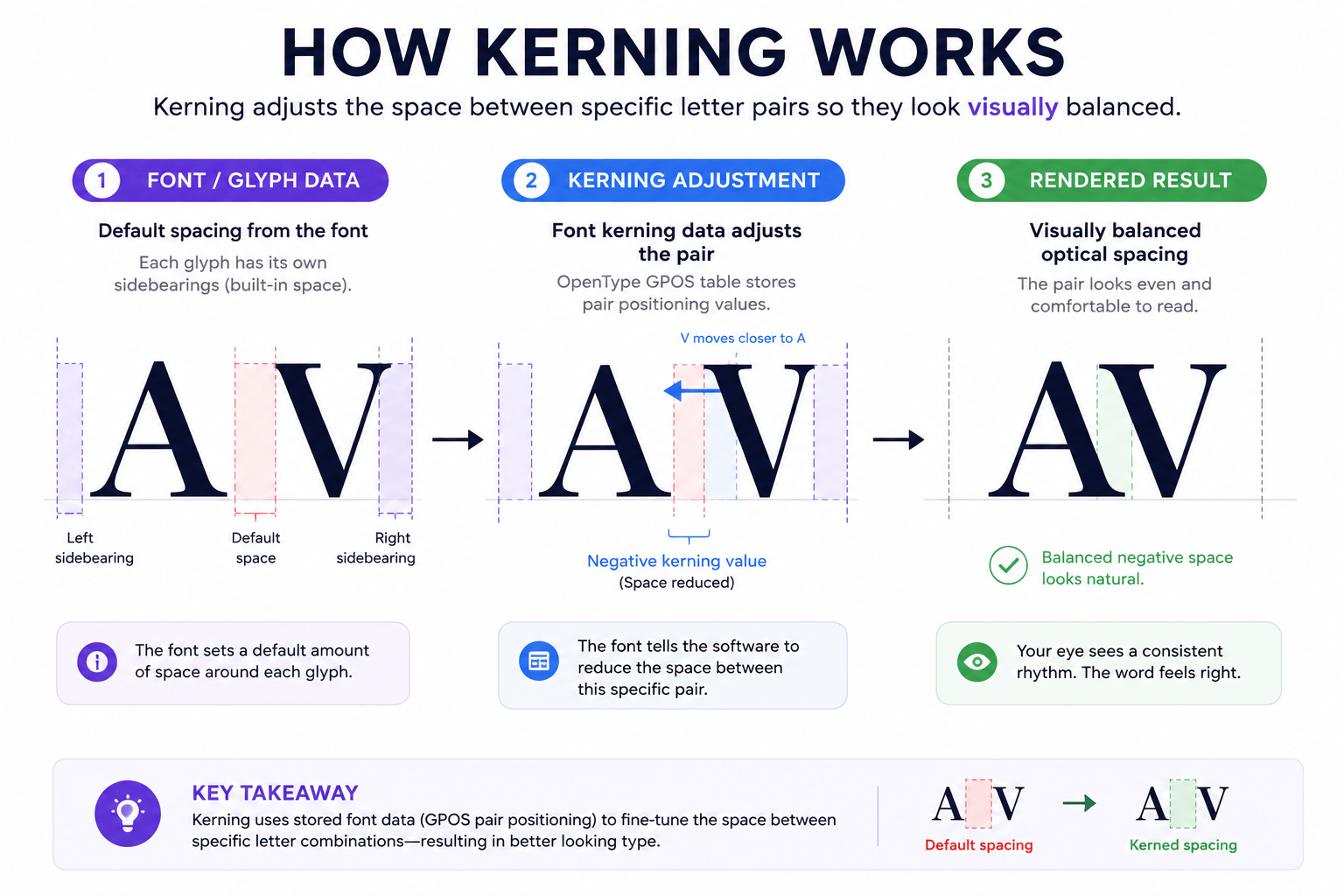
Your design application or browser can then use that information when it renders the text.
Metrics vs Optical Kerning
Some design applications provide options such as metrics and optical kerning.
Metrics kerning generally relies on the spacing and kerning information supplied by the font itself.
Optical kerning asks the application to analyze the shapes of neighboring characters and calculate spacing adjustments.
Neither option should be treated as an automatic “good versus bad” switch.
A well-made typeface may contain excellent kerning decisions created specifically for its letterforms. Optical kerning can sometimes help where the existing spacing produces an awkward result, including combinations involving different fonts or unusual characters.
The useful rule is simple:
Look at the result, not just the setting.
Typography software can give you a starting point. Your eye still makes the final judgment when the text is important enough to warrant manual attention.
Manual Kerning
Manual kerning means deliberately adjusting the space between particular characters yourself.
This is especially useful for short, prominent typography such as a logo, wordmark, title, or large headline.
Suppose the word WAVE looks balanced except for the relationship between the W and A. Changing the tracking of the entire word would affect every character.
Kerning lets you address the actual problem: that specific relationship.
That precision is what makes kerning different from broader spacing controls.
Kerning vs Tracking vs Leading
Kerning, tracking, and leading all affect typographic spacing, but they solve different problems.
Kerning adjusts spacing between specific character relationships.
Tracking adjusts spacing more broadly across a selected range of characters.
Leading controls the vertical spacing between lines of text.
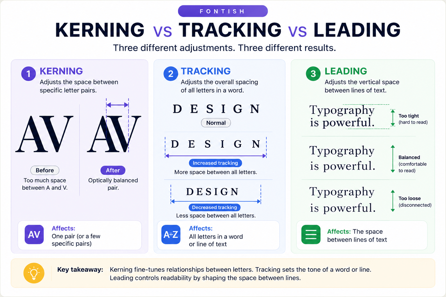
For example, if the A and V in a headline look too far apart, that is a kerning problem.
If the entire headline feels too loose, you may be dealing with a tracking issue.
If two lines of the headline feel cramped vertically, you are dealing with leading.
For a deeper explanation, read Tracking in Typography and Leading in Typography.
A useful shortcut is:
One awkward gap? Check kerning.
The whole word feels loose or tight? Check tracking.
The lines feel cramped? Check leading.
How to Kern Type by Eye
Kerning gets easier when you stop staring at the letters.
That sounds slightly ridiculous, so try it.
Instead of reading the word, look at the white shapes between its characters. You are trying to create a reasonably consistent visual rhythm between those spaces.
The Space-First Test
Here is the simplest way I know to change how you look at kerning:
Read the word once. Then stop reading the letters and inspect the negative spaces between them.
Which space interrupts the rhythm?
That is the pair worth investigating.
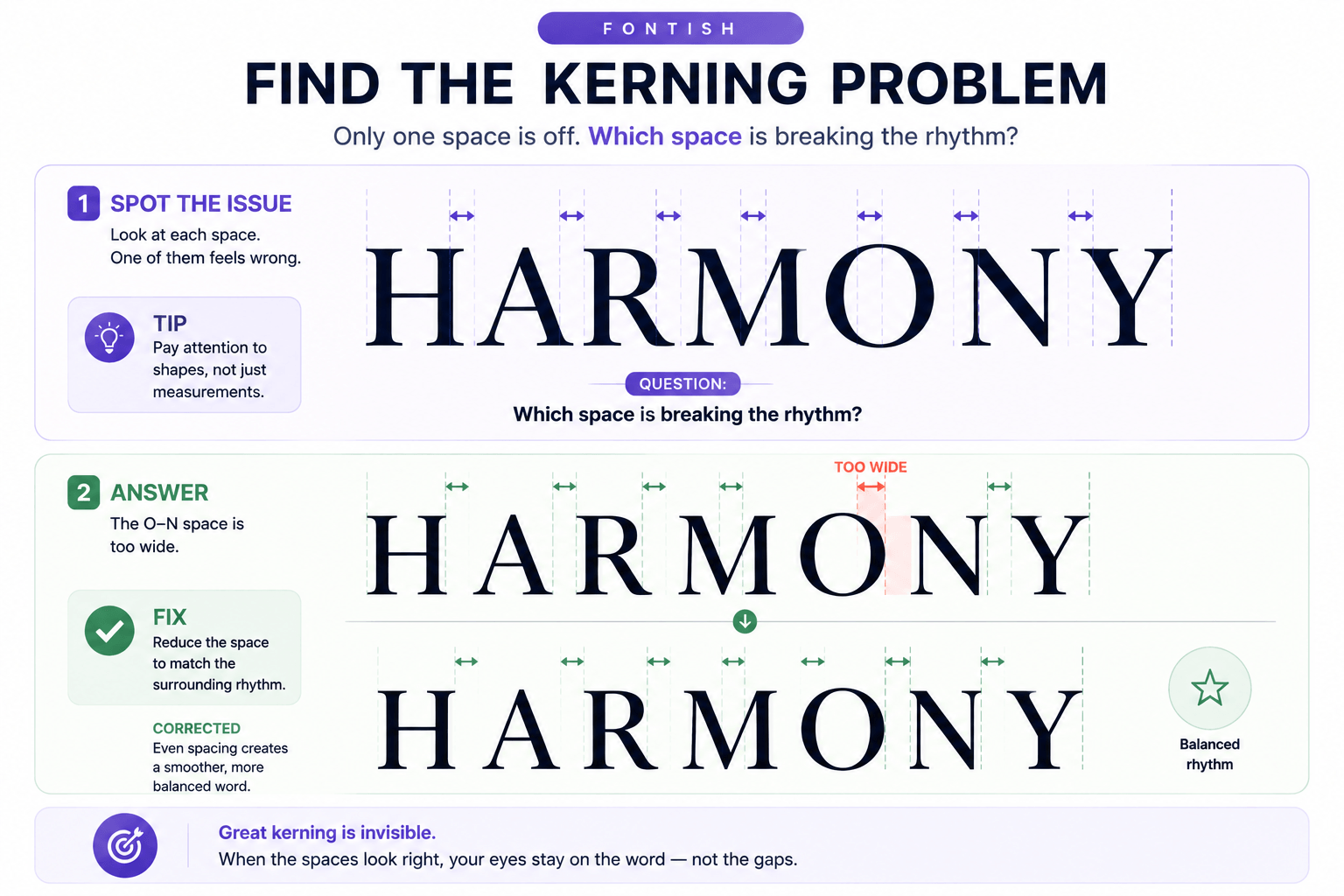
Once you can identify the problem, use this process.
1. Set the Type at Its Intended Size
Do not perfect the kerning of a tiny headline and then enlarge it dramatically.
Spacing relationships become much more visible as type gets larger, so inspect the typography at or near the size at which people will actually see it.
2. Scan the Spaces
Read the word once, then stop concentrating on its meaning.
Look at the negative space between each pair.
Which gap attracts your attention?
That is usually a better place to start than mechanically adjusting every pair.
3. Adjust the Worst Pair First
If one relationship is obviously too loose or tight, correct it.
Then look at the word again.
You may discover that fixing the most distracting pair is enough to make the entire word feel more balanced.
4. Compare the Rhythm
Move your eye across the spaces.
You are not trying to create identical geometric gaps. You are looking for a rhythm in which no individual space unnecessarily draws attention to itself.
5. Test the Whole Word Again
Kerning decisions should work as part of the word, not as isolated two-letter specimens.
A pair can look beautifully balanced on its own and still feel wrong once you restore the surrounding letters.
6. Change Your Viewing Distance
Zoom out.
Then zoom in.
If possible, step back from the screen for a moment.
Changing scale makes spacing problems easier to spot because you stop obsessing over individual outlines and start seeing the typography as a composition.
7. Stop When It Looks Balanced
There is a point where further adjustment stops improving the word and starts becoming recreational letter shuffling.
You are allowed to stop.
The Squint Test
One surprisingly useful trick is to squint slightly at the word.
Blurring the letter details reduces your tendency to read the characters individually. The dark letterforms and lighter spaces become more like abstract shapes, making uneven spacing easier to notice.
You can achieve a similar effect by zooming out significantly.
The principle is the same:
Reduce your attention to the letters and increase your attention to the space.
Letter Pairs That Commonly Need Attention
There is no universal blacklist of letter combinations that always require manual kerning.
Font design, weight, width, size, and context all affect the result.
More useful than memorizing a list of supposedly troublesome pairs is learning to recognize the shape relationships that create awkward spaces.
Diagonal + Diagonal
Examples:
AV
VA
WA
AW
Diagonal strokes can create large triangular areas of negative space. Moving the letters closer can often produce a more balanced relationship.
Overhang + Round Form
Examples:
To
Ta
The horizontal top of a capital T extends into the space above the following character. If spacing is based only on broad character boundaries, the lower area can appear unusually open.
Diagonal + Round Form
Examples:
Yo
Vo
A diagonal form beside a rounded letter can create irregular white-space shapes that differ from neighboring pairs.
Open or Irregular Shapes
Combinations involving letters such as L, T, Y, V, W, and A often deserve attention because their silhouettes leave unusual areas of space.
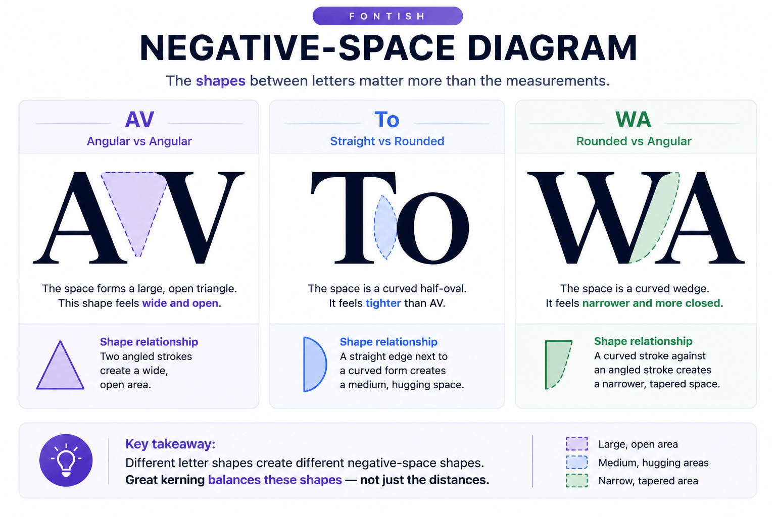
The useful lesson is not to memorize troublesome pairs, but to recognize the shape relationships that create troublesome spaces.
Once you can see those relationships, you can spot kerning problems in combinations you’ve never encountered before.
Where Kerning Matters Most
Not every text element deserves the same amount of kerning attention.
The practical question is:
How prominent is this typography?
A useful rule is that deliberate kerning becomes more worthwhile as typography becomes shorter, larger, more permanent, and more brand-visible.
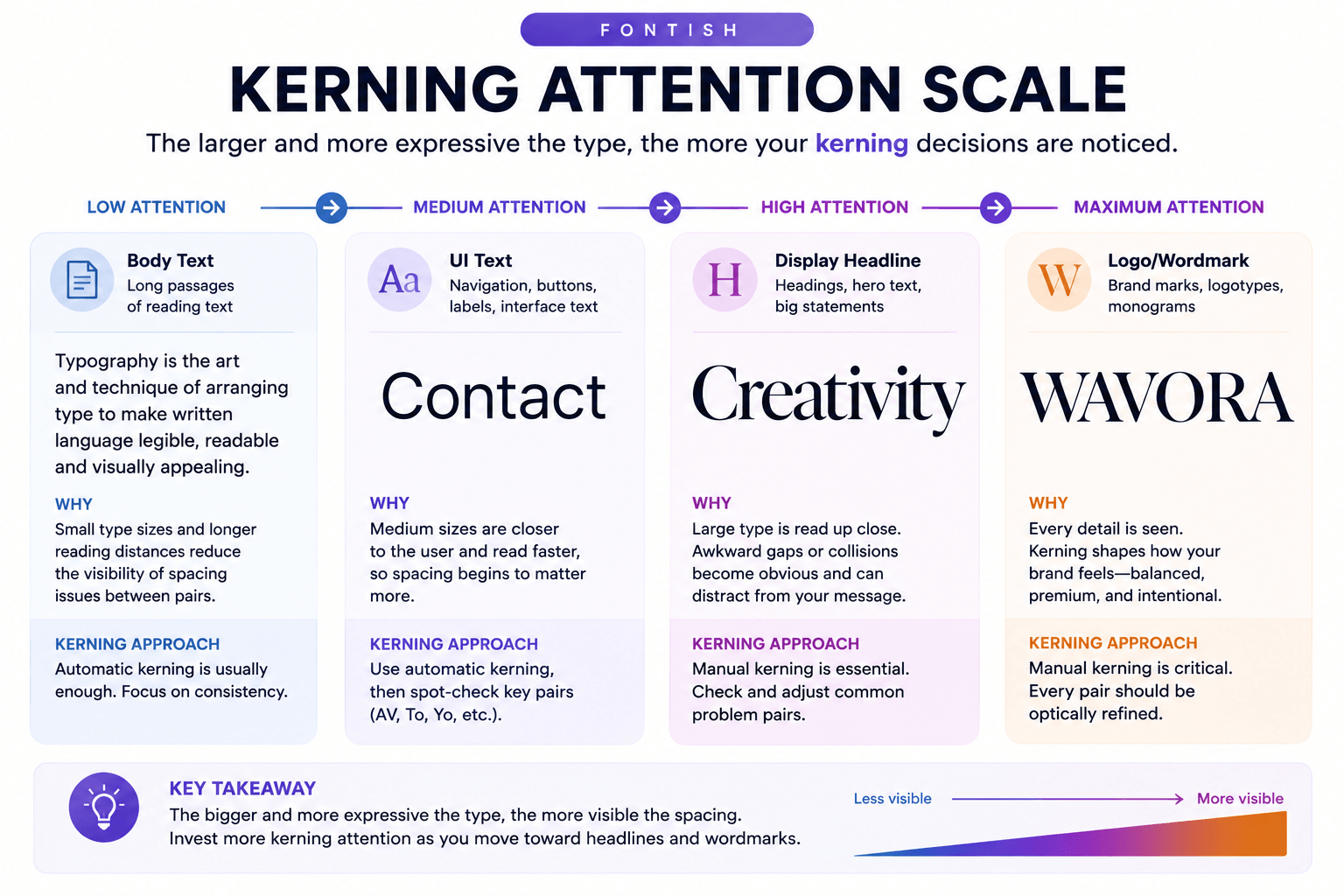
Logos and Wordmarks
Logos are one of the strongest cases for deliberate manual kerning.
A wordmark may contain only a handful of letters, yet those letters can appear on a website, storefront, product, business card, advertisement, and app icon for years.
Tiny spacing decisions suddenly matter a lot.
This is also where blindly accepting a font’s default spacing can be risky. The font designer created spacing for a general writing system. You are creating a specific visual mark.
Inspect every relationship.
If you’re still deciding which typeface should carry the identity in the first place, start with our guide to choosing the right font before fine-tuning individual letter relationships.
Headlines and Display Type
Large headlines expose spacing.
A pair that looks perfectly acceptable at body text size can become visually awkward when enlarged across half a screen.
For important display typography, inspect the result at its final size and make adjustments only where needed.
Posters, Packaging and Editorial Design
When typography becomes part of the composition rather than merely carrying information, spacing plays a larger visual role.
A poster with three enormous words gives the viewer plenty of opportunity to notice an uncomfortable gap.
The same applies to packaging, covers, advertisements, and other display-focused layouts.
Body Text
Body copy is different.
Manually kerning thousands of character pairs would be both impractical and usually unnecessary. A quality text typeface should contain spacing and kerning designed for continuous reading.
For body text, focus more heavily on choosing a well-made font and setting appropriate size, line length, tracking where necessary, and leading.
Manual kerning is best reserved for the moments where individual letter relationships are visually significant.
Kerning on Websites
Web typography can also use kerning information contained in fonts.
Browsers can apply that information during text rendering, and CSS provides the font-kerning property for controlling its use. MDN’s font-kerning reference documents the property and its browser support.
The main values are:
font-kerning: auto;
font-kerning: normal;
font-kerning: none;
With auto, the browser determines whether to use kerning.
normal applies the kerning information stored in the font.
none disables that stored kerning information.
For most ordinary website typography, you do not need to manually manage individual letter pairs. Start with a well-made web font and let its typography data do its job.
There is another important distinction for web designers:
letter-spacing is not the same thing as kerning.
Changing letter-spacing alters spacing across text more broadly. It is useful when you intentionally want a looser or tighter overall treatment, but it is not a precise replacement for pair-specific kerning.
A useful diagnostic is:
Local spacing problem → local adjustment.
Overall spacing problem → broader adjustment.
If one relationship in a display word looks wrong, adjusting the spacing of every character to compensate can simply create several new problems.
Common Kerning Mistakes
Understanding what not to adjust is part of learning kerning.
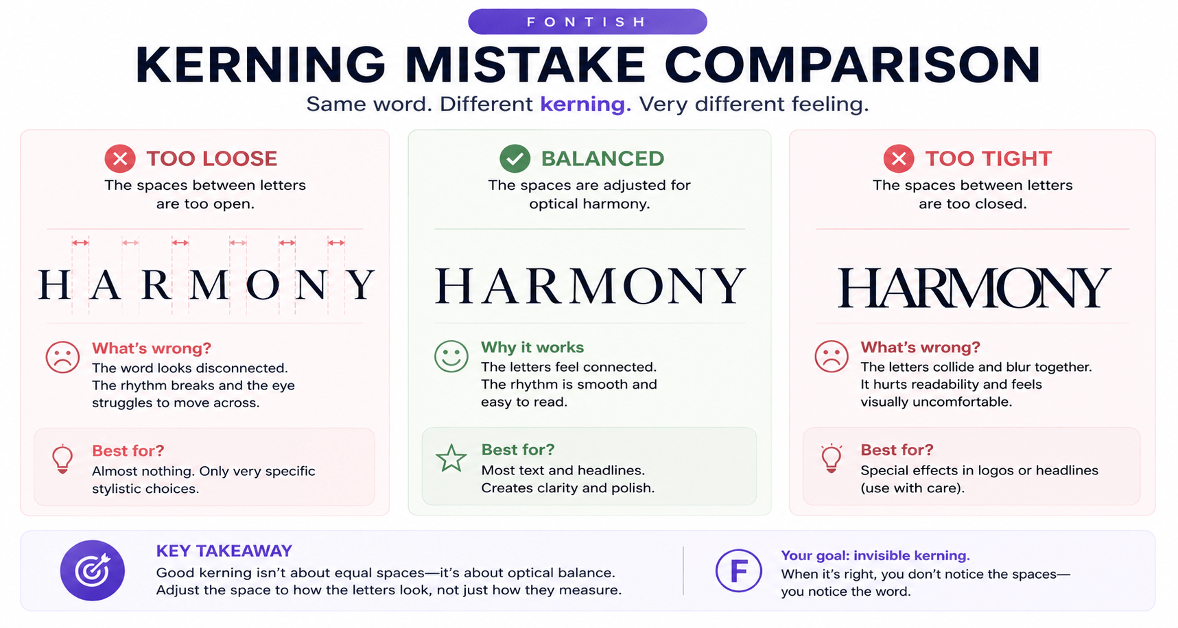
Adjusting Every Letter Pair
Manual kerning is not a ritual that every word must endure.
If a pair already looks balanced, leave it alone. The goal is to fix visible spacing problems, not prove that you found the kerning controls.
Making Every Gap Mathematically Equal
Because letterforms have different shapes, mathematically equal gaps can produce visually unequal spaces.
Trust optical balance over raw distance.
Using Tracking to Fix One Bad Pair
Imagine one gap in a five-letter word looks too wide.
Reducing the tracking of the entire word affects several relationships to solve one.
Fix the pair that needs fixing.
Over-Kerning
Tighter is not automatically better.
Pushing characters together until every available pocket of white space disappears can damage clarity and make a word feel cramped.
Kerning should balance space, not eliminate it.
Kerning Too Early
Fine spacing should not be your first design decision.
For a logo or headline, establish the wording, typeface, weight, approximate size, and basic composition first. Then refine individual relationships.
There is little value in spending fifteen minutes perfecting an AV pair in a typeface you replace five minutes later.
A Simple Kerning Workflow
When you need to manually kern important typography, use this five-step process:
Set
Choose the typeface, weight, approximate size, and context first.
Scan
Look across the word and identify the spaces that interrupt its visual rhythm.
Adjust
Correct the most obvious pair-specific problems without changing relationships that already work.
Compare
Review the adjusted pair in the context of the entire word rather than judging it in isolation.
Test
View the typography at different scales and, where relevant, in its real layout.
SET → SCAN → ADJUST → COMPARE → TEST
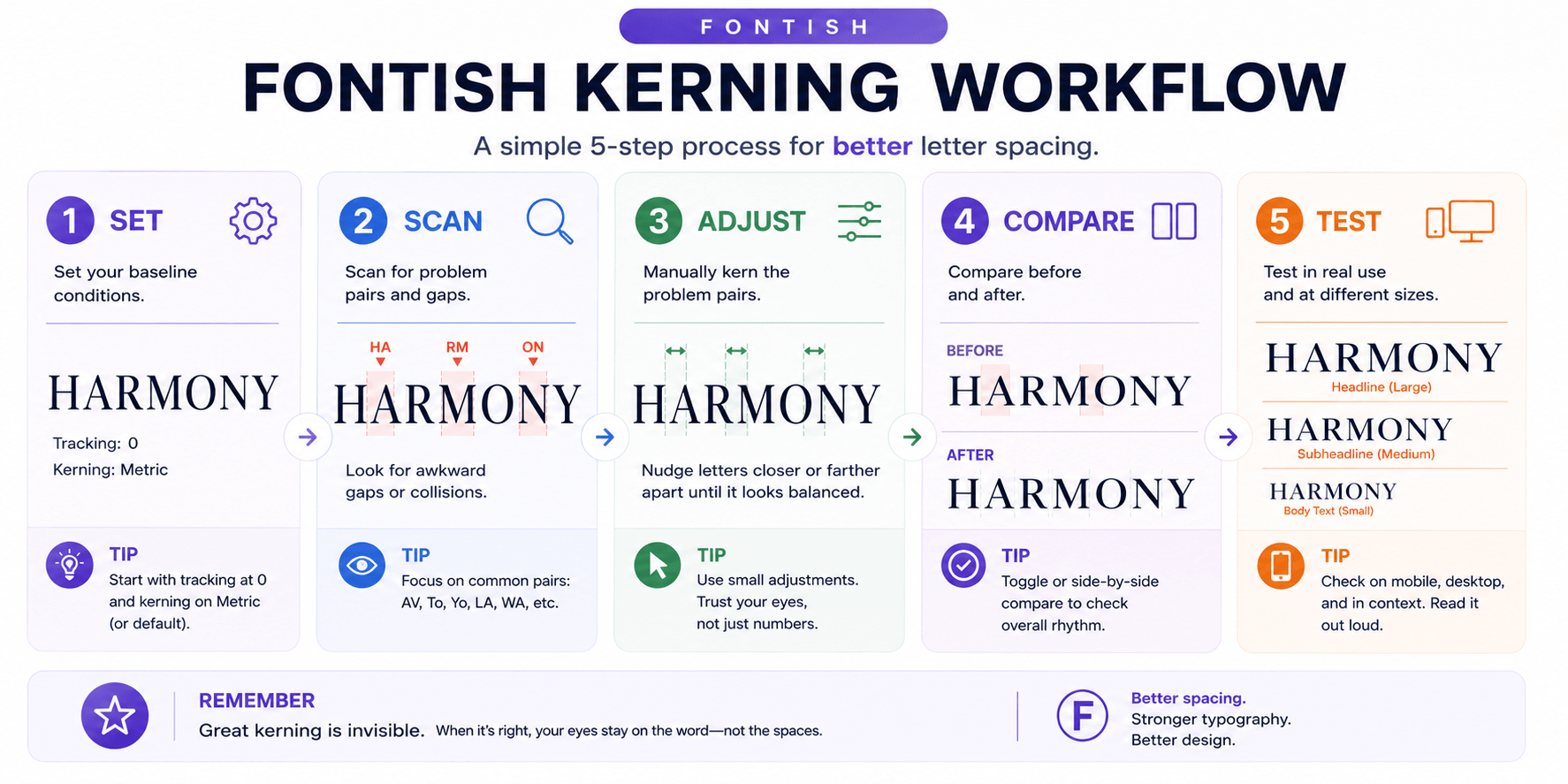
The workflow is deliberately simple.
Kerning can become highly technical at the type-design level, but everyday designers do not need to calculate every relationship. You need a reliable way to identify where the spacing feels wrong and make a controlled correction.
Related Kerning and Typography Concepts
Kerning becomes easier to understand when you see where it sits inside the larger typography system.
| Concept | What it controls | Practical distinction |
| Kerning | Space between specific glyph relationships | Fixes a local spacing problem |
| Tracking | Spacing across a range of characters | Makes a word or passage broadly tighter or looser |
| Leading | Vertical space between lines | Controls line spacing rather than letter spacing |
| Letter spacing | General horizontal character spacing | Common broader spacing control, including CSS letter-spacing |
| Sidebearings | Space built into the sides of glyphs | Establish much of a glyph’s default spacing |
| Glyph | Visual representation of a character or symbol | The actual form being positioned |
| Type anatomy | Structural parts and shapes of letterforms | Helps explain why different forms create different negative spaces |
For the broader system, Typography Explained connects spacing with hierarchy, anatomy, readability, font selection, and other typography fundamentals.
Frequently Asked Questions
What is kerning in simple terms?
Kerning adjusts the space between specific letters so they look visually balanced. If a gap in a word looks awkward, kerning is usually the spacing setting to check.
What is the difference between kerning and tracking?
Kerning adjusts specific letter relationships. Tracking changes spacing across a broader selection of text.
Think local problem = kerning; overall spacing problem = tracking.
Does every font have kerning?
Not every font contains the same amount or quality of kerning information. Modern OpenType fonts can use pair-positioning data to adjust particular glyph relationships.
Should you kern body text manually?
Usually not. A well-designed text font should already handle normal spacing effectively.
Manual kerning is more useful for logos, wordmarks, titles, and large display typography.
Is kerning important for websites?
Yes, but browsers and web fonts normally handle it automatically. CSS font-kerning provides additional control when needed.
For ordinary web copy, good font selection and overall typography settings matter more than manually adjusting individual pairs.
Bottom Line
Good kerning is not about making every space equal. It is about making the spaces look balanced.
Once you understand that, kerning becomes much less mysterious. Stop treating letters like identical boxes and start looking at the negative space their shapes create.
Use the Space-First Test, then follow:
Set → Scan → Adjust → Compare → Test.
When something still feels wrong, ask one question:
Which space is interrupting the rhythm?
Find that gap.
Then fix that gap.
That’s kerning.