I
I
In This Guide
You have searched through hundreds of fonts, rejected all of them for being almost right, and reached the wonderfully dangerous conclusion: “I’ll make my own.” Welcome to type design.
Font design can look like a wall of unfamiliar terms, Bézier curves, side bearings, kerning classes, metrics, and OpenType features.
Underneath the vocabulary, however, the job is straightforward to describe: you are building a consistent visual system that turns language into readable shapes.
This beginner guide takes you from the first design brief to a working export. You will learn what to draw first, how to keep letters related, when to start spacing, what to test, and what can safely wait until project two.
The goal is not to produce the next global superfamily over a weekend. It is to finish one focused, usable style and understand why it works. That is already a serious achievement.
What Font Design Actually Involves
Font design is not the same as drawing a handsome alphabet. A letter can look excellent in isolation and still fail the moment it meets another letter. Type is judged in words, lines, and paragraphs, so every glyph must belong to the same system.
A typeface is the visual design and the shared idea behind the characters. A font is the usable software resource that delivers a specific style or variable range.
If that distinction still feels slippery, start with Fontish’s typography guide.
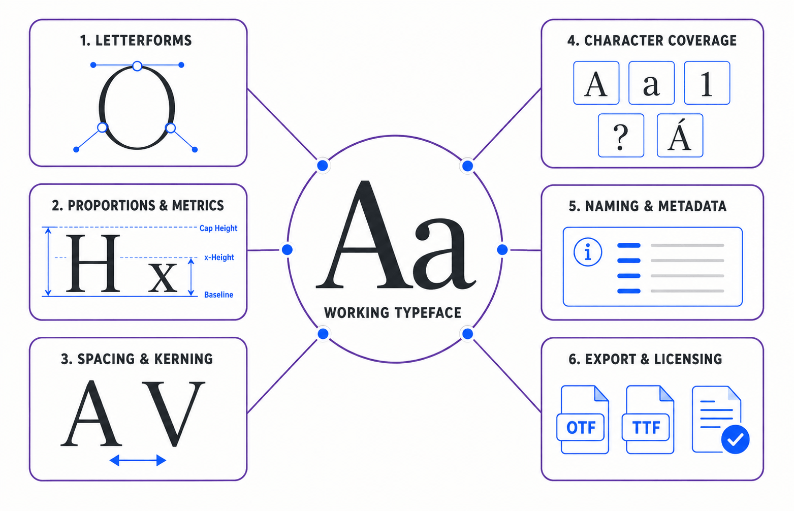
A functional first font usually asks you to coordinate several layers at once:
- Letterform proportions, stroke weight, and contrast
- Curves, corners, terminals, and repeated construction details
- Vertical metrics such as the baseline, x-height, cap height, ascenders, and descenders
- Horizontal spacing through side bearings and kerning
- Character coverage, punctuation, numerals, and symbols
- Font naming, metadata, export settings, and licensing
This is why type design feels closer to designing a product than creating a single illustration. The alphabet is the visible interface; the underlying rules make it reliable.
Designer insight: Great typefaces are not drawn letter by letter. They are built relationship by relationship.
What to Learn Before You Draw
You do not need a degree in typography before opening a font editor. You do need enough vocabulary to diagnose what your eyes are seeing. Otherwise, every correction becomes a vague game of “that looks weird.”
Learn Font Design Anatomy That Changes Decisions
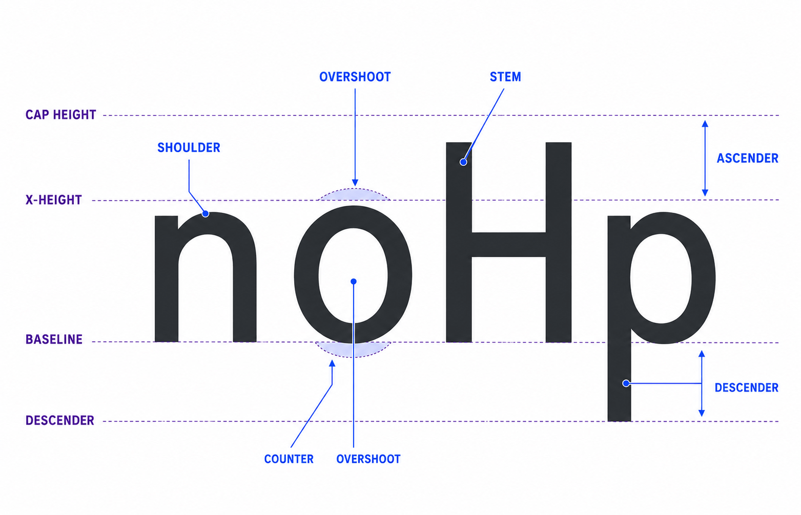
Start with the baseline, x-height, cap height, ascenders, and descenders. These measurements set the vertical proportions of the design and strongly affect its texture in text.
Then look at bowls, counters, apertures, stems, shoulders, terminals, and serifs.
Counters and apertures deserve special attention because type designers shape white space as deliberately as black strokes. Open forms usually survive small sizes better; cramped counters tend to fill in.
Stress and stroke contrast help establish personality. Diagonal stress can feel calligraphic or traditional. Vertical stress can feel constructed or modern.
High contrast creates drama but asks more from printing and screen rendering; low contrast is usually more forgiving at small sizes.
Choose a Classification and Use Case
Decide whether you are building a serif, sans serif, slab serif, script, or display face and where it is meant to work.
A headline face can exaggerate personality. A text face must remain comfortable across many lines. An interface face needs to stay clear at small sizes and in dense layouts.
If you need help connecting type characteristics to a practical brief, use Fontish’s guide to choosing the right font. The same questions work in reverse when you are designing one.
Write a one-sentence concept before you draw. For example: “A warm humanist sans for independent food brands, readable in packaging copy but distinctive in headlines.” That sentence gives you a test for every later decision.
Choose a Realistic First Font Project
The best first project is deliberately small. A single Regular style with basic Latin coverage teaches more than an unfinished family with nine weights, italics, and a variable optical-size axis humming ominously in the corner.
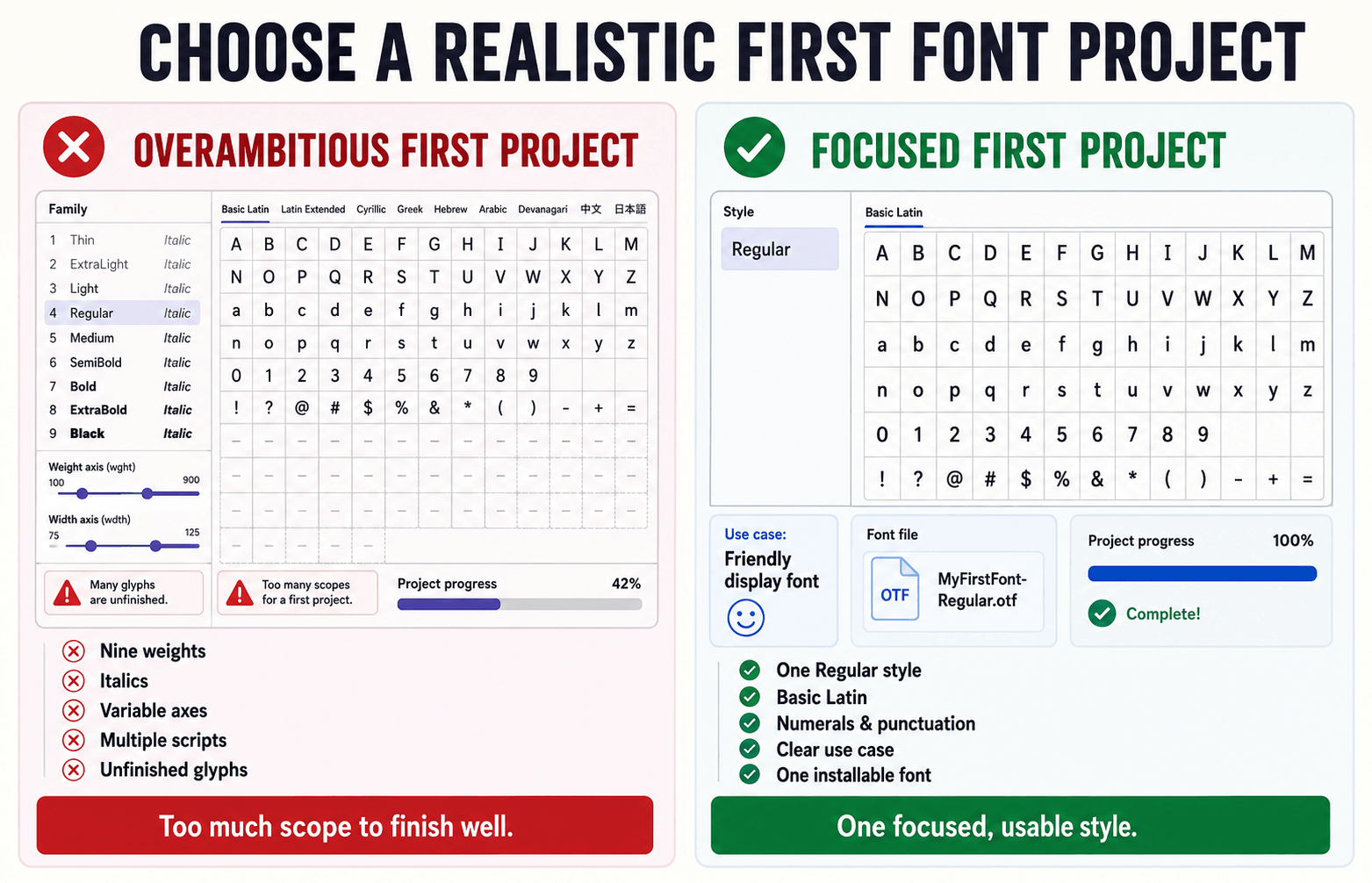
A sans serif can simplify a first project because there is no serif system to coordinate, but it is not mandatory. If your strongest idea is a chunky display serif, build that. Motivation matters, provided you limit the scope.
A useful first-project brief defines:
- Purpose: Headline, short text, branding, interface, or experimental display
- Tone: Warm, formal, playful, technical, editorial, or something more precise
- Target sizes: A narrow range you can test consistently
- Character set: Letters, numerals, core punctuation, and essential symbols
- Deliverable: One installable desktop font, not an entire foundry catalog
Study reference typefaces for proportions, rhythm, and construction—not to trace or slightly remix them. Record what you admire and what problem your design will solve differently.
Font Design Software and Equipment
You need a computer, a font editor, and enough patience to redraw the same curve several times without taking it personally.
A tablet is optional. Most outline refinement happens through nodes and handles, so a mouse or trackpad is perfectly workable.
Font Editors Worth Considering
| Editor | Platforms | Price Model | Best For | Learning Curve |
|---|---|---|---|---|
| Glyphs | macOS | Paid | Beginner-friendly professional workflow | Moderate |
| FontLab | macOS and Windows | Paid | Comprehensive professional production | Moderate–high |
| RoboFont | macOS | Paid/modular | Scriptable and customized workflows | High |
| FontForge | macOS, Windows and Linux | Free/open source | Zero-cost entry and experimentation | Moderate–high |
Glyphs is a popular macOS editor with an approachable workflow and an extensive official learning library.
FontLab offers a broad professional toolset across macOS and Windows.
RoboFont is highly flexible and appeals to designers who want a modular, scriptable environment.
FontForge is free and open source. Its interface takes time to learn, but its official documentation and tutorial cover font creation, glyph drawing, and outline import, making it a capable zero-cost starting point.
Illustrator, Affinity Designer, or Figma can help with rough sketches, but a general vector app does not manage font metrics, side bearings, kerning, character mapping, OpenType features, or reliable font exports. Sketch there if you like; finish in a proper font editor.
Pro tip: Pick one editor and complete a small project before comparing every feature. Tool shopping is unusually convincing procrastination.
How to Design Your First Typeface
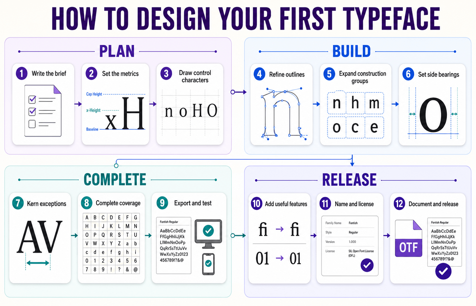
Font design follows a structured workflow, moving from a focused brief and control characters to spacing, testing, export, and release.
The steps below keep those decisions connected as the typeface develops.
1. Write the Design Brief
Define the reader, context, sizes, personality, and scope. Then collect references that support those choices.
If your font is for a cybersecurity dashboard, you may prioritize open apertures, stable spacing, and compact proportions. If it is for a luxury magazine, moderate-to-high contrast and more delicate details may be appropriate.
Do not describe the font only as “modern” or “clean.” Those words are too elastic to guide a curve. Describe how it should behave and where it will be used.
2. Set Up the Vertical Metrics
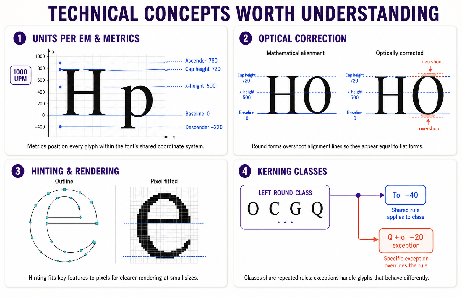
Many first Latin fonts use 1,000 units per em because the numbers are easy to reason about, although other values are valid.
A starting framework might place the baseline at 0, x-height near 500, cap height around 700–750, ascender near 750–800, and descender around −200 to −250.
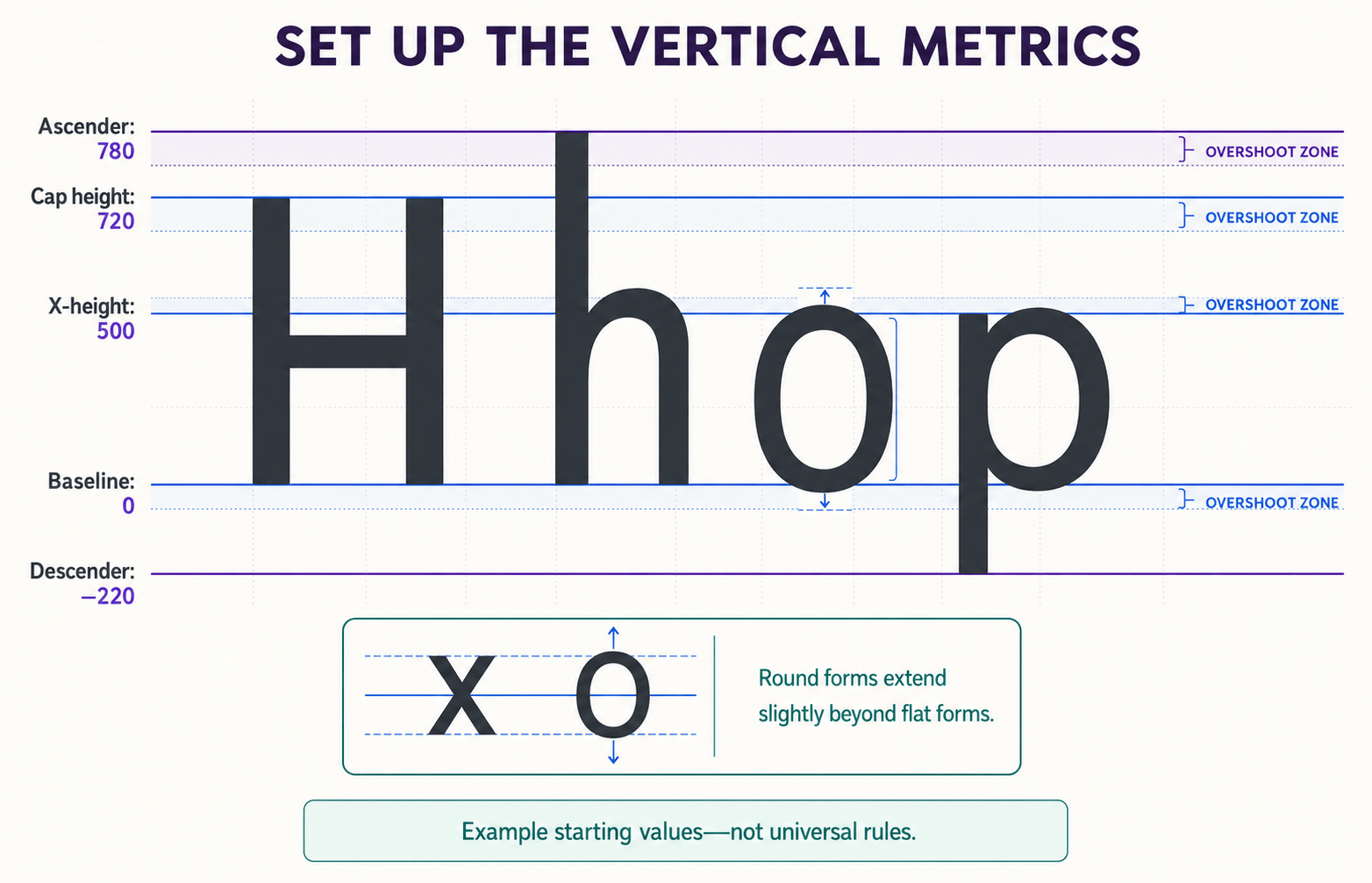
Treat those values as a starting hypothesis, not a recipe. A larger x-height can improve apparent size on screens but may reduce the visual difference between lowercase letters and capitals. Deep descenders add character but require more vertical room.
Remember overshoot: round and pointed forms usually extend slightly beyond flat alignment zones so they appear equal in height. An O measured exactly like an H often looks smaller. Type design is full of small lies told in service of visual truth.
3. Draw Control Characters First
Begin with n, o, H, and O. These control characters reveal the font design’s stems, arches, rounds, counters, proportions, contrast, and curve tension.
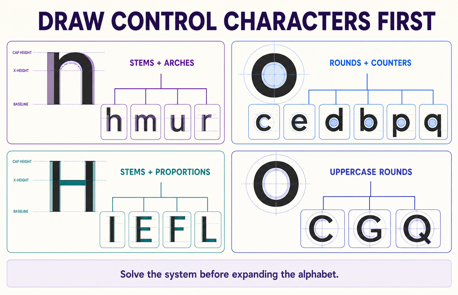
Once they agree, they provide components and visual logic for much of the alphabet.
Use n to develop h, m, u, and r. Use o to inform c, e, d, b, p, and q. H and O establish the uppercase rhythm. Test combinations such as non, noon, HOHO, and OHNO before expanding.
Do not polish one glyph until it sparkles while its neighbors remain blank. Control characters are prototypes; they should evolve together.
4. Build Clean Outlines
Digital letterforms use vector outlines made from line segments and Bézier curves.
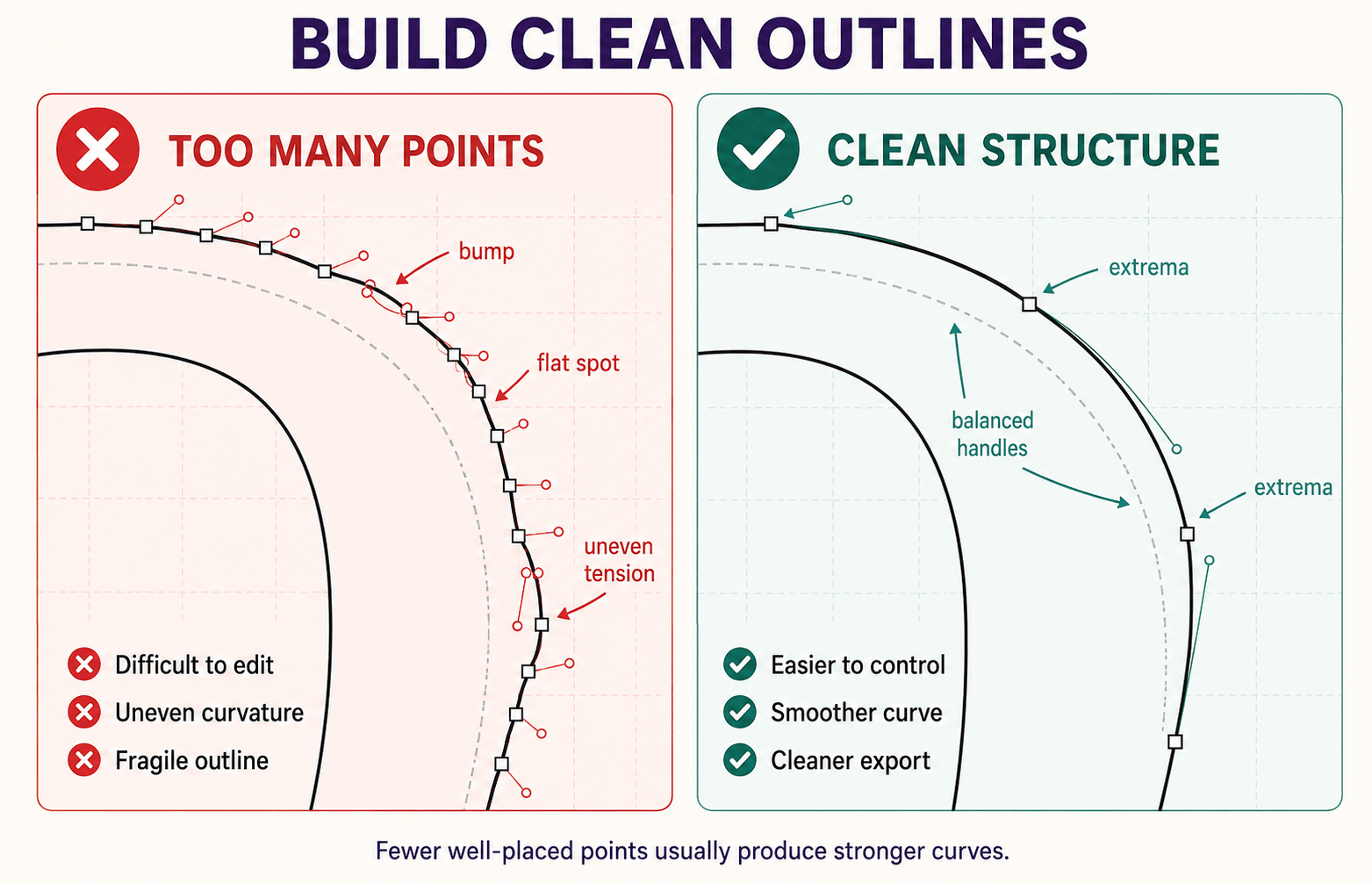
Place points at meaningful extrema, keep handles smooth where the curve should be smooth, and use as few points as the shape comfortably allows.
Too many nodes make curves lumpy and revisions painful. When a curve feels wrong, first move or remove points rather than adding another.
Compare related curves at the same zoom level, then inspect them again at the intended reading size. Perfect at 1,600% is not a useful design goal.
5. Expand by Construction Groups
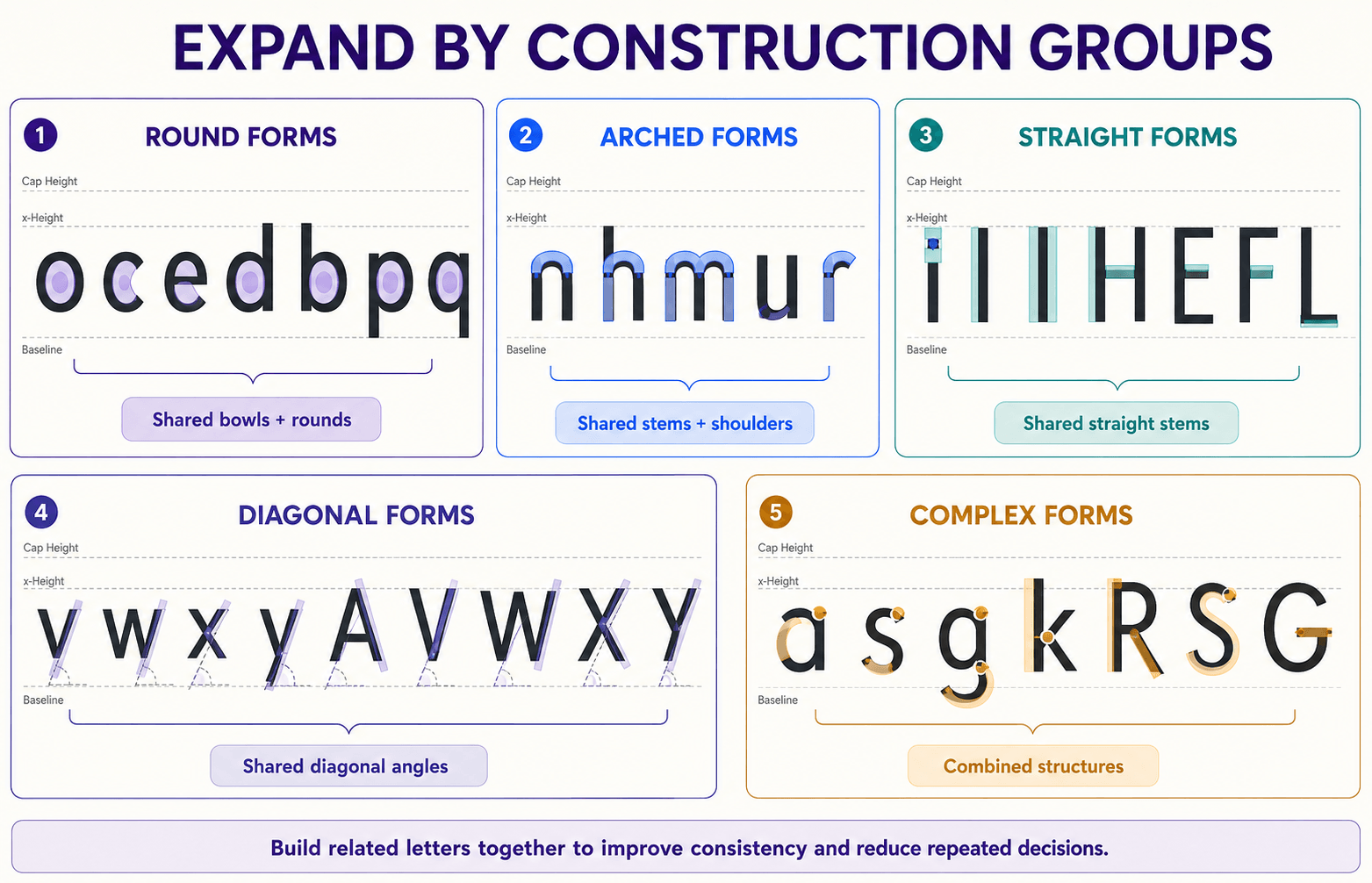
Build related letters together so each solution strengthens the system:
- Round forms: o, c, e, d, b, p, q
- Arched forms: n, h, m, u, r
- Straight forms: i, l, I, H, E, F, L
- Diagonal forms: v, w, x, y, A, V, W, X, Y
- Complex forms: a, s, g, k, R, S, G
The exact order can change, but grouping reduces random decisions.
Reuse components cautiously: shared parts improve consistency, yet optical corrections may require a component to change in a particular letter.
6. Space as You Draw
Side bearings: the space built into the left and right sides of each glyph creates the basic rhythm of the font.
Set them before kerning. If the underlying spacing is weak, kerning becomes an endless attempt to repair every combination individually.
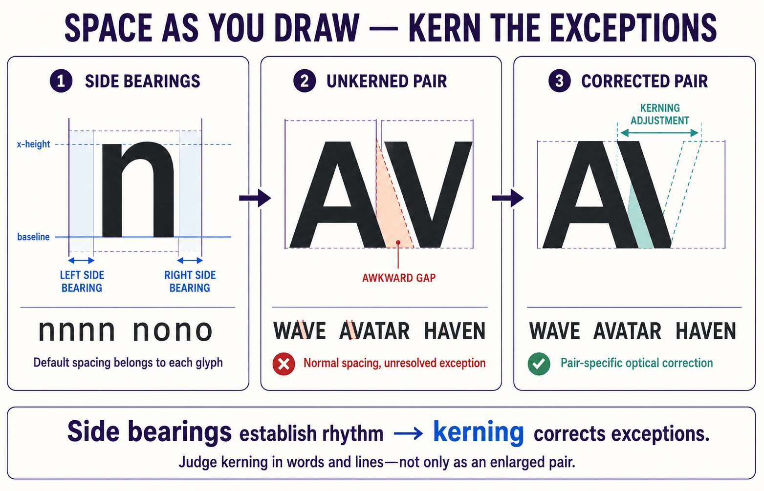
Test repeated control strings such as HHHH, OOOO, HOHO, nnnn, oooo, and nono. Then use real words. Turn the text upside down or blur your focus slightly to judge the pattern of light and dark without being distracted by meaning.
Keep tracking separate in your mind: tracking changes spacing across a selected run of text, while the font’s side bearings and kerning define its built-in rhythm. Leading controls vertical space between lines and belongs to typesetting rather than glyph construction.
7. Kern the Exceptions
In font design Kerning adjusts specific combinations whose shapes produce awkward gaps after normal spacing is sound. Diagonals and overhangs create familiar cases: AV, VA, WA, To, Ty, and Yo.
Start with class kerning, which groups glyphs with similar edges. A left-side class for O, C, G, and Q, for example, can reduce repetitive work. Add exceptions only where a glyph genuinely behaves differently.
Judge kerning inside words and lines, not as isolated pairs enlarged to heroic proportions. The goal is an even rhythm, not identical measured gaps.
8. Complete a Sensible Character Set
A first font release should include uppercase and lowercase letters, numerals, core punctuation, quotation marks, parentheses, basic currency symbols, and the marks required for the languages you claim to support.
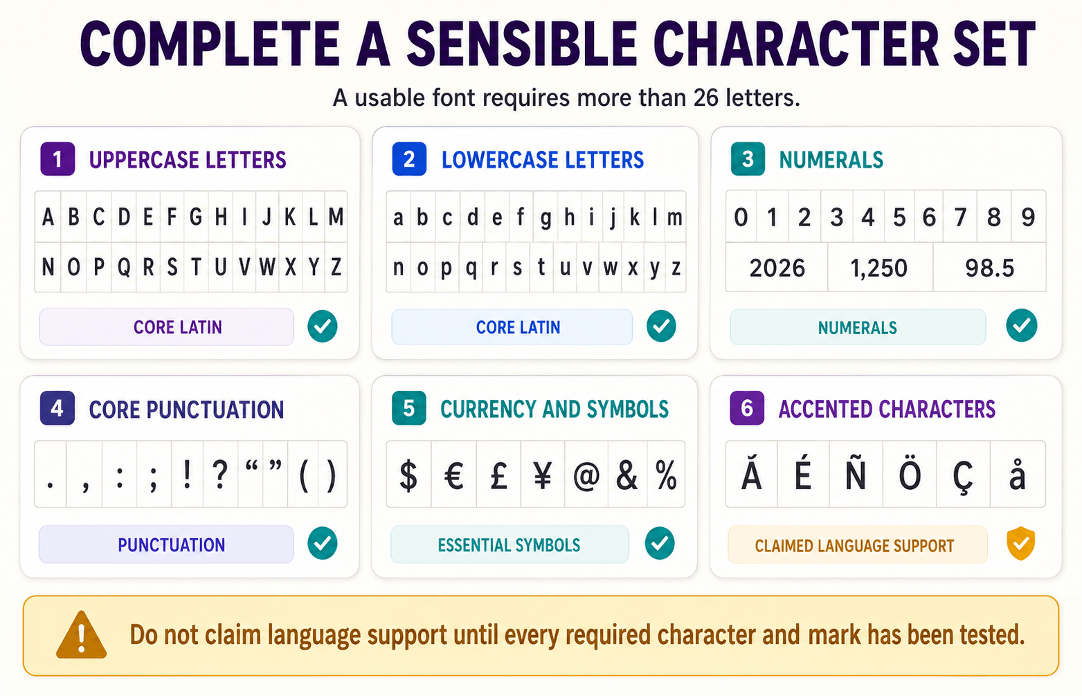
Do not promise broad language support because the font contains a few accented letters. Check Unicode assignments, accent construction, mark placement, and actual sample text.
The Unicode Consortium’s character code charts can help you confirm coverage, while the OpenType specification explains how fonts store and position glyph information.
For the technical source of truth, consult the OpenType specification and its font-file overview. You do not need to read the entire font design specification before export, but it is better than trusting a random forum answer from 2012.
9. Export Early and Test in Context
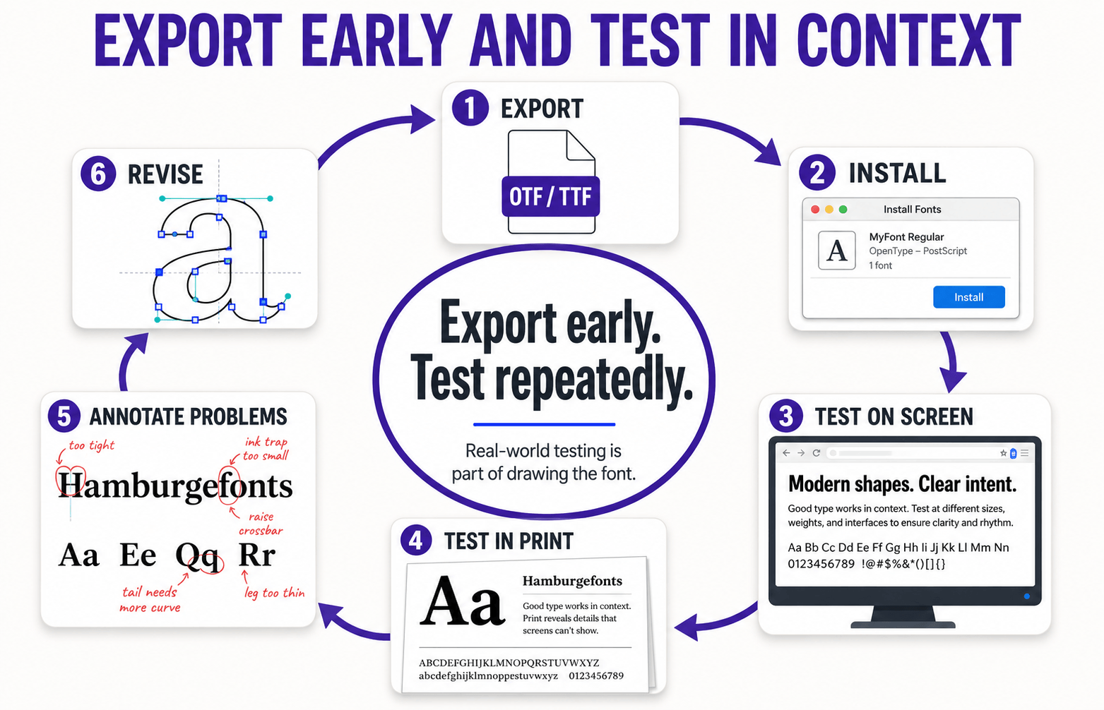
Export a rough version as soon as the control characters and basic spacing work. Install it under a versioned test name, then use it in the environments it was designed for.
- Set headlines and paragraphs at the minimum, typical, and maximum target sizes
- Print a page and inspect dark spots, weak strokes, and uneven rhythm
- Test on at least two screens and in more than one application
- Try awkward strings, repeated shapes, punctuation, numerals, and all-caps text
- Ask another person to read it without explaining what they are supposed to admire
Use a specimen that includes real language, not only Hamburgefontsiv-style test strings. Nonsense words reveal construction; actual paragraphs reveal reading problems.
Export, install, test, annotate, revise, and repeat. If the font seems to get worse as you learn, your drawing ability has not collapsed. Your eye has improved enough to notice what was already there.
10. Add Features Only After the Foundation Works
Ligatures, alternates, small caps, old-style figures, fractions, and variable axes can make a family more useful. They can also become attractive hiding places from unfinished spacing.
OpenType Layout supports glyph substitution and positioning for advanced typography and complex scripts.
Microsoft’s OpenType overview is a useful technical introduction. If you later build a variable family, the official font variations overview explains axes and variation space.
For font number one, complete the core character set and spacing first. A modest font that works is more valuable than a spectacular feature list attached to an unfinished alphabet.
11. Name, Export, and License the Font
OTF and TTF are common desktop formats. WOFF and WOFF2 are intended for web delivery.
Your editor may generate several formats, but distribution rights and technical needs should determine which files you release.
Check family and style names, version numbers, designer and foundry fields, copyright notices, and unique identifiers. Naming mistakes can cause fonts to appear in the wrong menu group or conflict with earlier test versions.
Read Glyphs’ naming guide and use a license that explicitly states whether commercial use, modification, redistribution, embedding, and web use are permitted. Licensing terms vary; Adobe’s font licensing FAQ is a useful example of how usage categories are explained, not a license template for your own font.
Before selling a design, search for confusingly similar family names and make sure you have the rights to every source asset you used.
If the release has meaningful commercial stakes, professional legal advice is wiser than improvising an EULA at 1:00 a.m.
12. Release, Document, and Learn
Your first font can be a portfolio project, a free download, a client asset, or a commercial product.
Whichever route you choose, include a specimen, character coverage, supported formats, version number, license summary, and clear installation instructions.
Do not judge the font design project only by sales. Finishing a font proves that you can carry a complex visual system from idea to production.
The next typeface will benefit from every spacing error and stubborn curve you survived in the first.
Technical Font Design Concepts Worth Understanding
Units per Em and Vertical Metrics
Units per em, or UPM, define the coordinate grid used for glyph outlines and measurements. The UPM value does not determine quality by itself.
What matters is that your outlines, alignment zones, and exported metrics work consistently across applications.
Pay special attention to ascender, descender, and line-gap values. Poor vertical metrics can clip accents or produce surprising line spacing.
Test accented capitals, deep descenders, and stacked marks rather than checking only plain English text.
Optical Correction
Mathematical equality often looks unequal. Round letters need overshoot. Diagonals may need a different stroke thickness from verticals.
Symmetrical shapes frequently benefit from tiny asymmetrical adjustments. Trust measurement to reveal patterns, then use your eye to finish the decision.
Hinting and Screen Rendering
Hinting helps rasterizers preserve important features at small pixel sizes, particularly on lower-resolution displays. Auto-hinting is normally enough for a first project.
Clean outlines, sensible spacing, and real-device testing will produce a larger improvement than obsessing over manual instructions too early.
For a clear explanation of what hinting can and cannot do, see Glyphs’ official guide to PostScript autohinting.
Kerning Classes and Exceptions
Kerning classes let similar glyphs share positioning rules, making a larger character set more manageable.
Keep the classes logically consistent and review the generated pairs. Class kerning is efficient, not magical; punctuation, accented forms, and unusual shapes still need inspection.
Common Beginner Mistakes
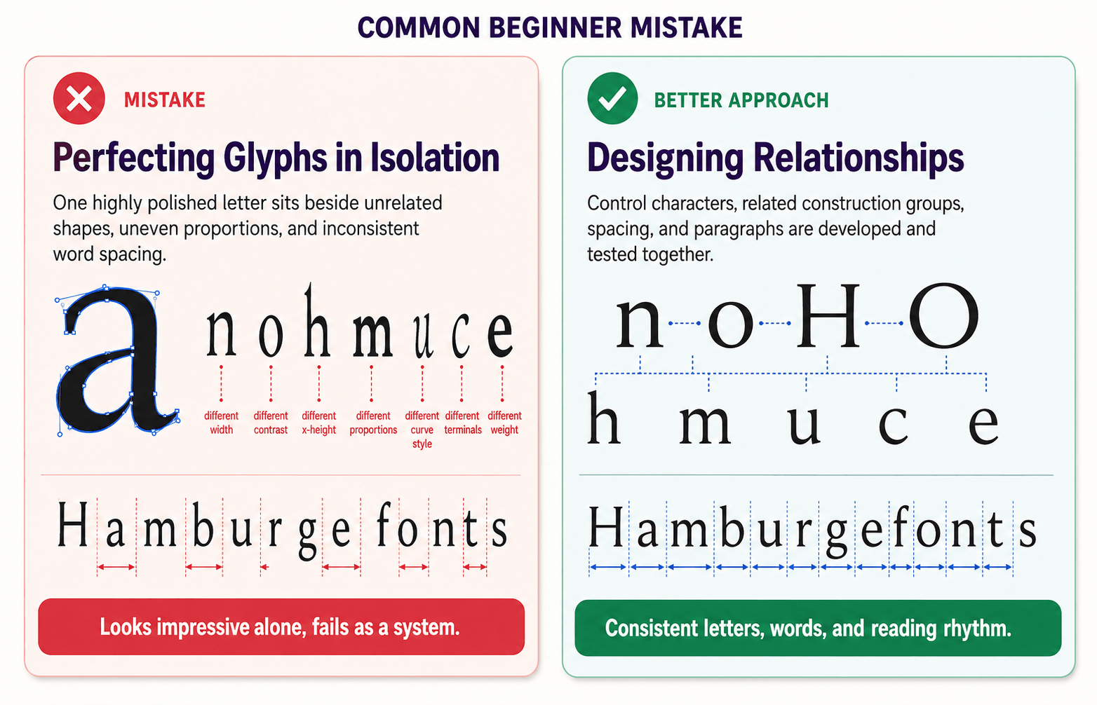
Most first font design problems begin as small inconsistencies: an unclear brief, isolated glyph development, weak spacing, or unnecessary complexity. Catching them early keeps the project manageable.
Starting Without a Brief
Without a defined user, purpose, and size range, the style drifts. Write the brief first and use it as a filter whenever a new idea appears.
Perfecting One Letter in Isolation
A gorgeous lowercase a cannot rescue an unrelated alphabet. Work across control characters and construction groups, then refine them together.
Copying Geometry Instead of Correcting Optically
Perfect circles and repeated numeric widths can look sterile or uneven. Build a system, but allow the eye to correct it where perception demands.
Ignoring Spacing Until the End
Spacing is part of the design, not post-production polish. Start with side bearings early, test words continuously, and kern only after the default rhythm is stable.
Adding Too Many Points
Extra points create bumps, fragile outlines, and slow revisions. Simplify first. If a curve cannot be controlled with a sensible structure, reconsider the shape rather than decorating the problem with nodes.
Expanding to Multiple Weights Too Soon
Complete one dependable Regular before adding Bold, Italic, or variable masters. Interpolation multiplies inconsistent point structures and weak design decisions with impressive efficiency.
Testing Only in the Font Editor
Export early. Use the font in layouts, browsers, PDFs, and print. A font editor is a workshop, not the final habitat.
Pre-Release Checklist
- The purpose, audience, and intended size range are clearly defined.
- Control characters and repeated shapes follow a consistent construction system.
- Curves are clean, contours are valid, and unnecessary points are removed.
- Baseline, x-height, cap height, ascenders, descenders, and overshoots are reviewed.
- Side bearings create an even default rhythm before kerning is applied.
- Kerning classes and exceptions are tested in words, sentences, and all-caps strings.
- Letters, numerals, punctuation, symbols, and claimed language coverage are complete.
- Accents, marks, and deep descenders are not clipped by vertical metrics.
- The font is tested in target applications, at target sizes, on screen, and in print.
- Family name, style name, metadata, versioning, and filenames are correct.
- Exported OTF and TTF files install cleanly; web formats are generated only when needed.
- The license and specimen explain permitted uses, coverage, and limitations.
Frequently Asked Questions
How Long Does It Take to Design a Font?
A focused basic Latin style may take a beginner several weeks or months of part-time work. A professional family with multiple styles, extensive language support, and advanced features can take many months or years. Scope is the strongest predictor, so keep the first project small enough to finish.
What Is the Best Free Font Design Software for Beginners?
FontForge is one of the best-established free and open-source options. Its interface takes some learning, but it can draw glyphs, manage spacing and kerning, edit metadata, and generate common font formats.
Should a Beginner Design a Serif or Sans Serif First?
A sans serif removes the additional challenge of coordinating serif shapes, so it can make a simpler teaching project. A focused display serif is also reasonable if the concept is clear. Choose the smaller, more motivating scope—not the category someone declares officially beginner-approved.
How Many Glyphs Should a First Font Include?
Include enough to support the languages and use case you promise: uppercase and lowercase letters, numerals, core punctuation, essential symbols, and the required accents. Do not chase a large glyph count for its own sake. Complete coverage beats impressive-looking blanks in a specimen chart.
What Is the Difference Between Spacing and Kerning?
Spacing sets the default space on both sides of every glyph through side bearings. Kerning corrects exceptional pairs whose shapes still look uneven. Strong spacing reduces the number of kerning exceptions you need.
Can I Sell My First Font?
Yes, provided the work is original, the family name does not create avoidable conflicts, the files are technically sound, and the license is clear. Treat the first release as both a product and a learning project; customer support and updates are part of selling software.
The Bottom Line
Learning font design is less about drawing prettier letters and more about seeing relationships: black shape against white space, curve against stem, glyph against word, and design decision against purpose.
Begin with a short brief. Draw n, o, H, and O. Build related letters, space them early, export before everything feels finished, and test the font where people will actually use it. Leave the nine-weight variable superfamily for later; it will wait patiently.
When your first font is working, sharpen the typesetting side of your eye with Fontish’s guides to pairing fonts, tracking, and leading. The better you understand type in use, the better your next typeface will become.
Open your font editor, draw the first n, and give the project a version number. A finished version 0.1 will teach you more than a perfect font that never leaves your imagination.