
 I
I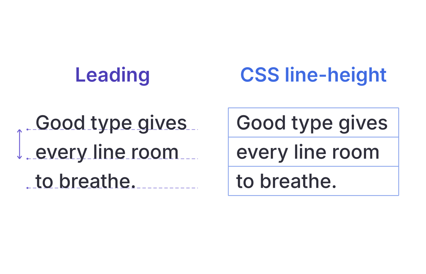
On This Page
Leading vs line height can seem like a naming dispute until you move a paragraph from a design file into a browser. You copy the spacing value, yet the text looks tighter than expected.
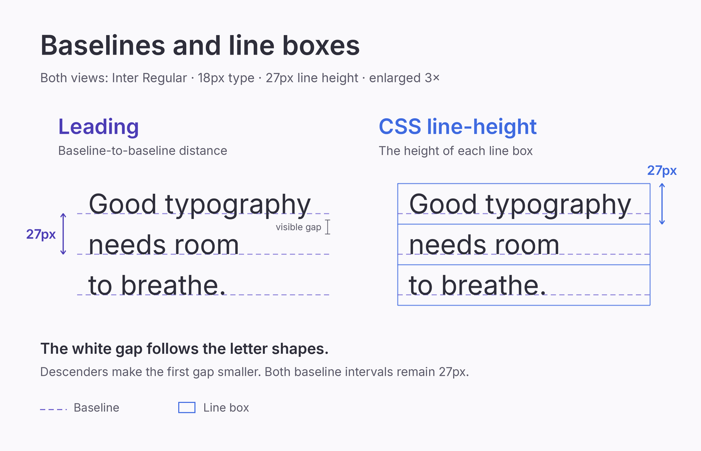
In modern layout software, leading usually means the distance from one line’s baseline to the next. CSS line-height controls the sizing of line boxes, the invisible boxes a browser uses to arrange lines of text. In a plain paragraph with consistent font settings, its value normally determines baseline spacing too.
Use the leading control in your layout app and line-height when implementing spacing on a website. Neither directly measures the visible white gap between letters; the font’s shapes affect how spacious the text looks.
What Is Leading?
In layout software such as InDesign, leading measures the vertical distance between consecutive text baselines. The baseline is the invisible line most letters sit on.
A designer might write 12/18 to specify 12-point type with 18-point leading. The first number is the type size; the second is the full interval between baselines.
The name comes from traditional typesetting, where printers inserted strips of lead between rows of metal type. Historically, leading referred to the added spacing.
Modern design apps commonly use the word for the total baseline-to-baseline distance, so check which meaning an older typography reference uses.
Our leading in typography guide explains how to choose spacing for different text roles.
What Is Line Height in CSS?
line-height controls the vertical sizing of line boxes. Each line box accommodates the text and other inline content on that line.
In a simple paragraph with consistent font settings, the specified line height normally determines the interval between successive baselines. Larger inline text, images, or vertical alignment can increase the space a particular line needs.
The property accepts unitless multipliers, lengths, percentages, and the keyword normal. A unitless value relates the line height to the element’s font size. A fixed pixel value specifies a length that stays fixed as that font size changes.
Letter proportions, including ascenders and descenders, affect the white gap you actually see. Two fonts can share a line-height value and still make a paragraph look noticeably different.
Side-by-Side Comparison
Here’s how a modern leading setting and CSS line-height compare in everyday work.
| Detail | Leading in layout software | CSS line-height |
|---|---|---|
| Main measurement | Distance between consecutive baselines | Sizing of line boxes; normally sets baseline spacing in uniform text |
| Where you set it | Typography controls or text styles in a design app | CSS rules applied to text elements |
| Common formats | Points, plus automatic or percentage settings depending on the app | Unitless multipliers, lengths, percentages, or normal |
| Example | 12pt type with 18pt leading | 18px type with line-height: 1.5, giving a specified line height of 27px |
| When font size changes | Fixed leading stays fixed; automatic leading can adjust | Unitless values scale with the element’s font size; fixed pixel values stay fixed |
| What can affect the result | Baseline grids and other layout settings | Larger inline content and vertical alignment |
The useful connection is the spacing ratio. For 12pt type with 18pt leading:
18 ÷ 12 = 1.5
A CSS value of line-height: 1.5 carries that proportion into the browser. It also lets you change the web text size without manually recalculating its line height.
Keep the units in view: 18pt leading and an 18px line height represent different lengths. Copying the number alone can substantially change the spacing. The ratio gives you a starting specification; the rendered paragraph shows whether it suits the layout.
Why the Difference Matters
A webpage’s typography system has to accommodate headings that wrap and readers who change the text size. Clear spacing specifications make those changes easier to manage.
Make the Design Handoff Precise
“Add 6px of leading” can mean 6px of additional spacing or a total baseline interval of 6px. That is quite a difference for a paragraph.
Specify the font family, weight, text size, and total line height, then state whether spacing stays fixed or scales with the text. Include paragraph spacing separately so the developer can reproduce both gaps.
Example handoff: Inter Regular, 18px; line-height: 1.5 (27px at this size); 1em between paragraphs. Keep the line-height ratio when the font size changes, and review the result in 320px and 640px text columns.
Choose How Spacing Scales
An inherited fixed line height can become too tight when a child element uses larger text. A unitless value lets each inheriting element calculate its line height from its own font size. That behavior matters in reusable components whose text sizes change at a breakpoint.
Give headings and paragraphs their own ratios. A multiplier that keeps body copy comfortable can leave a two-line heading looking disconnected.
Separate Line Spacing from Layout Spacing
Margins can separate paragraphs, while padding adds room inside a container. Increasing line-height changes spacing within wrapped text, so it can affect every line while leaving an unwanted margin in place.
If lines inside a paragraph feel crowded, inspect line height. If the paragraph reads comfortably but sits too far from the next one, inspect margins. Fixing the right gap avoids loosening the whole text block.
When to Use Each
Choose the control according to where the text will be composed. You might use leading for a brochure and CSS line-height for the website that promotes it.
Use Leading When Composing a Page
Use your layout app’s leading control for magazines, reports, brochures, and PDFs. Judge paragraph density at the intended page size, then save the setting in a text style for consistent reuse.
In a multi-column document, coordinate leading with a baseline grid when lines need to align across separate text frames.
If changing leading appears to do nothing, check the grid settings. InDesign’s baseline grid alignment can override the spacing you expect from the leading value.
Use CSS Line Height for Websites and Interfaces
Use line-height when the browser will lay out the text, including article paragraphs, navigation, form labels, cards, and headings. These elements can wrap differently as the available width or the wording changes.
Check your longest navigation item and form label at a narrow width. A label that fits on desktop may wrap on a phone, exposing line spacing you never saw in its one-line version.
For buttons, use padding or min-height to establish the control’s dimensions and choose line-height for its text. An oversized line height used to create the button’s height can leave awkward gaps when a longer label wraps.
Use Both When Moving a Design into Code
Use the design app to establish the intended spacing and CSS to implement its behavior. The app may call its control “leading” or “line height.” Check its units and how the value responds to a size change; the label alone does not describe the complete text style.
Practical Examples
Try these examples with a paragraph and a heading. Changing one setting at a time makes the effect easier to identify.
1. Translate a Layout’s Spacing Ratio into CSS
Take the 12pt type with 18pt leading from the comparison above. Preserve its 1.5 spacing ratio while choosing a web text size:
.reading-sample {
  font-size: 18px;
  line-height: 1.5;
}
The specified line height is 27px. Change the font size to 20px, keeping the multiplier, and it becomes 30px.
This is a starting point for adapting a print text style, rather than a guarantee of an identical appearance. Check the font actually loaded in the browser and the width of the text block before refining the spacing.
2. See Why 1.5 and 150% Inherit Differently
Suppose a card uses 16px text and contains a 24px heading. These rules explicitly make the heading inherit the card’s line-height setting:
.sample-card {
  font-size: 16px;
  line-height: 1.5;
}

.sample-card .sample-card-title {
  font-size: 24px;
  line-height: inherit;
}
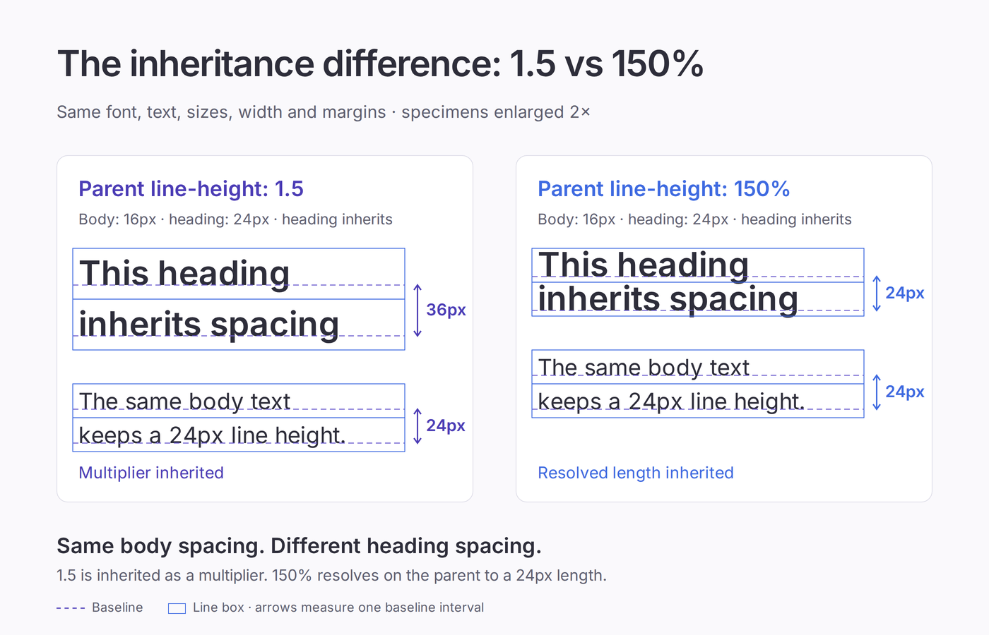
Change only the card’s declaration to line-height: 150%. Its ordinary text keeps the same calculated line height, but the heading’s result changes:
| Card’s setting | Calculated line height for 16px card text | Calculated line height for the 24px heading |
|---|---|---|
line-height: 1.5 | 24px | 36px |
line-height: 150% | 24px | 24px |
The unitless value passes the multiplier to the heading, which applies it to its own 24px font size. The percentage resolves to a 24px length on the card; the heading inherits that length even though its text is larger.
For proportional inheritance, a unitless value is usually the more useful default. MDN’s line-height documentation explains how numbers, lengths, and percentages behave.
3. Give Headings and Paragraphs Separate Spacing
This example assigns different proportions to a heading and its supporting text, then handles paragraph separation with margins:
.article-title {
  font-size: 40px;
  line-height: 1.1;
  margin-block: 0 16px;
}

.article-text {
  font-size: 18px;
  line-height: 1.6;
}

.article-text p {
  margin-block: 0;
}

.article-text p + p {
  margin-block-start: 1em;
}
The heading’s specified line height is 44px, and the body text’s is 28.8px. The margin rule adds space between consecutive paragraphs independently of the spacing inside them.
Treat these as sample settings. Try “A CAFÉ WITH A BIG IDEA” as a heading at a narrow width: the wrap and accented capital make a more demanding specimen than a one-line title.
For body text, “Agile typography gives every paragraph breathing room” includes both ascenders and descenders. Check bold and italic text too.
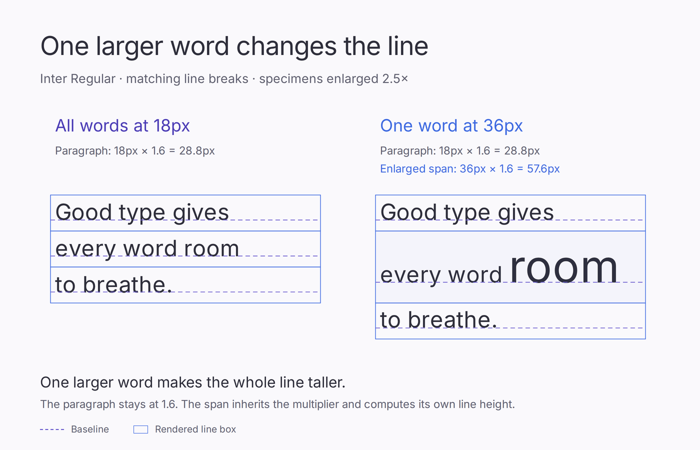
Next, wrap one body word in <span class="sample-emphasis">…</span> and enlarge it while leaving its line height inherited:
.article-text .sample-emphasis {
  font-size: 36px;
}
The span’s resolved line height becomes 57.6px (36 × 1.6), while the paragraph’s own value remains 28.8px. The enlarged word can make its line taller and change baseline spacing even though the paragraph’s setting stays the same.
If only one row looks unusually loose, inspect its inline font sizes, images, and vertical alignment before tightening the whole paragraph. Otherwise, you can fix the unusual row at the expense of every ordinary one.
Common Misconceptions
“Leading Is Only for Print”
Leading also describes spacing in typography created for screens. A designer can discuss a website’s leading while a developer implements those decisions with CSS line-height.
“Line Height Minus Font Size Gives the Visible Gap”
Subtracting 18px text size from a 27px line height gives 9px. It does not prove there are 9px of white space between the drawn letters on consecutive lines.
The calculation compares two settings. Visible clearance also depends on the letters’ heights, descenders, and accents. Use baseline spacing to describe the line interval, then inspect letterforms when judging whether the text looks crowded.
“normal Always Means 1.2”
line-height: normal lets the browser choose a value based on the font. A value around 1.2 is common in desktop browsers, but it is not a universal constant. A font change can alter spacing while the declaration remains normal.
Use an explicit value when a text style needs a specific proportion, and check the result with fallback fonts too.
“WCAG Requires Every Text Style to Use 1.5”
WCAG 2.2’s Text Spacing criterion requires that applicable content remain available and functional when users override certain spacing properties. Those changes include setting line height to at least 1.5 times the font size.
These are values the layout must accommodate, rather than mandatory defaults for every heading, label, and button. Test the criterion’s complete set of changes, including paragraph spacing, letter spacing, and word spacing.
Look for clipped content, overlapping text, or controls that become unusable. A carefully tuned default still needs room for the reader’s preferences.
Frequently Asked Questions
Is Leading the Same as Line Height?
They often express the same spacing intention. Modern leading usually measures baseline distance; CSS line-height controls line-box sizing, which normally determines that distance in uniform text.
How Do You Convert Leading into CSS Line Height?
Divide the total baseline interval by the font size, using the same units. Use the result as a unitless line-height value, then compare the browser’s rendering with the intended design.
What Line Height Should You Use for Body Text?
Start at 1.5 for long-form web copy, then adjust for font choice and column width. Seek clear line separation while keeping the paragraph visually connected.
Can Line Height Be Smaller than the Font Size?
Yes. A multiplier below 1 specifies a smaller line height, but glyphs can extend beyond that space and overlap neighboring lines. Check wrapped headings, accents, and descenders carefully.
Why Does Browser Spacing Look Different from My Design File?
Check the loaded font, text size, line height, and container width. Inherited styles, fallback fonts, and larger inline content can affect the result even when one spacing value matches.
Bottom Line
For web styles that should scale with the text, start with a unitless line-height and choose heading and body values separately.
Before finalizing them, check a heading that wraps and a full paragraph at a narrow width. Also test spacing overrides so readers can adjust the text without losing content.
Put that into practice with Fontish’s Type Scale Builder. Choose your font and body size, adjust the line height, and compare the desktop and mobile previews. Then apply the settings to your own content and read the result at its intended size.