
 I
I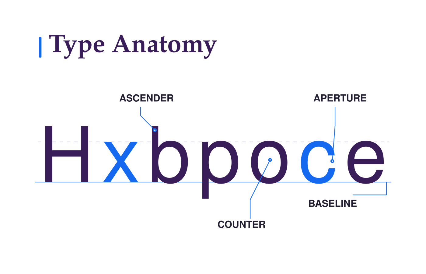
On This Page
A font can look excellent in a specimen and stumble in a button. At smaller sizes, an e closes up, a line feels crowded, or the headline loses the character that sold you on the typeface.
Those differences are easier to spot when you know where to look.
This guide walks through the parts of Latin letters that matter most in everyday design, then shows how to use them when comparing fonts in real layouts.
What Is Type Anatomy?
Type anatomy is the vocabulary for the shapes and spaces that make up a letter, along with the invisible lines that organize it. The main vertical stroke of an H is a stem. The white space inside an o is a counter. The line most letters sit on is the baseline.
Knowing those parts gives you a better way to compare fonts than saying one “just feels clearer.”
A taller x-height can make lowercase text appear larger at the same font size. A narrow opening in a c or e may become harder to distinguish when the text is small or heavy. The end of a stroke can give a headline much of its character.
You don’t need every term in a type designer’s vocabulary. Start with the parts you can see in familiar letters and test them at the size your layout needs.
How It Works
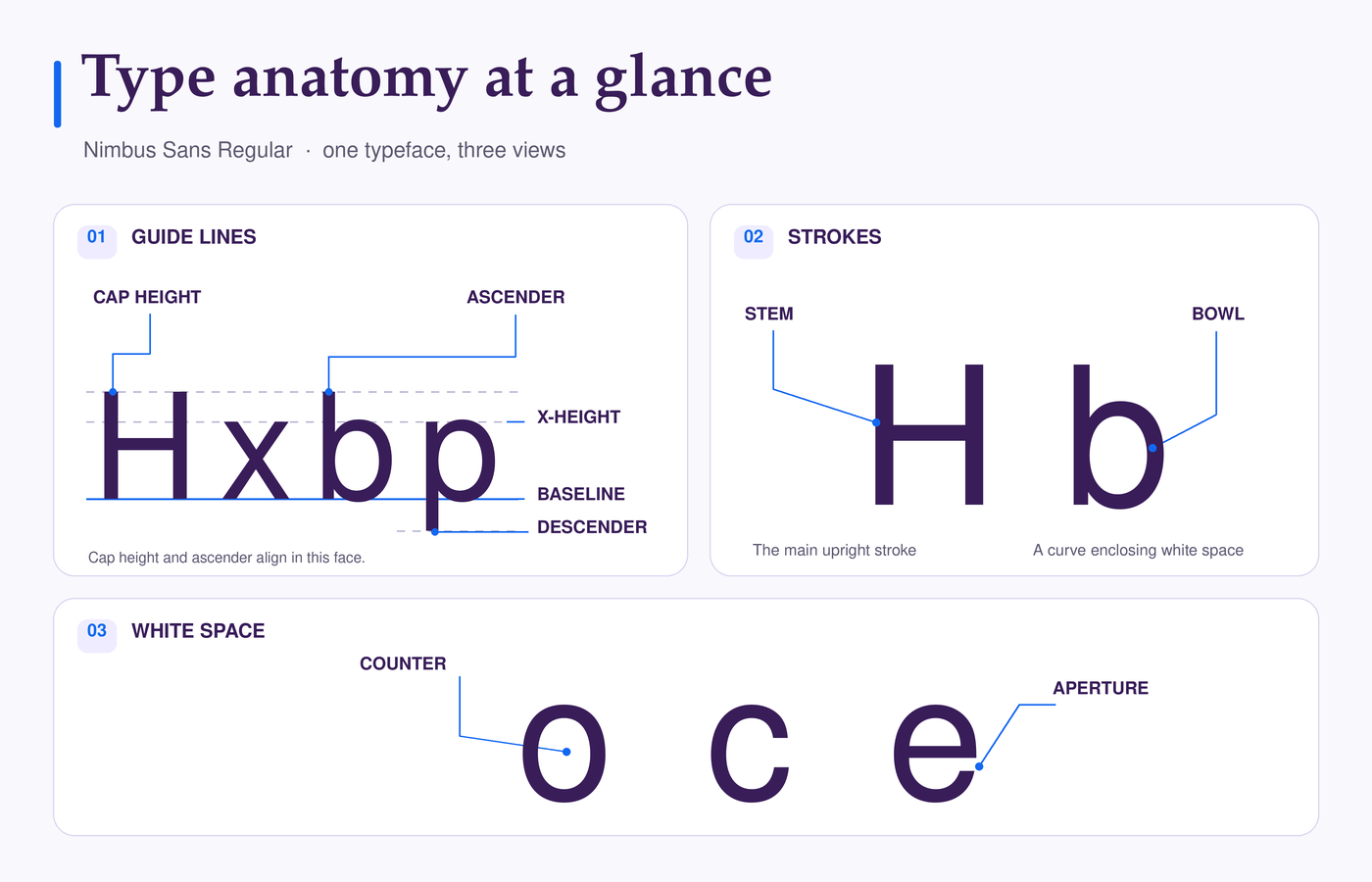
Set H x b p o c e in the same font. Together, they show you three things to inspect: the lines that set a letter’s proportions, the strokes that build its shape, and the white space those strokes leave behind.
Start with the invisible lines
The baseline is where most letters rest. The x-height measures the height of a lowercase x and gives you a reference for the main body of lowercase letters. The cap height reaches the top of flat capitals such as H. Two fonts can share the same font-size setting yet look noticeably different because these proportions differ.
Now look at b and p. The part of b rising above the x-height is an ascender; the part of p dropping below the baseline is a descender. These extensions help give lowercase words their varied shape. They also deserve a look when lines of text feel crowded.
Follow the strokes
The H has two vertical stems joined by a crossbar. The rounded stroke of a b is its bowl, while the curve that rises from a stem in an n is a shoulder. These names describe the drawn parts of a letter, rather than the spaces around them.
A terminal is the end of a stroke without a serif; it might be blunt, rounded, or tapered. A serif is a distinct small stroke at the end of a main stroke. Compare the endings in two fonts and you can often see a difference in character before you read a word.
Read the spaces too
The white space inside an o is a closed counter. A c has a counter that opens to the outside; that opening is its aperture. The aperture of an e can also be wide or tight.
Try shrinking c and e to the size of a caption or button label. If their openings begin to look cramped, you’ve found a reason to test that font more carefully in small text. The largest possible openings aren’t automatically best; what matters is how clearly the letters hold up in their intended setting.
Why It Matters in Design
- A letter rarely appears alone. It has to work in paragraphs, labels, headlines, and sometimes all three. Type anatomy helps you see why a font that looks appealing in a large specimen behaves differently in a real layout.
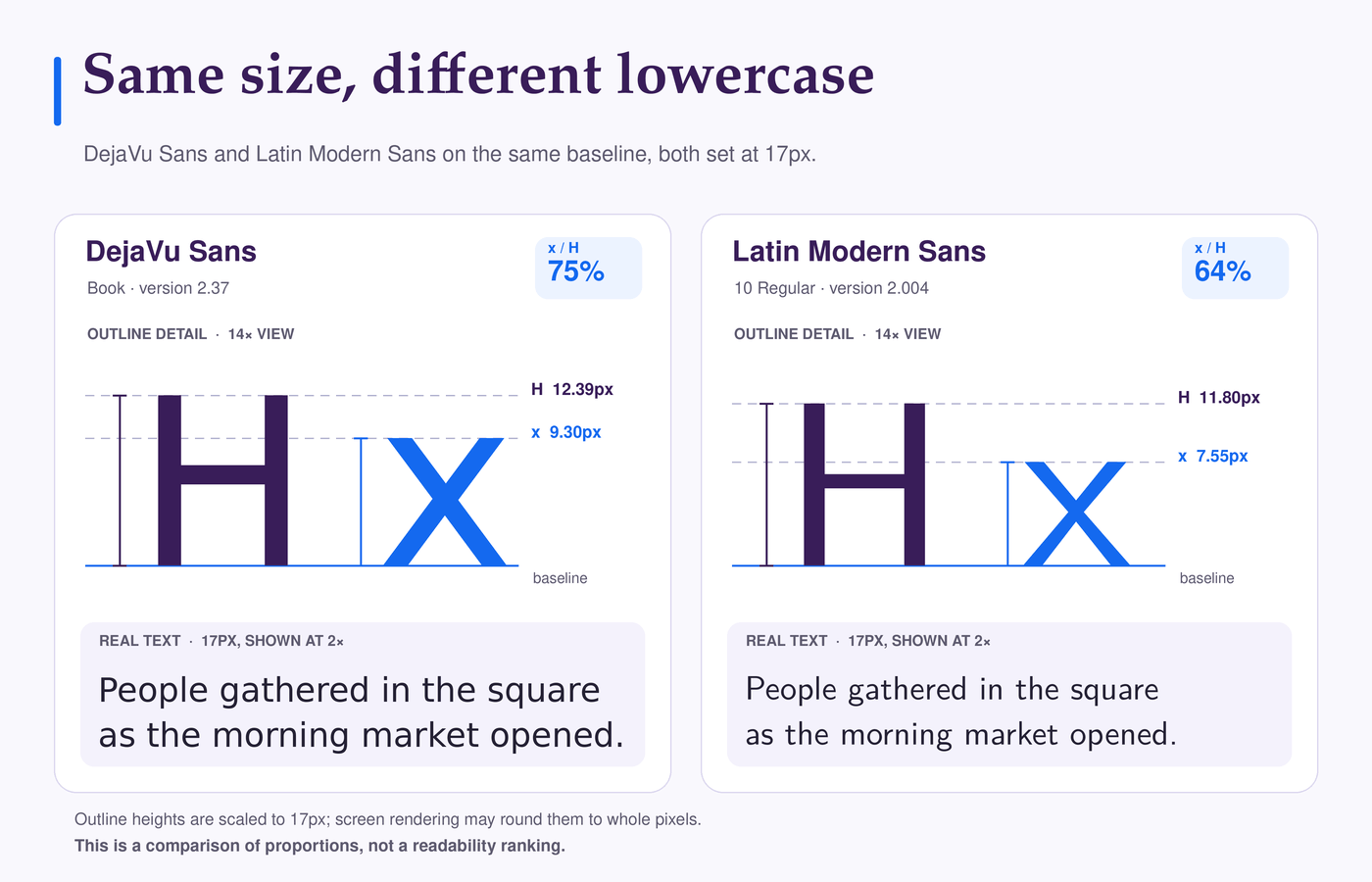
- Take two body fonts set at 17px. In DejaVu Sans, the x outline reaches about 75% of the H outline; in Latin Modern Sans, about 64%. The latter can look smaller at the same setting. Enlarge it to bring the lowercase closer and the paragraph may wrap differently. Compare both at sizes you would actually use.
- Small labels reveal other differences. Tight openings in a c or e, or small counters, can make a word feel crowded at a heavier weight. In a paragraph, long descenders can make closely spaced lines feel cramped. Looking at those shapes helps you identify what needs attention.
- Anatomy carries tone, too. The shape of a serif, a rounded terminal, or the form of a lowercase a can change the feel of a headline. Those details may be exactly what a brand needs at display size, even if another font works better for its paragraphs.
When a font feels wrong, anatomy gives you a place to look before you open the font menu again.
Practical Application
Use anatomy to test a font in the job you have for it. Make a small sample with a real headline, a paragraph, and a button or navigation label.
Include letters such as a, c, e, g, and p so you can inspect their shapes at the sizes readers will see. If you have the font file, Font Inspector lets you test real copy and examine its glyphs.
Compare the fonts at equal settings
Use the same size, weight, line spacing, and text width for a first pass. Look for differences in apparent size, open space, and the amount of room ascenders and descenders need.
Find the troublesome role
A font may look excellent in a headline but crowded in a small label. Check the letters causing that impression. Is the e closing up? Do the a and g remain easy to recognize? Are descenders making paragraph lines feel tight?
Quick check: Notice → Inspect → Try
| Notice | Inspect | Try |
|---|---|---|
| c and e look pinched | Apertures, weight | Try lighter or larger |
| Crowded paragraph | Ascenders, descenders | Add line spacing |
| Headline too formal | Terminals, serifs, a | Compare another face |
Adjust, then compare again
Give each candidate a reasonable change in size, weight, or line spacing and view it in the actual layout. Check narrow screens as well as desktop. Keep track of what improved and what each font still struggles to do.
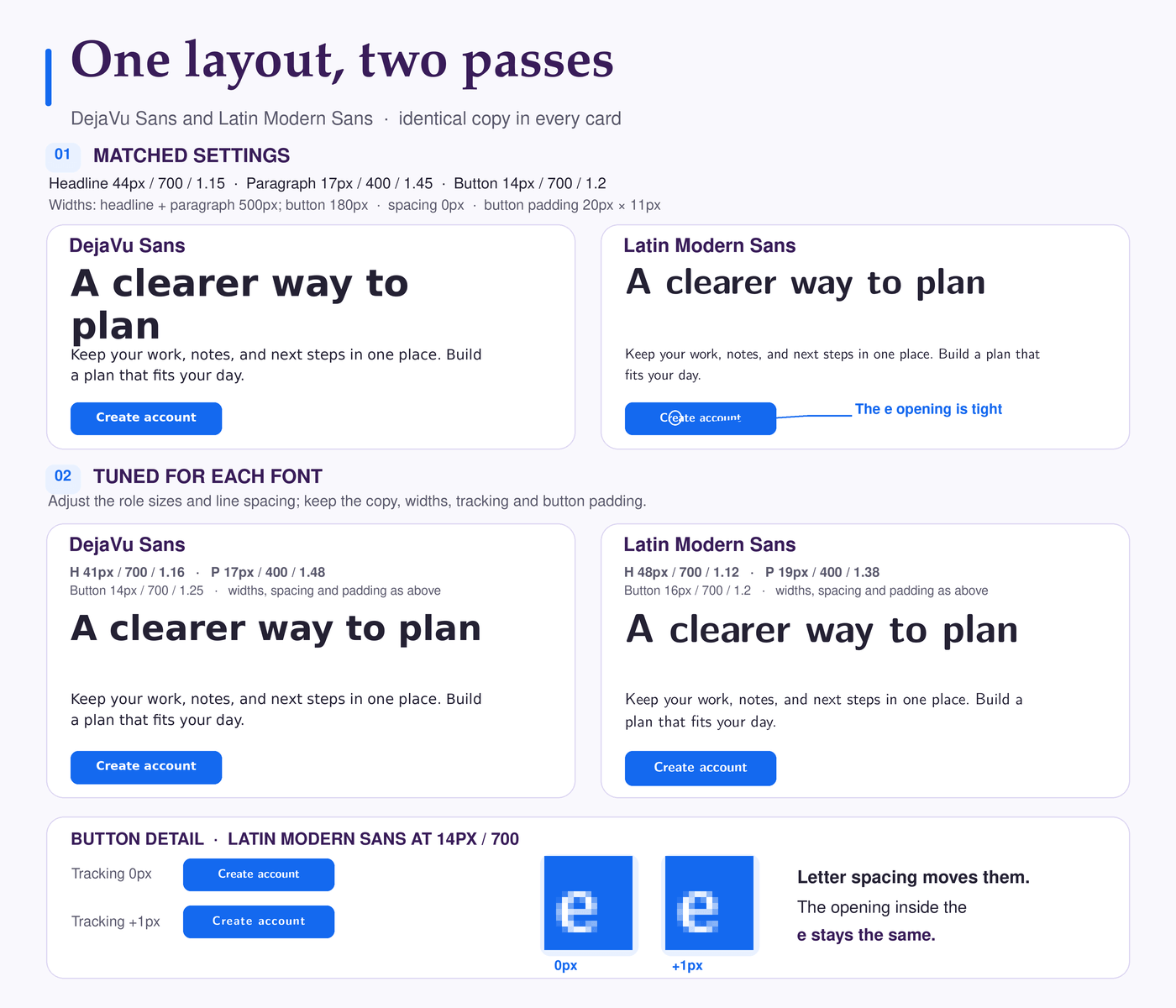
For example, suppose Create account looks clear in a paragraph but its e feels cramped in a small semibold button. Try the weight and size you would realistically use. If the opening still looks tight, another font may suit the interface better. Adding space between the letters will not widen the opening inside the e.
A useful decision sounds specific: “The c and e stay clear in labels, and the paragraph has room for descenders.” That gives you something to check again when the layout changes.
Common Mistakes and Misconceptions
Treating guidelines as hard edges
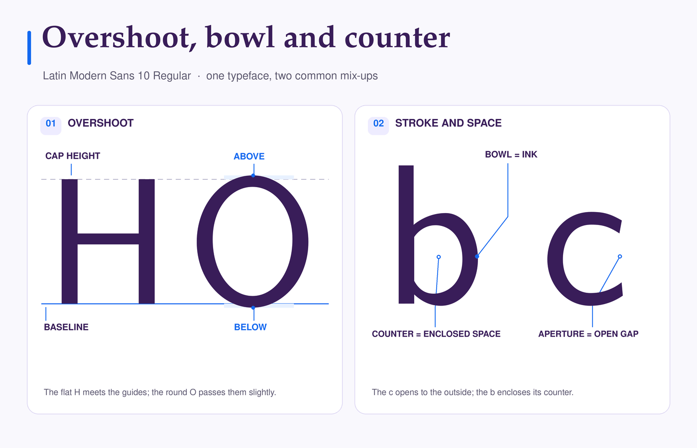
An uppercase O may extend slightly above the cap height and below the baseline. A lowercase o can reach beyond the x-height for the same reason.
This adjustment, called overshoot, helps round letters appear the same height as letters with flat tops and bottoms. If a curve crosses a guide line, it may be doing exactly what the type designer intended. Monotype’s article on overshoot explains the optical effect.
Confusing the bowl with the counter
In a lowercase b, the rounded stroke is the bowl; the white space it encloses is the counter. The gap where an open counter leads out of a c is its aperture. Knowing which part you mean makes it easier to explain why a letter looks crowded at a particular size.
Assuming a tall x-height guarantees clarity
A tall x-height can make lowercase text look larger, but a dense bold style can still close the openings in a caption. Judge the full word at its intended size and weight; x-height alone is not a legibility score.
Judging a whole family by one style
The Regular weight may leave plenty of space inside its letters while a heavier weight feels denser. Italics can also change familiar shapes, including a and g. Inspect the styles you intend to use; a beautiful Regular specimen tells you little about a bold navigation label.
Related Typography Concepts
Once you can identify the parts of a letter, you can describe what happens when letters form words and lines. For the wider picture, Typography Explained connects anatomy with hierarchy and font selection.
- Serif and sans serif. A serif is one finishing detail, but a category name tells you little about whether a family will work in a particular role. Serif vs Sans Serif shows how to make that choice in context.
- Sidebearings, kerning and tracking. Sidebearings provide built-in space on either side of a glyph. Kerning adjusts particular pairs, while tracking changes spacing across selected text. The shapes of A and V, for example, can make the gap between them appear wide. Kerning vs Tracking explains which adjustment fits the problem.
- Leading. Leading measures the distance between lines’ baselines. Ascenders and descenders can affect how crowded that distance feels. See Leading in Typography for a closer look at setting comfortable line spacing.
Frequently Asked Questions
What is type anatomy in simple terms?
Type anatomy names the parts of letters and the guide lines used to describe their proportions. Terms such as stem, counter, baseline, and x-height help you explain what you see when comparing fonts.
Which letters should I inspect first?
Try H, x, b, p, o, c, and e in the font you’re considering. Together, they reveal stems, height relationships, ascenders, descenders, counters, and openings. View them at the size you plan to use, alongside real words.
Is type anatomy the same as typography?
Type anatomy describes how letterforms are built. Typography is the broader practice of arranging type, including size, spacing, and hierarchy. Understanding the letters helps you make better decisions about the whole layout.
Does a larger x-height always make text easier to read?
No. It can make lowercase letters appear bigger at a given font size, but a heavy weight or narrow openings may still make small text hard to read. Test the size and weight you plan to use.
Does type anatomy apply to other writing systems?
Studying letterforms applies to other writing systems, but the guidelines and examples here describe Latin letters. Other scripts have their own structures and alignment conventions. Typotheque’s article on CJK typesetting gives a useful comparison.
Bottom Line
Type anatomy helps you explain why a promising font fails in a particular role. Check the e in a small label, the room for descenders in a paragraph, and the stroke endings in a headline—each at the size and weight you plan to use.
Start with the smallest text a font must carry. If reasonable adjustments fail, choose a better fit. For a brand system, How to Choose the Right Font helps you assess the whole identity.