
 I
I
On This Page
You download a font, open the folder, and find two versions: OTF and TTF. Same name, different endings. Before you type a word, you have to choose.
The OTF vs TTF decision usually comes down to the font files supplied and the software you’ll use them in. The extension alone won’t tell you which has more useful features or will look better in your design.
Quick answer: For desktop work, follow the font maker’s recommendation. If both versions offer the same features and work correctly in your application, either is a reasonable choice. For a website, look for the supplied WOFF2 webfont and a licence that covers web use.
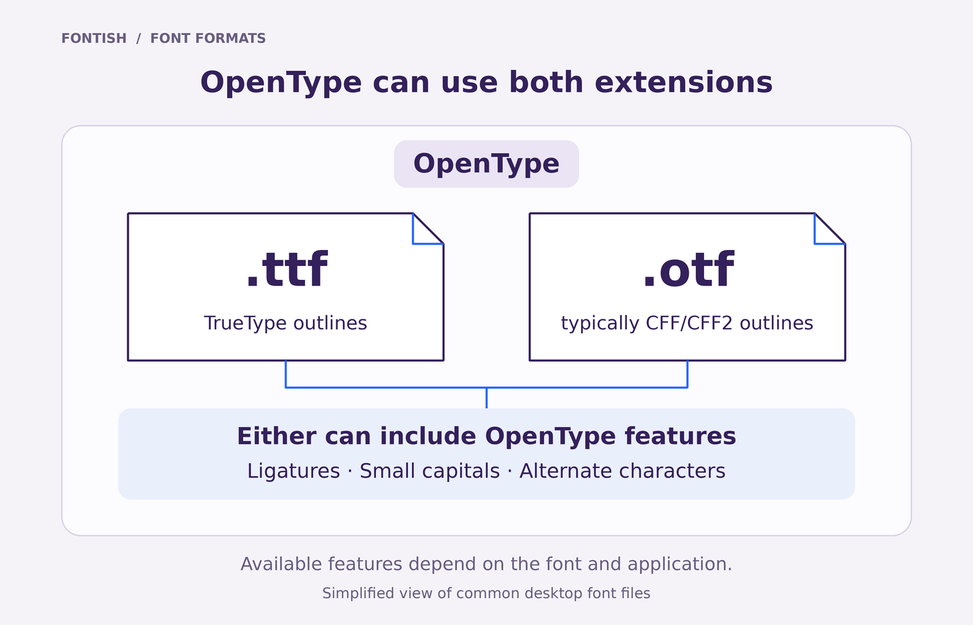
One detail clears up much of the confusion: a TTF file can contain OpenType features too. Ligatures, alternate letters and other typographic extras aren’t exclusive to files ending in .otf.
The useful question is whether either file gives you something your project needs—or causes a problem the other avoids.
Define the Two Concepts
OTF and TTF are font file extensions: the endings you see in filenames such as Example-Regular.otf and Example-Regular.ttf. They describe how font data is packaged, rather than a visual category such as serif or sans serif.
What is TTF?
TTF stands for TrueType Font. A .ttf file stores letter shapes as mathematical outlines, allowing software to draw them at different sizes. It can also contain hinting: instructions that help those shapes fit the pixel grid at small sizes.
Although TrueType is the older technology, a TTF file isn’t necessarily outdated. Modern .ttf files can use the OpenType structure and include features such as ligatures, small capitals and alternate characters.
What is OTF?
OTF is the extension commonly associated with OpenType fonts. OpenType builds on TrueType and supports additional ways to store letter shapes, along with advanced typography and broad language support.
In typical font downloads, the .otf version uses PostScript-style outlines, usually stored in a format called CFF, while the .ttf version uses TrueType outlines.
That difference matters to the software drawing the letters, but it doesn’t automatically make one version more attractive or capable.
OpenType and OTF aren’t quite the same thing
OpenType is the broader font format; .otf is a file extension. An OpenType font can also end in .ttf, as Microsoft’s OpenType specification explains.
Think of a ligature—the combined shape used for letters such as “fi.” Whether you can use it depends on what the font contains and whether your application supports it. Choosing the OTF file won’t add a ligature the designer never included.
Side-by-Side Comparison
The most useful OTF vs TTF comparison separates technical differences from things you need to check in the actual font. The extension tells you something about the file’s structure, but much less about its features or suitability for your project.
| What you’re comparing | OTF (.otf) | TTF (.ttf) |
|---|---|---|
| Typical outline format | PostScript-style outlines, commonly CFF | TrueType outlines |
| OpenType features | Can include ligatures, alternates, small capitals and more | Can include the same types of features |
| Language support | Depends on the characters and layout data included | Depends on the characters and layout data included |
| Application compatibility | Check support in your intended application | Check support in your intended application |
| Visual quality | Depends on the font’s construction and software rendering | Depends on the font’s construction and software rendering |
| File size | Varies with outlines, character coverage and other font data | Varies with outlines, character coverage and other font data |
| Website delivery | Prefer a supplied WOFF2 webfont | Prefer a supplied WOFF2 webfont |
For example, an OTF download might contain extra alternates that its TTF counterpart lacks. That would make the OTF version more useful for that particular release, rather than proving that every OTF file has more features.
Make the comparison fair: Use the same family, style and release wherever possible. Comparing an older TTF download with a newly updated OTF package mixes two questions: what changed in the font, and what changed in the format.
Keep the text, size, weight and layout settings identical for the first comparison. If something differs, check the supplied documentation before attributing it to OTF or TTF.
Why the Difference Matters
The OTF vs TTF choice becomes relevant when one file handles a task the other cannot.
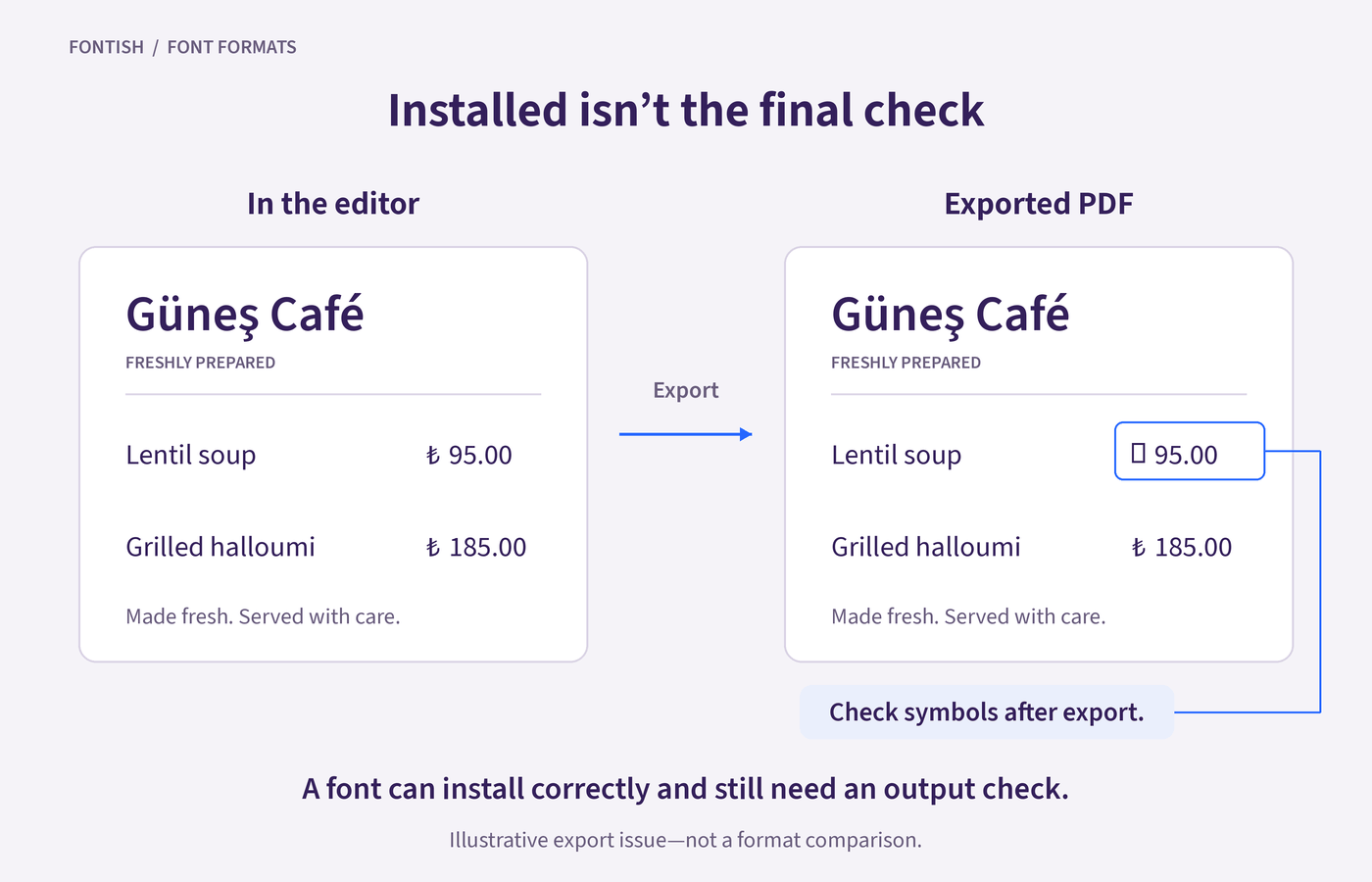
Installation is only the first check: a missing currency symbol or an unavailable alternate can still make a font unsuitable for the layout.
The features must work in your application
Suppose you’re designing a price list and want the digits to line up neatly. Tabular figures give each digit the same width, helping prices align when you use a consistent number of decimal places and a right or decimal tab.
Both OTF and TTF files can support this feature. What matters is whether your chosen font includes it and whether your application lets you activate it. A feature listed on the font’s product page is useful only if you can use it where you’re working.
Small text can reveal rendering differences
At a large headline size, two versions of the same typeface may look very similar. At small sizes, differences in outline construction, hinting and the software drawing the text can become easier to notice.
Check your actual paragraph or interface label at its intended size. Look for uneven strokes, cramped spaces and letters that become difficult to distinguish.
Our guide to type anatomy explains which shapes and openings to inspect.
Neither extension guarantees a cleaner result across every screen and application. If a difference appears only when you zoom far beyond the intended reading size, give it less weight than a problem readers will actually encounter.
A working file still needs a working output
Your design isn’t finished when the text looks right in the editor. It needs to survive the next step, whether that’s a PDF export, a printed page or a website.
Inspect the finished output as well as the source document. Missing characters, unexpected font substitutions, or changed line breaks point to specific problems to investigate. A format’s reputation won’t reveal them.
When to Use Each
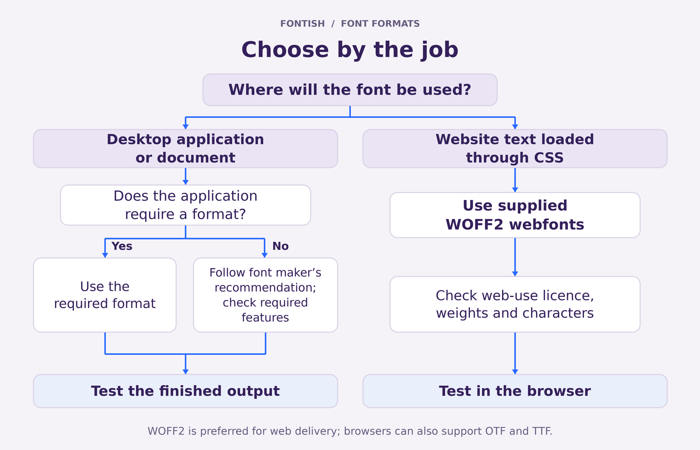
Start your OTF vs TTF decision with the font maker’s instructions and your application’s requirements. If neither points to a particular format, compare the supplied files for the characters and features your project needs.
Use OTF when that version offers a practical advantage
Choose OTF if the font maker recommends it for your workflow, or if that particular release includes features missing from the TTF version.
For example, a family’s OTF package might include the small capitals and alternate letters you need for an editorial layout. If those extras work in your application, they’re a good reason to choose it. The useful difference is what the file contains.
Use TTF when your workflow requires or recommends it
Choose TTF when an application, upload service or project specification requests it. It’s also a reasonable choice when the font maker supplies a TTF version with everything you need.
You don’t need to replace a working TTF file just because an OTF download is available. If your text displays correctly, the required features work and the finished output passes inspection, you already have a suitable file.
When both are equivalent, keep the choice simple
If both versions provide the same features and work equally well, choose one format consistently for the project. Record the font’s source and version so collaborators can use the same release, subject to its licence.
For an existing project, keep the supplied files unless you need to solve a specific problem. Once a font passes your checks, changing formats adds work without a clear benefit.
For websites, look for WOFF2
For text loaded through CSS, a supplied WOFF2 file is usually the better choice. It compresses font data efficiently for web delivery and can retain OpenType features. MDN’s webfont guidance recommends WOFF2 for this purpose.
You may therefore use an OTF or TTF file while designing the page, then use the corresponding WOFF2 webfont on the live site. Check that your font licence covers the intended use.
Practical Examples
Here’s how the choice plays out in three everyday projects. Use the same small test sample to check each file, then adapt it to the work in front of you.
Build a sample that exposes useful differences
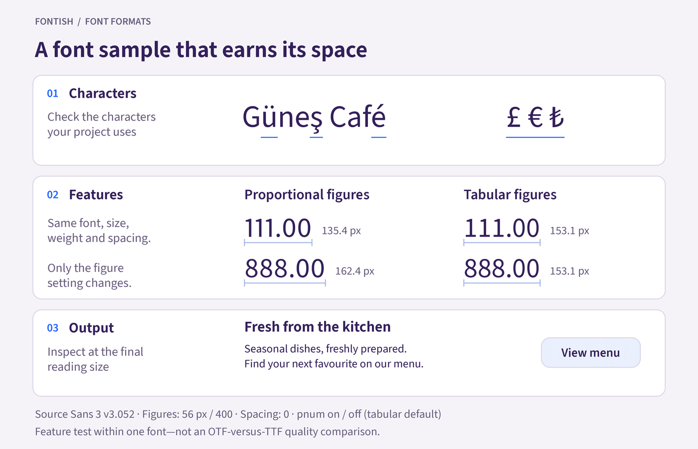
Start with your real heading and a short paragraph. Add a line containing characters, numbers and letter combinations you might otherwise forget to test:
Güneş Café — office, affinity, 0123456789, £ € ₺
Replace the accents and currency symbols with those your project actually needs. “Office” and “affinity” provide letter combinations you can inspect when testing ligatures; the numbers give you a starting point for checking figure styles.
Run three checks:
- Characters: Are the required letters, accents and symbols present? Inspect them in the application’s glyph or character panel where available, as well as in the text.
- Features: Activate the feature you need and inspect the result. For a quick tabular-figure check, set “111.00” and “888.00” on separate lines at the same size and weight. Their widths should match with tabular figures active; matching widths alone doesn’t prove that the feature was switched on, because the font may already use equal-width digits by default.
- Output: Export, print or open the sample on the receiving device. Check it at the size people will actually read.
This is a focused project check, not a full font-quality audit. Its purpose is to catch problems that would affect your design before you build the whole layout.
Designing a café menu
You’re setting a menu with dish names, descriptions and a right-aligned price column. The font download includes OTF and TTF versions, so you test a few representative lines—including prices such as “9.00,” “11.50” and “24.00.”
Check that the currency symbol is present and, if you want uniformly spaced digits, that tabular figures are available and enabled. Then export a sample PDF and print it at the intended size. Small descriptions deserve particular attention: text that feels comfortable on an enlarged screen preview can feel cramped on paper.
If the prices still look uneven, check the column alignment and decimal places before changing font files. Tabular figures won’t repair an inconsistently arranged column.
The choice: Use the version that supports the required characters and features and produces a clean result. If both pass, follow the font maker’s recommendation.
Preparing a presentation for a colleague
You’ve finished a presentation on your computer, but a colleague will deliver it from theirs. The immediate concern is whether their setup can reproduce the typography.
Check the presentation software’s font requirements and embedding options, including whether the font permits embedding. For PowerPoint, Microsoft’s font-embedding guidance explains the available options and restrictions.
Open the presentation on the receiving computer and inspect the title slides, text-heavy slides and tightly fitted labels. If a title that occupied two lines now needs three, first confirm that the intended font and style are actually being used.
The choice: Use the supported font version that survives the handoff correctly. Investigate font availability and embedding before assuming that switching extensions will fix a substitution or layout change.
Building a small business website
Your font package contains desktop files and a separate webfont folder. Use the desktop version in your design application, then select the corresponding WOFF2 files for the website.
Check that the webfont package includes the weights and characters used in the design. A business name such as “Güneş Studio,” for example, gives you a reason to test “ü” and “ş” rather than relying on an English-only sample.
Include your longest navigation label and a real button alongside the headline and paragraph. These small pieces of text can expose wrapping problems that a spacious desktop mockup hides.
The choice: Use WOFF2 for browser delivery and test at desktop and mobile widths. If you’re still choosing the typeface itself, our best fonts for websites guide compares families by the jobs they perform.
Common Misconceptions
“OTF has more features” and “TTF is lower quality” sound like convenient buying advice. Neither claim tells you what’s inside the files you’re comparing.
“OTF is for professionals; TTF is for beginners”
Neither extension describes the user’s skill or the typeface’s quality. A carefully built TTF can serve demanding design work, while an OTF file can still have limited character coverage or poor spacing.
Judge the font by its design, capabilities and performance in your project. If the design itself feels wrong, return to the broader task of choosing the right font before changing formats.
“Only OTF supports advanced typography”
Ligatures, small capitals and stylistic alternates are OpenType capabilities, and they can be included in .ttf files too. Their availability depends on the font’s contents and the application using it.
An OpenType label also doesn’t promise every possible feature. Check the features listed for the specific family and release.
“OTF files are always smaller”
Different outline formats can produce different file sizes, but the extension alone doesn’t reliably rank them. Character coverage, outlines, hinting, and other included data all affect the result.
Compare the actual files. For a website, compare the webfont files you’ll deliver to visitors, since those downloads affect the page.
“Converting TTF to OTF upgrades the font”
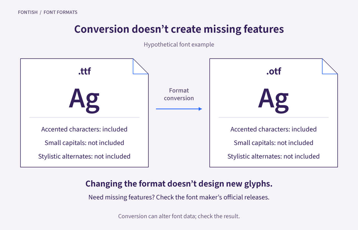
Changing the format won’t invent missing characters, improve awkward spacing or create a set of alternate letters. Conversion can also change font data, so you need to check the result.
If you need another format, look for an official release from the font maker first. Simply renaming .ttf to .otf doesn’t convert the file.
Frequently Asked Questions
Is OTF or TTF better for graphic design?
Neither is automatically better. Choose the version that includes the characters and features you need and works correctly in your design software. If both versions are equivalent, follow the font maker’s recommendation rather than expecting the extension to improve the design.
Does TTF support ligatures and alternate characters?
Yes. A TTF file can include OpenType features such as ligatures and stylistic alternates. The font designer must include those features, and your application must support them. Switching formats will help only if the other release actually contains the missing feature.
Is OTF better than TTF for printing?
The extension alone doesn’t determine print quality. Either can produce excellent results when the font is well made and supported by your workflow. Check the exported PDF and print a sample at the intended size, especially when the design uses small text or delicate strokes.
Should I use OTF or TTF on my website?
For most websites, use a supplied WOFF2 webfont instead. WOFF2 compresses font data for efficient browser delivery while supporting OpenType capabilities. Check that the webfont includes your required weights and characters and that your licence covers web use.
Will converting TTF to OTF make the text sharper?
Conversion isn’t a reliable way to improve sharpness. Text rendering depends on the font’s outlines, hinting, size and the software displaying it. First inspect the text at its actual viewing size and check whether the font maker provides a version suited to your application.
Choose the File That Works for Your Project
The OTF vs TTF decision starts with your project’s requirements. Follow the font maker’s recommendation, check the features you need and confirm that your software handles the file correctly. When both versions meet those requirements, either is a sound choice.
Before committing, run the sample check above using your actual content. Keep a record of the font version and a copy of the tested output with the project.
If the file passes and the alternative offers no useful advantage, you can stop comparing extensions and finish the design.