
 I
On This Page
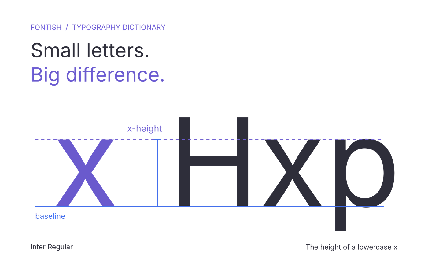
X-height is the distance from a typeface’s baseline to the top of its lowercase “x.” It describes the height of the main lowercase body, excluding ascenders and descenders.
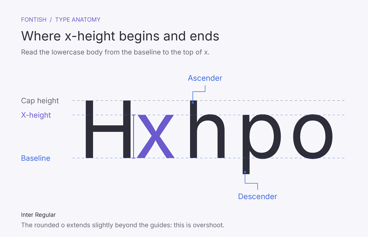
The bodies of letters like “x” and “n” reach roughly this height. An “h” has an ascender that rises above it; a “p” has a descender that drops below the baseline.
This helps explain why two fonts set to 18px can look different in size: one has taller lowercase bodies than the other.
Understanding x-height helps you choose body text, balance font pairings, and replace typefaces when the size looks right but the text still feels off.
How It Works
A font’s size setting scales its design using a reference space called the em. At a font size of 20px, one em equals 20px. That does not mean the visible lowercase letters are 20px tall: their height depends on their proportions within that reference space.
The same font size can produce different x-heights
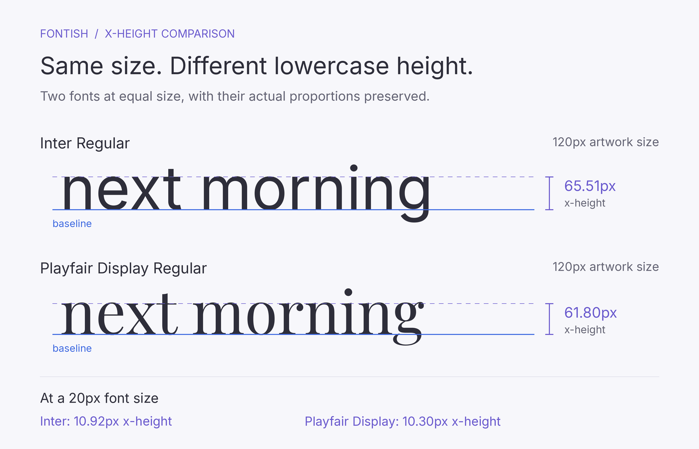
For a concrete comparison, we measured the lowercase “x” in Inter Regular and Playfair Display Regular. At a font size of 20px, Inter’s calculated x-height is approximately 10.92px, while Playfair Display’s is 10.30px.
| Measurement | Inter Regular | Playfair Display Regular |
|---|---|---|
| Font size | 20px | 20px |
| X-height relative to font size | 54.59% | 51.50% |
| Calculated x-height | 10.92px | 10.30px |
Measurements use Inter version 4.001 at weight 400 and optical size 14, and Playfair Display version 1.203 at weight 400. X-height was measured from the lowercase “x” outlines and calculated at the stated font size. Different versions or variation settings may produce different results.
The difference is modest, which makes it useful. Two fonts don’t need dramatically different proportions for the lowercase height to change when you switch families.
Inter has the taller lowercase “x” at these settings. That does not establish which font reads better or looks larger in every context. Stroke thickness, letter width and spacing also affect the impression.
X-height scales with the text
When you enlarge a font without changing its design settings, its x-height increases proportionally. Increasing this Playfair Display specimen from 20px to 24px, for example, increases its calculated x-height from 10.30px to 12.36px.
When designers describe a typeface as having a “large x-height,” they usually mean large relative to its overall size. Enlarging a small-x-height font makes all its letters bigger; it doesn’t redesign their proportions.
Some variable fonts can change proportions through optical-size or other controls. Keep those settings fixed when comparing fonts to isolate size.
Why some letters extend beyond the guide
An x-height guide is a reference, not a rigid ceiling for every lowercase letter. Rounded letters such as “o” often extend slightly above it and below the baseline. This adjustment, called overshoot, helps curved letters appear the same height as their flat-edged neighbours.
Dots and accents also extend beyond the central lowercase body. Start with “x” when comparing heights, then examine a complete word to see how the surrounding shapes work together.
Why It Matters in Design
X-height affects the apparent size of a form label, the balance of a font pairing and the texture of a paragraph. Those differences influence how you set the text, even when the font-size values initially seem sensible.
It influences small-text legibility
At small sizes, a generous x-height gives lowercase letter bodies more visible height. That can help preserve useful detail in captions, navigation and interface labels.
Letters still need distinct shapes, sufficient spacing and clear internal spaces. A tall lowercase “e” with a cramped opening can remain difficult to recognise. Choosing taller lowercase letters should never become an excuse to shrink essential information.
It changes the balance between fonts
A heading can look commanding in a font preview, then feel surprisingly modest beside body text with tall lowercase letters. The numerical size difference may suggest a strong hierarchy while the visible difference feels weaker.
This is particularly noticeable in headings containing plenty of lowercase letters. You may need to adjust the heading size, weight or surrounding space to give it the intended emphasis.
X-height also matters when two fonts serve equivalent roles—for example, when a quotation uses a different typeface within an article. A small size adjustment can make that transition feel more balanced without removing the distinction between them.
It affects the texture of a paragraph
A paragraph’s texture is the pattern of letter shapes and white space you notice before reading individual words. Larger lowercase bodies can make that pattern feel fuller. Smaller ones can create a more pronounced contrast between the central bodies and their extending strokes.
When you replace a font with one that has a larger x-height, keeping the same line-height value may leave the paragraph feeling more crowded. The baselines can remain the same distance apart while the visible letters occupy more of the space between them.
This is one reason typography involves more than choosing a font. A font menu can replace the letters in one click; getting the spacing right takes a little more judgment.
Practical Application
A controlled comparison helps you identify an x-height mismatch before adjusting the layout. Start with equal settings, then evaluate what the text needs to do.
Compare the same text at the same size
Place two candidate fonts side by side using identical content, font size, line height and text-box width. Choose comparable regular weights, while remembering that “Regular” won’t look equally heavy in every family.
Include a short lowercase sample such as “next morning,” followed by a paragraph from your project. The sample makes the central letter bodies easy to compare; the paragraph reveals what happens across several lines.
Read both passages. Does one appear smaller? Are the openings in letters such as “e” still clear? Keep the settings unchanged during this first comparison so you can identify differences before trying to fix them.
Adjust for the role the text needs to perform
To estimate the replacement size needed to match an existing x-height, use:
Replacement font size = original font size × original x-height ratio ÷ replacement x-height ratio
Here, the ratio means x-height divided by font size—not x-height divided by cap height. Use the same measurement basis for both fonts.
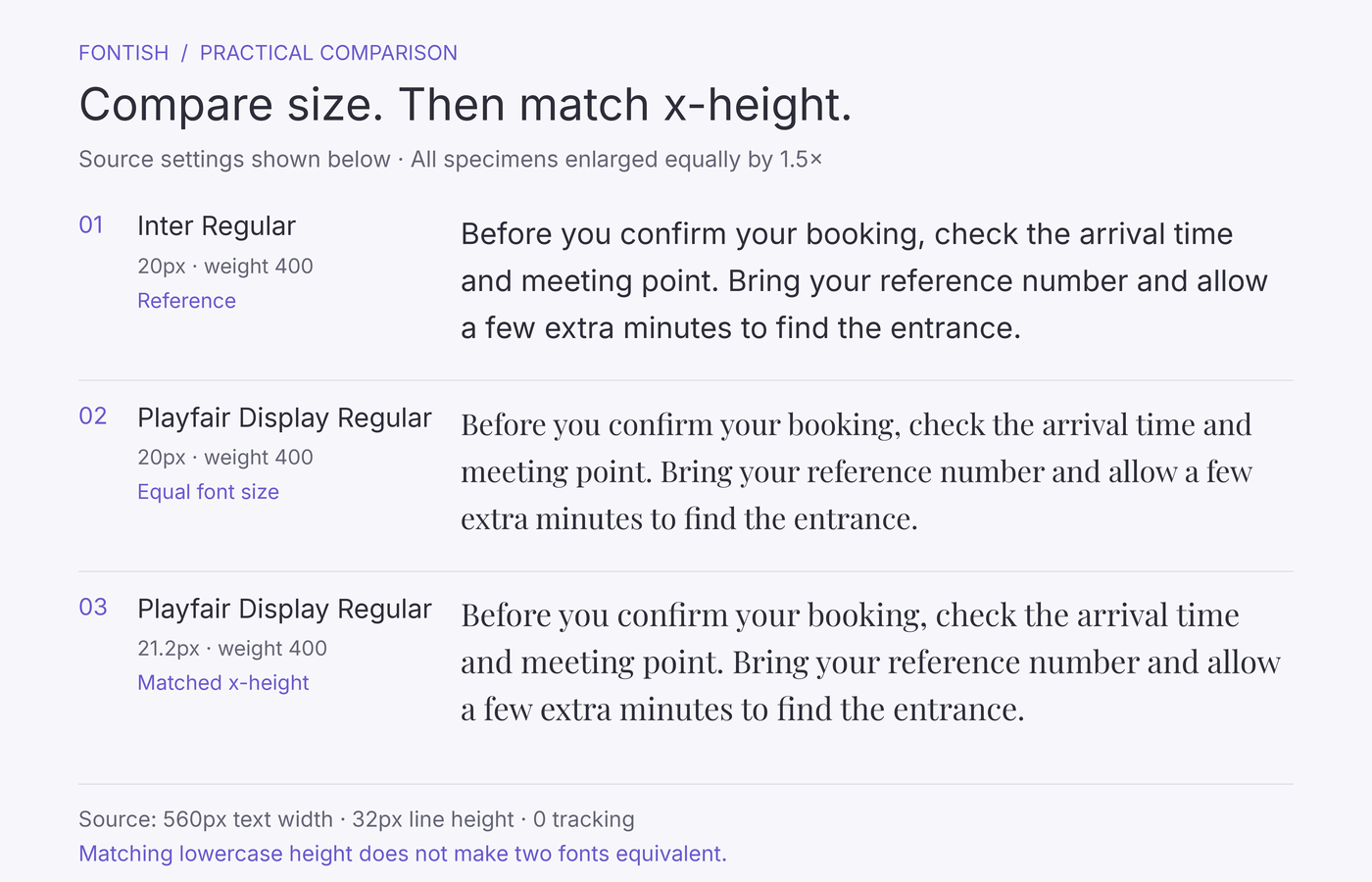
Using our measured specimens, matching Playfair Display to Inter at 20px gives:
20 × 0.545898 ÷ 0.515 ≈ 21.2px
At approximately 21.2px, Playfair Display’s lowercase “x” reaches the same height as Inter’s at 20px. Both are about 10.92px tall in outline terms.
This example demonstrates size matching; it is not a recommendation to replace Inter body text with Playfair Display.
The calculation provides a starting point. The replacement’s capitals, ascenders and word widths may still feel different. Compare the full paragraph before accepting the result.
For fonts serving equivalent roles, similar apparent lowercase sizes can be useful. Headings and body text need a different judgment: their job is to establish hierarchy, so matching their visible letter heights would usually defeat the purpose.
Keep capitals and numbers in view, too. An adjustment that balances lowercase text may leave prices, dates or uppercase labels looking disproportionately large.
Recheck spacing after changing the size
Once the apparent size feels right, review line spacing and paragraph width. Read several lines continuously rather than judging a single attractive word.
If the paragraph feels crowded, try a modest increase in line height. If it becomes too tall or wraps awkwardly, reconsider the font or text-box width before squeezing the letters together. Tight tracking is a poor repair for a font that doesn’t fit its assigned space.
For website text, check a narrow phone layout as well as desktop. For print, inspect a sample at its intended physical size. An enlarged preview can hide problems that become obvious in the finished design.
Compare twice to find the real mismatch
Save two versions of your comparison. In the first, keep the font sizes equal. In the second, adjust one font until the lowercase “x” heights approximately match. Use the same passage and text-box width in both versions.
The first comparison shows how the fonts behave at identical settings. The second helps you judge what differences remain once lowercase height is roughly equal.
If one paragraph still looks darker, inspect stroke weight and spacing. If it wraps onto more lines, examine letter widths and the size adjustment. If individual characters remain hard to distinguish, look closely at their shapes and openings.
Use this stopping rule: if matching lowercase height creates new problems elsewhere, reconsider the replacement font. A font that needs substantial enlargement may be a poor fit for a compact card, even if it looks excellent in a wider article column.
Record the settings and your reason for the decision. “Matched lowercase height, but rejected because labels wrapped” is a more useful note than “this one felt wrong.”
Common Mistakes and Misconceptions
X-height helps explain visible differences. It becomes less useful when treated as a rule for choosing every font or correcting intentional proportions.
Treating a large x-height as a quality score
A smaller x-height doesn’t make a typeface poorly designed. It may suit a spacious editorial layout or an expressive headline perfectly well, even if it needs a larger size for comfortable body reading.
Choose for the intended use. If a font struggles in a small caption, that tells you something about its suitability for that caption—not its value everywhere else.
Assuming font pairs need matching x-heights
Similar x-heights can help two typefaces sit comfortably together, particularly when they share a line. They aren’t a requirement for a successful pairing.
A heading and its supporting paragraph can have different proportions and still feel coherent. Matching one measurement won’t rescue a pairing whose weight, width or overall character feels awkward.
Stretching letters to change their proportions
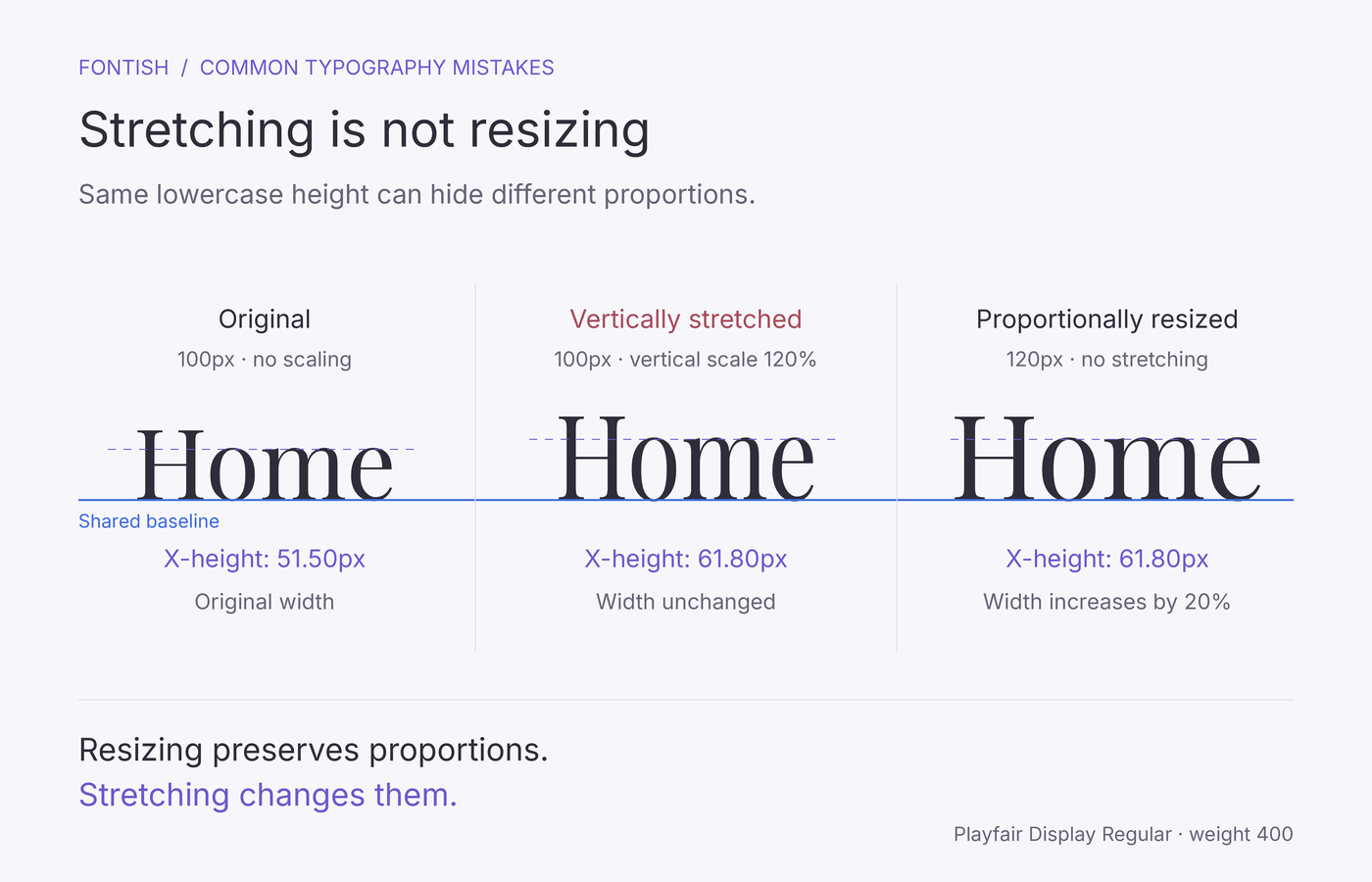
Vertically stretching text raises its visible x-height, but it also distorts the entire design. Curves change shape, stroke relationships shift, and capitals and ascenders become taller too.
Increase the font size proportionally if the text simply needs to appear larger. If the proportions themselves are unsuitable, choose a different typeface rather than pulling the letters into shape.
Judging x-height from an all-caps sample
A specimen reading “DESIGN STUDIO” can show you capitals, spacing and stroke contrast. It cannot show the height of lowercase letters that aren’t there. Add a mixed-case heading and a lowercase passage before judging the font for body text.
For an actual all-caps logo or label, focus on the visible capitals and their spacing. X-height describes another part of the typeface, but it isn’t the measurement driving that particular design.
Related Typography Concepts
Several nearby measurements help you identify which part of the typography needs attention. Our guide to type anatomy shows how these features fit together within individual letters.
| Concept | What it describes | How it relates to x-height |
|---|---|---|
| Baseline | The imaginary line on which most letters sit | The starting point for measuring x-height |
| Cap height | The height of flat-topped capitals such as “H,” measured from the baseline | Shows the uppercase–lowercase size relationship |
| Ascenders and descenders | Strokes extending above the x-height or below the baseline | Explain why lowercase letters occupy more height than their central bodies |
| Counters and apertures | Enclosed spaces within letters and openings to the outside | Help determine whether lowercase details remain clear |
| Leading | In modern layout usage, the distance between consecutive baselines | Controls line spacing without changing x-height |
| Tracking | Spacing adjusted across a range of characters | Changes horizontal spacing without making letters taller |
Cap height reveals the uppercase–lowercase relationship
Two fonts can have similar cap heights but noticeably different x-heights. Their uppercase headings may appear comparable in size, while their mixed-case text feels quite different.
Compare “HOME” with “Home” in each font. The second sample reveals how the lowercase letters sit beside the capital—a useful check for names, navigation labels and short headings.
Letter spaces matter alongside letter height
The enclosed space inside an “o” is a counter; the opening on a “c” is an aperture. These details help explain why two fonts with similar x-heights may perform differently at small sizes.
If letters look clogged, inspect those spaces and the stroke weight. Lowercase height alone won’t tell you where the problem lies.
Spacing controls solve different problems
If individual letters appear too small, review the font and its size. If neighbouring lines feel crowded, review leading and line spacing. If letters feel tightly packed across a word, examine their spacing.
These adjustments work together, but they aren’t interchangeable. Increasing line spacing can give a paragraph breathing room; it cannot enlarge the lowercase letters within it.
Frequently Asked Questions
Why is it called x-height?
The lowercase “x” provides a convenient reference for the height of the main lowercase body. It has no ascender or descender, and its top avoids the rounded overshoot found in letters such as “o.” The term refers to the lowercase “x,” not the capital “X.”
How do you measure a font’s x-height?
Measure vertically from the baseline to the top of the lowercase “x.” For a visual comparison, set both fonts at the same size and align their baselines. For precise measurements, inspect the glyph outlines in a font editor; screenshots can introduce rounding and rendering errors.
Always record the font size alongside the measurement. For variable fonts, also record the axis settings that define the specimen.
What is a good x-height for body text?
There is no single ideal ratio. A relatively generous x-height can help lowercase letters remain visible at smaller sizes, but body text also needs clear letterforms, suitable spacing and a comfortable overall size. Test a full paragraph in the intended layout rather than choosing by the ratio alone.
Is x-height the same as half the font size?
No. Half the font size is only a rough approximation for some fonts. In our measured examples, Inter’s x-height is approximately 54.59% of its font size and Playfair Display’s is 51.50%. Other typefaces and settings can differ.
Can you change x-height without changing the font size?
In ordinary text formatting, you usually cannot adjust x-height independently. Increasing font size enlarges the entire design.
Some variable fonts provide a dedicated control. Roboto Flex, for example, includes a lowercase-height axis called YTLC. Using a font’s designed variation controls is different from vertically stretching its letters, and access to those controls depends on your software.
Bottom Line
Understanding x-height gives you a more precise way to explain why text feels too small or out of balance. You can examine the lowercase proportions and decide whether a size adjustment will help—or whether a different typeface would serve the layout better.
Try the two-pass comparison on one paragraph from your current project. Start with equal font sizes, then approximately match the lowercase heights and examine what still differs.
Check the wrapping, capitals and line spacing before choosing your settings. You’ll finish with a clearer reason for your decision than “this font just looks better.”