

In This Pairing
Some font pairings create contrast by shouting across the page. Lora and Poppins take a more civilised approach.
Lora introduces warmth through brushed curves, moderate stroke contrast, and subtly calligraphic letterforms. Poppins responds with clean circles, consistent strokes, and confident geometric proportions. One feels written; the other feels constructed.
That difference gives the pairing its visual energy.
The combination works especially well for lifestyle brands, wellness websites, thoughtful blogs, educational platforms, boutique businesses, and editorial projects. It can feel elegant, but never stiff. Modern, but not sterile.
More importantly, the Lora and Poppins pairing creates a clear division of labour. Lora can carry expressive headlines and quotations, while Poppins keeps navigation, supporting copy, buttons, and interface elements under control.
The result is a typography system that feels intentional from the first headline to the final call-to-action.
- Lifestyle brands
- Wellness websites
- Editorial blogs
- Personal brands
- Online publications
- Portfolios
- Highly technical dashboards
- Aggressive sports branding
- Ultra-minimal software interfaces
- Warm
- Intelligent
- Modern
- Approachable
- Polished
Lora + Poppins is a strong choice when you want visitors to feel welcomed before they start analysing the design. It gives content a distinctive voice without making the interface harder to navigate.
Lora is a contemporary serif designed for text, with moderate contrast and calligraphic roots. Poppins is an international geometric sans serif with strong circular construction and extensive weight options. Both are available through Google Fonts.
Meet the Pair
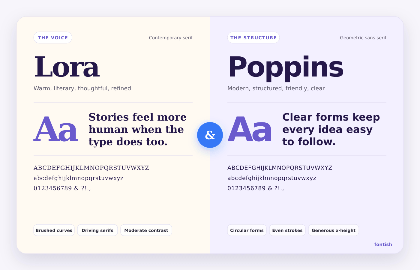
Lora and Poppins come from very different typographic traditions. That is precisely why they work so well together.
Lora: The Warm Storyteller
Lora is a contemporary serif typeface that blends literary character with modern usability. Subtle calligraphic influence gives it a hand-crafted rhythm, while its moderate contrast and open counters ensure strong readability on screens.
Lora‘s brushed curves and driving serifs give words a human rhythm, while its moderate contrast prevents it from becoming too decorative.
Unlike many display serifs, Lora was built to handle real reading. It works in headlines, introductions, quotations, and body copy when given enough space.
Its personality feels:
- Warm
- Literary
- Thoughtful
- Refined
- Human
Lora is not the typeface that walks into a room wearing a crown. It is the one carrying a well-designed notebook and asking an unexpectedly good question.
Poppins: The Modern Organiser
Poppins is a geometric sans serif built on clean circular forms and precise proportions, giving it a modern, structured, and highly legible appearance.
Poppins has a generous x-height and broad family of weights make it useful across interfaces, navigation, buttons, captions, and supporting copy.
Its personality feels:
- Modern
- Structured
- Friendly
- Confident
- Clear
Some geometric fonts can feel mechanical. Poppins avoids much of that coldness through its rounded forms and open appearance. Besides Lora, it becomes the calm organiser that lets the more expressive typeface take the spotlight.
Live Pairing Preview
Designing a more thoughtful everyday life starts with clarity and calm intention. This preview shows how Lora brings a warm, editorial voice to your headlines, while Poppins keeps the structure clean, modern, and easy to navigate.
ABCDEFGHIJKLMNOPQRSTUVWXYZ
abcdefghijklmnopqrstuvwxyz
0123456789 ! ? & % $ # @ ( ) [ ] : ; , .
The preview allows adjustments to font size, weight, line height, alignment, and text content. It includes both uppercase and lowercase characters, numbers, punctuation, and a copyable CSS setup if desired.
A useful default configuration is:
| Element | Font | Weight | Suggested size |
|---|---|---|---|
| Main heading | Lora | 600 | 48–64px |
| Section heading | Lora | 600 | 32–40px |
| Introductory text | Poppins | 400 | 18–21px |
| Body text | Poppins | 400 | 16–18px |
| Navigation | Poppins | 500 | 15–16px |
| Button label | Poppins | 600 | 14–16px |
The exact values should respond to the layout. The important part is preserving a visible difference between Lora’s expressive role and Poppins’ functional role.
Why This Pairing Works
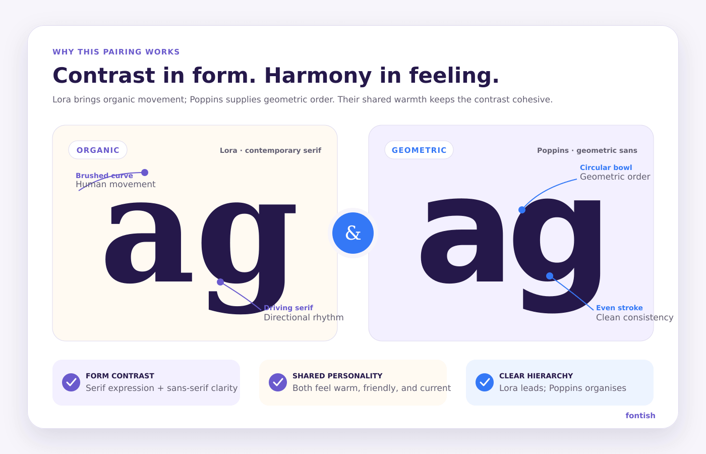
The Lora + Poppins font pairing succeeds because it creates contrast across several typographic dimensions without producing conflict.
Organic Curves Meet Clean Geometry
Lora contains traces of the hand. Its curves feel brushed, and its serifs push the eye forward through a line of text.
Poppins is more rational. Its shapes rely heavily on geometry, particularly circles, giving layouts an immediate sense of structure.
This creates a useful visual conversation:
- Lora adds emotion.
- Poppins adds order.
- Lora attracts attention.
- Poppins makes information easier to scan.
- Lora gives the brand a voice.
- Poppins keeps that voice from becoming overwhelming.
Their Personalities Are Different but Compatible
Not every serif and sans-serif pairing works simply because the categories differ. The individual personalities still need to agree.
Lora feels contemporary rather than historical. Poppins feels friendly rather than industrial. Both lean approachable, which gives the pairing a shared emotional foundation.
Their forms contrast, but their attitudes do not.
Clear Roles Improve Hierarchy
Readers should not need detective training to understand which text matters most.
Lora naturally pulls attention toward headlines, featured statements, and quotations. Poppins performs well in smaller, functional roles where clarity matters more than personality.
When those responsibilities remain consistent, the page becomes easier to scan before a visitor reads a single full paragraph.
Myth: Any serif and geometric sans serif will automatically make a good pairing.
Reality: Category contrast is only the starting point. Lora and Poppins work because their personalities remain approachable, their roles are clearly separated, and neither typeface visually overwhelms the other.
Font Roles
The safest way to use Lora + Poppins is to give each font a defined job.
Lora Provides the Voice
Use Lora for:
- H1 and H2 headings
- Article titles
- Editorial introductions
- Featured quotations
- Testimonial statements
- Selected product or collection names
- Short pull quotes
Lora should carry the moments where the brand needs to sound personal, thoughtful, or emotionally engaging.
Avoid scattering it across every label and interface control. Its personality becomes less effective when everything is trying to speak with the same dramatic voice.
Poppins Provides the Structure
Use Poppins for:
- Navigation menus
- Body copy
- Buttons
- Form labels
- Captions
- Metadata
- Categories and tags
- Product details
- Interface instructions
Poppins keeps practical information clean and predictable. Its range of weights also lets you create secondary hierarchy without introducing a third typeface.
A More Editorial Alternative
For long-form articles, Lora can also handle body copy while Poppins controls the interface around it.
In that arrangement:
- Use Lora Regular for article paragraphs.
- Use Lora Semibold for headings.
- Use Poppins Medium for navigation and labels.
- Use Poppins Semibold for buttons and small calls-to-action.
This version feels more literary. It works well for essays, journals, book-related websites, and cultural publications.
Best Use Cases
Lora brings calmness and human warmth to wellness content, while Poppins keeps schedules, service information, and calls-to-action easy to follow.
Lora gives article titles and quotations a recognisable editorial voice. Poppins makes category labels, author details, navigation, and summaries feel current.
For handmade products, skincare, fashion, food, or homeware, the pairing communicates care without looking rustic.
Example: A Wellness Brand Homepage
On a wellness homepage, Lora Semibold could handle the main promise and testimonial quotations, while Poppins manages navigation, service descriptions, appointment details and booking buttons.
This creates emotional warmth at the moments that need persuasion while keeping every action clear and predictable.
Pairing Formula
Expressive voice
Main headline expression
structural support
Subhead or UI reinforcement
A successful Lora and Poppins setup relies on a simple, role-based hierarchy rather than an overly complex scale of styles.
A reliable Lora and Poppins system does not require twelve font sizes and a minor spreadsheet crisis. Start with a compact hierarchy.
| Role | Typeface | Weight | Desktop size | Line height |
|---|---|---|---|---|
| H1 | Lora | 600 | 52–64px | 1.05–1.15 |
| H2 | Lora | 600 | 34–42px | 1.15–1.25 |
| H3 | Lora | 500–600 | 25–30px | 1.2–1.3 |
| Intro | Poppins | 400 | 19–21px | 1.55–1.7 |
| Body | Poppins | 400 | 16–18px | 1.6–1.75 |
| Navigation | Poppins | 500 | 15–16px | 1.2 |
| Button | Poppins | 600 | 14–16px | 1.2 |
| Caption | Poppins | 400–500 | 13–14px | 1.4–1.5 |
Control the Contrast
For most layouts, Lora should appear larger and visually more prominent than Poppins.
A headline-to-body ratio between roughly 2.5:1 and 3.5:1 usually gives the serif enough presence. If the sizes sit too close together, the roles start to blur.
Keep Weight Choices Focused
A practical system may only need:
- Lora Semibold
- Lora Regular
- Poppins Regular
- Poppins Medium
- Poppins Semibold
Using every available weight does not make the design sophisticated. It usually makes the stylesheet look like a font buffet.
Use Space as Part of the Formula
Lora needs breathing room, particularly at display sizes. Give headings clear separation from the elements above and below them.
Poppins can support tighter interface spacing, but body paragraphs still need comfortable line height and a reasonable measure. Aim for approximately 55–75 characters per line in long-form content.
Website Implementation
Both fonts can be loaded from Google Fonts. Request only the styles and weights the project actually uses to reduce unnecessary font files.
<link rel="preconnect" href="https://fonts.googleapis.com">
<link rel="preconnect" href="https://fonts.gstatic.com" crossorigin>
<link href="https://fonts.googleapis.com/css2?family=Lora:ital,wght@0,400;0,600;1,400&family=Poppins:wght@400;500;600&display=swap" rel="stylesheet">
Then create role-based CSS variables:
:root {
  --font-display: "Lora", Georgia, serif;
  --font-ui: "Poppins", Arial, sans-serif;
}

body {
  font-family: var(--font-ui);
  font-size: 1rem;
  line-height: 1.7;
}

h1,
h2,
h3 {
  font-family: var(--font-display);
  font-weight: 600;
  line-height: 1.15;
}

h1 {
  font-size: clamp(2.75rem, 6vw, 4rem);
}

h2 {
  font-size: clamp(2rem, 4vw, 2.625rem);
}

.eyebrow,
.button,
.site-navigation {
  font-family: var(--font-ui);
  font-weight: 600;
}
Check the Mobile Hierarchy
Large Lora headlines can wrap awkwardly on narrow screens. Use responsive sizing rather than forcing desktop values onto mobile.
Watch for:
- Single words stranded on the final line
- Headlines taking up the entire first screen
- Lines becoming too tight around Lora’s ascenders and descenders
- Poppins body copy becoming too small to preserve the contrast
A beautiful desktop headline that becomes seven lines on a phone is not expressive typography. It is an obstacle course.
Protect Performance
- Load only the weights in use.
- Use
font-display: swap. - Preconnect to the font origin when loading externally.
- Consider self-hosting for greater control.
- Test layout shifts and loading behaviour on slower connections.
Common Mistakes
Lora and Poppins work best when each typeface has a consistent purpose. Use Lora for expressive headings and Poppins for clear, functional text.
Discover simple ideas for calmer spaces, meaningful routines, and intentional living.
Discover simple ideas for calmer spaces, meaningful routines, and intentional living.
❌ Using Both Fonts Everywhere
If Lora and Poppins alternate constantly within the same section, the system loses its logic.
✅ Better approach: Assign stable roles. Let Lora create expressive moments, and Poppins manage practical information.
❌ Setting Lora Too Light at Small Sizes
Lora’s moderate contrast can make thin strokes appear weaker on some screens, particularly when the font is small or placed over an image.
✅ Better approach: Use Regular or Semibold weights and test the type at real device sizes. Add a solid or controlled background behind image-based text.
❌ Making Poppins Body Copy Too Heavy
Poppins Medium or Semibold may look crisp in a button, but it can become tiring across long paragraphs.
✅ Better approach: Use Regular for body copy. Reserve heavier weights for labels, navigation, short introductions, and actions.
❌ Removing Too Much Space Around Headlines
Lora has an expressive silhouette. Crowding it against other elements makes the typography look accidental.
✅ Better approach: Increase the spacing around major headings and use tighter spacing only between a headline and its directly related subtitle.
❌ Relying on Typography to Create Warmth Alone
Lora can add warmth, but it cannot rescue a layout built from cold colours, cramped cards, generic stock photos, and harsh spacing.
✅ Better approach: Support the font pairing with thoughtful imagery, comfortable spacing, natural colour choices, and a clear grid.
❌ Using Excessive Letter Spacing
Poppins can tolerate modest tracking in short uppercase labels. Lora usually cannot.
✅ Better approach: Keep Lora close to its default spacing. Apply letter spacing selectively to Poppins labels rather than globally across the typography system.
Similar Pairings
Lora + Poppins is versatile, but the best font pairing still depends on the tone your project needs.
| Pairing | Personality | Best for | Why consider it |
|---|---|---|---|
| Lora + Inter | Warm and highly functional | Editorial products, content platforms | Inter feels quieter and more neutral than Poppins |
| Merriweather + Poppins | Sturdy and approachable | Education, publishing, information-heavy sites | Merriweather is robust at smaller reading sizes |
| Playfair Display + Poppins | Dramatic and fashionable | Luxury, beauty, campaigns | Creates stronger display contrast and more visual drama |
| Lora + Montserrat | Confident and contemporary | Personal brands, agencies, portfolios | Montserrat feels firmer and slightly more architectural |
| Cormorant Garamond + Poppins | Artistic and elegant | Fashion, culture, premium branding | Offers a more decorative and high-fashion serif voice |
Choose Lora and Poppins when warmth and modern clarity should feel equally important.
If you need a quieter interface, Lora + Inter may be more appropriate. If you want stronger luxury signals, Playfair Display + Poppins introduces more drama.
If you enjoyed exploring the Lora + Poppins pairing, you may also want to review our related font combination: Playfair Display + Inter Font Pairing and Libre Baskerville + Inter Font Pairing.
Quick Reference Cheat Sheet
To help you apply this pairing quickly and consistently, the following cheat sheet distils the key decisions into a simple, practical reference. Use it as a fast guide when setting up your typography system or checking hierarchy across a layout.
| Decision | Recommendation |
|---|---|
| Main headline | Lora Semibold |
| Section headings | Lora Medium or Semibold |
| Body copy | Poppins Regular |
| Long editorial body copy | Lora Regular as an alternative |
| Navigation | Poppins Medium |
| Buttons | Poppins Semibold |
| Labels | Poppins Medium, optional uppercase |
| Recommended contrast | Medium to high |
| Ideal visual style | Warm editorial minimalism |
| Best background | White, cream, pale lavender, soft neutral |
| Avoid | Crowded layouts and overly decorative styling |
| Overall verdict | Highly recommended |
Fast setup: Use Lora for voice and Poppins for structure.
Best beginner rule: If a reader needs to act on it, use Poppins. If a reader needs to feel it, consider Lora.
For a deeper understanding of how to choose the right typeface for your project, it’s worth exploring this comprehensive guide on font selection.
Frequently Asked Questions
Do Lora and Poppins go together?
Yes. Lora and Poppins work well because Lora’s calligraphic serif details contrast with Poppins’ geometric construction. Both fonts still feel approachable, so the combination looks coordinated rather than mismatched.
Which font should I use for headings?
Lora is usually the stronger heading font because its curves and serifs give titles more personality. Poppins can then handle body copy, navigation, buttons, and labels.
Can Lora be used for body text?
Yes. Lora was designed as a text typeface and performs well in longer passages when the size, line height, and line length are comfortable. For a cleaner interface-led design, use Poppins for body copy and reserve Lora for headings.
Are Lora and Poppins free for commercial use?
Both font families are available under the SIL Open Font License 1.1. This generally allows commercial use, embedding, modification, and redistribution under the licence conditions. Review the current licence files before distributing modified font software.
Is Lora + Poppins suitable for a logo?
The pairing can guide a wider brand identity, but a logo needs more than simply typing the business name in Lora. Consider custom spacing, modified letterforms, and how the mark performs at small sizes. Poppins can support the logo through taglines and brand-system typography.
The Bottom Line
Lora + Poppins is one of the more dependable Google Fonts pairings for brands that want to appear modern without losing their human side.
Lora supplies warmth, editorial character, and a sense of thoughtful craftsmanship. Poppins supplies clarity, geometry, and the practical range needed for a complete digital interface. Neither font has to pretend to be the other.
✅ Choose this pairing for lifestyle brands, wellness businesses, blogs, education, portfolios, personal brands, and boutique products.
❌ Choose something else if the project needs a strictly neutral software aesthetic, an aggressive athletic personality, or an overtly luxurious fashion voice.
Beginners can use Lora and Poppins confidently because their natural roles are easy to understand. Keep Lora expressive, let Poppins handle the practical work, and resist the temptation to use six weights simply because the menu offers them.
Build the hierarchy first, test it on real screens, and give the typography enough space to do its job. When those fundamentals are in place, Lora and Poppins deliver exactly what this pairing promises: warmth with modern clarity.