
 I
I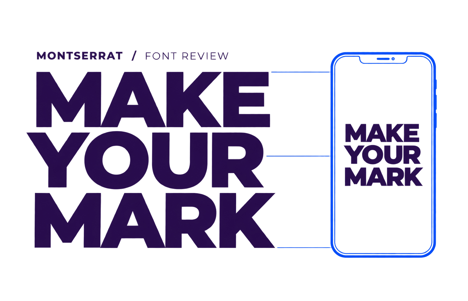
In This Review
Montserrat makes a short headline feel deliberately designed. Its broad capitals and rounded lowercase give words presence, but the extra width can turn an elegant desktop title into a crowded stack on a phone.
This Montserrat font review looks at where that character earns its space, which weights and pairings suit the job, and what to check in a real website layout.
For a heading-led system with a serif reading voice, our Montserrat and Merriweather pairing shows the two roles in action.
- Brand and campaign headlines
- Landing page hero text
- Section headings
- Presentation titles
- Websites with a separate font for longer reading
- Dense dashboards and compact interfaces
- Crowded navigation
- Small body text in narrow columns
- Brands seeking a quiet
- traditional tone
- Confident
- modern
- approachable
- structured
Montserrat earns its place when a short headline needs to lead the page. Give it room, check the wrap on mobile, and let the rest of the type support that first impression. The snapshot below covers the family details behind those choices.
What Is Montserrat?
Montserrat is a geometric sans serif that Julieta Ulanovsky drew from old signs and posters in the Buenos Aires neighbourhood of the same name.
Its broad capitals, rounded lowercase forms and nearly even strokes give short headings a firm silhouette. Sentence case softens that structure; all caps gives it the punch of a poster.
Start with a short lesson on hierarchy, then practise with real headings, paragraphs and buttons. Use what you learn in your next layout.
ABCDEFGHIJKLMNOPQRSTUVWXYZ
abcdefghijklmnopqrstuvwxyz
0123456789 ! ? & % $ # @ ( ) [ ] : ; , .
After its 2011 release, other designers helped expand Montserrat into a family with upright and italic styles and variable weights from 100 to 900.
Regular feels measured, Semibold supports a prominent heading, and ExtraBold can make a few words the page’s main graphic. Give those strongest styles room by keeping the surrounding text calmer.
Where It Works Best
Give Montserrat a clear, prominent job: a brand message, a page heading, or a presentation title. These three uses make the most of its character.
Montserrat gives short brand messages a strong shape across websites, posters and presentation covers. Use a consistent set of weights to connect those pieces.
Use Montserrat for hero headlines and section titles, with a quieter font for longer explanations. This gives visitors a clear path through content-heavy pages.
Montserrat makes short slide titles and announcements stand out beside photos or open space. Keep the message brief; test captions and chart labels separately.
Readability and Practical Use
Montserrat can carry paragraphs, and its Latin design was reworked in 2017. Its broad proportions still affect how much text fits per line, something a five-word specimen will never show.
In our matched browser comparison, Montserrat measured 15.6–19.1% wider than DM Sans across three headlines set with the same words and CSS settings at 54px. At a width of 320px, “Make every word count” took three lines in Montserrat and two in DM Sans.
That is a fit result, not a readability score. The width gives a short message presence when it has room; it becomes harder to manage when the layout is tight.
For body text, read two or three real paragraphs at the size and column width you plan to publish. Check them on a phone, then adjust line spacing and width if the page feels dense. If the reading still takes effort, compare a quieter family in our best fonts for websites guide.
Finally, check the longest real headline, navigation item, and button label at the narrowest screen width. If one word falls onto a line by itself, edit the copy or give the heading more room. Shrinking every label to make it fit can weaken the hierarchy across the page.
Weights, Styles and Character Support
Character Support
Google Fonts lists Latin, Latin Extended, Cyrillic, Cyrillic Extended, and Vietnamese subsets for Montserrat.
For multilingual work, test the names, accented words, punctuation, and symbols you will actually publish. A missing character that falls back to another font can be surprisingly noticeable in a headline.
Choosing the Right Weights
These are starting points. Judge each choice alongside the other text on the page.
| Role | Start with | Check at the final size |
|---|---|---|
| Body paragraphs | 400 | Read several paragraphs; lighter weights may feel faint at small sizes. |
| Buttons and short navigation | 500–600 | Check that real labels remain clear and fit on mobile. |
| Section headings | 600 | Make sure they stand apart from body text without dominating every section. |
| Hero headlines | 700 | Test the longest real headline for awkward wraps. |
| Short campaign or poster titles | 800–900 | Give the heavy letters enough space and keep the message brief. |
Weights and Styles
Montserrat is available in upright and italic styles with variable weights from 100 to 900. That gives you plenty of control, though a clear hierarchy usually needs only a few distinct weights.
Use italics for genuine emphasis and judge them at the size they will appear on the page.
Strengths and Limitations
| ✅ Strength | ⚠️ Limitation to account for |
|---|---|
| The variable weight range creates several levels of emphasis within one family. | Too many similar weights can make the hierarchy harder to see. |
| Upright and italic styles allow emphasis without switching families. | Check that the italic style you intend to use is included in the published design. |
| The listed subsets cover Latin, Cyrillic, and Vietnamese text. | Test the project’s actual characters; subset names alone cannot verify every word or symbol. |
| Heavy styles give short headings a strong visual shape. | Their width can crowd long titles and compact layouts. |
Best Font Pairings
A useful pairing gives each font a distinct job. Let Montserrat lead with headings and short actions, then choose a serif that suits the amount and tone of the reading that follows.
| Font Pairing | Best For | Difficulty | Verdict |
|---|---|---|---|
| Montserrat + Merriweather | Educational and service websites with substantial content | Easy | ★★★★★ |
| Montserrat + Lora | Editorial websites and brand stories | Moderate | ★★★★☆ |
| Montserrat + Source Serif 4 | Guides, resource libraries, and content-heavy websites | Easy | ★★★★☆ |
Start with a short lesson on hierarchy, then practise with real headings, paragraphs and buttons. Use what you learn in your next layout.
ABCDEFGHIJKLMNOPQRSTUVWXYZ
abcdefghijklmnopqrstuvwxyz
0123456789 ! ? & % $ # @ ( ) [ ] : ; , .
Montserrat + Merriweather
Use Montserrat for headings and Merriweather for paragraphs. Merriweather’s sturdy text design gives longer explanations a comfortable reading rhythm beside Montserrat’s strong headings. This pair suits educational and service websites where visitors need both a clear first impression and substantial detail.
Montserrat + Lora
Lora brings softer, calligraphic movement to Montserrat’s structured headings.
Try Montserrat for page and section titles, with Lora carrying articles, brand stories, or a short quotation. It is a good fit when the site should feel both contemporary and editorial.
Montserrat + Source Serif 4
Source Serif 4 gives long guides and explanations a steady text face, while Montserrat marks the sections and key actions. This pairing suits resource libraries and content-heavy sites where readers spend time on the page. Keep the headings prominent, but let the paragraphs set the reading pace.
Our Montserrat–Merriweather specimen exposed a useful trap: Montserrat measured about 13% wider at 54px/700, yet at 42px in a 320px frame both faces used three lines, with different breaks. Width alone cannot tell you whether a headline will sit well. Preview each pair with your real headline and a full paragraph before deciding.
How to Use It on a Website
On a website, Montserrat works best when it has a consistent job from page to page. Decide where it should draw attention, then apply that choice across the site.
Give It a Defined Role
Use Montserrat for page headings, section titles, and perhaps your main buttons. Let a quieter font carry long paragraphs and detailed labels if those areas feel crowded.
On a service site, Montserrat can lead the page title while descriptions and forms use the body face. If a long service name crowds the mobile menu, the navigation can use that quieter face too.
Load the Styles You Use
If your headings use weights 600 and 700, request those weights from Google Fonts; add italic only if it appears in the design.
Include a fallback such as font-family: "Montserrat", sans-serif;. Google Fonts’ display=swap setting lets that fallback show while Montserrat loads.
Check More Than the Homepage
Preview an article, a landing page, and a page with an unusually long title.
Check headings, menus, and buttons at phone width, including how they look before and after Montserrat loads. A fallback can wrap differently, so give important text enough room to work in both.
Common Mistakes
Montserrat makes a strong first impression. The trouble starts when every part of the page is asked to make the same impression.
Choose from short, practical lessons and build something you can use.
All the text demands attention, so the main message loses its lead.
Choose from short, practical lessons and build something you can use.
The title leads while the detail stays comfortable to read.
Using Heavy Weights Everywhere
The comparison shows what happens when a heavy heading and an equally emphatic paragraph compete. The same problem spreads when ExtraBold appears on every section title, button, and card heading. Keep the strongest weight for one focal message; let supporting text step back.
Squeezing the Type to Fit
When a title wraps badly, tightening the letter spacing across the site is a rough fix. Edit the wording, give the title more room where possible, or try a lighter weight. Check the result on a phone; a heading that looks tidy on desktop can still feel cramped there.
Putting Long Messages in All Caps
Montserrat’s capitals suit a short label or campaign line. A full sentence in heavy capitals can demand more attention than the message deserves. Try sentence case for headings people need to read quickly, and save all caps for genuinely brief text.
Expecting the Font to Build the Brand
Montserrat gives a brand a solid typographic starting point, but its identity also comes from the words, imagery, colour, and spacing around the type. If a page feels generic, adding another weight or effect may only make it busier.
Alternatives to Consider
If Montserrat’s character appeals to you but keeps causing the same problem in your layout, compare it with a font that handles that job differently.
| Alternative | Best For | What It Changes | Choose It When |
|---|---|---|---|
| DM Sans | Brand websites that also need substantial text and interface labels | A quieter geometric look with narrower text in our matched specimens | You want one family for headings, navigation, and body copy |
| Inter | Dashboards, forms, and information-heavy websites | A more restrained look with details designed for screen text | Visitors spend more time using the interface than reading large headlines |
| Poppins | Rounded brand headings and projects using Latin and Devanagari | More circular letterforms and a softer geometric feel | You want a rounder look or need both scripts |
Frequently Asked Questions
Is Montserrat free for commercial use?
Yes. Montserrat uses the SIL Open Font License 1.1, which allows use on commercial websites, in client work, and in logos. If you plan to modify or redistribute the font files, check the licence terms.
Is Montserrat a good font for websites?
Yes, especially when a website needs confident hero headlines and clear section titles. Give its broad letters room. Test compact menus, forms, and longer text separately before using Montserrat across every part of the site.
Can Montserrat be used for body text?
Yes. Montserrat can set paragraphs, though its width and geometric rhythm become more noticeable across several of them. Read real copy at your final size and column width. If it feels busy after sensible spacing changes, give paragraphs a quieter companion font.
What font pairs best with Montserrat?
Merriweather is a good first test for content-rich sites: use Montserrat for headings and Merriweather for paragraphs. Lora brings a softer editorial tone, while Source Serif 4 suits guides and reference content. Judge each pair at the sizes you plan to use.
Is Montserrat good for a logo?
It can give a short name a confident geometric shape. Test the exact brand name in several weights and check how it looks at small sizes. If the typed wordmark feels too familiar, custom spacing or lettering can give it a more distinct identity.
Montserrat Font Review: Bottom Line
Choose Montserrat when a short message needs presence: a brand name, landing page headline, or campaign title. It does not have to carry every paragraph and control to earn its place in the system.
Put your longest real heading beside a substantial paragraph at phone width. If the hierarchy works without tiny type or awkward breaks, build around Montserrat. If the same fit problem keeps returning across pages, compare DM Sans in that layout before committing.