
 I
I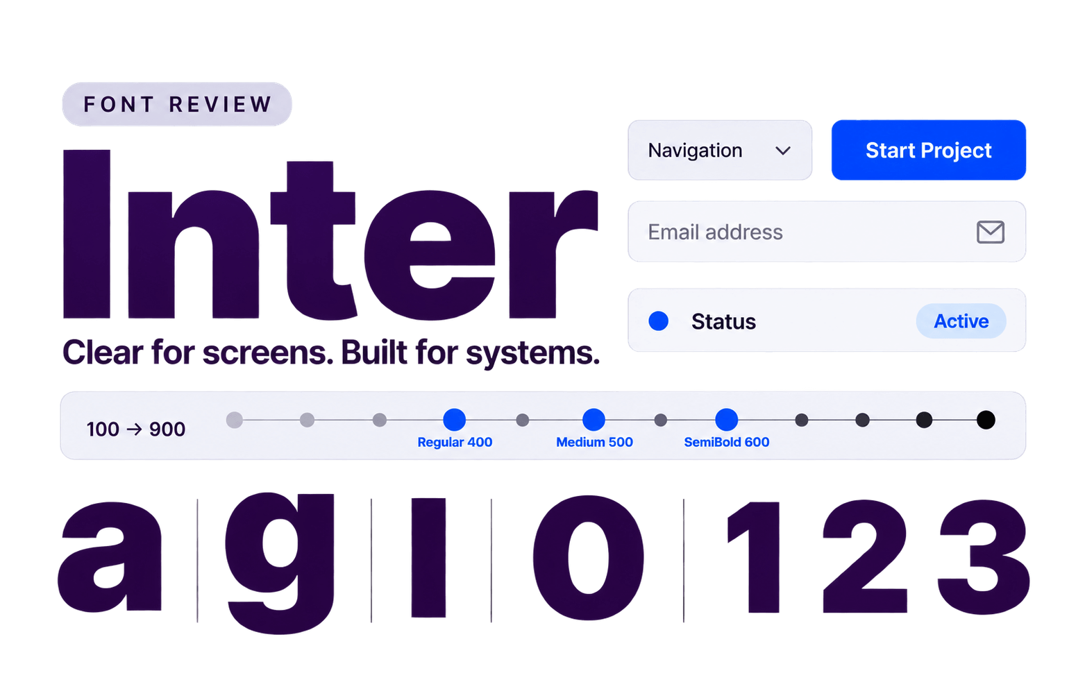
In This Review
If you need one free font to handle a website, app or design system, Inter is usually one of the first names on the shortlist. That reputation is deserved. It was built for screens, stays clear at small sizes and offers enough range to carry a large interface without constantly asking for attention.
Reliability has a trade-off, though. Inter is now so familiar that it can make a brand feel generic when it is expected to supply all the personality. It is excellent at organising information; it is less convincing when the typography needs to be the main event.
In this Inter font review, we will look at how it reads, where it performs best, what can go wrong and when another typeface would give the design a stronger voice.
- Websites
- SaaS products
- Apps
- Dashboards
- Design systems
- Interface-heavy projects
- Luxury-first brands
- Heritage-led identities
- Playful or handcrafted brands
- Dramatic editorial layouts
- Neutral
- Modern
- Precise
- Calm
- Efficient
Inter’s appeal rests on three practical strengths: screen clarity, a flexible weight range and a neutral voice. The snapshot below covers the essentials before we see how those strengths behave in real design work.
What Is Inter?
Inter is a neo-grotesque sans serif designed by Rasmus Andersson for digital environments. Its tall x-height, open counters, sturdy strokes and compact proportions keep lowercase text visibly large without forcing the font size upward.
The overall texture is clean and controlled: friendly enough for everyday use, neutral enough to sit behind the product.
Use this preview to test Inter’s hierarchy, spacing and small-text clarity before applying it to a real interface or website.
ABCDEFGHIJKLMNOPQRSTUVWXYZ
abcdefghijklmnopqrstuvwxyz
0123456789 ! ? & % $ # @ ( ) [ ] : ; , .
The project began in late 2016 as an experiment in building a crisp typeface for 11-pixel interface text. It has since grown into a much broader family, with true italics, variable files and optical sizing for both text and display use.
That range explains much of Inter’s appeal. One family can handle navigation, forms, tables, paragraphs, marketing copy and large headings while keeping the system coherent. It is also free and open source under the SIL Open Font License 1.1, which removes much of the licensing friction from personal and commercial work.
Inter’s greatest strength is also its limitation: it is intentionally useful before expressive. That is an advantage in a product interface.
For a brand that needs heritage, luxury, playfulness or editorial drama, Inter may need a more characterful partner—or a different lead typeface altogether.
Myth: Because Inter was designed for screens, it is automatically the best choice for every website.
Reality: Inter excels in interfaces and practical web typography, but expressive brands may need a more distinctive lead typeface or display partner.
Where Inter Works Best
Inter works best when typography needs to organise information without becoming the centre of attention. For a broader shortlist arranged by role, compare it with our guide to the best fonts for websites.
This is Inter’s natural territory. It stays clear across navigation, buttons, forms, tables and status labels, making it a strong choice for dashboards, account areas, admin panels and mobile apps.
Its neutral tone suits B2B websites, service businesses, documentation and knowledge bases. Inter can handle headings and body text within a single system while allowing content and visuals to lead.
Inter works well across product interfaces, marketing pages and internal tools. Teams can assign a small set of weights to clear roles without introducing several competing font families.
Note: These use cases work because Inter is doing practical work, not trying to be the personality. When a brand needs more character, keep Inter in the functional roles and pair it with a more expressive display typeface.
Readability and Practical Use
Inter earns its reputation for readability most convincingly in small, functional text. Its tall x-height keeps lowercase letters visibly large, while open counters and sturdy strokes help labels and instructions remain clear.
In Interfaces and Small Text
For labels, buttons, menus and form fields, 14–16 pixels is a sensible starting range. Regular (400) and Medium (500) usually hold up better than lighter weights, especially with muted colours or low-contrast backgrounds. Inter’s compact width also helps in navigation bars and data tables.
In Paragraphs
Inter works well for body copy, documentation and help articles, but its large lowercase letters can make tightly set paragraphs feel dense. Start with a line height between 1.5 and 1.65 and a comfortable column width.
Optical sizing can refine letterforms when the variable font is used, but it cannot rescue cramped spacing or poor contrast.
Weights, Styles and Character Support
Inter offers nine weights, but most websites and apps need only three or four.
Choosing the Right Weights
| Role | Weight | Practical use |
|---|---|---|
| Body copy | Regular 400 | Paragraphs, documentation and general reading |
| Navigation and buttons | Medium 500 | Compact controls that need slightly more authority |
| Headings | SemiBold 600 or Bold 700 | Clear hierarchy without excessive contrast |
| Large display text | Thin 100 to Light 300 | Use only at generous sizes and with strong contrast |
A small, deliberate set creates a clearer hierarchy and a leaner font load than using every available weight.
Variable Font and Italics
The variable font supports weights between the usual fixed steps and includes optical sizing for different text sizes. Inter also provides true italics, so emphasis, quotations and supporting text look designed rather than mechanically slanted.
Character and Language Support
With more than 2,000 glyphs covering 147 languages, Inter is well equipped for multilingual websites and international products. Its character set includes the numbers, currency symbols, punctuation and specialised UI characters many interfaces require.
Broad support is not universal support. Test every required language and symbol before launch.
Inter’s Strengths and Limitations
| ✅ What Inter Does Well | ⚠️ Where Inter Falls Short |
|---|---|
| Stays clear in small interface text | Familiarity can make brands feel generic |
| Covers weights from 100 to 900 | Neutrality limits expressive identities |
| Includes true italics and variable options | Tall lowercase can feel dense in tight paragraphs |
| Supports broad language and symbol coverage | Light weights weaken at small sizes |
| Free for personal and commercial work | Still needs hierarchy, spacing and art direction |
Best Inter Font Pairings
Inter pairs best with a typeface that adds contrast, warmth or a stronger editorial voice. Another restrained sans serif may work, but it rarely changes the mood.
| Font Pairing | Best For | Difficulty | Verdict |
|---|---|---|---|
| Playfair Display + Inter | Editorial websites, portfolios and premium brands | Easy | ★★★★★ |
| Libre Baskerville + Inter | Professional services, education and publishing | Medium | ★★★★★ |
| Lora + Inter | Blogs, lifestyle, wellness and storytelling | Easy | ★★★★☆ |
1. Playfair Display and Inter
Playfair Display brings high-contrast elegance while Inter keeps the supporting text practical. Use Playfair for prominent headlines and section openers, then let Inter handle body copy and controls. The pairing suits editorial websites, portfolios and polished brands.
2. Libre Baskerville and Inter
Libre Baskerville feels calmer and more traditional than Playfair Display. Use it for headings, introductions or pull quotes, with Inter covering body text and functional elements. Their different proportions may need modest size tuning.
3. Lora and Inter
Lora adds warmth and a more conversational character, making it useful for blogs, wellness brands and storytelling. It can handle headings or long-form reading text while Inter covers navigation, metadata and controls.
Give the fonts separate jobs. In these pairings, the serif sets the mood while Inter keeps the interface working.
Playfair Display gives the headline its editorial confidence, while Inter keeps the supporting text clear and controlled. Adjust the size and weight until the contrast feels deliberate without letting either font overpower the other.
ABCDEFGHIJKLMNOPQRSTUVWXYZ
abcdefghijklmnopqrstuvwxyz
0123456789 ! ? & % $ # @ ( ) [ ] : ; , .
How to Use Inter on a Website
Inter is easy to implement when every weight has a clear job. Start small and expand only when the design needs more.
Build a Simple Hierarchy
Use size and spacing to create most of the hierarchy, then add weight where it clarifies a role. The table above is a starting point, not a rulebook.
Use a Reliable CSS Stack
body {
  font-family: "Inter", ui-sans-serif, system-ui, -apple-system,
    BlinkMacSystemFont, "Segoe UI", sans-serif;
  font-optical-sizing: auto;
  font-weight: 400;
  line-height: 1.6;
}
The system fonts provide readable fallbacks while Inter loads or if the web font fails. With a compatible variable file, font-optical-sizing: auto lets the browser adjust letterforms for different text sizes.
Keep Font Loading Lean
Load only the weights and styles the website uses. A variable font can simplify a system with several weights and optical sizing; a site using only Regular and Bold may be leaner with static files. Compare the actual files before deciding.
Declare only loaded weights. Otherwise, the browser may manufacture a heavier or slanted version that looks close enough to escape notice but not good enough to deserve the Inter name.
Test the finished system on a slow mobile connection as well as a fast desktop.
Common Mistakes
Inter is difficult to make unreadable, but easy to make forgettable. Most problems come from overusing its flexibility or asking its neutrality to carry the brand.
Loading Every Weight
Loading every weight adds files and near-identical choices without improving the hierarchy. Start with the smallest set that covers the roles in the design.
Flattening the Hierarchy
When body text, navigation, cards and buttons use similar sizes and weights, consistency becomes sameness. Use spacing, scale and colour contrast to show importance.
Squeezing the Text Too Tightly
Inter’s tall x-height already makes lowercase text appear large. Narrow containers, long lines and tight spacing can quickly produce a dense page. Give it room; the fold will survive.
Expecting Inter to Supply the Personality
Inter can keep a design calm and organised, but it will not create a luxury, heritage or playful identity on its own. Build that character through layout, colour, imagery or a distinctive display partner rather than stretching or overtracking the font.
Mistake Comparison
Good hierarchy guides the eye from the main idea to the supporting details. Readers should know what matters without having to hunt for it.
Similar scale and tight spacing flatten the hierarchy.
Good hierarchy guides the eye from the main idea to the supporting details. Readers should know what matters without having to hunt for it.
Clearer scale and spacing make the page easier to scan.
Inter Alternatives to Consider
These alternatives stay practical while changing the reading texture or giving the design a more noticeable voice.
| Alternative | Best For | What It Changes | Choose It When |
|---|---|---|---|
| Source Sans 3 | Documentation, education and content-heavy websites | A more open, humanist reading texture | Comfortable body copy matters more than compact interface text |
| Figtree | Startups, consumer products and marketing websites | A softer, friendlier digital voice | Inter feels slightly too clinical or anonymous |
| IBM Plex Sans | Technology brands, data products and institutions | A stronger technical and editorial character | The typeface needs to contribute more visibly to the brand |
For a measured look at their different reading textures, see our Inter and Figtree comparison.
Start with the reason for leaving Inter. If the real problem is weak hierarchy, cramped spacing or an unclear brand direction, changing the font only gives the problem a new outfit.
Frequently Asked Questions
Is Inter a good font for websites?
Yes. Inter stays clear across navigation, forms, tables and body text, making it especially useful for product and interface-heavy websites. Expressive brands may need stronger imagery, layout or a display partner.
Is Inter good for body text?
Yes, when given enough space. Start with Regular (400), a line height between 1.5 and 1.65 and a comfortable column width; tightly packed lines can make its tall lowercase letters feel dense.
Is Inter free for commercial use?
Yes. Inter is released under the SIL Open Font License 1.1, so it can be used in personal and commercial projects. Keep the licence information with redistributed font files and check the current licence terms for unusual distribution cases.
What fonts pair well with Inter?
Playfair Display, Libre Baskerville and Lora add useful serif contrast. Use the serif for prominent headings or editorial moments and Inter for body copy and interface elements.
Is Inter too overused for branding?
Inter is common, but familiarity is only a problem when the brand expects the typeface to create all the character. Strong layout, colour, imagery or a display partner can make it feel intentional rather than default.
Bottom Line
Inter earns its reputation as one of the safest free choices for websites, apps, dashboards and design systems. It stays clear at small sizes, covers a complete interface and rarely competes with the content.
Choose it when reliability matters more than typographic drama. Look elsewhere—or add an expressive partner—when the typeface must carry a luxury, heritage or highly distinctive identity.
Before committing, build one real page using Regular (400) for body text, Medium (500) for controls and SemiBold (600) or Bold (700) for headings. Test it on mobile and desktop.
If the hierarchy remains clear and the brand still feels like itself, stop auditioning fonts. Inter has done the job.