In This Review Roboto is easy to overlook because it already feels familiar.
Its rounded bowls, upright structure and relatively compact words suit the everyday work of an interface: explaining a setting, showing an account balance or helping someone finish a booking.
This Roboto font review asks where that familiarity helps, and where it leaves a design short of personality.
The useful surprise is how much control the current family offers. Weight, width and real italics give you room to build a coherent system without reaching for another font.
I would shortlist Roboto for a service website or product interface, then test whether the headings need a more distinctive partner. Recognition is useful. A recognisable brand takes more work.
Quick Verdict
Roboto is a reliable choice for websites, interfaces and everyday reading. Flexible weights, width control and real italics support clear hierarchy, though distinctive branding may need a more expressive partner.
8.6/10
Overall score
★
★
★
★
★
Best For
Account interfaces
Service websites
Help centres
Avoid For
Distinctive wordmarks without custom work
Decorative display typography
Personality
Familiar
Practical
Restrained
Here is a quick snapshot of the Roboto font.
Designer / Foundry
Originally Christian Robertson for Google; current Google Fonts credits also list ParaType and Font Bureau.
Classification
Sans serif; commonly described as neo-grotesque, with geometric construction and open curves.
License
SIL Open Font License 1.1.
Styles
Upright and italic variable files
Best For
App interfaces, service websites, dashboards and body text.
Top Pairings
Playfair Display, Lora, Oswald
What Is Roboto?
Roboto in brief
Roboto is a sans-serif typeface originally designed by Christian Robertson for Google and first released with Android 4.0 in 2011.
Roboto combines an upright, orderly structure with curves that soften its appearance.
Headings feel firm, while paragraphs have a quieter texture—a useful balance when one family handles titles, instructions and controls.
Look at the lowercase a and g in the preview below. The double-storey a adds detail; the single-storey g gives words like “booking” a different rhythm than Open Sans. These small choices shape its familiar, practical character.
LIVE SINGLE-FONT PREVIEW Roboto
FontAbril Fatface Alegreya Alegreya Sans Anton Antonio Archivo Archivo Narrow Arial Arvo Barlow Barlow Condensed Bebas Neue Bitter Bodoni Moda Bricolage Grotesque Cabin Cardo Caveat Cinzel Cormorant Garamond Crimson Pro Crimson Text Dancing Script DM Mono DM Sans DM Serif Display DM Serif Text EB Garamond Figtree Fira Code Fira Sans Fjalla One Fraunces Geist Geist Mono Georgia Google Sans Flex Great Vibes IBM Plex Mono IBM Plex Sans IBM Plex Sans Condensed IBM Plex Serif Inconsolata Inter JetBrains Mono Karla Lato League Gothic League Spartan Lexend Libre Baskerville Libre Caslon Display Libre Caslon Text Libre Franklin Literata Lobster Lora Manrope Merriweather Montserrat Mulish Newsreader Noto Sans Noto Sans Display Noto Serif Noto Serif Display Nunito Nunito Sans Open Sans Oswald Outfit Pacifico Playfair Display Plus Jakarta Sans Poppins Prata PT Sans PT Sans Narrow PT Serif Public Sans Quicksand Raleway Red Hat Display Red Hat Text Roboto Roboto Condensed Roboto Flex Roboto Slab Rubik Sacramento Sora Source Code Pro Source Sans 3 Source Serif 4 Space Grotesk Space Mono Spectral system-ui Teko Times New Roman Ubuntu Ubuntu Mono Urbanist Verdana Work Sans Zilla Slab Aclonica Calligraffitti Cherry Cream Soda Chewy Coming Soon Crafty Girls Creepster Caps Crushed Fontdiner Swanky Homemade Apple Irish Grover jsMath cmbx10 jsMath cmex10 jsMath cmmi10 jsMath cmr10 jsMath cmsy10 jsMath cmti10 Just Another Hand Kosugi Kosugi Maru Kranky Luckiest Guy Maiden Orange Montez Mountains of Christmas Permanent Marker Rancho Redressed Rochester Rock Salt Satisfy Schoolbell Slackey Smokum Special Elite Sunshiney Syncopate Ultra Unkempt Walter Turncoat Yellowtail 42dot Sans ABeeZee Abel Abhaya Libre Aboreto Abyssinica SIL Acme Actor Adamina ADLaM Display Advent Pro Afacad Afacad Flux Agbalumo Agdasima Aguafina Script Agu Display Akatab Akaya Kanadaka Akaya Telivigala Akronim Akshar Akt Aladin Alan Sans Alata Alatsi Albert Sans Aldrich Alef Alegreya Sans SC Alegreya SC Aleo Alexandria Alex Brush Alfa Slab One Alice Alien Block Alike Alike Angular Alkalami Alkatra Allan Allerta Allerta Stencil Allison Allura Almarai Almendra Almendra Display Almendra SC Alumni Sans Alumni Sans Collegiate One Alumni Sans Collegiate One SC Alumni Sans Inline One Alumni Sans Pinstripe Alumni Sans SC Alyamama Amarante Amaranth Amarna Amatic SC Amethysta Amiko Amiri Amiri Quran Amita Anaheim Ancizar Sans Ancizar Serif Andada Pro Andika Anek Bangla Anek Devanagari Anek Gujarati Anek Gurmukhi Anek Kannada Anek Latin Anek Malayalam Anek Odia Anek Tamil Anek Telugu Angkor Annapurna SIL Annie Use Your Telescope Anonymous Pro Anta Antic Antic Didone Antic Slab Anton SC Anuphan Anybody Aoboshi One Arapey Arbutus Arbutus Slab Architects Daughter Archivo Black Aref Ruqaa Aref Ruqaa Ink Are You Serious Arima Arimo Arizonia Armata AR One Sans Arsenal Arsenal SC Artifika Arya Asap Asap Condensed Asap Sharp Asar Asimovian Asset Assistant Asta Sans Astloch Asul Athiti Atkinson Hyperlegible Atkinson Hyperlegible Mono Atkinson Hyperlegible Next Atma Atomic Age Aubrey Audiowide Autour One Average Average Sans Averia Gruesa Libre Averia Libre Averia Sans Libre Averia Serif Libre Azeret Mono B612 B612 Mono Babylonica Bacasime Antique Badeen Display Bad Script Bagel Fat One Bahiana Bahianita Bai Jamjuree Bakbak One Ballet Baloo 2 Baloo Bhai 2 Baloo Bhaijaan 2 Baloo Bhaina 2 Baloo Chettan 2 Baloo Da 2 Baloo Paaji 2 Baloo Tamma 2 Baloo Tammudu 2 Baloo Thambi 2 Balsamiq Sans Balthazar Bangers Barlow Semi Condensed Barriecito Barrio Basic Baskervville Baskervville SC Batang BatangChe Battambang Baumans Bayon BBH Bartle BBH Bogle BBH Hegarty Beau Rivage Beiruti Belanosima Belgrano Bellefair Belleza Bellota Bellota Text BenchNine Benne Bentham Berkshire Swash Besley Betania Patmos Betania Patmos GDL Betania Patmos Guide Line Betania Patmos In Betania Patmos In GDL Beth Ellen Bevan Be Vietnam Pro Bhavuka BhuTuka Expanded One Bigelow Rules Bigshot One Big Shoulders Big Shoulders Display Big Shoulders Display SC Big Shoulders Inline Big Shoulders Inline Display Big Shoulders Inline Display SC Big Shoulders Inline Text Big Shoulders Inline Text SC Big Shoulders Stencil Big Shoulders Stencil Display Big Shoulders Stencil Display SC Big Shoulders Stencil Text Big Shoulders Stencil Text SC Big Shoulders Text Big Shoulders Text SC Bilbo Bilbo Swash Caps BioRhyme BioRhyme Expanded Birthstone Birthstone Bounce Biryani Bitcount Bitcount Grid Double Bitcount Grid Double Ink Bitcount Grid Single Bitcount Grid Single Ink Bitcount Ink Bitcount Prop Double Bitcount Prop Double Ink Bitcount Prop Single Bitcount Prop Single Ink Bitcount Single Bitcount Single Ink BIZ UDGothic BIZ UDMincho BIZ UDPGothic BIZ UDPMincho BJCree Black And White Picture Black Han Sans Black Ops One Blaka Blaka Hollow Blaka Ink Blinker Bodoni Moda SC Bokor Boldonse Bona Nova Bona Nova SC Bonbon Bonheur Royale Boogaloo Borel Bowlby One Bowlby One SC Bpmf Huninn Bpmf Iansui Bpmf Zihi Kai Std Braah One Brawler Bree Serif Briem Hand Bruno Ace Bruno Ace SC Brygada 1918 Bubblegum Sans Bubbler One Buda Buenard Bungee Bungee Color Bungee Hairline Bungee Inline Bungee Outline Bungee Shade Bungee Spice Bungee Tint Butcherman Butterfly Kids Bytesized Caacupe One Cabin Condensed Cabin Sketch Cactus Classical Serif Caesar Dressing Cagliostro Cairo Cairo Play Caladea Calistoga Cal Sans Cambay Cambo Candal Cantarell Cantata One Cantora One Caprasimo Capriola Caramel Carattere Carlito Carme Carrois Gothic Carrois Gothic SC Carter One Cascadia Code Cascadia Mono Castoro Castoro Titling Catamaran Caudex Cause Caveat Brush Cedarville Cursive Ceviche One Chakra Petch Changa Changa One Chango Charis SIL Charm Charmonman Chathura Chau Philomene One Chela One Chelsea Market Cherish Cherry Bomb One Cherry Swash Chicle Chilanka Chiron GoRound TC Chiron Hei HK Chiron Sung HK Chivo Chivo Mono Chocolate Classical Sans Chokokutai Chonburi Cinzel Decorative Clarity City Clicker Script Climate Crisis Coda Codystar Coiny Combo Comfortaa Comforter Comforter Brush Comic Neue Comic Relief Comme Commissioner Concert One Condiment Contrail One Convergence Cookie Copse Coral Pixels Corben Corinthia Cormorant Cormorant Infant Cormorant SC Cormorant Unicase Cormorant Upright Cossette Texte Cossette Titre Courgette Courier Prime Cousine Coustard Covered By Your Grace Creepster Crete Round Croissant One Cuprum Cute Font Cutive Cutive Mono Dai Banna SIL Damion Danfo Dangrek Darker Grotesque Darumadrop One Datatype David Libre Dawning of a New Day Days One Dekko Dela Gothic One Delicious Handrawn Delius Delius Swash Caps Delius Unicase Della Respira Denk One Devonshire Dhurjati Dhyana Didact Gothic Digital Numbers Diphylleia Diplomata Diplomata SC Do Hyeon Dokdo Domine Donegal One Dongle Doppio One Dorsa Dosis DotGothic16 Doto Dotum DotumChe Dr Sugiyama Duru Sans Dynalight DynaPuff Eagle Lake East Sea Dokdo Eater Economica Eczar Edu AU VIC WA NT Arrows Edu AU VIC WA NT Dots Edu AU VIC WA NT Guides Edu AU VIC WA NT Hand Edu AU VIC WA NT Pre Edu NSW ACT Foundation Edu QLD Beginner Edu SA Beginner Edu TAS Beginner Edu VIC WA NT Beginner Ek Mukta Electrolize El Messiri Elms Sans Elsie Elsie Swash Caps Emblema One Emilys Candy Encode Sans Encode Sans Condensed Encode Sans Expanded Encode Sans SC Encode Sans Semi Condensed Encode Sans Semi Expanded Engagement Englebert Enriqueta Ephesis Epilogue Epunda Sans Epunda Slab Erica One Esteban Estedad Estonia Euphoria Script Ewert Exile Exo Exo 2 Expletus Sans Explora Faculty Glyphic Fahkwang Familjen Grotesk Fanwood Text Farro Farsan Fascinate Fascinate Inline Faster One Fasthand Fauna One Faustina Federant Federo Felipa Fenix Festive Finger Paint Finlandica Finlandica Headline Finlandica Text Fira Mono Fira Sans Condensed Fira Sans Extra Condensed Fjord One Flamenco Flavors Fleur De Leah Flow Block Flow Circular Flow Rounded Foldit Fondamento Forum Fragment Mono Fragment Mono SC Francois One Frank Ruhl Libre Freckle Face Fredericka the Great Fredoka Freehand Freeman Fresca Frijole Fruktur Fugaz One Fuggles Funnel Display Funnel Sans Fustat Fuzzy Bubbles Gabarito Gabriela Gaegu Gafata Gajraj One Galada Galdeano Galindo Ga Maamli Gamja Flower Gantari Gasoek One Gayathri Geist Pixel Gelasio Gemunu Libre Genos Gentium Book Plus Gentium Plus Geo Geologica Geom Geomini Georama Geostar Geostar Fill Germania One GFS Didot GFS Neohellenic Gideon Roman Gidole Gidugu Gilda Display Girassol Give You Glory Glass Antiqua Glegoo Gloock Gloria Hallelujah Glory Gluten Goblin One Gochi Hand Goldman Golos Text Google Sans Google Sans Code Gorditas Gothic A1 Gotu Goudy Bookletter 1911 Gowun Batang Gowun Dodum Graduate Grand Hotel Grandiflora One Grandstander Grape Nuts Gravitas One Grechen Fuemen Grenze Grenze Gotisch Grey Qo Griffy Gruppo Gudea Gugi Gulim GulimChe Gulzar Gungsuh GungsuhChe Gupter Gurajada Gveret Levin Gwendolyn Habibi Hachi Maru Pop Hahmlet Halant Hammersmith One Hanalei Hanalei Fill Handjet Handlee Hanken Grotesk Hanuman Happy Monkey Harmattan Headland One Hedvig Letters Sans Hedvig Letters Serif Heebo Henny Penny Hepta Slab Hermeneus One Herr Von Muellerhoff Hibur Mono Hi Melody Hina Mincho Hind Hind Colombo Hind Guntur Hind Jalandhar Hind Kochi Hind Madurai Hind Mysuru Hind Siliguri Hind Vadodara Holtwood One SC Homenaje Honk Host Grotesk Hubballi Hubot Sans Huninn Hurricane Iansui Ibarra Real Nova IBM Plex Sans Arabic IBM Plex Sans Devanagari IBM Plex Sans Hebrew IBM Plex Sans JP IBM Plex Sans KR IBM Plex Sans Thai IBM Plex Sans Thai Looped Iceberg Iceland Idiqlat Imbue IM Fell Double Pica IM Fell Double Pica SC IM Fell DW Pica IM Fell DW Pica SC IM Fell English IM Fell English SC IM Fell French Canon IM Fell French Canon SC IM Fell Great Primer IM Fell Great Primer SC Imperial Script Imprima Inclusive Sans Inder Indie Flower Ingrid Darling Inika Inknut Antiqua Inria Sans Inria Serif Inspiration Instrument Sans Instrument Serif Intel One Mono Inter Tight Iosevka Charon Iosevka Charon Mono Island Moments Isometra Istok Web Italiana Italianno Itim Jacquard 12 Jacquard 12 Charted Jacquard 24 Jacquard 24 Charted Jacquarda Bastarda 9 Jacquarda Bastarda 9 Charted Jacques Francois Jacques Francois Shadow Jaini Jaini Purva Jaldi Jaro Jersey 10 Jersey 10 Charted Jersey 15 Jersey 15 Charted Jersey 20 Jersey 20 Charted Jersey 25 Jersey 25 Charted Jim Nightshade Joan Jockey One Jolly Lodger Jomhuria Jomolhari Josefin Sans Josefin Slab Jost Joti One Jua Judson Julee Julius Sans One Junge Jura Just Me Again Down Here K2D Kablammo Kadwa Kaisei Decol Kaisei HarunoUmi Kaisei Opti Kaisei Tokumin Kalam Kalnia Kalnia Glaze Kameron Kanchenjunga Kanit Kantumruy Pro Kapakana Karantina Karma Katibeh Kaushan Script Kavivanar Kavoon Kay Pho Du Kdam Thmor Pro Keania One Kedebideri Kelly Slab Kenia Khand Khula Kings Kirang Haerang Kite One Kiwi Maru Klee One Knewave Kodchasan Kode Mono KoHo Koh Santepheap Kolker Brush Konkhmer Sleokchher Kotta One Koulen Kreon Kripa Kristi Krona One Krub Kufam Kulim Park Kumar One Kumar One Outline Kumbh Sans Kurale La Belle Aurore Labrada Lacquer Laila Lakki Reddy Lalezar Lancelot Langar Lateef Lavishly Yours League Script Leckerli One Ledger Lekton Lemon Lemonada Lexend Deca Lexend Exa Lexend Giga Lexend Mega Lexend Peta Lexend Tera Lexend Zetta Libertinus Keyboard Libertinus Mono Libertinus Sans Libertinus Serif Libertinus Serif Display Libre Barcode 128 Libre Barcode 128 Text Libre Barcode 39 Libre Barcode 39 Extended Libre Barcode 39 Extended Text Libre Barcode 39 Text Libre Barcode EAN13 Text Libre Bodoni Libre Caslon Condensed Licorice Life Savers Lilex Lilita One Lily Script One Limelight Linden Hill LINE Seed JP Lisu Bosa Liter Liu Jian Mao Cao Livvic Lobster Two Londrina Outline Londrina Shadow Londrina Sketch Londrina Solid Long Cang Loved by the King Love Light Lovers Quarrel Love Ya Like A Sister Lugrasimo Lumanosimo Lunasima Lusitana Lustria Luxurious Roman Luxurious Script LXGW Marker Gothic LXGW WenKai Mono TC LXGW WenKai TC Macondo Macondo Swash Caps Mada Madimi One Magra Maitree Major Mono Display Mako Mali Mallanna Maname Mandali Manjari Mansalva Manuale Manufacturing Consent Marcellus Marcellus SC Marck Script Margarine Marhey Markazi Text Marko One Marmelad Martel Martel Sans Martian Mono Marvel Ma Shan Zheng Matangi Mate Matemasie Mate SC Maven Pro McLaren Mea Culpa Meddon MedievalSharp Medula One Meera Inimai Megrim Meie Script Menbere Meow Script Merge One Merienda Merriweather Sans Mervale Script Metal Metal Mania Metamorphous Metrophobic Michroma Micro 5 Micro 5 Charted Milonga Miltonian Miltonian Tattoo Mina Mingzat Miniver Miranda Sans Miriam Libre Mirza Miss Fajardose Mitr Mochiy Pop One Mochiy Pop P One Modak Modern Antiqua Moderustic Mogra Mohave Moirai One Molengo Momo Signature Momo Trust Display Momo Trust Sans Mona Sans Monda Monofett Monomakh Monomaniac One Monoton Monsieur La Doulaise Montaga Montagu Slab MonteCarlo Montenegrin Gothic One Montserrat Alternates Montserrat Subrayada Montserrat Underline Moo Lah Lah Mooli Moon Dance Moul Moulpali Mouse Memoirs Mozilla Headline Mozilla Text M PLUS 1 M PLUS 1 Code M PLUS 1p M PLUS 2 M PLUS Code Latin M PLUS Rounded 1c M PLUS U Mr Bedfort Mr Dafoe Mr De Haviland Mrs Saint Delafield Mrs Sheppards Ms Madi Mukta Mukta Mahee Mukta Malar Mukta Vaani Murecho MuseoModerno Mynerve My Soul Mystery Quest Nabla Namdhinggo Nanum Brush Script Nanum Gothic Nanum Gothic Coding Nanum Myeongjo Nanum Pen Script Narnoor Nata Sans National Park NATS Neonderthaw Nerko One Neucha Neuton Nevermind New Amsterdam New Rocker News Cycle New Tegomin Niconne Niramit Nixie One Nobile Nokora Norican Nosifer Nosifer Caps Notable Nothing You Could Do Noticia Text Noto Kufi Arabic Noto Music Noto Naskh Arabic Noto Nastaliq Urdu Noto Rashi Hebrew Noto Sans Adlam Noto Sans Adlam Unjoined Noto Sans Anatolian Hieroglyphs Noto Sans Arabic Noto Sans Armenian Noto Sans Avestan Noto Sans Balinese Noto Sans Bamum Noto Sans Bassa Vah Noto Sans Batak Noto Sans Bengali Noto Sans Bhaiksuki Noto Sans Brahmi Noto Sans Buginese Noto Sans Buhid Noto Sans Canadian Aboriginal Noto Sans Carian Noto Sans Caucasian Albanian Noto Sans Chakma Noto Sans Cham Noto Sans Cherokee Noto Sans Chorasmian Noto Sans Coptic Noto Sans Cuneiform Noto Sans Cypriot Noto Sans Cypro Minoan Noto Sans Deseret Noto Sans Devanagari Noto Sans Duployan Noto Sans Egyptian Hieroglyphs Noto Sans Elbasan Noto Sans Elymaic Noto Sans Ethiopic Noto Sans Georgian Noto Sans Glagolitic Noto Sans Gothic Noto Sans Grantha Noto Sans Gujarati Noto Sans Gunjala Gondi Noto Sans Gurmukhi Noto Sans Hanifi Rohingya Noto Sans Hanunoo Noto Sans Hatran Noto Sans Hebrew Noto Sans HK Noto Sans Imperial Aramaic Noto Sans Indic Siyaq Numbers Noto Sans Inscriptional Pahlavi Noto Sans Inscriptional Parthian Noto Sans Javanese Noto Sans JP Noto Sans Kaithi Noto Sans Kannada Noto Sans Kawi Noto Sans Kayah Li Noto Sans Kharoshthi Noto Sans Khmer Noto Sans Khojki Noto Sans Khudawadi Noto Sans KR Noto Sans Lao Noto Sans Lao Looped Noto Sans Lepcha Noto Sans Limbu Noto Sans Linear A Noto Sans Linear B Noto Sans Lisu Noto Sans Lycian Noto Sans Lydian Noto Sans Mahajani Noto Sans Malayalam Noto Sans Mandaic Noto Sans Manichaean Noto Sans Marchen Noto Sans Masaram Gondi Noto Sans Mayan Numerals Noto Sans Medefaidrin Noto Sans Meetei Mayek Noto Sans Mende Kikakui Noto Sans Meroitic Noto Sans Miao Noto Sans Modi Noto Sans Mongolian Noto Sans Mono Noto Sans Mro Noto Sans Multani Noto Sans Myanmar Noto Sans Nabataean Noto Sans Nag Mundari Noto Sans Nandinagari Noto Sans Newa Noto Sans New Tai Lue Noto Sans NKo Noto Sans NKo Unjoined Noto Sans Nushu Noto Sans Ogham Noto Sans Ol Chiki Noto Sans Old Hungarian Noto Sans Old North Arabian Noto Sans Old Permic Noto Sans Old Persian Noto Sans Old Sogdian Noto Sans Old South Arabian Noto Sans Old Turkic Noto Sans Oriya Noto Sans Osage Noto Sans Osmanya Noto Sans Pahawh Hmong Noto Sans Palmyrene Noto Sans Pau Cin Hau Noto Sans PhagsPa Noto Sans Phoenician Noto Sans Psalter Pahlavi Noto Sans Rejang Noto Sans Runic Noto Sans Samaritan Noto Sans Saurashtra Noto Sans SC Noto Sans Sharada Noto Sans Shavian Noto Sans Siddham Noto Sans SignWriting Noto Sans Sinhala Noto Sans Sogdian Noto Sans Sora Sompeng Noto Sans Soyombo Noto Sans Sundanese Noto Sans Sunuwar Noto Sans Syloti Nagri Noto Sans Symbols Noto Sans Symbols 2 Noto Sans Syriac Noto Sans Syriac Eastern Noto Sans Syriac Western Noto Sans Tagalog Noto Sans Tagbanwa Noto Sans Tai Le Noto Sans Tai Tham Noto Sans Tai Viet Noto Sans Takri Noto Sans Tamil Noto Sans Tamil Supplement Noto Sans Tangsa Noto Sans TC Noto Sans Telugu Noto Sans Thaana Noto Sans Thai Noto Sans Thai Looped Noto Sans Tifinagh Noto Sans Tirhuta Noto Sans Ugaritic Noto Sans Vai Noto Sans Vithkuqi Noto Sans Wancho Noto Sans Warang Citi Noto Sans Yi Noto Sans Zanabazar Square Noto Serif Ahom Noto Serif Armenian Noto Serif Balinese Noto Serif Bengali Noto Serif Devanagari Noto Serif Dives Akuru Noto Serif Dogra Noto Serif Ethiopic Noto Serif Georgian Noto Serif Grantha Noto Serif Gujarati Noto Serif Gurmukhi Noto Serif Hebrew Noto Serif Hentaigana Noto Serif HK Noto Serif JP Noto Serif Kannada Noto Serif Khitan Small Script Noto Serif Khmer Noto Serif Khojki Noto Serif KR Noto Serif Lao Noto Serif Makasar Noto Serif Malayalam Noto Serif NP Hmong Noto Serif Old Uyghur Noto Serif Oriya Noto Serif Ottoman Siyaq Noto Serif SC Noto Serif Sinhala Noto Serif Tamil Noto Serif Tangut Noto Serif TC Noto Serif Telugu Noto Serif Thai Noto Serif Tibetan Noto Serif Todhri Noto Serif Toto Noto Serif Vithkuqi Noto Serif Yezidi Noto Traditional Nushu Noto Znamenny Musical Notation Nova Cut Nova Flat Nova Mono Nova Oval Nova Round Nova Script Nova Slim Nova Square NTR Numans Nuosu SIL Odibee Sans Odor Mean Chey Offside OFL Sorts Mill Goudy TT Oi Ojuju Oldenburg Old Standard TT Ole Oleo Script Oleo Script Swash Caps Onest Oooh Baby Oranienbaum Orbit Orbitron Oregano Orelega One Orienta Original Surfer Otomanopee One Overlock Overlock SC Overpass Overpass Mono Over the Rainbow Ovo Oxanium Oxygen Oxygen Mono Padauk Padyakke Expanded One Palanquin Palanquin Dark Palette Mosaic Pangolin Paprika Parastoo Parisienne Parkinsans Passero One Passion One Passions Conflict Pathway Extreme Pathway Gothic One Patrick Hand Patrick Hand SC Pattaya Patua One Pavanam Paytone One Peddana Peralta Petemoss Petit Formal Script Petrona Philosopher Phudu Piazzolla Piedra Pinyon Script Pirata One Pixelify Sans Plaster Platypi Play Playball Playfair Playfair Display SC Playpen Sans Playpen Sans Arabic Playpen Sans Deva Playpen Sans Hebrew Playpen Sans Thai Pliant Pochaevsk Podkova Poetsen One Poiret One Poller One Poltawski Nowy Poly Pompiere Ponnala Ponomar Pontano Sans Poor Story Porter Sans Block Port Lligat Sans Port Lligat Slab Potta One Pragati Narrow Praise Preahvihear Press Start 2P Pridi Princess Sofia Prociono Prompt Prosto One Protest Guerrilla Protest Revolution Protest Riot Protest Strike Proza Libre PT Mono PT Sans Caption PT Serif Caption Puppies Play Puritan Purple Purse Pushster Qahiri Quando Quantico Quattrocento Quattrocento Sans Questrial Quintessential Qwigley Qwitcher Grypen Racing Sans One Radio Canada Radio Canada Big Radley Rajdhani Rakkas Raleway Dots Ramabhadra Ramaraja Rambla Rammetto One Rampart One Ramsina Ranchers Ranga Rasa Rationale Ravi Prakash Readex Pro Recursive Redacted Redacted Script Reddit Mono Reddit Sans Reddit Sans Condensed Red Hat Mono Red Rose Reem Kufi Reem Kufi Fun Reem Kufi Ink Reenie Beanie Reggae One REM Rethink Sans Revalia Rhodium Libre Ribeye Ribeye Marrow Righteous Risque Road Rage Roboto Mono Roboto Serif Rock 3D RocknRoll One Rokkitt Romanesco Ropa Sans Rosario Rosarivo Rouge Script Rowdies Rozha One Rubik 80s Fade Rubik Beastly Rubik Broken Fax Rubik Bubbles Rubik Burned Rubik Dirt Rubik Distressed Rubik Doodle Shadow Rubik Doodle Triangles Rubik Gemstones Rubik Glitch Rubik Glitch Pop Rubik Iso Rubik Lines Rubik Maps Rubik Marker Hatch Rubik Maze Rubik Microbe Rubik Mono One Rubik Moonrocks Rubik One Rubik Pixels Rubik Puddles Rubik Scribble Rubik Spray Paint Rubik Storm Rubik Vinyl Rubik Wet Paint Ruda Rufina Ruge Boogie Ruluko Rum Raisin Ruslan Display Russo One Ruthie Ruwudu Rye Sahitya Sail Saira Saira Condensed Saira Extra Condensed Saira Semi Condensed Saira Stencil Saira Stencil One Salsa Sanchez Sancreek Sankofa Display Sansation Sansita Sansita One Sansita Swashed Sarabun Sarala Sarina Sarpanch Sassy Frass Savate Sawarabi Gothic Sawarabi Mincho Scada Scheherazade New Schibsted Grotesk Science Gothic Scope One Scoutie Sans Seaweed Script Secular One Sedan Sedan SC Sedgwick Ave Sedgwick Ave Display Sekuya Sen Send Flowers Sevillana Seymour One Shadows Into Light Shadows Into Light Two Shafarik Shalimar Shantell Sans Shanti Share Share Tech Share Tech Mono Shippori Antique Shippori Antique B1 Shippori Mincho Shippori Mincho B1 Shizuru Shojumaru Short Stack Shrikhand Sigmar Sigmar One Signika Signika Negative Signika Negative SC Signika SC Silkscreen Simonetta Sintony Sirin Stencil Sirivennela Sitara Six Caps Sixtyfour Sixtyfour Convergence Skranji Slabo 13px Slabo 27px Slackside One Smooch Smooch Sans Smythe Sniglet Snippet Snowburst One SN Pro Sofadi One Sofia Sofia Sans Sofia Sans Condensed Sofia Sans Extra Condensed Sofia Sans Semi Condensed Solitreo Solway Sometype Mono Sono Sonsie One Sorts Mill Goudy Sour Gummy Special Gothic Special Gothic Condensed One Special Gothic Expanded One Spectral SC Spicy Rice Spinnaker Spirax Splash Spline Sans Spline Sans Mono Squada One Square Peg Sree Krushnadevaraya Sriracha Srisakdi Staatliches Stack Sans Headline Stack Sans Notch Stack Sans Text Stalemate Stalinist One Stardos Stencil Stick Stick No Bills Stint Ultra Condensed Stint Ultra Expanded STIX Two Text Stoke Story Script Strait Strichpunkt Sans Strong Style Script Sue Ellen Francisco Suez One Sulphur Point Sumana Supermercado One Sura Suranna Suravaram SUSE SUSE Mono Suwannaphum Swanky and Moo Moo Syne Syne Mono Syne Tactile Tac One Tagesschrift Tai Heritage Pro Tajawal Tangerine Tapestry Taprom TASA Explorer TASA Orbiter Tauri Taviraj Teachers Tektur Telex Tenali Ramakrishna Tenor Sans Text Me One Texturina Thabit Thasadith The Girl Next Door The Nautigal Tienne TikTok Sans Tillana Tilt Neon Tilt Prism Tilt Warp Timmana Tinos Tiny5 Tiny5 Duo Tiro Bangla Tiro Devanagari Hindi Tiro Devanagari Marathi Tiro Devanagari Sanskrit Tiro Gurmukhi Tiro Kannada Tiro Tamil Tiro Telugu Tirra Titan One Titillium Web Tomorrow Tourney Trade Winds Train One Triodion Trirong Trispace Trocchi Trochut Truculenta Trykker Tsukimi Rounded Tuffy Tulpen One Turret Road Twinkle Star Uchen Unbounded Uncial Antiqua Underdog Unica One UnifrakturCook UnifrakturMaguntia Unlock Unna UoqMunThenKhung Updock Valley Sans Vampiro One Varela Varela Round Varta Vast Shadow Vazirmatn Vend Sans Vesper Libre Viaoda Libre Vibes Vibur Victor Mono Vidaloka Viga Vina Sans Voces Volkhov Vollkorn Vollkorn SC Voltaire VT323 Vujahday Script Waiting for the Sunrise Wallpoet Warnes Water Brush Waterfall WDXL Lubrifont JP N WDXL Lubrifont SC WDXL Lubrifont TC Wellfleet Wendy One Whisper WindSong Winky Rough Winky Sans Wire One Wittgenstein Wix Madefor Display Wix Madefor Text Workbench Xanh Mono Xmind Yaldevi Yaldevi Colombo Yanone Kaffeesatz Yantramanav Yarndings 12 Yarndings 12 Charted Yarndings 20 Yarndings 20 Charted Yatra One Yeon Sung Yeseva One Yesteryear Yomogi Young Serif Yrsa Ysabeau Ysabeau Infant Ysabeau Office Ysabeau SC Yuji Boku Yuji Hentaigana Akari Yuji Hentaigana Akebono Yuji Mai Yuji Syuku Yusei Magic Yuyu Yuyu Short Zain Zalando Sans Zalando Sans Expanded Zalando Sans SemiExpanded ZCOOL KuaiLe ZCOOL QingKe HuangYou ZCOOL XiaoWei Zen Antique Zen Antique Soft Zen Dots Zen Kaku Gothic Antique Zen Kaku Gothic New Zen Kurenaido Zen Loop Zen Maru Gothic Zen Old Mincho Zen Tokyo Zoo Zeyada Zhi Mang Xing Zilla Slab Highlight Ubuntu Condensed Ubuntu Sans Ubuntu Sans Mono
Size54px
Weight100 200 300 400 500 600 700 800 900
Line height1.08
Reset
Click the text to try your own words
Manage Your Day
Your plans, clearly organised
Check your upcoming bookings, update your details and keep everything in one place. When plans change, find the information you need and choose what happens next.
Uppercase ABCDEFGHIJKLMNOPQRSTUVWXYZ
Lowercase abcdefghijklmnopqrstuvwxyz
Numbers & punctuation 0123456789 ! ? & % $ # @ ( ) [ ] : ; , .
Copy CSS
Where It Works Best
Roboto makes the most sense when a page contains several kinds of information and readers need to move between them quickly.
Use its quieter paragraph texture for explanation and a restrained weight change for actions. These three settings give its familiar voice a useful job instead of expecting it to supply the whole identity.
👤 Account and booking interfaces
01 Bookings, settings and account pages need a clear route through labels, values and actions. Roboto keeps those elements in one family, while weight and spacing define their roles.
💼 Service business websites
02 A repair service or consultancy often needs to explain an offer before it needs a dramatic typographic entrance. Roboto supports pricing details, process descriptions and contact information without adding much stylistic friction.
📖 Help and learning centres
03 Instructional content mixes paragraphs, numbered steps and small interface labels. Roboto can connect those pieces visually while allowing a contrasting code font where needed.
Readability and Practical Use
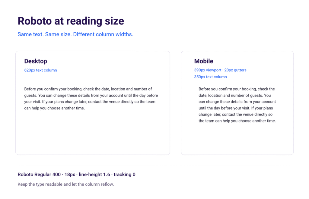
Roboto deserves a paragraph test, not just a polished headline. The passage below includes ordinary instructions, longer words and enough punctuation to expose reading rhythm.
Use it at the size your visitors will actually encounter. A comfortable desktop column can become tiring on a phone if the type shrinks simply to preserve the layout.
Before you confirm your booking, check the date, location and number of guests. You can change these details from your account until the day before your visit. If your plans change later, contact the venue directly so the team can help you choose another time.
The same passage in Roboto Regular at 18px with 1.6 line-height. Narrower columns change the wrapping, not the type size. The moderate stroke contrast keeps the paragraph’s colour fairly steady. That helps with instructions because no strongly decorative feature repeatedly pulls attention away from the sentence.
The result still depends on the layout: narrow columns create more returns to the left edge, while overlong lines make it harder to find the next line.
Character recognition deserves a separate check. Set “Il1” and “O0” in the exact version and size you plan to use.
Roboto’s capital I and lowercase l are both simple upright forms; surrounding words help in prose, but an isolated account code supplies less context. Choose a more explicit code treatment when a mistaken character would cause trouble.
Weight is another practical control. Regular is the sensible starting point for this passage; Medium can strengthen short labels. Thin and Light need more care at small sizes, especially with pale text or a busy background. Calling a font readable does not grant permission to starve it of contrast.
Practical takeaway: keep the paragraph at a comfortable size, shorten the column when needed and test awkward identifiers separately. Choose your spacing from the actual copy, rather than making every line fit an attractive mockup.
Weights, Styles and Character Support
Current Roboto gives you more flexibility than the older six-weight description suggests. The reviewed Google Fonts files include continuous weight and width axes in separate upright and italic fonts.
Start with a few purposeful settings; a slider with hundreds of positions doesn’t require a design system with hundreds of styles.
Weight Suggested role Practical caution 100 Thin / 200 ExtraLight Large, short display text Check contrast and rendering; avoid essential small text. 300 Light Spacious large headings Treat as a deliberate tone choice, not the body default. 400 Regular Paragraphs and descriptions Use the actual italic file for emphasis. 500 Medium Labels and restrained emphasis Useful between paragraph and bold heading. 600 SemiBold Subheadings and stronger labels Available through the current variable range; verify older static packages. 700 Bold Headings and key actions Keep enough space inside and around short labels. 800 ExtraBold / 900 Black Short promotional statements Check counters and wrapping at the intended size.
Compare these four working weights below. Notice how the same words gain emphasis from Regular to Bold, while size and spacing stay unchanged.
Weights · Live font preview Size 24px
400 Manage your account
500 Manage your account
600 Manage your account
700 Manage your account
Width control
Roboto’s width axis runs from 75 to 100, with 100 as the normal default. It narrows the letterforms through font interpolation rather than mechanically squeezing them.
Use it deliberately: changing width affects both text texture and wrapping.
Language and character support
The current distribution supports Latin, Greek and Cyrillic, including extended subsets and Vietnamese. The reviewed files also include Turkish characters and the lira sign ₺.
Check your actual text after web delivery, since subsets can omit characters. Arabic and Chinese need suitable companion fonts; the included symbols do not make Roboto a specialist mathematical typeface.
Related Roboto families
Roboto Flex, Roboto Mono and Roboto Slab are separate families with different capabilities. Their features don’t automatically apply to Roboto, and the reviewed Roboto files lack an optical-size axis.
Best Font Pairings for Roboto
Pair Roboto when another family has a clear role to play. I usually keep it for body copy, labels, and navigation, then choose headings based on the project’s voice.
The three options below offer different kinds of contrast. Begin with two families and a small set of weights before adding another visual variable.
1. Playfair Display with Roboto
Heading: Playfair Display 700. Body: Roboto 400.
Playfair Display brings pronounced stroke contrast and serif detail to a large title; Roboto gives the supporting explanation a steadier texture. This suits a page where the headline should feel editorial without making every booking detail ornate.
Keep Playfair out of tiny controls and use Roboto for dates, prices and navigation.
Suitable for: boutique service websites; magazine features; hospitality landing pages.
2. Lora with Roboto
Heading: Lora 600. Body: Roboto 400.
Lora’s curved serif details give the title a more written character, while Roboto keeps supporting text straightforward. I would choose this combination for thoughtful content that needs warmth without a theatrical headline.
Use a visible size difference: setting both families at similar size and weight weakens the role distinction you introduced them to create.
Suitable for: Independent publications; Educational sites; Consultant articles.
Our Lora and Poppins guide shows a related serif-and-sans arrangement; substituting Roboto changes the supporting texture, so retest the spacing.
3. Oswald with Roboto
Heading: Oswald 600. Body: Roboto 400.
Oswald’s narrow, tall shapes create contrast without introducing serifs. Use it for a concise event title or a strong section label, then let Roboto carry the schedule and explanation.
Avoid turning every heading into a compressed capital-letter announcement. Sentence case and a quieter body column give the condensed face room to make its point.
Suitable for: Event pages; Sports features; Campaign landing pages.
LIVE PAIRING PREVIEW Playfair Display + Roboto
Headline fontAbril Fatface Alegreya Alegreya Sans Anton Antonio Archivo Archivo Narrow Arial Arvo Barlow Barlow Condensed Bebas Neue Bitter Bodoni Moda Bricolage Grotesque Cabin Cardo Caveat Cinzel Cormorant Garamond Crimson Pro Crimson Text Dancing Script DM Mono DM Sans DM Serif Display DM Serif Text EB Garamond Figtree Fira Code Fira Sans Fjalla One Fraunces Geist Geist Mono Georgia Google Sans Flex Great Vibes IBM Plex Mono IBM Plex Sans IBM Plex Sans Condensed IBM Plex Serif Inconsolata Inter JetBrains Mono Karla Lato League Gothic League Spartan Lexend Libre Baskerville Libre Caslon Display Libre Caslon Text Libre Franklin Literata Lobster Lora Manrope Merriweather Montserrat Mulish Newsreader Noto Sans Noto Sans Display Noto Serif Noto Serif Display Nunito Nunito Sans Open Sans Oswald Outfit Pacifico Playfair Display Plus Jakarta Sans Poppins Prata PT Sans PT Sans Narrow PT Serif Public Sans Quicksand Raleway Red Hat Display Red Hat Text Roboto Roboto Condensed Roboto Flex Roboto Slab Rubik Sacramento Sora Source Code Pro Source Sans 3 Source Serif 4 Space Grotesk Space Mono Spectral system-ui Teko Times New Roman Ubuntu Ubuntu Mono Urbanist Verdana Work Sans Zilla Slab Aclonica Calligraffitti Cherry Cream Soda Chewy Coming Soon Crafty Girls Creepster Caps Crushed Fontdiner Swanky Homemade Apple Irish Grover jsMath cmbx10 jsMath cmex10 jsMath cmmi10 jsMath cmr10 jsMath cmsy10 jsMath cmti10 Just Another Hand Kosugi Kosugi Maru Kranky Luckiest Guy Maiden Orange Montez Mountains of Christmas Permanent Marker Rancho Redressed Rochester Rock Salt Satisfy Schoolbell Slackey Smokum Special Elite Sunshiney Syncopate Ultra Unkempt Walter Turncoat Yellowtail 42dot Sans ABeeZee Abel Abhaya Libre Aboreto Abyssinica SIL Acme Actor Adamina ADLaM Display Advent Pro Afacad Afacad Flux Agbalumo Agdasima Aguafina Script Agu Display Akatab Akaya Kanadaka Akaya Telivigala Akronim Akshar Akt Aladin Alan Sans Alata Alatsi Albert Sans Aldrich Alef Alegreya Sans SC Alegreya SC Aleo Alexandria Alex Brush Alfa Slab One Alice Alien Block Alike Alike Angular Alkalami Alkatra Allan Allerta Allerta Stencil Allison Allura Almarai Almendra Almendra Display Almendra SC Alumni Sans Alumni Sans Collegiate One Alumni Sans Collegiate One SC Alumni Sans Inline One Alumni Sans Pinstripe Alumni Sans SC Alyamama Amarante Amaranth Amarna Amatic SC Amethysta Amiko Amiri Amiri Quran Amita Anaheim Ancizar Sans Ancizar Serif Andada Pro Andika Anek Bangla Anek Devanagari Anek Gujarati Anek Gurmukhi Anek Kannada Anek Latin Anek Malayalam Anek Odia Anek Tamil Anek Telugu Angkor Annapurna SIL Annie Use Your Telescope Anonymous Pro Anta Antic Antic Didone Antic Slab Anton SC Anuphan Anybody Aoboshi One Arapey Arbutus Arbutus Slab Architects Daughter Archivo Black Aref Ruqaa Aref Ruqaa Ink Are You Serious Arima Arimo Arizonia Armata AR One Sans Arsenal Arsenal SC Artifika Arya Asap Asap Condensed Asap Sharp Asar Asimovian Asset Assistant Asta Sans Astloch Asul Athiti Atkinson Hyperlegible Atkinson Hyperlegible Mono Atkinson Hyperlegible Next Atma Atomic Age Aubrey Audiowide Autour One Average Average Sans Averia Gruesa Libre Averia Libre Averia Sans Libre Averia Serif Libre Azeret Mono B612 B612 Mono Babylonica Bacasime Antique Badeen Display Bad Script Bagel Fat One Bahiana Bahianita Bai Jamjuree Bakbak One Ballet Baloo 2 Baloo Bhai 2 Baloo Bhaijaan 2 Baloo Bhaina 2 Baloo Chettan 2 Baloo Da 2 Baloo Paaji 2 Baloo Tamma 2 Baloo Tammudu 2 Baloo Thambi 2 Balsamiq Sans Balthazar Bangers Barlow Semi Condensed Barriecito Barrio Basic Baskervville Baskervville SC Batang BatangChe Battambang Baumans Bayon BBH Bartle BBH Bogle BBH Hegarty Beau Rivage Beiruti Belanosima Belgrano Bellefair Belleza Bellota Bellota Text BenchNine Benne Bentham Berkshire Swash Besley Betania Patmos Betania Patmos GDL Betania Patmos Guide Line Betania Patmos In Betania Patmos In GDL Beth Ellen Bevan Be Vietnam Pro Bhavuka BhuTuka Expanded One Bigelow Rules Bigshot One Big Shoulders Big Shoulders Display Big Shoulders Display SC Big Shoulders Inline Big Shoulders Inline Display Big Shoulders Inline Display SC Big Shoulders Inline Text Big Shoulders Inline Text SC Big Shoulders Stencil Big Shoulders Stencil Display Big Shoulders Stencil Display SC Big Shoulders Stencil Text Big Shoulders Stencil Text SC Big Shoulders Text Big Shoulders Text SC Bilbo Bilbo Swash Caps BioRhyme BioRhyme Expanded Birthstone Birthstone Bounce Biryani Bitcount Bitcount Grid Double Bitcount Grid Double Ink Bitcount Grid Single Bitcount Grid Single Ink Bitcount Ink Bitcount Prop Double Bitcount Prop Double Ink Bitcount Prop Single Bitcount Prop Single Ink Bitcount Single Bitcount Single Ink BIZ UDGothic BIZ UDMincho BIZ UDPGothic BIZ UDPMincho BJCree Black And White Picture Black Han Sans Black Ops One Blaka Blaka Hollow Blaka Ink Blinker Bodoni Moda SC Bokor Boldonse Bona Nova Bona Nova SC Bonbon Bonheur Royale Boogaloo Borel Bowlby One Bowlby One SC Bpmf Huninn Bpmf Iansui Bpmf Zihi Kai Std Braah One Brawler Bree Serif Briem Hand Bruno Ace Bruno Ace SC Brygada 1918 Bubblegum Sans Bubbler One Buda Buenard Bungee Bungee Color Bungee Hairline Bungee Inline Bungee Outline Bungee Shade Bungee Spice Bungee Tint Butcherman Butterfly Kids Bytesized Caacupe One Cabin Condensed Cabin Sketch Cactus Classical Serif Caesar Dressing Cagliostro Cairo Cairo Play Caladea Calistoga Cal Sans Cambay Cambo Candal Cantarell Cantata One Cantora One Caprasimo Capriola Caramel Carattere Carlito Carme Carrois Gothic Carrois Gothic SC Carter One Cascadia Code Cascadia Mono Castoro Castoro Titling Catamaran Caudex Cause Caveat Brush Cedarville Cursive Ceviche One Chakra Petch Changa Changa One Chango Charis SIL Charm Charmonman Chathura Chau Philomene One Chela One Chelsea Market Cherish Cherry Bomb One Cherry Swash Chicle Chilanka Chiron GoRound TC Chiron Hei HK Chiron Sung HK Chivo Chivo Mono Chocolate Classical Sans Chokokutai Chonburi Cinzel Decorative Clarity City Clicker Script Climate Crisis Coda Codystar Coiny Combo Comfortaa Comforter Comforter Brush Comic Neue Comic Relief Comme Commissioner Concert One Condiment Contrail One Convergence Cookie Copse Coral Pixels Corben Corinthia Cormorant Cormorant Infant Cormorant SC Cormorant Unicase Cormorant Upright Cossette Texte Cossette Titre Courgette Courier Prime Cousine Coustard Covered By Your Grace Creepster Crete Round Croissant One Cuprum Cute Font Cutive Cutive Mono Dai Banna SIL Damion Danfo Dangrek Darker Grotesque Darumadrop One Datatype David Libre Dawning of a New Day Days One Dekko Dela Gothic One Delicious Handrawn Delius Delius Swash Caps Delius Unicase Della Respira Denk One Devonshire Dhurjati Dhyana Didact Gothic Digital Numbers Diphylleia Diplomata Diplomata SC Do Hyeon Dokdo Domine Donegal One Dongle Doppio One Dorsa Dosis DotGothic16 Doto Dotum DotumChe Dr Sugiyama Duru Sans Dynalight DynaPuff Eagle Lake East Sea Dokdo Eater Economica Eczar Edu AU VIC WA NT Arrows Edu AU VIC WA NT Dots Edu AU VIC WA NT Guides Edu AU VIC WA NT Hand Edu AU VIC WA NT Pre Edu NSW ACT Foundation Edu QLD Beginner Edu SA Beginner Edu TAS Beginner Edu VIC WA NT Beginner Ek Mukta Electrolize El Messiri Elms Sans Elsie Elsie Swash Caps Emblema One Emilys Candy Encode Sans Encode Sans Condensed Encode Sans Expanded Encode Sans SC Encode Sans Semi Condensed Encode Sans Semi Expanded Engagement Englebert Enriqueta Ephesis Epilogue Epunda Sans Epunda Slab Erica One Esteban Estedad Estonia Euphoria Script Ewert Exile Exo Exo 2 Expletus Sans Explora Faculty Glyphic Fahkwang Familjen Grotesk Fanwood Text Farro Farsan Fascinate Fascinate Inline Faster One Fasthand Fauna One Faustina Federant Federo Felipa Fenix Festive Finger Paint Finlandica Finlandica Headline Finlandica Text Fira Mono Fira Sans Condensed Fira Sans Extra Condensed Fjord One Flamenco Flavors Fleur De Leah Flow Block Flow Circular Flow Rounded Foldit Fondamento Forum Fragment Mono Fragment Mono SC Francois One Frank Ruhl Libre Freckle Face Fredericka the Great Fredoka Freehand Freeman Fresca Frijole Fruktur Fugaz One Fuggles Funnel Display Funnel Sans Fustat Fuzzy Bubbles Gabarito Gabriela Gaegu Gafata Gajraj One Galada Galdeano Galindo Ga Maamli Gamja Flower Gantari Gasoek One Gayathri Geist Pixel Gelasio Gemunu Libre Genos Gentium Book Plus Gentium Plus Geo Geologica Geom Geomini Georama Geostar Geostar Fill Germania One GFS Didot GFS Neohellenic Gideon Roman Gidole Gidugu Gilda Display Girassol Give You Glory Glass Antiqua Glegoo Gloock Gloria Hallelujah Glory Gluten Goblin One Gochi Hand Goldman Golos Text Google Sans Google Sans Code Gorditas Gothic A1 Gotu Goudy Bookletter 1911 Gowun Batang Gowun Dodum Graduate Grand Hotel Grandiflora One Grandstander Grape Nuts Gravitas One Grechen Fuemen Grenze Grenze Gotisch Grey Qo Griffy Gruppo Gudea Gugi Gulim GulimChe Gulzar Gungsuh GungsuhChe Gupter Gurajada Gveret Levin Gwendolyn Habibi Hachi Maru Pop Hahmlet Halant Hammersmith One Hanalei Hanalei Fill Handjet Handlee Hanken Grotesk Hanuman Happy Monkey Harmattan Headland One Hedvig Letters Sans Hedvig Letters Serif Heebo Henny Penny Hepta Slab Hermeneus One Herr Von Muellerhoff Hibur Mono Hi Melody Hina Mincho Hind Hind Colombo Hind Guntur Hind Jalandhar Hind Kochi Hind Madurai Hind Mysuru Hind Siliguri Hind Vadodara Holtwood One SC Homenaje Honk Host Grotesk Hubballi Hubot Sans Huninn Hurricane Iansui Ibarra Real Nova IBM Plex Sans Arabic IBM Plex Sans Devanagari IBM Plex Sans Hebrew IBM Plex Sans JP IBM Plex Sans KR IBM Plex Sans Thai IBM Plex Sans Thai Looped Iceberg Iceland Idiqlat Imbue IM Fell Double Pica IM Fell Double Pica SC IM Fell DW Pica IM Fell DW Pica SC IM Fell English IM Fell English SC IM Fell French Canon IM Fell French Canon SC IM Fell Great Primer IM Fell Great Primer SC Imperial Script Imprima Inclusive Sans Inder Indie Flower Ingrid Darling Inika Inknut Antiqua Inria Sans Inria Serif Inspiration Instrument Sans Instrument Serif Intel One Mono Inter Tight Iosevka Charon Iosevka Charon Mono Island Moments Isometra Istok Web Italiana Italianno Itim Jacquard 12 Jacquard 12 Charted Jacquard 24 Jacquard 24 Charted Jacquarda Bastarda 9 Jacquarda Bastarda 9 Charted Jacques Francois Jacques Francois Shadow Jaini Jaini Purva Jaldi Jaro Jersey 10 Jersey 10 Charted Jersey 15 Jersey 15 Charted Jersey 20 Jersey 20 Charted Jersey 25 Jersey 25 Charted Jim Nightshade Joan Jockey One Jolly Lodger Jomhuria Jomolhari Josefin Sans Josefin Slab Jost Joti One Jua Judson Julee Julius Sans One Junge Jura Just Me Again Down Here K2D Kablammo Kadwa Kaisei Decol Kaisei HarunoUmi Kaisei Opti Kaisei Tokumin Kalam Kalnia Kalnia Glaze Kameron Kanchenjunga Kanit Kantumruy Pro Kapakana Karantina Karma Katibeh Kaushan Script Kavivanar Kavoon Kay Pho Du Kdam Thmor Pro Keania One Kedebideri Kelly Slab Kenia Khand Khula Kings Kirang Haerang Kite One Kiwi Maru Klee One Knewave Kodchasan Kode Mono KoHo Koh Santepheap Kolker Brush Konkhmer Sleokchher Kotta One Koulen Kreon Kripa Kristi Krona One Krub Kufam Kulim Park Kumar One Kumar One Outline Kumbh Sans Kurale La Belle Aurore Labrada Lacquer Laila Lakki Reddy Lalezar Lancelot Langar Lateef Lavishly Yours League Script Leckerli One Ledger Lekton Lemon Lemonada Lexend Deca Lexend Exa Lexend Giga Lexend Mega Lexend Peta Lexend Tera Lexend Zetta Libertinus Keyboard Libertinus Mono Libertinus Sans Libertinus Serif Libertinus Serif Display Libre Barcode 128 Libre Barcode 128 Text Libre Barcode 39 Libre Barcode 39 Extended Libre Barcode 39 Extended Text Libre Barcode 39 Text Libre Barcode EAN13 Text Libre Bodoni Libre Caslon Condensed Licorice Life Savers Lilex Lilita One Lily Script One Limelight Linden Hill LINE Seed JP Lisu Bosa Liter Liu Jian Mao Cao Livvic Lobster Two Londrina Outline Londrina Shadow Londrina Sketch Londrina Solid Long Cang Loved by the King Love Light Lovers Quarrel Love Ya Like A Sister Lugrasimo Lumanosimo Lunasima Lusitana Lustria Luxurious Roman Luxurious Script LXGW Marker Gothic LXGW WenKai Mono TC LXGW WenKai TC Macondo Macondo Swash Caps Mada Madimi One Magra Maitree Major Mono Display Mako Mali Mallanna Maname Mandali Manjari Mansalva Manuale Manufacturing Consent Marcellus Marcellus SC Marck Script Margarine Marhey Markazi Text Marko One Marmelad Martel Martel Sans Martian Mono Marvel Ma Shan Zheng Matangi Mate Matemasie Mate SC Maven Pro McLaren Mea Culpa Meddon MedievalSharp Medula One Meera Inimai Megrim Meie Script Menbere Meow Script Merge One Merienda Merriweather Sans Mervale Script Metal Metal Mania Metamorphous Metrophobic Michroma Micro 5 Micro 5 Charted Milonga Miltonian Miltonian Tattoo Mina Mingzat Miniver Miranda Sans Miriam Libre Mirza Miss Fajardose Mitr Mochiy Pop One Mochiy Pop P One Modak Modern Antiqua Moderustic Mogra Mohave Moirai One Molengo Momo Signature Momo Trust Display Momo Trust Sans Mona Sans Monda Monofett Monomakh Monomaniac One Monoton Monsieur La Doulaise Montaga Montagu Slab MonteCarlo Montenegrin Gothic One Montserrat Alternates Montserrat Subrayada Montserrat Underline Moo Lah Lah Mooli Moon Dance Moul Moulpali Mouse Memoirs Mozilla Headline Mozilla Text M PLUS 1 M PLUS 1 Code M PLUS 1p M PLUS 2 M PLUS Code Latin M PLUS Rounded 1c M PLUS U Mr Bedfort Mr Dafoe Mr De Haviland Mrs Saint Delafield Mrs Sheppards Ms Madi Mukta Mukta Mahee Mukta Malar Mukta Vaani Murecho MuseoModerno Mynerve My Soul Mystery Quest Nabla Namdhinggo Nanum Brush Script Nanum Gothic Nanum Gothic Coding Nanum Myeongjo Nanum Pen Script Narnoor Nata Sans National Park NATS Neonderthaw Nerko One Neucha Neuton Nevermind New Amsterdam New Rocker News Cycle New Tegomin Niconne Niramit Nixie One Nobile Nokora Norican Nosifer Nosifer Caps Notable Nothing You Could Do Noticia Text Noto Kufi Arabic Noto Music Noto Naskh Arabic Noto Nastaliq Urdu Noto Rashi Hebrew Noto Sans Adlam Noto Sans Adlam Unjoined Noto Sans Anatolian Hieroglyphs Noto Sans Arabic Noto Sans Armenian Noto Sans Avestan Noto Sans Balinese Noto Sans Bamum Noto Sans Bassa Vah Noto Sans Batak Noto Sans Bengali Noto Sans Bhaiksuki Noto Sans Brahmi Noto Sans Buginese Noto Sans Buhid Noto Sans Canadian Aboriginal Noto Sans Carian Noto Sans Caucasian Albanian Noto Sans Chakma Noto Sans Cham Noto Sans Cherokee Noto Sans Chorasmian Noto Sans Coptic Noto Sans Cuneiform Noto Sans Cypriot Noto Sans Cypro Minoan Noto Sans Deseret Noto Sans Devanagari Noto Sans Duployan Noto Sans Egyptian Hieroglyphs Noto Sans Elbasan Noto Sans Elymaic Noto Sans Ethiopic Noto Sans Georgian Noto Sans Glagolitic Noto Sans Gothic Noto Sans Grantha Noto Sans Gujarati Noto Sans Gunjala Gondi Noto Sans Gurmukhi Noto Sans Hanifi Rohingya Noto Sans Hanunoo Noto Sans Hatran Noto Sans Hebrew Noto Sans HK Noto Sans Imperial Aramaic Noto Sans Indic Siyaq Numbers Noto Sans Inscriptional Pahlavi Noto Sans Inscriptional Parthian Noto Sans Javanese Noto Sans JP Noto Sans Kaithi Noto Sans Kannada Noto Sans Kawi Noto Sans Kayah Li Noto Sans Kharoshthi Noto Sans Khmer Noto Sans Khojki Noto Sans Khudawadi Noto Sans KR Noto Sans Lao Noto Sans Lao Looped Noto Sans Lepcha Noto Sans Limbu Noto Sans Linear A Noto Sans Linear B Noto Sans Lisu Noto Sans Lycian Noto Sans Lydian Noto Sans Mahajani Noto Sans Malayalam Noto Sans Mandaic Noto Sans Manichaean Noto Sans Marchen Noto Sans Masaram Gondi Noto Sans Mayan Numerals Noto Sans Medefaidrin Noto Sans Meetei Mayek Noto Sans Mende Kikakui Noto Sans Meroitic Noto Sans Miao Noto Sans Modi Noto Sans Mongolian Noto Sans Mono Noto Sans Mro Noto Sans Multani Noto Sans Myanmar Noto Sans Nabataean Noto Sans Nag Mundari Noto Sans Nandinagari Noto Sans Newa Noto Sans New Tai Lue Noto Sans NKo Noto Sans NKo Unjoined Noto Sans Nushu Noto Sans Ogham Noto Sans Ol Chiki Noto Sans Old Hungarian Noto Sans Old North Arabian Noto Sans Old Permic Noto Sans Old Persian Noto Sans Old Sogdian Noto Sans Old South Arabian Noto Sans Old Turkic Noto Sans Oriya Noto Sans Osage Noto Sans Osmanya Noto Sans Pahawh Hmong Noto Sans Palmyrene Noto Sans Pau Cin Hau Noto Sans PhagsPa Noto Sans Phoenician Noto Sans Psalter Pahlavi Noto Sans Rejang Noto Sans Runic Noto Sans Samaritan Noto Sans Saurashtra Noto Sans SC Noto Sans Sharada Noto Sans Shavian Noto Sans Siddham Noto Sans SignWriting Noto Sans Sinhala Noto Sans Sogdian Noto Sans Sora Sompeng Noto Sans Soyombo Noto Sans Sundanese Noto Sans Sunuwar Noto Sans Syloti Nagri Noto Sans Symbols Noto Sans Symbols 2 Noto Sans Syriac Noto Sans Syriac Eastern Noto Sans Syriac Western Noto Sans Tagalog Noto Sans Tagbanwa Noto Sans Tai Le Noto Sans Tai Tham Noto Sans Tai Viet Noto Sans Takri Noto Sans Tamil Noto Sans Tamil Supplement Noto Sans Tangsa Noto Sans TC Noto Sans Telugu Noto Sans Thaana Noto Sans Thai Noto Sans Thai Looped Noto Sans Tifinagh Noto Sans Tirhuta Noto Sans Ugaritic Noto Sans Vai Noto Sans Vithkuqi Noto Sans Wancho Noto Sans Warang Citi Noto Sans Yi Noto Sans Zanabazar Square Noto Serif Ahom Noto Serif Armenian Noto Serif Balinese Noto Serif Bengali Noto Serif Devanagari Noto Serif Dives Akuru Noto Serif Dogra Noto Serif Ethiopic Noto Serif Georgian Noto Serif Grantha Noto Serif Gujarati Noto Serif Gurmukhi Noto Serif Hebrew Noto Serif Hentaigana Noto Serif HK Noto Serif JP Noto Serif Kannada Noto Serif Khitan Small Script Noto Serif Khmer Noto Serif Khojki Noto Serif KR Noto Serif Lao Noto Serif Makasar Noto Serif Malayalam Noto Serif NP Hmong Noto Serif Old Uyghur Noto Serif Oriya Noto Serif Ottoman Siyaq Noto Serif SC Noto Serif Sinhala Noto Serif Tamil Noto Serif Tangut Noto Serif TC Noto Serif Telugu Noto Serif Thai Noto Serif Tibetan Noto Serif Todhri Noto Serif Toto Noto Serif Vithkuqi Noto Serif Yezidi Noto Traditional Nushu Noto Znamenny Musical Notation Nova Cut Nova Flat Nova Mono Nova Oval Nova Round Nova Script Nova Slim Nova Square NTR Numans Nuosu SIL Odibee Sans Odor Mean Chey Offside OFL Sorts Mill Goudy TT Oi Ojuju Oldenburg Old Standard TT Ole Oleo Script Oleo Script Swash Caps Onest Oooh Baby Oranienbaum Orbit Orbitron Oregano Orelega One Orienta Original Surfer Otomanopee One Overlock Overlock SC Overpass Overpass Mono Over the Rainbow Ovo Oxanium Oxygen Oxygen Mono Padauk Padyakke Expanded One Palanquin Palanquin Dark Palette Mosaic Pangolin Paprika Parastoo Parisienne Parkinsans Passero One Passion One Passions Conflict Pathway Extreme Pathway Gothic One Patrick Hand Patrick Hand SC Pattaya Patua One Pavanam Paytone One Peddana Peralta Petemoss Petit Formal Script Petrona Philosopher Phudu Piazzolla Piedra Pinyon Script Pirata One Pixelify Sans Plaster Platypi Play Playball Playfair Playfair Display SC Playpen Sans Playpen Sans Arabic Playpen Sans Deva Playpen Sans Hebrew Playpen Sans Thai Pliant Pochaevsk Podkova Poetsen One Poiret One Poller One Poltawski Nowy Poly Pompiere Ponnala Ponomar Pontano Sans Poor Story Porter Sans Block Port Lligat Sans Port Lligat Slab Potta One Pragati Narrow Praise Preahvihear Press Start 2P Pridi Princess Sofia Prociono Prompt Prosto One Protest Guerrilla Protest Revolution Protest Riot Protest Strike Proza Libre PT Mono PT Sans Caption PT Serif Caption Puppies Play Puritan Purple Purse Pushster Qahiri Quando Quantico Quattrocento Quattrocento Sans Questrial Quintessential Qwigley Qwitcher Grypen Racing Sans One Radio Canada Radio Canada Big Radley Rajdhani Rakkas Raleway Dots Ramabhadra Ramaraja Rambla Rammetto One Rampart One Ramsina Ranchers Ranga Rasa Rationale Ravi Prakash Readex Pro Recursive Redacted Redacted Script Reddit Mono Reddit Sans Reddit Sans Condensed Red Hat Mono Red Rose Reem Kufi Reem Kufi Fun Reem Kufi Ink Reenie Beanie Reggae One REM Rethink Sans Revalia Rhodium Libre Ribeye Ribeye Marrow Righteous Risque Road Rage Roboto Mono Roboto Serif Rock 3D RocknRoll One Rokkitt Romanesco Ropa Sans Rosario Rosarivo Rouge Script Rowdies Rozha One Rubik 80s Fade Rubik Beastly Rubik Broken Fax Rubik Bubbles Rubik Burned Rubik Dirt Rubik Distressed Rubik Doodle Shadow Rubik Doodle Triangles Rubik Gemstones Rubik Glitch Rubik Glitch Pop Rubik Iso Rubik Lines Rubik Maps Rubik Marker Hatch Rubik Maze Rubik Microbe Rubik Mono One Rubik Moonrocks Rubik One Rubik Pixels Rubik Puddles Rubik Scribble Rubik Spray Paint Rubik Storm Rubik Vinyl Rubik Wet Paint Ruda Rufina Ruge Boogie Ruluko Rum Raisin Ruslan Display Russo One Ruthie Ruwudu Rye Sahitya Sail Saira Saira Condensed Saira Extra Condensed Saira Semi Condensed Saira Stencil Saira Stencil One Salsa Sanchez Sancreek Sankofa Display Sansation Sansita Sansita One Sansita Swashed Sarabun Sarala Sarina Sarpanch Sassy Frass Savate Sawarabi Gothic Sawarabi Mincho Scada Scheherazade New Schibsted Grotesk Science Gothic Scope One Scoutie Sans Seaweed Script Secular One Sedan Sedan SC Sedgwick Ave Sedgwick Ave Display Sekuya Sen Send Flowers Sevillana Seymour One Shadows Into Light Shadows Into Light Two Shafarik Shalimar Shantell Sans Shanti Share Share Tech Share Tech Mono Shippori Antique Shippori Antique B1 Shippori Mincho Shippori Mincho B1 Shizuru Shojumaru Short Stack Shrikhand Sigmar Sigmar One Signika Signika Negative Signika Negative SC Signika SC Silkscreen Simonetta Sintony Sirin Stencil Sirivennela Sitara Six Caps Sixtyfour Sixtyfour Convergence Skranji Slabo 13px Slabo 27px Slackside One Smooch Smooch Sans Smythe Sniglet Snippet Snowburst One SN Pro Sofadi One Sofia Sofia Sans Sofia Sans Condensed Sofia Sans Extra Condensed Sofia Sans Semi Condensed Solitreo Solway Sometype Mono Sono Sonsie One Sorts Mill Goudy Sour Gummy Special Gothic Special Gothic Condensed One Special Gothic Expanded One Spectral SC Spicy Rice Spinnaker Spirax Splash Spline Sans Spline Sans Mono Squada One Square Peg Sree Krushnadevaraya Sriracha Srisakdi Staatliches Stack Sans Headline Stack Sans Notch Stack Sans Text Stalemate Stalinist One Stardos Stencil Stick Stick No Bills Stint Ultra Condensed Stint Ultra Expanded STIX Two Text Stoke Story Script Strait Strichpunkt Sans Strong Style Script Sue Ellen Francisco Suez One Sulphur Point Sumana Supermercado One Sura Suranna Suravaram SUSE SUSE Mono Suwannaphum Swanky and Moo Moo Syne Syne Mono Syne Tactile Tac One Tagesschrift Tai Heritage Pro Tajawal Tangerine Tapestry Taprom TASA Explorer TASA Orbiter Tauri Taviraj Teachers Tektur Telex Tenali Ramakrishna Tenor Sans Text Me One Texturina Thabit Thasadith The Girl Next Door The Nautigal Tienne TikTok Sans Tillana Tilt Neon Tilt Prism Tilt Warp Timmana Tinos Tiny5 Tiny5 Duo Tiro Bangla Tiro Devanagari Hindi Tiro Devanagari Marathi Tiro Devanagari Sanskrit Tiro Gurmukhi Tiro Kannada Tiro Tamil Tiro Telugu Tirra Titan One Titillium Web Tomorrow Tourney Trade Winds Train One Triodion Trirong Trispace Trocchi Trochut Truculenta Trykker Tsukimi Rounded Tuffy Tulpen One Turret Road Twinkle Star Uchen Unbounded Uncial Antiqua Underdog Unica One UnifrakturCook UnifrakturMaguntia Unlock Unna UoqMunThenKhung Updock Valley Sans Vampiro One Varela Varela Round Varta Vast Shadow Vazirmatn Vend Sans Vesper Libre Viaoda Libre Vibes Vibur Victor Mono Vidaloka Viga Vina Sans Voces Volkhov Vollkorn Vollkorn SC Voltaire VT323 Vujahday Script Waiting for the Sunrise Wallpoet Warnes Water Brush Waterfall WDXL Lubrifont JP N WDXL Lubrifont SC WDXL Lubrifont TC Wellfleet Wendy One Whisper WindSong Winky Rough Winky Sans Wire One Wittgenstein Wix Madefor Display Wix Madefor Text Workbench Xanh Mono Xmind Yaldevi Yaldevi Colombo Yanone Kaffeesatz Yantramanav Yarndings 12 Yarndings 12 Charted Yarndings 20 Yarndings 20 Charted Yatra One Yeon Sung Yeseva One Yesteryear Yomogi Young Serif Yrsa Ysabeau Ysabeau Infant Ysabeau Office Ysabeau SC Yuji Boku Yuji Hentaigana Akari Yuji Hentaigana Akebono Yuji Mai Yuji Syuku Yusei Magic Yuyu Yuyu Short Zain Zalando Sans Zalando Sans Expanded Zalando Sans SemiExpanded ZCOOL KuaiLe ZCOOL QingKe HuangYou ZCOOL XiaoWei Zen Antique Zen Antique Soft Zen Dots Zen Kaku Gothic Antique Zen Kaku Gothic New Zen Kurenaido Zen Loop Zen Maru Gothic Zen Old Mincho Zen Tokyo Zoo Zeyada Zhi Mang Xing Zilla Slab Highlight Ubuntu Condensed Ubuntu Sans Ubuntu Sans Mono
Subheading fontSame as headline Abril Fatface Alegreya Alegreya Sans Anton Antonio Archivo Archivo Narrow Arial Arvo Barlow Barlow Condensed Bebas Neue Bitter Bodoni Moda Bricolage Grotesque Cabin Cardo Caveat Cinzel Cormorant Garamond Crimson Pro Crimson Text Dancing Script DM Mono DM Sans DM Serif Display DM Serif Text EB Garamond Figtree Fira Code Fira Sans Fjalla One Fraunces Geist Geist Mono Georgia Google Sans Flex Great Vibes IBM Plex Mono IBM Plex Sans IBM Plex Sans Condensed IBM Plex Serif Inconsolata Inter JetBrains Mono Karla Lato League Gothic League Spartan Lexend Libre Baskerville Libre Caslon Display Libre Caslon Text Libre Franklin Literata Lobster Lora Manrope Merriweather Montserrat Mulish Newsreader Noto Sans Noto Sans Display Noto Serif Noto Serif Display Nunito Nunito Sans Open Sans Oswald Outfit Pacifico Playfair Display Plus Jakarta Sans Poppins Prata PT Sans PT Sans Narrow PT Serif Public Sans Quicksand Raleway Red Hat Display Red Hat Text Roboto Roboto Condensed Roboto Flex Roboto Slab Rubik Sacramento Sora Source Code Pro Source Sans 3 Source Serif 4 Space Grotesk Space Mono Spectral system-ui Teko Times New Roman Ubuntu Ubuntu Mono Urbanist Verdana Work Sans Zilla Slab Aclonica Calligraffitti Cherry Cream Soda Chewy Coming Soon Crafty Girls Creepster Caps Crushed Fontdiner Swanky Homemade Apple Irish Grover jsMath cmbx10 jsMath cmex10 jsMath cmmi10 jsMath cmr10 jsMath cmsy10 jsMath cmti10 Just Another Hand Kosugi Kosugi Maru Kranky Luckiest Guy Maiden Orange Montez Mountains of Christmas Permanent Marker Rancho Redressed Rochester Rock Salt Satisfy Schoolbell Slackey Smokum Special Elite Sunshiney Syncopate Ultra Unkempt Walter Turncoat Yellowtail 42dot Sans ABeeZee Abel Abhaya Libre Aboreto Abyssinica SIL Acme Actor Adamina ADLaM Display Advent Pro Afacad Afacad Flux Agbalumo Agdasima Aguafina Script Agu Display Akatab Akaya Kanadaka Akaya Telivigala Akronim Akshar Akt Aladin Alan Sans Alata Alatsi Albert Sans Aldrich Alef Alegreya Sans SC Alegreya SC Aleo Alexandria Alex Brush Alfa Slab One Alice Alien Block Alike Alike Angular Alkalami Alkatra Allan Allerta Allerta Stencil Allison Allura Almarai Almendra Almendra Display Almendra SC Alumni Sans Alumni Sans Collegiate One Alumni Sans Collegiate One SC Alumni Sans Inline One Alumni Sans Pinstripe Alumni Sans SC Alyamama Amarante Amaranth Amarna Amatic SC Amethysta Amiko Amiri Amiri Quran Amita Anaheim Ancizar Sans Ancizar Serif Andada Pro Andika Anek Bangla Anek Devanagari Anek Gujarati Anek Gurmukhi Anek Kannada Anek Latin Anek Malayalam Anek Odia Anek Tamil Anek Telugu Angkor Annapurna SIL Annie Use Your Telescope Anonymous Pro Anta Antic Antic Didone Antic Slab Anton SC Anuphan Anybody Aoboshi One Arapey Arbutus Arbutus Slab Architects Daughter Archivo Black Aref Ruqaa Aref Ruqaa Ink Are You Serious Arima Arimo Arizonia Armata AR One Sans Arsenal Arsenal SC Artifika Arya Asap Asap Condensed Asap Sharp Asar Asimovian Asset Assistant Asta Sans Astloch Asul Athiti Atkinson Hyperlegible Atkinson Hyperlegible Mono Atkinson Hyperlegible Next Atma Atomic Age Aubrey Audiowide Autour One Average Average Sans Averia Gruesa Libre Averia Libre Averia Sans Libre Averia Serif Libre Azeret Mono B612 B612 Mono Babylonica Bacasime Antique Badeen Display Bad Script Bagel Fat One Bahiana Bahianita Bai Jamjuree Bakbak One Ballet Baloo 2 Baloo Bhai 2 Baloo Bhaijaan 2 Baloo Bhaina 2 Baloo Chettan 2 Baloo Da 2 Baloo Paaji 2 Baloo Tamma 2 Baloo Tammudu 2 Baloo Thambi 2 Balsamiq Sans Balthazar Bangers Barlow Semi Condensed Barriecito Barrio Basic Baskervville Baskervville SC Batang BatangChe Battambang Baumans Bayon BBH Bartle BBH Bogle BBH Hegarty Beau Rivage Beiruti Belanosima Belgrano Bellefair Belleza Bellota Bellota Text BenchNine Benne Bentham Berkshire Swash Besley Betania Patmos Betania Patmos GDL Betania Patmos Guide Line Betania Patmos In Betania Patmos In GDL Beth Ellen Bevan Be Vietnam Pro Bhavuka BhuTuka Expanded One Bigelow Rules Bigshot One Big Shoulders Big Shoulders Display Big Shoulders Display SC Big Shoulders Inline Big Shoulders Inline Display Big Shoulders Inline Display SC Big Shoulders Inline Text Big Shoulders Inline Text SC Big Shoulders Stencil Big Shoulders Stencil Display Big Shoulders Stencil Display SC Big Shoulders Stencil Text Big Shoulders Stencil Text SC Big Shoulders Text Big Shoulders Text SC Bilbo Bilbo Swash Caps BioRhyme BioRhyme Expanded Birthstone Birthstone Bounce Biryani Bitcount Bitcount Grid Double Bitcount Grid Double Ink Bitcount Grid Single Bitcount Grid Single Ink Bitcount Ink Bitcount Prop Double Bitcount Prop Double Ink Bitcount Prop Single Bitcount Prop Single Ink Bitcount Single Bitcount Single Ink BIZ UDGothic BIZ UDMincho BIZ UDPGothic BIZ UDPMincho BJCree Black And White Picture Black Han Sans Black Ops One Blaka Blaka Hollow Blaka Ink Blinker Bodoni Moda SC Bokor Boldonse Bona Nova Bona Nova SC Bonbon Bonheur Royale Boogaloo Borel Bowlby One Bowlby One SC Bpmf Huninn Bpmf Iansui Bpmf Zihi Kai Std Braah One Brawler Bree Serif Briem Hand Bruno Ace Bruno Ace SC Brygada 1918 Bubblegum Sans Bubbler One Buda Buenard Bungee Bungee Color Bungee Hairline Bungee Inline Bungee Outline Bungee Shade Bungee Spice Bungee Tint Butcherman Butterfly Kids Bytesized Caacupe One Cabin Condensed Cabin Sketch Cactus Classical Serif Caesar Dressing Cagliostro Cairo Cairo Play Caladea Calistoga Cal Sans Cambay Cambo Candal Cantarell Cantata One Cantora One Caprasimo Capriola Caramel Carattere Carlito Carme Carrois Gothic Carrois Gothic SC Carter One Cascadia Code Cascadia Mono Castoro Castoro Titling Catamaran Caudex Cause Caveat Brush Cedarville Cursive Ceviche One Chakra Petch Changa Changa One Chango Charis SIL Charm Charmonman Chathura Chau Philomene One Chela One Chelsea Market Cherish Cherry Bomb One Cherry Swash Chicle Chilanka Chiron GoRound TC Chiron Hei HK Chiron Sung HK Chivo Chivo Mono Chocolate Classical Sans Chokokutai Chonburi Cinzel Decorative Clarity City Clicker Script Climate Crisis Coda Codystar Coiny Combo Comfortaa Comforter Comforter Brush Comic Neue Comic Relief Comme Commissioner Concert One Condiment Contrail One Convergence Cookie Copse Coral Pixels Corben Corinthia Cormorant Cormorant Infant Cormorant SC Cormorant Unicase Cormorant Upright Cossette Texte Cossette Titre Courgette Courier Prime Cousine Coustard Covered By Your Grace Creepster Crete Round Croissant One Cuprum Cute Font Cutive Cutive Mono Dai Banna SIL Damion Danfo Dangrek Darker Grotesque Darumadrop One Datatype David Libre Dawning of a New Day Days One Dekko Dela Gothic One Delicious Handrawn Delius Delius Swash Caps Delius Unicase Della Respira Denk One Devonshire Dhurjati Dhyana Didact Gothic Digital Numbers Diphylleia Diplomata Diplomata SC Do Hyeon Dokdo Domine Donegal One Dongle Doppio One Dorsa Dosis DotGothic16 Doto Dotum DotumChe Dr Sugiyama Duru Sans Dynalight DynaPuff Eagle Lake East Sea Dokdo Eater Economica Eczar Edu AU VIC WA NT Arrows Edu AU VIC WA NT Dots Edu AU VIC WA NT Guides Edu AU VIC WA NT Hand Edu AU VIC WA NT Pre Edu NSW ACT Foundation Edu QLD Beginner Edu SA Beginner Edu TAS Beginner Edu VIC WA NT Beginner Ek Mukta Electrolize El Messiri Elms Sans Elsie Elsie Swash Caps Emblema One Emilys Candy Encode Sans Encode Sans Condensed Encode Sans Expanded Encode Sans SC Encode Sans Semi Condensed Encode Sans Semi Expanded Engagement Englebert Enriqueta Ephesis Epilogue Epunda Sans Epunda Slab Erica One Esteban Estedad Estonia Euphoria Script Ewert Exile Exo Exo 2 Expletus Sans Explora Faculty Glyphic Fahkwang Familjen Grotesk Fanwood Text Farro Farsan Fascinate Fascinate Inline Faster One Fasthand Fauna One Faustina Federant Federo Felipa Fenix Festive Finger Paint Finlandica Finlandica Headline Finlandica Text Fira Mono Fira Sans Condensed Fira Sans Extra Condensed Fjord One Flamenco Flavors Fleur De Leah Flow Block Flow Circular Flow Rounded Foldit Fondamento Forum Fragment Mono Fragment Mono SC Francois One Frank Ruhl Libre Freckle Face Fredericka the Great Fredoka Freehand Freeman Fresca Frijole Fruktur Fugaz One Fuggles Funnel Display Funnel Sans Fustat Fuzzy Bubbles Gabarito Gabriela Gaegu Gafata Gajraj One Galada Galdeano Galindo Ga Maamli Gamja Flower Gantari Gasoek One Gayathri Geist Pixel Gelasio Gemunu Libre Genos Gentium Book Plus Gentium Plus Geo Geologica Geom Geomini Georama Geostar Geostar Fill Germania One GFS Didot GFS Neohellenic Gideon Roman Gidole Gidugu Gilda Display Girassol Give You Glory Glass Antiqua Glegoo Gloock Gloria Hallelujah Glory Gluten Goblin One Gochi Hand Goldman Golos Text Google Sans Google Sans Code Gorditas Gothic A1 Gotu Goudy Bookletter 1911 Gowun Batang Gowun Dodum Graduate Grand Hotel Grandiflora One Grandstander Grape Nuts Gravitas One Grechen Fuemen Grenze Grenze Gotisch Grey Qo Griffy Gruppo Gudea Gugi Gulim GulimChe Gulzar Gungsuh GungsuhChe Gupter Gurajada Gveret Levin Gwendolyn Habibi Hachi Maru Pop Hahmlet Halant Hammersmith One Hanalei Hanalei Fill Handjet Handlee Hanken Grotesk Hanuman Happy Monkey Harmattan Headland One Hedvig Letters Sans Hedvig Letters Serif Heebo Henny Penny Hepta Slab Hermeneus One Herr Von Muellerhoff Hibur Mono Hi Melody Hina Mincho Hind Hind Colombo Hind Guntur Hind Jalandhar Hind Kochi Hind Madurai Hind Mysuru Hind Siliguri Hind Vadodara Holtwood One SC Homenaje Honk Host Grotesk Hubballi Hubot Sans Huninn Hurricane Iansui Ibarra Real Nova IBM Plex Sans Arabic IBM Plex Sans Devanagari IBM Plex Sans Hebrew IBM Plex Sans JP IBM Plex Sans KR IBM Plex Sans Thai IBM Plex Sans Thai Looped Iceberg Iceland Idiqlat Imbue IM Fell Double Pica IM Fell Double Pica SC IM Fell DW Pica IM Fell DW Pica SC IM Fell English IM Fell English SC IM Fell French Canon IM Fell French Canon SC IM Fell Great Primer IM Fell Great Primer SC Imperial Script Imprima Inclusive Sans Inder Indie Flower Ingrid Darling Inika Inknut Antiqua Inria Sans Inria Serif Inspiration Instrument Sans Instrument Serif Intel One Mono Inter Tight Iosevka Charon Iosevka Charon Mono Island Moments Isometra Istok Web Italiana Italianno Itim Jacquard 12 Jacquard 12 Charted Jacquard 24 Jacquard 24 Charted Jacquarda Bastarda 9 Jacquarda Bastarda 9 Charted Jacques Francois Jacques Francois Shadow Jaini Jaini Purva Jaldi Jaro Jersey 10 Jersey 10 Charted Jersey 15 Jersey 15 Charted Jersey 20 Jersey 20 Charted Jersey 25 Jersey 25 Charted Jim Nightshade Joan Jockey One Jolly Lodger Jomhuria Jomolhari Josefin Sans Josefin Slab Jost Joti One Jua Judson Julee Julius Sans One Junge Jura Just Me Again Down Here K2D Kablammo Kadwa Kaisei Decol Kaisei HarunoUmi Kaisei Opti Kaisei Tokumin Kalam Kalnia Kalnia Glaze Kameron Kanchenjunga Kanit Kantumruy Pro Kapakana Karantina Karma Katibeh Kaushan Script Kavivanar Kavoon Kay Pho Du Kdam Thmor Pro Keania One Kedebideri Kelly Slab Kenia Khand Khula Kings Kirang Haerang Kite One Kiwi Maru Klee One Knewave Kodchasan Kode Mono KoHo Koh Santepheap Kolker Brush Konkhmer Sleokchher Kotta One Koulen Kreon Kripa Kristi Krona One Krub Kufam Kulim Park Kumar One Kumar One Outline Kumbh Sans Kurale La Belle Aurore Labrada Lacquer Laila Lakki Reddy Lalezar Lancelot Langar Lateef Lavishly Yours League Script Leckerli One Ledger Lekton Lemon Lemonada Lexend Deca Lexend Exa Lexend Giga Lexend Mega Lexend Peta Lexend Tera Lexend Zetta Libertinus Keyboard Libertinus Mono Libertinus Sans Libertinus Serif Libertinus Serif Display Libre Barcode 128 Libre Barcode 128 Text Libre Barcode 39 Libre Barcode 39 Extended Libre Barcode 39 Extended Text Libre Barcode 39 Text Libre Barcode EAN13 Text Libre Bodoni Libre Caslon Condensed Licorice Life Savers Lilex Lilita One Lily Script One Limelight Linden Hill LINE Seed JP Lisu Bosa Liter Liu Jian Mao Cao Livvic Lobster Two Londrina Outline Londrina Shadow Londrina Sketch Londrina Solid Long Cang Loved by the King Love Light Lovers Quarrel Love Ya Like A Sister Lugrasimo Lumanosimo Lunasima Lusitana Lustria Luxurious Roman Luxurious Script LXGW Marker Gothic LXGW WenKai Mono TC LXGW WenKai TC Macondo Macondo Swash Caps Mada Madimi One Magra Maitree Major Mono Display Mako Mali Mallanna Maname Mandali Manjari Mansalva Manuale Manufacturing Consent Marcellus Marcellus SC Marck Script Margarine Marhey Markazi Text Marko One Marmelad Martel Martel Sans Martian Mono Marvel Ma Shan Zheng Matangi Mate Matemasie Mate SC Maven Pro McLaren Mea Culpa Meddon MedievalSharp Medula One Meera Inimai Megrim Meie Script Menbere Meow Script Merge One Merienda Merriweather Sans Mervale Script Metal Metal Mania Metamorphous Metrophobic Michroma Micro 5 Micro 5 Charted Milonga Miltonian Miltonian Tattoo Mina Mingzat Miniver Miranda Sans Miriam Libre Mirza Miss Fajardose Mitr Mochiy Pop One Mochiy Pop P One Modak Modern Antiqua Moderustic Mogra Mohave Moirai One Molengo Momo Signature Momo Trust Display Momo Trust Sans Mona Sans Monda Monofett Monomakh Monomaniac One Monoton Monsieur La Doulaise Montaga Montagu Slab MonteCarlo Montenegrin Gothic One Montserrat Alternates Montserrat Subrayada Montserrat Underline Moo Lah Lah Mooli Moon Dance Moul Moulpali Mouse Memoirs Mozilla Headline Mozilla Text M PLUS 1 M PLUS 1 Code M PLUS 1p M PLUS 2 M PLUS Code Latin M PLUS Rounded 1c M PLUS U Mr Bedfort Mr Dafoe Mr De Haviland Mrs Saint Delafield Mrs Sheppards Ms Madi Mukta Mukta Mahee Mukta Malar Mukta Vaani Murecho MuseoModerno Mynerve My Soul Mystery Quest Nabla Namdhinggo Nanum Brush Script Nanum Gothic Nanum Gothic Coding Nanum Myeongjo Nanum Pen Script Narnoor Nata Sans National Park NATS Neonderthaw Nerko One Neucha Neuton Nevermind New Amsterdam New Rocker News Cycle New Tegomin Niconne Niramit Nixie One Nobile Nokora Norican Nosifer Nosifer Caps Notable Nothing You Could Do Noticia Text Noto Kufi Arabic Noto Music Noto Naskh Arabic Noto Nastaliq Urdu Noto Rashi Hebrew Noto Sans Adlam Noto Sans Adlam Unjoined Noto Sans Anatolian Hieroglyphs Noto Sans Arabic Noto Sans Armenian Noto Sans Avestan Noto Sans Balinese Noto Sans Bamum Noto Sans Bassa Vah Noto Sans Batak Noto Sans Bengali Noto Sans Bhaiksuki Noto Sans Brahmi Noto Sans Buginese Noto Sans Buhid Noto Sans Canadian Aboriginal Noto Sans Carian Noto Sans Caucasian Albanian Noto Sans Chakma Noto Sans Cham Noto Sans Cherokee Noto Sans Chorasmian Noto Sans Coptic Noto Sans Cuneiform Noto Sans Cypriot Noto Sans Cypro Minoan Noto Sans Deseret Noto Sans Devanagari Noto Sans Duployan Noto Sans Egyptian Hieroglyphs Noto Sans Elbasan Noto Sans Elymaic Noto Sans Ethiopic Noto Sans Georgian Noto Sans Glagolitic Noto Sans Gothic Noto Sans Grantha Noto Sans Gujarati Noto Sans Gunjala Gondi Noto Sans Gurmukhi Noto Sans Hanifi Rohingya Noto Sans Hanunoo Noto Sans Hatran Noto Sans Hebrew Noto Sans HK Noto Sans Imperial Aramaic Noto Sans Indic Siyaq Numbers Noto Sans Inscriptional Pahlavi Noto Sans Inscriptional Parthian Noto Sans Javanese Noto Sans JP Noto Sans Kaithi Noto Sans Kannada Noto Sans Kawi Noto Sans Kayah Li Noto Sans Kharoshthi Noto Sans Khmer Noto Sans Khojki Noto Sans Khudawadi Noto Sans KR Noto Sans Lao Noto Sans Lao Looped Noto Sans Lepcha Noto Sans Limbu Noto Sans Linear A Noto Sans Linear B Noto Sans Lisu Noto Sans Lycian Noto Sans Lydian Noto Sans Mahajani Noto Sans Malayalam Noto Sans Mandaic Noto Sans Manichaean Noto Sans Marchen Noto Sans Masaram Gondi Noto Sans Mayan Numerals Noto Sans Medefaidrin Noto Sans Meetei Mayek Noto Sans Mende Kikakui Noto Sans Meroitic Noto Sans Miao Noto Sans Modi Noto Sans Mongolian Noto Sans Mono Noto Sans Mro Noto Sans Multani Noto Sans Myanmar Noto Sans Nabataean Noto Sans Nag Mundari Noto Sans Nandinagari Noto Sans Newa Noto Sans New Tai Lue Noto Sans NKo Noto Sans NKo Unjoined Noto Sans Nushu Noto Sans Ogham Noto Sans Ol Chiki Noto Sans Old Hungarian Noto Sans Old North Arabian Noto Sans Old Permic Noto Sans Old Persian Noto Sans Old Sogdian Noto Sans Old South Arabian Noto Sans Old Turkic Noto Sans Oriya Noto Sans Osage Noto Sans Osmanya Noto Sans Pahawh Hmong Noto Sans Palmyrene Noto Sans Pau Cin Hau Noto Sans PhagsPa Noto Sans Phoenician Noto Sans Psalter Pahlavi Noto Sans Rejang Noto Sans Runic Noto Sans Samaritan Noto Sans Saurashtra Noto Sans SC Noto Sans Sharada Noto Sans Shavian Noto Sans Siddham Noto Sans SignWriting Noto Sans Sinhala Noto Sans Sogdian Noto Sans Sora Sompeng Noto Sans Soyombo Noto Sans Sundanese Noto Sans Sunuwar Noto Sans Syloti Nagri Noto Sans Symbols Noto Sans Symbols 2 Noto Sans Syriac Noto Sans Syriac Eastern Noto Sans Syriac Western Noto Sans Tagalog Noto Sans Tagbanwa Noto Sans Tai Le Noto Sans Tai Tham Noto Sans Tai Viet Noto Sans Takri Noto Sans Tamil Noto Sans Tamil Supplement Noto Sans Tangsa Noto Sans TC Noto Sans Telugu Noto Sans Thaana Noto Sans Thai Noto Sans Thai Looped Noto Sans Tifinagh Noto Sans Tirhuta Noto Sans Ugaritic Noto Sans Vai Noto Sans Vithkuqi Noto Sans Wancho Noto Sans Warang Citi Noto Sans Yi Noto Sans Zanabazar Square Noto Serif Ahom Noto Serif Armenian Noto Serif Balinese Noto Serif Bengali Noto Serif Devanagari Noto Serif Dives Akuru Noto Serif Dogra Noto Serif Ethiopic Noto Serif Georgian Noto Serif Grantha Noto Serif Gujarati Noto Serif Gurmukhi Noto Serif Hebrew Noto Serif Hentaigana Noto Serif HK Noto Serif JP Noto Serif Kannada Noto Serif Khitan Small Script Noto Serif Khmer Noto Serif Khojki Noto Serif KR Noto Serif Lao Noto Serif Makasar Noto Serif Malayalam Noto Serif NP Hmong Noto Serif Old Uyghur Noto Serif Oriya Noto Serif Ottoman Siyaq Noto Serif SC Noto Serif Sinhala Noto Serif Tamil Noto Serif Tangut Noto Serif TC Noto Serif Telugu Noto Serif Thai Noto Serif Tibetan Noto Serif Todhri Noto Serif Toto Noto Serif Vithkuqi Noto Serif Yezidi Noto Traditional Nushu Noto Znamenny Musical Notation Nova Cut Nova Flat Nova Mono Nova Oval Nova Round Nova Script Nova Slim Nova Square NTR Numans Nuosu SIL Odibee Sans Odor Mean Chey Offside OFL Sorts Mill Goudy TT Oi Ojuju Oldenburg Old Standard TT Ole Oleo Script Oleo Script Swash Caps Onest Oooh Baby Oranienbaum Orbit Orbitron Oregano Orelega One Orienta Original Surfer Otomanopee One Overlock Overlock SC Overpass Overpass Mono Over the Rainbow Ovo Oxanium Oxygen Oxygen Mono Padauk Padyakke Expanded One Palanquin Palanquin Dark Palette Mosaic Pangolin Paprika Parastoo Parisienne Parkinsans Passero One Passion One Passions Conflict Pathway Extreme Pathway Gothic One Patrick Hand Patrick Hand SC Pattaya Patua One Pavanam Paytone One Peddana Peralta Petemoss Petit Formal Script Petrona Philosopher Phudu Piazzolla Piedra Pinyon Script Pirata One Pixelify Sans Plaster Platypi Play Playball Playfair Playfair Display SC Playpen Sans Playpen Sans Arabic Playpen Sans Deva Playpen Sans Hebrew Playpen Sans Thai Pliant Pochaevsk Podkova Poetsen One Poiret One Poller One Poltawski Nowy Poly Pompiere Ponnala Ponomar Pontano Sans Poor Story Porter Sans Block Port Lligat Sans Port Lligat Slab Potta One Pragati Narrow Praise Preahvihear Press Start 2P Pridi Princess Sofia Prociono Prompt Prosto One Protest Guerrilla Protest Revolution Protest Riot Protest Strike Proza Libre PT Mono PT Sans Caption PT Serif Caption Puppies Play Puritan Purple Purse Pushster Qahiri Quando Quantico Quattrocento Quattrocento Sans Questrial Quintessential Qwigley Qwitcher Grypen Racing Sans One Radio Canada Radio Canada Big Radley Rajdhani Rakkas Raleway Dots Ramabhadra Ramaraja Rambla Rammetto One Rampart One Ramsina Ranchers Ranga Rasa Rationale Ravi Prakash Readex Pro Recursive Redacted Redacted Script Reddit Mono Reddit Sans Reddit Sans Condensed Red Hat Mono Red Rose Reem Kufi Reem Kufi Fun Reem Kufi Ink Reenie Beanie Reggae One REM Rethink Sans Revalia Rhodium Libre Ribeye Ribeye Marrow Righteous Risque Road Rage Roboto Mono Roboto Serif Rock 3D RocknRoll One Rokkitt Romanesco Ropa Sans Rosario Rosarivo Rouge Script Rowdies Rozha One Rubik 80s Fade Rubik Beastly Rubik Broken Fax Rubik Bubbles Rubik Burned Rubik Dirt Rubik Distressed Rubik Doodle Shadow Rubik Doodle Triangles Rubik Gemstones Rubik Glitch Rubik Glitch Pop Rubik Iso Rubik Lines Rubik Maps Rubik Marker Hatch Rubik Maze Rubik Microbe Rubik Mono One Rubik Moonrocks Rubik One Rubik Pixels Rubik Puddles Rubik Scribble Rubik Spray Paint Rubik Storm Rubik Vinyl Rubik Wet Paint Ruda Rufina Ruge Boogie Ruluko Rum Raisin Ruslan Display Russo One Ruthie Ruwudu Rye Sahitya Sail Saira Saira Condensed Saira Extra Condensed Saira Semi Condensed Saira Stencil Saira Stencil One Salsa Sanchez Sancreek Sankofa Display Sansation Sansita Sansita One Sansita Swashed Sarabun Sarala Sarina Sarpanch Sassy Frass Savate Sawarabi Gothic Sawarabi Mincho Scada Scheherazade New Schibsted Grotesk Science Gothic Scope One Scoutie Sans Seaweed Script Secular One Sedan Sedan SC Sedgwick Ave Sedgwick Ave Display Sekuya Sen Send Flowers Sevillana Seymour One Shadows Into Light Shadows Into Light Two Shafarik Shalimar Shantell Sans Shanti Share Share Tech Share Tech Mono Shippori Antique Shippori Antique B1 Shippori Mincho Shippori Mincho B1 Shizuru Shojumaru Short Stack Shrikhand Sigmar Sigmar One Signika Signika Negative Signika Negative SC Signika SC Silkscreen Simonetta Sintony Sirin Stencil Sirivennela Sitara Six Caps Sixtyfour Sixtyfour Convergence Skranji Slabo 13px Slabo 27px Slackside One Smooch Smooch Sans Smythe Sniglet Snippet Snowburst One SN Pro Sofadi One Sofia Sofia Sans Sofia Sans Condensed Sofia Sans Extra Condensed Sofia Sans Semi Condensed Solitreo Solway Sometype Mono Sono Sonsie One Sorts Mill Goudy Sour Gummy Special Gothic Special Gothic Condensed One Special Gothic Expanded One Spectral SC Spicy Rice Spinnaker Spirax Splash Spline Sans Spline Sans Mono Squada One Square Peg Sree Krushnadevaraya Sriracha Srisakdi Staatliches Stack Sans Headline Stack Sans Notch Stack Sans Text Stalemate Stalinist One Stardos Stencil Stick Stick No Bills Stint Ultra Condensed Stint Ultra Expanded STIX Two Text Stoke Story Script Strait Strichpunkt Sans Strong Style Script Sue Ellen Francisco Suez One Sulphur Point Sumana Supermercado One Sura Suranna Suravaram SUSE SUSE Mono Suwannaphum Swanky and Moo Moo Syne Syne Mono Syne Tactile Tac One Tagesschrift Tai Heritage Pro Tajawal Tangerine Tapestry Taprom TASA Explorer TASA Orbiter Tauri Taviraj Teachers Tektur Telex Tenali Ramakrishna Tenor Sans Text Me One Texturina Thabit Thasadith The Girl Next Door The Nautigal Tienne TikTok Sans Tillana Tilt Neon Tilt Prism Tilt Warp Timmana Tinos Tiny5 Tiny5 Duo Tiro Bangla Tiro Devanagari Hindi Tiro Devanagari Marathi Tiro Devanagari Sanskrit Tiro Gurmukhi Tiro Kannada Tiro Tamil Tiro Telugu Tirra Titan One Titillium Web Tomorrow Tourney Trade Winds Train One Triodion Trirong Trispace Trocchi Trochut Truculenta Trykker Tsukimi Rounded Tuffy Tulpen One Turret Road Twinkle Star Uchen Unbounded Uncial Antiqua Underdog Unica One UnifrakturCook UnifrakturMaguntia Unlock Unna UoqMunThenKhung Updock Valley Sans Vampiro One Varela Varela Round Varta Vast Shadow Vazirmatn Vend Sans Vesper Libre Viaoda Libre Vibes Vibur Victor Mono Vidaloka Viga Vina Sans Voces Volkhov Vollkorn Vollkorn SC Voltaire VT323 Vujahday Script Waiting for the Sunrise Wallpoet Warnes Water Brush Waterfall WDXL Lubrifont JP N WDXL Lubrifont SC WDXL Lubrifont TC Wellfleet Wendy One Whisper WindSong Winky Rough Winky Sans Wire One Wittgenstein Wix Madefor Display Wix Madefor Text Workbench Xanh Mono Xmind Yaldevi Yaldevi Colombo Yanone Kaffeesatz Yantramanav Yarndings 12 Yarndings 12 Charted Yarndings 20 Yarndings 20 Charted Yatra One Yeon Sung Yeseva One Yesteryear Yomogi Young Serif Yrsa Ysabeau Ysabeau Infant Ysabeau Office Ysabeau SC Yuji Boku Yuji Hentaigana Akari Yuji Hentaigana Akebono Yuji Mai Yuji Syuku Yusei Magic Yuyu Yuyu Short Zain Zalando Sans Zalando Sans Expanded Zalando Sans SemiExpanded ZCOOL KuaiLe ZCOOL QingKe HuangYou ZCOOL XiaoWei Zen Antique Zen Antique Soft Zen Dots Zen Kaku Gothic Antique Zen Kaku Gothic New Zen Kurenaido Zen Loop Zen Maru Gothic Zen Old Mincho Zen Tokyo Zoo Zeyada Zhi Mang Xing Zilla Slab Highlight Ubuntu Condensed Ubuntu Sans Ubuntu Sans Mono Body fontAbril Fatface Alegreya Alegreya Sans Anton Antonio Archivo Archivo Narrow Arial Arvo Barlow Barlow Condensed Bebas Neue Bitter Bodoni Moda Bricolage Grotesque Cabin Cardo Caveat Cinzel Cormorant Garamond Crimson Pro Crimson Text Dancing Script DM Mono DM Sans DM Serif Display DM Serif Text EB Garamond Figtree Fira Code Fira Sans Fjalla One Fraunces Geist Geist Mono Georgia Google Sans Flex Great Vibes IBM Plex Mono IBM Plex Sans IBM Plex Sans Condensed IBM Plex Serif Inconsolata Inter JetBrains Mono Karla Lato League Gothic League Spartan Lexend Libre Baskerville Libre Caslon Display Libre Caslon Text Libre Franklin Literata Lobster Lora Manrope Merriweather Montserrat Mulish Newsreader Noto Sans Noto Sans Display Noto Serif Noto Serif Display Nunito Nunito Sans Open Sans Oswald Outfit Pacifico Playfair Display Plus Jakarta Sans Poppins Prata PT Sans PT Sans Narrow PT Serif Public Sans Quicksand Raleway Red Hat Display Red Hat Text Roboto Roboto Condensed Roboto Flex Roboto Slab Rubik Sacramento Sora Source Code Pro Source Sans 3 Source Serif 4 Space Grotesk Space Mono Spectral system-ui Teko Times New Roman Ubuntu Ubuntu Mono Urbanist Verdana Work Sans Zilla Slab Aclonica Calligraffitti Cherry Cream Soda Chewy Coming Soon Crafty Girls Creepster Caps Crushed Fontdiner Swanky Homemade Apple Irish Grover jsMath cmbx10 jsMath cmex10 jsMath cmmi10 jsMath cmr10 jsMath cmsy10 jsMath cmti10 Just Another Hand Kosugi Kosugi Maru Kranky Luckiest Guy Maiden Orange Montez Mountains of Christmas Permanent Marker Rancho Redressed Rochester Rock Salt Satisfy Schoolbell Slackey Smokum Special Elite Sunshiney Syncopate Ultra Unkempt Walter Turncoat Yellowtail 42dot Sans ABeeZee Abel Abhaya Libre Aboreto Abyssinica SIL Acme Actor Adamina ADLaM Display Advent Pro Afacad Afacad Flux Agbalumo Agdasima Aguafina Script Agu Display Akatab Akaya Kanadaka Akaya Telivigala Akronim Akshar Akt Aladin Alan Sans Alata Alatsi Albert Sans Aldrich Alef Alegreya Sans SC Alegreya SC Aleo Alexandria Alex Brush Alfa Slab One Alice Alien Block Alike Alike Angular Alkalami Alkatra Allan Allerta Allerta Stencil Allison Allura Almarai Almendra Almendra Display Almendra SC Alumni Sans Alumni Sans Collegiate One Alumni Sans Collegiate One SC Alumni Sans Inline One Alumni Sans Pinstripe Alumni Sans SC Alyamama Amarante Amaranth Amarna Amatic SC Amethysta Amiko Amiri Amiri Quran Amita Anaheim Ancizar Sans Ancizar Serif Andada Pro Andika Anek Bangla Anek Devanagari Anek Gujarati Anek Gurmukhi Anek Kannada Anek Latin Anek Malayalam Anek Odia Anek Tamil Anek Telugu Angkor Annapurna SIL Annie Use Your Telescope Anonymous Pro Anta Antic Antic Didone Antic Slab Anton SC Anuphan Anybody Aoboshi One Arapey Arbutus Arbutus Slab Architects Daughter Archivo Black Aref Ruqaa Aref Ruqaa Ink Are You Serious Arima Arimo Arizonia Armata AR One Sans Arsenal Arsenal SC Artifika Arya Asap Asap Condensed Asap Sharp Asar Asimovian Asset Assistant Asta Sans Astloch Asul Athiti Atkinson Hyperlegible Atkinson Hyperlegible Mono Atkinson Hyperlegible Next Atma Atomic Age Aubrey Audiowide Autour One Average Average Sans Averia Gruesa Libre Averia Libre Averia Sans Libre Averia Serif Libre Azeret Mono B612 B612 Mono Babylonica Bacasime Antique Badeen Display Bad Script Bagel Fat One Bahiana Bahianita Bai Jamjuree Bakbak One Ballet Baloo 2 Baloo Bhai 2 Baloo Bhaijaan 2 Baloo Bhaina 2 Baloo Chettan 2 Baloo Da 2 Baloo Paaji 2 Baloo Tamma 2 Baloo Tammudu 2 Baloo Thambi 2 Balsamiq Sans Balthazar Bangers Barlow Semi Condensed Barriecito Barrio Basic Baskervville Baskervville SC Batang BatangChe Battambang Baumans Bayon BBH Bartle BBH Bogle BBH Hegarty Beau Rivage Beiruti Belanosima Belgrano Bellefair Belleza Bellota Bellota Text BenchNine Benne Bentham Berkshire Swash Besley Betania Patmos Betania Patmos GDL Betania Patmos Guide Line Betania Patmos In Betania Patmos In GDL Beth Ellen Bevan Be Vietnam Pro Bhavuka BhuTuka Expanded One Bigelow Rules Bigshot One Big Shoulders Big Shoulders Display Big Shoulders Display SC Big Shoulders Inline Big Shoulders Inline Display Big Shoulders Inline Display SC Big Shoulders Inline Text Big Shoulders Inline Text SC Big Shoulders Stencil Big Shoulders Stencil Display Big Shoulders Stencil Display SC Big Shoulders Stencil Text Big Shoulders Stencil Text SC Big Shoulders Text Big Shoulders Text SC Bilbo Bilbo Swash Caps BioRhyme BioRhyme Expanded Birthstone Birthstone Bounce Biryani Bitcount Bitcount Grid Double Bitcount Grid Double Ink Bitcount Grid Single Bitcount Grid Single Ink Bitcount Ink Bitcount Prop Double Bitcount Prop Double Ink Bitcount Prop Single Bitcount Prop Single Ink Bitcount Single Bitcount Single Ink BIZ UDGothic BIZ UDMincho BIZ UDPGothic BIZ UDPMincho BJCree Black And White Picture Black Han Sans Black Ops One Blaka Blaka Hollow Blaka Ink Blinker Bodoni Moda SC Bokor Boldonse Bona Nova Bona Nova SC Bonbon Bonheur Royale Boogaloo Borel Bowlby One Bowlby One SC Bpmf Huninn Bpmf Iansui Bpmf Zihi Kai Std Braah One Brawler Bree Serif Briem Hand Bruno Ace Bruno Ace SC Brygada 1918 Bubblegum Sans Bubbler One Buda Buenard Bungee Bungee Color Bungee Hairline Bungee Inline Bungee Outline Bungee Shade Bungee Spice Bungee Tint Butcherman Butterfly Kids Bytesized Caacupe One Cabin Condensed Cabin Sketch Cactus Classical Serif Caesar Dressing Cagliostro Cairo Cairo Play Caladea Calistoga Cal Sans Cambay Cambo Candal Cantarell Cantata One Cantora One Caprasimo Capriola Caramel Carattere Carlito Carme Carrois Gothic Carrois Gothic SC Carter One Cascadia Code Cascadia Mono Castoro Castoro Titling Catamaran Caudex Cause Caveat Brush Cedarville Cursive Ceviche One Chakra Petch Changa Changa One Chango Charis SIL Charm Charmonman Chathura Chau Philomene One Chela One Chelsea Market Cherish Cherry Bomb One Cherry Swash Chicle Chilanka Chiron GoRound TC Chiron Hei HK Chiron Sung HK Chivo Chivo Mono Chocolate Classical Sans Chokokutai Chonburi Cinzel Decorative Clarity City Clicker Script Climate Crisis Coda Codystar Coiny Combo Comfortaa Comforter Comforter Brush Comic Neue Comic Relief Comme Commissioner Concert One Condiment Contrail One Convergence Cookie Copse Coral Pixels Corben Corinthia Cormorant Cormorant Infant Cormorant SC Cormorant Unicase Cormorant Upright Cossette Texte Cossette Titre Courgette Courier Prime Cousine Coustard Covered By Your Grace Creepster Crete Round Croissant One Cuprum Cute Font Cutive Cutive Mono Dai Banna SIL Damion Danfo Dangrek Darker Grotesque Darumadrop One Datatype David Libre Dawning of a New Day Days One Dekko Dela Gothic One Delicious Handrawn Delius Delius Swash Caps Delius Unicase Della Respira Denk One Devonshire Dhurjati Dhyana Didact Gothic Digital Numbers Diphylleia Diplomata Diplomata SC Do Hyeon Dokdo Domine Donegal One Dongle Doppio One Dorsa Dosis DotGothic16 Doto Dotum DotumChe Dr Sugiyama Duru Sans Dynalight DynaPuff Eagle Lake East Sea Dokdo Eater Economica Eczar Edu AU VIC WA NT Arrows Edu AU VIC WA NT Dots Edu AU VIC WA NT Guides Edu AU VIC WA NT Hand Edu AU VIC WA NT Pre Edu NSW ACT Foundation Edu QLD Beginner Edu SA Beginner Edu TAS Beginner Edu VIC WA NT Beginner Ek Mukta Electrolize El Messiri Elms Sans Elsie Elsie Swash Caps Emblema One Emilys Candy Encode Sans Encode Sans Condensed Encode Sans Expanded Encode Sans SC Encode Sans Semi Condensed Encode Sans Semi Expanded Engagement Englebert Enriqueta Ephesis Epilogue Epunda Sans Epunda Slab Erica One Esteban Estedad Estonia Euphoria Script Ewert Exile Exo Exo 2 Expletus Sans Explora Faculty Glyphic Fahkwang Familjen Grotesk Fanwood Text Farro Farsan Fascinate Fascinate Inline Faster One Fasthand Fauna One Faustina Federant Federo Felipa Fenix Festive Finger Paint Finlandica Finlandica Headline Finlandica Text Fira Mono Fira Sans Condensed Fira Sans Extra Condensed Fjord One Flamenco Flavors Fleur De Leah Flow Block Flow Circular Flow Rounded Foldit Fondamento Forum Fragment Mono Fragment Mono SC Francois One Frank Ruhl Libre Freckle Face Fredericka the Great Fredoka Freehand Freeman Fresca Frijole Fruktur Fugaz One Fuggles Funnel Display Funnel Sans Fustat Fuzzy Bubbles Gabarito Gabriela Gaegu Gafata Gajraj One Galada Galdeano Galindo Ga Maamli Gamja Flower Gantari Gasoek One Gayathri Geist Pixel Gelasio Gemunu Libre Genos Gentium Book Plus Gentium Plus Geo Geologica Geom Geomini Georama Geostar Geostar Fill Germania One GFS Didot GFS Neohellenic Gideon Roman Gidole Gidugu Gilda Display Girassol Give You Glory Glass Antiqua Glegoo Gloock Gloria Hallelujah Glory Gluten Goblin One Gochi Hand Goldman Golos Text Google Sans Google Sans Code Gorditas Gothic A1 Gotu Goudy Bookletter 1911 Gowun Batang Gowun Dodum Graduate Grand Hotel Grandiflora One Grandstander Grape Nuts Gravitas One Grechen Fuemen Grenze Grenze Gotisch Grey Qo Griffy Gruppo Gudea Gugi Gulim GulimChe Gulzar Gungsuh GungsuhChe Gupter Gurajada Gveret Levin Gwendolyn Habibi Hachi Maru Pop Hahmlet Halant Hammersmith One Hanalei Hanalei Fill Handjet Handlee Hanken Grotesk Hanuman Happy Monkey Harmattan Headland One Hedvig Letters Sans Hedvig Letters Serif Heebo Henny Penny Hepta Slab Hermeneus One Herr Von Muellerhoff Hibur Mono Hi Melody Hina Mincho Hind Hind Colombo Hind Guntur Hind Jalandhar Hind Kochi Hind Madurai Hind Mysuru Hind Siliguri Hind Vadodara Holtwood One SC Homenaje Honk Host Grotesk Hubballi Hubot Sans Huninn Hurricane Iansui Ibarra Real Nova IBM Plex Sans Arabic IBM Plex Sans Devanagari IBM Plex Sans Hebrew IBM Plex Sans JP IBM Plex Sans KR IBM Plex Sans Thai IBM Plex Sans Thai Looped Iceberg Iceland Idiqlat Imbue IM Fell Double Pica IM Fell Double Pica SC IM Fell DW Pica IM Fell DW Pica SC IM Fell English IM Fell English SC IM Fell French Canon IM Fell French Canon SC IM Fell Great Primer IM Fell Great Primer SC Imperial Script Imprima Inclusive Sans Inder Indie Flower Ingrid Darling Inika Inknut Antiqua Inria Sans Inria Serif Inspiration Instrument Sans Instrument Serif Intel One Mono Inter Tight Iosevka Charon Iosevka Charon Mono Island Moments Isometra Istok Web Italiana Italianno Itim Jacquard 12 Jacquard 12 Charted Jacquard 24 Jacquard 24 Charted Jacquarda Bastarda 9 Jacquarda Bastarda 9 Charted Jacques Francois Jacques Francois Shadow Jaini Jaini Purva Jaldi Jaro Jersey 10 Jersey 10 Charted Jersey 15 Jersey 15 Charted Jersey 20 Jersey 20 Charted Jersey 25 Jersey 25 Charted Jim Nightshade Joan Jockey One Jolly Lodger Jomhuria Jomolhari Josefin Sans Josefin Slab Jost Joti One Jua Judson Julee Julius Sans One Junge Jura Just Me Again Down Here K2D Kablammo Kadwa Kaisei Decol Kaisei HarunoUmi Kaisei Opti Kaisei Tokumin Kalam Kalnia Kalnia Glaze Kameron Kanchenjunga Kanit Kantumruy Pro Kapakana Karantina Karma Katibeh Kaushan Script Kavivanar Kavoon Kay Pho Du Kdam Thmor Pro Keania One Kedebideri Kelly Slab Kenia Khand Khula Kings Kirang Haerang Kite One Kiwi Maru Klee One Knewave Kodchasan Kode Mono KoHo Koh Santepheap Kolker Brush Konkhmer Sleokchher Kotta One Koulen Kreon Kripa Kristi Krona One Krub Kufam Kulim Park Kumar One Kumar One Outline Kumbh Sans Kurale La Belle Aurore Labrada Lacquer Laila Lakki Reddy Lalezar Lancelot Langar Lateef Lavishly Yours League Script Leckerli One Ledger Lekton Lemon Lemonada Lexend Deca Lexend Exa Lexend Giga Lexend Mega Lexend Peta Lexend Tera Lexend Zetta Libertinus Keyboard Libertinus Mono Libertinus Sans Libertinus Serif Libertinus Serif Display Libre Barcode 128 Libre Barcode 128 Text Libre Barcode 39 Libre Barcode 39 Extended Libre Barcode 39 Extended Text Libre Barcode 39 Text Libre Barcode EAN13 Text Libre Bodoni Libre Caslon Condensed Licorice Life Savers Lilex Lilita One Lily Script One Limelight Linden Hill LINE Seed JP Lisu Bosa Liter Liu Jian Mao Cao Livvic Lobster Two Londrina Outline Londrina Shadow Londrina Sketch Londrina Solid Long Cang Loved by the King Love Light Lovers Quarrel Love Ya Like A Sister Lugrasimo Lumanosimo Lunasima Lusitana Lustria Luxurious Roman Luxurious Script LXGW Marker Gothic LXGW WenKai Mono TC LXGW WenKai TC Macondo Macondo Swash Caps Mada Madimi One Magra Maitree Major Mono Display Mako Mali Mallanna Maname Mandali Manjari Mansalva Manuale Manufacturing Consent Marcellus Marcellus SC Marck Script Margarine Marhey Markazi Text Marko One Marmelad Martel Martel Sans Martian Mono Marvel Ma Shan Zheng Matangi Mate Matemasie Mate SC Maven Pro McLaren Mea Culpa Meddon MedievalSharp Medula One Meera Inimai Megrim Meie Script Menbere Meow Script Merge One Merienda Merriweather Sans Mervale Script Metal Metal Mania Metamorphous Metrophobic Michroma Micro 5 Micro 5 Charted Milonga Miltonian Miltonian Tattoo Mina Mingzat Miniver Miranda Sans Miriam Libre Mirza Miss Fajardose Mitr Mochiy Pop One Mochiy Pop P One Modak Modern Antiqua Moderustic Mogra Mohave Moirai One Molengo Momo Signature Momo Trust Display Momo Trust Sans Mona Sans Monda Monofett Monomakh Monomaniac One Monoton Monsieur La Doulaise Montaga Montagu Slab MonteCarlo Montenegrin Gothic One Montserrat Alternates Montserrat Subrayada Montserrat Underline Moo Lah Lah Mooli Moon Dance Moul Moulpali Mouse Memoirs Mozilla Headline Mozilla Text M PLUS 1 M PLUS 1 Code M PLUS 1p M PLUS 2 M PLUS Code Latin M PLUS Rounded 1c M PLUS U Mr Bedfort Mr Dafoe Mr De Haviland Mrs Saint Delafield Mrs Sheppards Ms Madi Mukta Mukta Mahee Mukta Malar Mukta Vaani Murecho MuseoModerno Mynerve My Soul Mystery Quest Nabla Namdhinggo Nanum Brush Script Nanum Gothic Nanum Gothic Coding Nanum Myeongjo Nanum Pen Script Narnoor Nata Sans National Park NATS Neonderthaw Nerko One Neucha Neuton Nevermind New Amsterdam New Rocker News Cycle New Tegomin Niconne Niramit Nixie One Nobile Nokora Norican Nosifer Nosifer Caps Notable Nothing You Could Do Noticia Text Noto Kufi Arabic Noto Music Noto Naskh Arabic Noto Nastaliq Urdu Noto Rashi Hebrew Noto Sans Adlam Noto Sans Adlam Unjoined Noto Sans Anatolian Hieroglyphs Noto Sans Arabic Noto Sans Armenian Noto Sans Avestan Noto Sans Balinese Noto Sans Bamum Noto Sans Bassa Vah Noto Sans Batak Noto Sans Bengali Noto Sans Bhaiksuki Noto Sans Brahmi Noto Sans Buginese Noto Sans Buhid Noto Sans Canadian Aboriginal Noto Sans Carian Noto Sans Caucasian Albanian Noto Sans Chakma Noto Sans Cham Noto Sans Cherokee Noto Sans Chorasmian Noto Sans Coptic Noto Sans Cuneiform Noto Sans Cypriot Noto Sans Cypro Minoan Noto Sans Deseret Noto Sans Devanagari Noto Sans Duployan Noto Sans Egyptian Hieroglyphs Noto Sans Elbasan Noto Sans Elymaic Noto Sans Ethiopic Noto Sans Georgian Noto Sans Glagolitic Noto Sans Gothic Noto Sans Grantha Noto Sans Gujarati Noto Sans Gunjala Gondi Noto Sans Gurmukhi Noto Sans Hanifi Rohingya Noto Sans Hanunoo Noto Sans Hatran Noto Sans Hebrew Noto Sans HK Noto Sans Imperial Aramaic Noto Sans Indic Siyaq Numbers Noto Sans Inscriptional Pahlavi Noto Sans Inscriptional Parthian Noto Sans Javanese Noto Sans JP Noto Sans Kaithi Noto Sans Kannada Noto Sans Kawi Noto Sans Kayah Li Noto Sans Kharoshthi Noto Sans Khmer Noto Sans Khojki Noto Sans Khudawadi Noto Sans KR Noto Sans Lao Noto Sans Lao Looped Noto Sans Lepcha Noto Sans Limbu Noto Sans Linear A Noto Sans Linear B Noto Sans Lisu Noto Sans Lycian Noto Sans Lydian Noto Sans Mahajani Noto Sans Malayalam Noto Sans Mandaic Noto Sans Manichaean Noto Sans Marchen Noto Sans Masaram Gondi Noto Sans Mayan Numerals Noto Sans Medefaidrin Noto Sans Meetei Mayek Noto Sans Mende Kikakui Noto Sans Meroitic Noto Sans Miao Noto Sans Modi Noto Sans Mongolian Noto Sans Mono Noto Sans Mro Noto Sans Multani Noto Sans Myanmar Noto Sans Nabataean Noto Sans Nag Mundari Noto Sans Nandinagari Noto Sans Newa Noto Sans New Tai Lue Noto Sans NKo Noto Sans NKo Unjoined Noto Sans Nushu Noto Sans Ogham Noto Sans Ol Chiki Noto Sans Old Hungarian Noto Sans Old North Arabian Noto Sans Old Permic Noto Sans Old Persian Noto Sans Old Sogdian Noto Sans Old South Arabian Noto Sans Old Turkic Noto Sans Oriya Noto Sans Osage Noto Sans Osmanya Noto Sans Pahawh Hmong Noto Sans Palmyrene Noto Sans Pau Cin Hau Noto Sans PhagsPa Noto Sans Phoenician Noto Sans Psalter Pahlavi Noto Sans Rejang Noto Sans Runic Noto Sans Samaritan Noto Sans Saurashtra Noto Sans SC Noto Sans Sharada Noto Sans Shavian Noto Sans Siddham Noto Sans SignWriting Noto Sans Sinhala Noto Sans Sogdian Noto Sans Sora Sompeng Noto Sans Soyombo Noto Sans Sundanese Noto Sans Sunuwar Noto Sans Syloti Nagri Noto Sans Symbols Noto Sans Symbols 2 Noto Sans Syriac Noto Sans Syriac Eastern Noto Sans Syriac Western Noto Sans Tagalog Noto Sans Tagbanwa Noto Sans Tai Le Noto Sans Tai Tham Noto Sans Tai Viet Noto Sans Takri Noto Sans Tamil Noto Sans Tamil Supplement Noto Sans Tangsa Noto Sans TC Noto Sans Telugu Noto Sans Thaana Noto Sans Thai Noto Sans Thai Looped Noto Sans Tifinagh Noto Sans Tirhuta Noto Sans Ugaritic Noto Sans Vai Noto Sans Vithkuqi Noto Sans Wancho Noto Sans Warang Citi Noto Sans Yi Noto Sans Zanabazar Square Noto Serif Ahom Noto Serif Armenian Noto Serif Balinese Noto Serif Bengali Noto Serif Devanagari Noto Serif Dives Akuru Noto Serif Dogra Noto Serif Ethiopic Noto Serif Georgian Noto Serif Grantha Noto Serif Gujarati Noto Serif Gurmukhi Noto Serif Hebrew Noto Serif Hentaigana Noto Serif HK Noto Serif JP Noto Serif Kannada Noto Serif Khitan Small Script Noto Serif Khmer Noto Serif Khojki Noto Serif KR Noto Serif Lao Noto Serif Makasar Noto Serif Malayalam Noto Serif NP Hmong Noto Serif Old Uyghur Noto Serif Oriya Noto Serif Ottoman Siyaq Noto Serif SC Noto Serif Sinhala Noto Serif Tamil Noto Serif Tangut Noto Serif TC Noto Serif Telugu Noto Serif Thai Noto Serif Tibetan Noto Serif Todhri Noto Serif Toto Noto Serif Vithkuqi Noto Serif Yezidi Noto Traditional Nushu Noto Znamenny Musical Notation Nova Cut Nova Flat Nova Mono Nova Oval Nova Round Nova Script Nova Slim Nova Square NTR Numans Nuosu SIL Odibee Sans Odor Mean Chey Offside OFL Sorts Mill Goudy TT Oi Ojuju Oldenburg Old Standard TT Ole Oleo Script Oleo Script Swash Caps Onest Oooh Baby Oranienbaum Orbit Orbitron Oregano Orelega One Orienta Original Surfer Otomanopee One Overlock Overlock SC Overpass Overpass Mono Over the Rainbow Ovo Oxanium Oxygen Oxygen Mono Padauk Padyakke Expanded One Palanquin Palanquin Dark Palette Mosaic Pangolin Paprika Parastoo Parisienne Parkinsans Passero One Passion One Passions Conflict Pathway Extreme Pathway Gothic One Patrick Hand Patrick Hand SC Pattaya Patua One Pavanam Paytone One Peddana Peralta Petemoss Petit Formal Script Petrona Philosopher Phudu Piazzolla Piedra Pinyon Script Pirata One Pixelify Sans Plaster Platypi Play Playball Playfair Playfair Display SC Playpen Sans Playpen Sans Arabic Playpen Sans Deva Playpen Sans Hebrew Playpen Sans Thai Pliant Pochaevsk Podkova Poetsen One Poiret One Poller One Poltawski Nowy Poly Pompiere Ponnala Ponomar Pontano Sans Poor Story Porter Sans Block Port Lligat Sans Port Lligat Slab Potta One Pragati Narrow Praise Preahvihear Press Start 2P Pridi Princess Sofia Prociono Prompt Prosto One Protest Guerrilla Protest Revolution Protest Riot Protest Strike Proza Libre PT Mono PT Sans Caption PT Serif Caption Puppies Play Puritan Purple Purse Pushster Qahiri Quando Quantico Quattrocento Quattrocento Sans Questrial Quintessential Qwigley Qwitcher Grypen Racing Sans One Radio Canada Radio Canada Big Radley Rajdhani Rakkas Raleway Dots Ramabhadra Ramaraja Rambla Rammetto One Rampart One Ramsina Ranchers Ranga Rasa Rationale Ravi Prakash Readex Pro Recursive Redacted Redacted Script Reddit Mono Reddit Sans Reddit Sans Condensed Red Hat Mono Red Rose Reem Kufi Reem Kufi Fun Reem Kufi Ink Reenie Beanie Reggae One REM Rethink Sans Revalia Rhodium Libre Ribeye Ribeye Marrow Righteous Risque Road Rage Roboto Mono Roboto Serif Rock 3D RocknRoll One Rokkitt Romanesco Ropa Sans Rosario Rosarivo Rouge Script Rowdies Rozha One Rubik 80s Fade Rubik Beastly Rubik Broken Fax Rubik Bubbles Rubik Burned Rubik Dirt Rubik Distressed Rubik Doodle Shadow Rubik Doodle Triangles Rubik Gemstones Rubik Glitch Rubik Glitch Pop Rubik Iso Rubik Lines Rubik Maps Rubik Marker Hatch Rubik Maze Rubik Microbe Rubik Mono One Rubik Moonrocks Rubik One Rubik Pixels Rubik Puddles Rubik Scribble Rubik Spray Paint Rubik Storm Rubik Vinyl Rubik Wet Paint Ruda Rufina Ruge Boogie Ruluko Rum Raisin Ruslan Display Russo One Ruthie Ruwudu Rye Sahitya Sail Saira Saira Condensed Saira Extra Condensed Saira Semi Condensed Saira Stencil Saira Stencil One Salsa Sanchez Sancreek Sankofa Display Sansation Sansita Sansita One Sansita Swashed Sarabun Sarala Sarina Sarpanch Sassy Frass Savate Sawarabi Gothic Sawarabi Mincho Scada Scheherazade New Schibsted Grotesk Science Gothic Scope One Scoutie Sans Seaweed Script Secular One Sedan Sedan SC Sedgwick Ave Sedgwick Ave Display Sekuya Sen Send Flowers Sevillana Seymour One Shadows Into Light Shadows Into Light Two Shafarik Shalimar Shantell Sans Shanti Share Share Tech Share Tech Mono Shippori Antique Shippori Antique B1 Shippori Mincho Shippori Mincho B1 Shizuru Shojumaru Short Stack Shrikhand Sigmar Sigmar One Signika Signika Negative Signika Negative SC Signika SC Silkscreen Simonetta Sintony Sirin Stencil Sirivennela Sitara Six Caps Sixtyfour Sixtyfour Convergence Skranji Slabo 13px Slabo 27px Slackside One Smooch Smooch Sans Smythe Sniglet Snippet Snowburst One SN Pro Sofadi One Sofia Sofia Sans Sofia Sans Condensed Sofia Sans Extra Condensed Sofia Sans Semi Condensed Solitreo Solway Sometype Mono Sono Sonsie One Sorts Mill Goudy Sour Gummy Special Gothic Special Gothic Condensed One Special Gothic Expanded One Spectral SC Spicy Rice Spinnaker Spirax Splash Spline Sans Spline Sans Mono Squada One Square Peg Sree Krushnadevaraya Sriracha Srisakdi Staatliches Stack Sans Headline Stack Sans Notch Stack Sans Text Stalemate Stalinist One Stardos Stencil Stick Stick No Bills Stint Ultra Condensed Stint Ultra Expanded STIX Two Text Stoke Story Script Strait Strichpunkt Sans Strong Style Script Sue Ellen Francisco Suez One Sulphur Point Sumana Supermercado One Sura Suranna Suravaram SUSE SUSE Mono Suwannaphum Swanky and Moo Moo Syne Syne Mono Syne Tactile Tac One Tagesschrift Tai Heritage Pro Tajawal Tangerine Tapestry Taprom TASA Explorer TASA Orbiter Tauri Taviraj Teachers Tektur Telex Tenali Ramakrishna Tenor Sans Text Me One Texturina Thabit Thasadith The Girl Next Door The Nautigal Tienne TikTok Sans Tillana Tilt Neon Tilt Prism Tilt Warp Timmana Tinos Tiny5 Tiny5 Duo Tiro Bangla Tiro Devanagari Hindi Tiro Devanagari Marathi Tiro Devanagari Sanskrit Tiro Gurmukhi Tiro Kannada Tiro Tamil Tiro Telugu Tirra Titan One Titillium Web Tomorrow Tourney Trade Winds Train One Triodion Trirong Trispace Trocchi Trochut Truculenta Trykker Tsukimi Rounded Tuffy Tulpen One Turret Road Twinkle Star Uchen Unbounded Uncial Antiqua Underdog Unica One UnifrakturCook UnifrakturMaguntia Unlock Unna UoqMunThenKhung Updock Valley Sans Vampiro One Varela Varela Round Varta Vast Shadow Vazirmatn Vend Sans Vesper Libre Viaoda Libre Vibes Vibur Victor Mono Vidaloka Viga Vina Sans Voces Volkhov Vollkorn Vollkorn SC Voltaire VT323 Vujahday Script Waiting for the Sunrise Wallpoet Warnes Water Brush Waterfall WDXL Lubrifont JP N WDXL Lubrifont SC WDXL Lubrifont TC Wellfleet Wendy One Whisper WindSong Winky Rough Winky Sans Wire One Wittgenstein Wix Madefor Display Wix Madefor Text Workbench Xanh Mono Xmind Yaldevi Yaldevi Colombo Yanone Kaffeesatz Yantramanav Yarndings 12 Yarndings 12 Charted Yarndings 20 Yarndings 20 Charted Yatra One Yeon Sung Yeseva One Yesteryear Yomogi Young Serif Yrsa Ysabeau Ysabeau Infant Ysabeau Office Ysabeau SC Yuji Boku Yuji Hentaigana Akari Yuji Hentaigana Akebono Yuji Mai Yuji Syuku Yusei Magic Yuyu Yuyu Short Zain Zalando Sans Zalando Sans Expanded Zalando Sans SemiExpanded ZCOOL KuaiLe ZCOOL QingKe HuangYou ZCOOL XiaoWei Zen Antique Zen Antique Soft Zen Dots Zen Kaku Gothic Antique Zen Kaku Gothic New Zen Kurenaido Zen Loop Zen Maru Gothic Zen Old Mincho Zen Tokyo Zoo Zeyada Zhi Mang Xing Zilla Slab Highlight Ubuntu Condensed Ubuntu Sans Ubuntu Sans Mono Size54px
Weight400 500 600 700 800 900
Line height1.08
Reset
Click the text to try your own words
A little more room to unwind
A quiet stay, at your own pace
Choose a quiet weekend, explore the neighbourhood and make time for a slower morning. Check available dates to plan your stay.
Uppercase ABCDEFGHIJKLMNOPQRSTUVWXYZ
Lowercase abcdefghijklmnopqrstuvwxyz
Numbers & punctuation 0123456789 ! ? & % $ # @ ( ) [ ] : ; , .
Copy CSS
Keep the body font consistent across the surrounding interface. Introducing a serif title doesn’t require serif navigation, serif filters, or a serif checkout.
Start with the headline and paragraph, then inspect the longest title at phone width before applying the combination across a site.
How to Use Roboto on a Website
Start with the styles your layout actually uses. This example requests Regular, Medium and Bold upright, plus Regular italic, through the Google Fonts CSS API. It gives a straightforward site enough range for paragraphs, labels and headings without assuming that every weight and related Roboto family needs to load.
Font loading
<!-- Add once in the document head, not inside article copy. -->
<link rel="preconnect" href="https://fonts.googleapis.com">
<link rel="preconnect" href="https://fonts.gstatic.com" crossorigin>
<link href="https://fonts.googleapis.com/css2?family=Roboto:ital,wght@0,400;0,500;0,700;1,400&display=swap" rel="stylesheet">Practical application
body {
  font-family: "Roboto", system-ui, -apple-system,
    "Segoe UI", Arial, sans-serif;
  font-size: 1.125rem;
  font-weight: 400;
  line-height: 1.6;
}
.article-copy { max-width: 65ch; }
h1, h2, h3 { font-weight: 700; line-height: 1.2; }
button, input, select, textarea { font: inherit; }
button, label { font-weight: 500; }
em { font-style: italic; }
strong { font-weight: 700; }
.article-copy table { font-variant-numeric: tabular-nums; }
The fallbacks keep text available while Roboto loads, although their different metrics can change wrapping. The swap setting prioritises immediate text display; it does not guarantee zero layout shift.
In WordPress, load the family once through the theme or font system instead of duplicating the request in each block.
Self-hosting is also possible: retain the licence and serve suitable webfont files. Compare actual transfer sizes before assuming a variable file will always be smaller than a small static set.
If you need the continuous weight range, use the Google Fonts CSS API documentation to request it explicitly. The example above does not request the width axis or bold italic. Add only the capabilities your CSS will actually use.
Common Mistakes When Using Roboto
Roboto’s flexibility makes it easy to accept a merely adequate result. The more useful question is whether each typographic choice serves the page. These three mistakes concern identity, version consistency and character recognition: problems that a fresh coat of colour will not automatically solve.
Mistake 1 — Expecting the default to define the brand Problem: A logo, hero heading, paragraph and button all use Roboto with only small size changes. The page communicates, but it has little typographic identity. Why it matters: Roboto’s familiar forms can make an otherwise considered business look like a starting template.
Fix: give the main heading a clear scale and role, then decide whether custom lettering, a stronger display partner or a different lead family is warranted. Keep Roboto where it earns its place: useful details and supporting text. Changing every element to another neutral sans often leaves the same problem intact.
MISTAKE COMPARISON
Same Font, Clearer Hierarchy
WRONG Everything looks equally important
Plan your visit
Choose a date, check the available times and confirm your booking. You can update your details from your account before your visit.
Roboto · Heading 18px / 400 · Roboto · Body 18px / 400
The heading matches the paragraph in size and weight, making the two harder to distinguish at a glance.
CORRECT Give the heading a clear role
Plan your visit
Choose a date, check the available times and confirm your booking. You can update your details from your account before your visit.
Roboto · Heading 30px / 700 · Roboto · Body 18px / 400
A larger, bolder heading sets a clear starting point, while the paragraph stays comfortable to read.
PRO TIP Build hierarchy with size, weight and spacing first. Add a second font when the design needs a different voice.
Mistake 2 — Mixing Roboto versions without checking Problem: A design file uses a recent variable Roboto, while the website loads an older static package and requests weights that package does not contain.
Why it matters: matching family names do not prove matching files, and the browser may select a nearby face or synthesise styling.
Fix: record the source and version, inventory the actual weights and italics, and use one deliberate distribution across the handoff. Inspect rendered fonts in the browser. Also keep that package’s licence with the files; a current licence description should not silently overwrite an older download’s terms.
Mistake 3 — Using ordinary text settings for identifiers Problem: An invitation code or reference number appears in small Roboto text with no way to copy it.
Why it matters: similar upright characters, such as capital I and lowercase l, can be hard to distinguish without word context.
Fix: test the exact character set and choose a code treatment with unmistakable forms, sufficient size and a copy action where useful. For numeric columns, test tabular figures and alignment separately. Equal digit widths solve alignment; they do not make every letter and digit unambiguous.
Alternatives to Roboto
Replace Roboto when another family solves a specific problem in the same role. A new font is not automatically an improvement, and a display alternative should not inherit all the body settings without a check.
These three options offer different reasons to change: interface detail, paragraph character and stronger heading presence.
Inter for interface detail
Inter is a useful alternative when the project centres on interfaces and you want to examine its character options and optical sizing. Its official family includes an optical-size axis that the reviewed Roboto files lack.
That is a concrete capability difference, not proof of better readability everywhere. Compare the actual labels and identifiers before replacing an established system.
Best fit: Product interfaces; Data tools; Design systems. Read our Inter font review .
Open Sans for a more open paragraph voice
Open Sans is worth testing when Roboto feels a little too mechanical for an explanatory website. In the inspected upright specimens, its double-storey g changes the lowercase texture, and the same account heading occupies more space.
I would test it for help pages and service information, while checking that the wider phrase still fits menus and compact controls.
Best fit: Help centres; Public information sites; Service explanations. Compare the official Open Sans family .
Montserrat for stronger headings
Montserrat is the alternative when the heading itself needs more geometric presence. Its rounder, wider appearance gives short phrases a different voice, but can cause earlier line breaks in narrow columns.
Treat this as a replacement for Roboto’s heading role first. Moving an entire article into Montserrat creates a separate reading decision, not an automatic upgrade.
Live Font Comparison
Reviewed font · Roboto Checking available weight…
Manage your account
Alternative 1 · Inter Checking available weight…
Manage your account
Alternative 2 · Open Sans Checking available weight…
Manage your account
Alternative 3 · Montserrat Checking available weight…
Manage your account
In a controlled local specimen, “Manage your account” occupied less width in Roboto than in these three alternatives at the same nominal size and weight.
That is a result for one phrase, not a universal width ranking. First compare equally; then adjust size and spacing for the layout you actually need. Our website font guide offers a broader role-based shortlist.
Frequently Asked Questions
Is Roboto free for commercial use?
Yes. The current Google Fonts release uses the SIL Open Font License 1.1, which permits commercial use subject to its conditions. Keep the copyright and licence notices when redistributing font software.
Older Roboto packages may use different terms, so check the licence included with your download rather than relying on the family name alone.
Is Roboto a good font for long articles?
It can be, especially on a practical service or product website. Begin with Regular, a comfortable size and a controlled line length, then read several real paragraphs on a phone. The font alone cannot compensate for tiny text, poor contrast or a column that is too wide.
Is Roboto the same as Roboto Flex?
No. They are separate family choices. The current Roboto files reviewed here provide weight and width axes in upright and italic files. Roboto Flex offers a different variable-font system with additional controls. Check the exact family before copying axis settings; the shared name does not make the files interchangeable.
Can I use Roboto for a logo?
The current licence permits use in a logo, but that doesn’t make an unmodified Roboto wordmark distinctive. Judge the actual name, letter spacing and brand context. If the identity needs an unmistakable typographic voice, consider custom lettering or another lead typeface while keeping Roboto for functional text.
Should I choose Roboto or Inter?
Keep Roboto when it already supports a coherent interface and solves the project’s requirements. Consider Inter when its character options or optical sizing address a specific need.
Compare identical labels, paragraphs and identifiers in both, then judge wrapping and clarity at the final sizes. Familiarity alone is not a reason to rebuild a working system.
Bottom Line
The takeaway from this Roboto font review: choose it for a consistent voice across everyday tasks, and give it a more expressive partner when the brand needs personality.
Its current family gives you enough control to build a practical hierarchy without collecting extra fonts for every job. Regular body text, measured emphasis and clear spacing are a stronger starting point than an elaborate weight palette.
Its limitation is identity. If the headline must carry the brand’s personality, give Roboto a more expressive partner or choose another lead family.
Before committing, set your longest heading, a real paragraph and one awkward identifier together at phone width. Keep Roboto if that page works convincingly; change it when the test reveals a specific reason.

 I
I