
In This Pairing
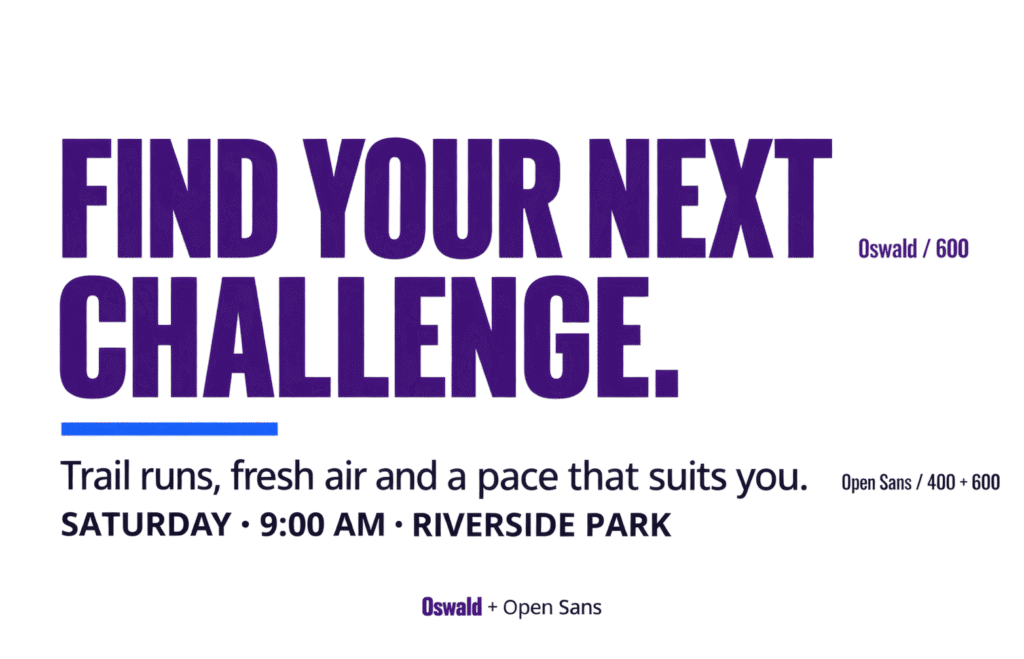
Oswald and Open Sans give a page strong headings without making every line demand attention.
Oswald’s narrow, upright letters give titles a compact, assertive shape, while Open Sans gives the supporting text a more open texture. Both are sans serifs, but their different proportions help distinguish what readers notice first from what they read next.
The challenge is controlling that contrast.
Heavy Oswald headings can crowd a layout, especially when every title is in capitals; undersized body text only makes the imbalance worse.
This guide shows you where the pairing fits, how to divide the work between the fonts, and which settings to adjust when a page feels more forceful than you intended.
- Sports and fitness brands
- Event pages
- News and magazines
- Campaigns
- Bold service brands
- Delicate luxury identities
- Soft romantic styling
- Dense interfaces with competing headings
- Assertive
- Energetic
- Direct
- Approachable
Choose Oswald and Open Sans when your design needs prominent headlines alongside clear, practical information. I’d start with Oswald 500–600 for headings and Open Sans 400 for body copy, adding Open Sans 600 for navigation and buttons.
The pairing suits sports, fitness and event pages where a strong title needs readable details beneath it. It’s less natural for a delicate or understated identity, particularly when Oswald is heavy and set in capitals.
Keep Oswald selective. Using it on every label, button, and subheading can make a useful accent dominate the whole page.
Meet the Pair
Compare the same words in these two fonts, and the difference is easy to spot. Oswald’s naturally condensed letterforms take up less horizontal space; Open Sans has broader proportions and a more open look.
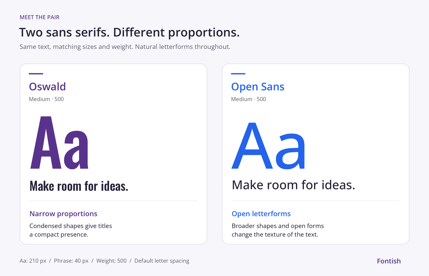
Oswald: compact and assertive
Oswald is a condensed sans serif originally designed by Vernon Adams, drawing on the Alternate Gothic tradition and adapted for digital use.
Oswald’s tall, narrow letters give short titles a firm presence. They can also help a headline fit where a wider typeface would wrap earlier, although the result still depends on the words and available space.
That compact shape suits event names, article titles and campaign messages. Medium and SemiBold provide useful emphasis without immediately reaching for the heaviest weight.
Long passages reveal the trade-off. The narrow proportions create a dense texture, so Oswald works best here as the headline font rather than the voice of every paragraph.
Open Sans: open and approachable
Open Sans is a humanist sans serif designed by Steve Matteson, with open forms and proportions suited to body text and interface use.
Open Sans creates a visible change beneath an Oswald heading. Its less compressed shapes separate the supporting copy from the title without introducing a serif or decorative style.
Look at the openings in letters such as c and e. These details help explain its open appearance; our type anatomy guide shows how to inspect them at the sizes your design actually uses.
Regular works well for paragraphs, while SemiBold can distinguish a navigation item, button or small heading. An event page needs its date and booking instructions to be as usable as its headline is noticeable.
Live Pairing Preview
Join a guided trail run, try a new training session or take the walking route at your own pace. Check the schedule, choose your activity and find everything you need to arrive prepared.
ABCDEFGHIJKLMNOPQRSTUVWXYZ
abcdefghijklmnopqrstuvwxyz
0123456789 ! ? & % $ # @ ( ) [ ] : ; , .
The headline gives Oswald one clear job: catch attention. Open Sans carries the invitation, practical explanation and next action, showing how the pairing works across a complete section.
Notice that the subheading stays in Open Sans. Its heavier weight distinguishes it from the paragraph without introducing another Oswald headline.
Replace the sample with your own copy before judging the result. Compare Oswald 500 and 600, then check your longest title at phone width. Look for awkward breaks, isolated final words and headings that crowd the text beneath them.
Why This Pairing Works
The contrast comes mainly from proportion and density. That gives the two fonts distinct jobs even though both belong to the sans-serif category.
Different proportions make the contrast visible
Oswald’s condensed construction and Open Sans’s broader proportions create a difference readers can see before they read the words.
You do not need a serif to create hierarchy. Our guide to pairing fonts explains how differences in proportion, weight and purpose can separate two sans serifs.
Compact headings balance an open texture
An Oswald heading forms a concentrated patch of text. A paragraph in Open Sans has a different rhythm, especially at a regular weight with comfortable line spacing.
Space around the heading helps that distinction. Too little can make the title crowd the paragraph; too much can make it appear disconnected from the content it introduces.
Shared simplicity keeps the page cohesive
Neither font depends on ornament to establish its character. Both can sit beside straightforward photography, simple icons and practical interface elements without adding another decorative style.
For an event website, that leaves room for the photography and colour palette to set the atmosphere. The typography can concentrate on introducing the event and organising its details.
Hierarchy extends beyond the headline
Open Sans can handle smaller headings, buttons, labels and captions as well as paragraphs. Changes in size and weight within that family create secondary levels of information.
This matters on a schedule: session titles should stand out from times and descriptions, but they do not all need the same display treatment as the event name.
Font Roles
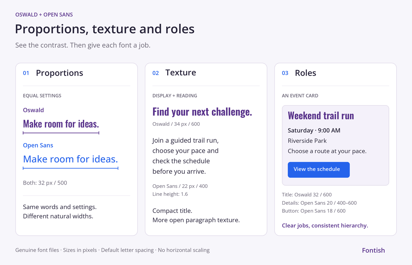
Use this division as a starting point. Oswald marks the major sections; Open Sans handles the finer distinctions within them.
| Element | Recommended font | Why it works |
|---|---|---|
| H1 headings | Oswald SemiBold, 600 | Gives the main title a compact, assertive presence |
| H2 headings | Oswald Medium, 500 | Marks major sections with less weight than the title |
| H3 headings | Open Sans SemiBold, 600 | Separates smaller topics without adding another display style |
| Body copy | Open Sans Regular, 400 | Creates an open, consistent reading texture |
| Introductions | Open Sans Regular, 400, slightly larger | Distinguishes the opening copy through size |
| Navigation | Open Sans SemiBold, 600 | Keeps short functional text clear |
| Buttons and labels | Open Sans SemiBold, 600 | Adds emphasis while staying connected to the interface |
| Pull quotes | Open Sans Regular Italic, 400 | Introduces a change of voice within the same family |
| Captions and metadata | Open Sans Regular, 400 | Keeps supporting details visually secondary |
These roles can change with the project, but equivalent elements should behave consistently. If one card uses Open Sans for its title, neighbouring cards should follow the same rule.
Check that division in three places before committing:
| Test the pairing in… | What to inspect | What to try |
|---|---|---|
| A hero with one title | Does Oswald give the message enough presence without overwhelming the introduction? | Compare weights 500 and 600 before increasing the size. |
| A grid of six article or event cards | Do repeated Oswald titles make the page feel crowded? | Try Open Sans 600 for card titles while keeping Oswald for the page and section headings. |
| A schedule or registration form | Are times, labels and instructions easy to scan? | Use Open Sans consistently and create emphasis through weight and spacing. |
A pairing that works in the hero may need different roles in the rest of the page. Keep the two families, but let the amount and purpose of the text determine where each belongs.
Best Use Cases
These three settings make good use of the pairing’s contrast between prominent titles and practical supporting information.
Use Oswald for class names and short motivational headings. Open Sans handles timetables, membership details and joining instructions, helping readers move from interest to action.
Use Oswald for event names and campaign headlines. Use Open Sans for dates, schedules and booking details so readers can quickly find what they need.
Oswald gives article titles a compact, direct character; Open Sans carries summaries, bylines and longer reading. Keep heavy, uppercase titles selective to avoid crowding busy article grids.
Note: Judge the pairing in the busiest part of the design. Schedules, article grids and information-heavy sections reveal problems that a spacious hero can hide.
Pairing Formula
Start with a small set of styles. Add another only when an element needs a distinction the existing styles cannot provide.
Compact headings with strong presence
Main titles and major section headings
Clear details and comfortable reading
Body text, smaller headings, navigation and buttons
Compact display type establishes emphasis; open supporting text carries the explanation and next action.
Use these desktop values as a practical starting point:
| Role | Font | Size | Weight | Line height |
|---|---|---|---|---|
| H1 | Oswald | 48–56px | 600 | 1.1–1.2 |
| H2 | Oswald | 30–36px | 500 | 1.2–1.3 |
| H3 | Open Sans | 22–26px | 600 | 1.3–1.4 |
| Body | Open Sans | 17–19px | 400 | 1.55–1.7 |
| Navigation and buttons | Open Sans | 15–16px | 600 | 1.3–1.4 |
On mobile, try an H1 around 34–40px and H2 headings around 26–30px. Let the actual line breaks guide your final choice.
Start with default letter spacing. Oswald is already condensed, so tightening it further can crowd the letters. If a heading feels too forceful, adjust its weight before reducing the body text to compensate.
Website Implementation
Load the styles your design uses, then assign them to consistent roles. The example below follows the scale above and includes a genuine italic for Open Sans quotations or emphasis.
Load the fonts
Add these links to the document’s <head>, or use your theme’s font-loading system to request the equivalent styles:
<link rel="preconnect" href="https://fonts.googleapis.com">
<link rel="preconnect" href="https://fonts.gstatic.com" crossorigin>
<link
href="https://fonts.googleapis.com/css2?family=Open+Sans:ital,wght@0,400;0,600;0,700;1,400&family=Oswald:wght@500;600&display=swap"
rel="stylesheet"
>This loads Oswald 500 and 600, plus Open Sans 400, 600, 700 and Regular Italic. Open Sans 700 supplies a real bold weight for strong emphasis within body text.
The display=swap setting allows fallback text to appear while the fonts load. The Google Fonts CSS API documentation explains how to request other weights and styles.
Assign the font roles
:root {
  --font-heading: "Oswald", sans-serif;
  --font-body: "Open Sans", sans-serif;
}

body {
  font-family: var(--font-body);
  font-size: 1.125rem;
  font-weight: 400;
  line-height: 1.6;
}

h1,
h2 {
  font-family: var(--font-heading);
  letter-spacing: normal;
}

h1 {
  font-size: clamp(2.25rem, 1.5rem + 3vw, 3.5rem);
  font-weight: 600;
  line-height: 1.15;
}

h2 {
  font-size: clamp(1.625rem, 1.25rem + 1.5vw, 2.25rem);
  font-weight: 500;
  line-height: 1.25;
}

h3 {
  font-family: var(--font-body);
  font-size: clamp(1.375rem, 1.125rem + 1vw, 1.625rem);
  font-weight: 600;
  line-height: 1.35;
}

button,
input,
select,
textarea {
  font: inherit;
}

nav,
button,
.button,
label {
  font-family: var(--font-body);
  font-size: 1rem;
  font-weight: 600;
  line-height: 1.4;
}

strong,
b {
  font-weight: 700;
}

.prose {
  max-width: 65ch;
}
With a default 16px root size, the body starts at 18px. The clamp() values let headings change with the viewport while keeping upper and lower limits.
Apply .prose to the reading column. Its width limit prevents paragraphs from stretching across the entire screen; adjust it to suit your content and layout.
Check the finished page
Before treating the settings as final:
- Check your longest title at phone width.
- Read several paragraphs together, not just a sample sentence.
- Check menus, form labels and buttons at 200% zoom.
- Confirm that text remains usable while fallback fonts are showing.
- Check that the theme and plugins are not loading duplicate copies of the same fonts.
In WordPress, apply these rules through the appropriate theme or component styles. The example uses site-wide selectors; if you only want to style a preview or sample, scope the rules to that component’s wrapper.
A theme may use more specific selectors, so confirm the fonts and weights that actually render.
Common Mistakes
Most problems come from making too much text compete for attention. The comparison below shows how case, weight and line spacing can turn supporting copy into another headline.
Join a guided trail run, choose your pace and check the schedule before you arrive.
The treatment feels cramped, inconsistent, or difficult to scan.
Join a guided trail run, choose your pace and check the schedule before you arrive.
The corrected treatment creates clearer hierarchy, rhythm, and readability.
Turning every heading into a slogan
Uppercase Oswald can work for a short campaign message. Repeating it across every section title makes an ordinary information page feel unusually urgent.
Use sentence case for longer headings and reserve capitals for brief moments that need that treatment.
Using condensed letters to squeeze in more copy
A narrow font can save space, but it cannot edit a headline. Adding words simply because they fit often produces a dense, awkward title.
Consider an event heading:
Before: Join Our Weekend Trail Running and Outdoor Fitness Event
After: Find your next challenge
Supporting line: Weekend trail runs and outdoor fitness sessions for every pace.
The shorter version gives Oswald a focused message and moves the explanation into Open Sans. Use that approach when the surrounding page already makes the event clear.
For a standalone event listing, a descriptive title such as “Weekend Trail Running & Fitness” may be more useful. Keep the words readers need to identify the event; move secondary detail beneath them.
Making Open Sans too small to compete
Shrinking the paragraph may make a heading look more impressive, but it also makes the explanation harder to read.
Keep the body at a comfortable size. If the hierarchy feels unbalanced, reduce the headline’s weight or size instead.
Carrying headline spacing into paragraphs
A tight line height can suit a short title. Applied to a full paragraph, the same setting leaves too little separation between lines.
Give body text its own line height. Start around 1.6 and judge it alongside the column width and paragraph length.
Giving every interface element the display font
Oswald can work in an isolated short label, but using it throughout navigation, buttons and forms adds display emphasis to routine tasks.
Open Sans provides a more consistent starting point for these elements, particularly when labels grow longer or need to wrap.
When troubleshooting, change one variable at a time. Adjust the heading weight, heading size, space around it or body line height, then compare the result before making another change.
Similar Pairings
If the roles feel right but the mood needs adjusting, try these alternatives. The first keeps the all-sans approach; the others introduce a serif for a bigger change in character.
| Pairing | How the mood changes |
|---|---|
| Montserrat + Open Sans | Replacing Oswald with Montserrat gives headings broader, more geometric shapes. Try it when you want a less condensed look while keeping Open Sans for paragraphs and controls. Recheck headline wrapping—the extra width matters on mobile. |
| Montserrat + Merriweather | Broad sans-serif headings meet serif body text. Consider it for an educational site or publication where you want a more traditional reading texture alongside confident titles. |
| Lora + Poppins | Lora’s curved, calligraphic details soften the headline voice, while Poppins handles supporting text and controls. Try it when a lifestyle or wellness project needs a gentler tone. |
Stay with Oswald and Open Sans when compact, assertive headings are part of the brief. Change the pairing when the character is wrong for the project, not when a single heading needs adjustment.
Quick Reference
Use these settings as a starting point, then check your longest headline and a full paragraph on mobile.
| Setting | Recommendation |
|---|---|
| Main headings | Oswald SemiBold, 600 |
| Section headings | Oswald Medium, 500 |
| Smaller headings | Open Sans SemiBold, 600 |
| Body copy | Open Sans Regular, 400 |
| Navigation and buttons | Open Sans SemiBold, 600, at 15–16px |
| Body size | Start at 18px; adjust within 17–19px to suit the layout |
| Body line height | Start at 1.6; adjust within 1.55–1.7 |
| Letter spacing | Start with the default; avoid tightening Oswald’s already narrow letters |
| Overall character | Assertive, energetic and approachable |
| Best suited to | Sports and fitness websites, event pages, campaigns and editorial layouts |
| Main risk | Too many heavy or all-caps headings competing for attention |
| First adjustment | If headings overpower the copy, try Oswald 500 before shrinking the body text |
Frequently Asked Questions
Do Oswald and Open Sans work well together?
Yes. Oswald’s condensed shapes give headings a distinct presence, while Open Sans creates a more open texture in paragraphs. That difference helps separate titles from supporting information, even though both fonts are sans serifs.
Which font should I use for headings?
Use Oswald for the main title and major section headings. Start with SemiBold (600) for the title and Medium (500) for section headings.
Open Sans SemiBold (600) works well for smaller headings, keeping detailed sections connected to the body copy.
Can I use Oswald for body text?
Oswald can work for a short statement or a few lines of display copy. Its narrow proportions are less forgiving across long paragraphs, particularly at small sizes.
For this pairing, give sustained reading to Open Sans. Save Oswald for text readers need to notice first.
Does this pairing work on mobile?
Yes, with a responsive heading scale and comfortable body text. Start around 34–40px for the main heading and 18px for paragraphs, then check the actual content.
Oswald’s narrow letters can help a title fit, but they are no reason to squeeze in more words. Check your longest heading for awkward line breaks.
How do I make the pairing feel less aggressive?
Try Oswald Medium (500), sentence case and more space around headings. Keep paragraphs in Open Sans Regular (400), reserving SemiBold for smaller headings and controls.
If the result still feels too forceful, the condensed headline style may be wrong for the project. That is a useful design decision, not a settings problem.
Bottom Line
Oswald and Open Sans work best when a page needs a strong headline and an easy path into the details. The pairing is a useful choice for event pages, fitness brands and publications that need clear emphasis.
Before committing, build one section with your real title, a full paragraph and a button, then check it on mobile. Give Oswald the main title and Open Sans the supporting work: you should notice the message first and find the details without effort.